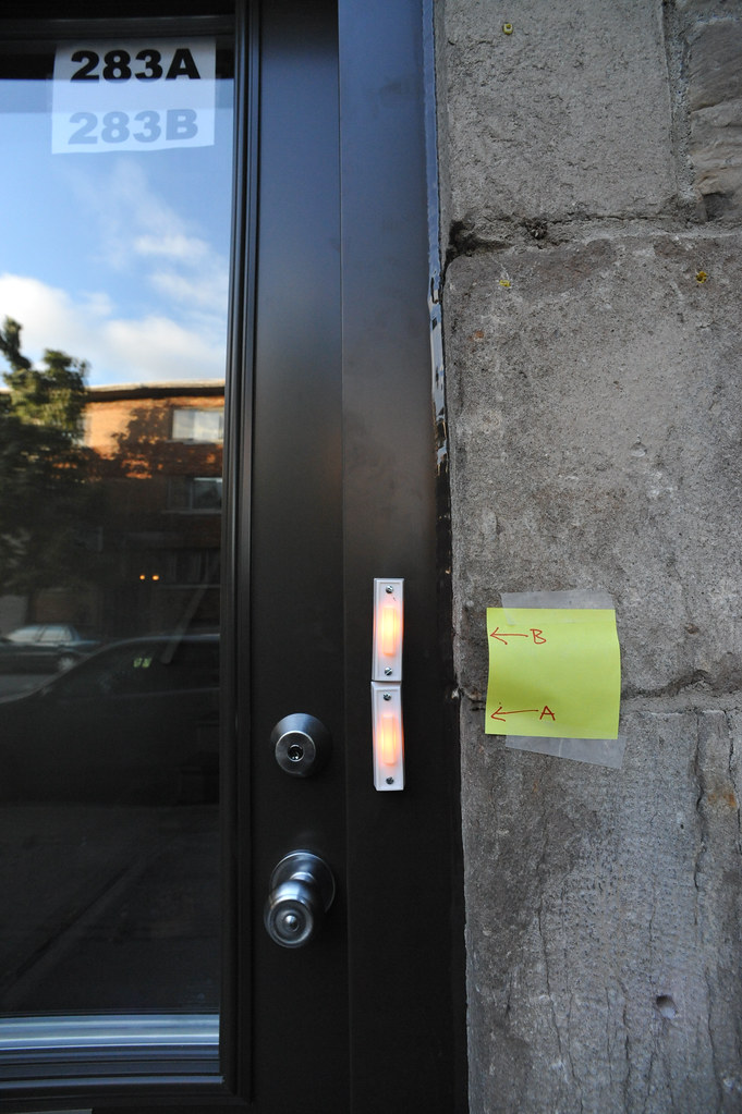
Interface fail. Evidently, the ordering of the apartments inside here is different from the screwed-on doorbells so one of the tenants improvised a new user interface. Hysterical.
The implied cardinality here of apartments — top to bottom? alphabetical? — must have been poorly communicated. But the question is — why not take the more robust and fault-tolerant solution to swap the order of the paper signs taped to the inside of the door’s glass? A passing prankster might find a small bit of amusement in putting up a new post-it, perhaps with “C” and “D” instead of “A” and “B”..(ahem..)
Why would Nicolas blog this? To consider when cardinal ordering schemas do or do not imply specific interface templates. Is it a design principle that letters lower in the cardinal alphabetical “scale” go on top? Or, do they go on the bottom, as in the heuristic that basement, underground apartments always have letters, such as the dingy Apt. B, next to the boiler room?