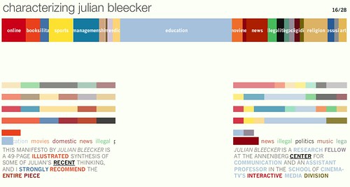
Ian Bogost flagged this one from the netherline — a curious visualization engine called “personas Web” used to create these kinds of colored bands that somehow represent and categorize me based on a comb through of the network, I assume. I might be projecting a bit, but it appears that the principle here is this: through an aggregation of “stuff” found about me, seeded only by my first and last name, this instrument constructs a visualization by data scouring. I like the idea generally speaking — or, it’s provocative at least. You can imagine data “fingerprints” or some such thing. A unique signature of you and your footprint in all teh world’s databases and links and structures and this then indicates the canonical you in some weird data geek-y, network-y way.
The engine does lots of quick-cut processing, and you can sort of watch it do its work. It reminds me of watching a really well-done, action packed, cut-cut-cut visual introduction to an action-spy film, like Bourne or something. But, meh..then its like the film gets snagged in the sprockets and breaks. The house lights come up. People moan and throw popcorn at the screen. Because it just stops dead leaving me with a bunch of striped bars and some vague categories. I guess I am now meant to interpret the size of the bars? Or correlate that in my brain to myself and who I am? And what’s this “illegal” category of things? I’d sure like to investigate where that came from.
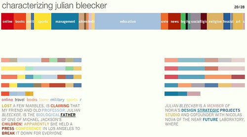
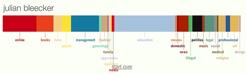
But, there doesn’t seem to be any mechanism for shift-right-clicking your way into the slag heap of stuff from which the color bar was assembled. And the process runs awfully quick in the midst of it so there’s no making sense of it along the way. It’s a nice idea, or what I think the idea is is, you know…nice. The punch colors are colorful and web-2.0-y, I guess. But, sadly, I have no clear idea about how this is meant to convey information in a meaningful, interactive, exploratory way.
Why do I blog this? Remind myself about data visualization, analytics and all the other things. Visual data footprints could be a nice sort of unique mark.
Yeah, mine looked like yours, basically. Maybe slightly less management. But it's one of those visualizations where the ratio of visualization to content is pretty damn low.
I had the same wish when I saw my results (with illegal being the trigger word, as well). Even a list of which words/phrases added to each category would be an improvement. Interested, I reran it immediately and got widely varying results. To get a more unique mark the persona processor obviously needs more time and less (immediate) visual flash to gather more unique information. Possibly they could ask for common usernames/pseudonyms as well to avoid false positives.
Nice tool, I imagine having it somewhere near would be useful, so you could see how your activity impact your footprint, your digital ‘karma’, if you will. Or may be even not only digital.
Hey Billy!
@ethan it would be nice to know if there is some sort of purposeful algorithm in there that perhaps decides what data to gather, or what starting points to follow. I can only guess what it is doing — is it walking a tree of results brought back from the Google search API? Or…what?
@slava this idea of a non-digital imprint, some sort of object that is representative in a unique way to the results of your digital footprint — that’s quite intriguing. A kind of fab’d key or something. Hmmm…
I found it through someone on Twitter… and I think it’s mostly baloney. It couldn’t find any info about me, and when I tried a friend, it found text that has nothing to do with her. It also seems to analyze the same 3 words over and over, in different contexts… just doesn’t make sense.
And yes, at the end the bars look pretty but need the choice to Cmd-click on them. At least give us the percentage size of the bar slice, maybe the number of ‘hits’ relevant to it (if it’s not all BS, see above)