Weekending 19122011

On the Swiss front of the laboratory (Nicolas), there is progress on the game controller project. Laurent and myself indeed met with scenographers in Lausanne to discuss the upcoming presence of the joypad collection at the Swiss Museum of Science-Fiction (yes, there is such thing as a Swiss Museum of Science-Fiction) in 2012. We chatted about the way the controllers will be presented, a chapter I wrote for the catalogue of the exhibit and also a new visual representation to be displayed as a complement to the devices. It’s the diagram that you can see at the beginning of this blogpost, designed by Laurent Bolli. What started as a book project is now slightly more complex with various artifacts like these. It seems that we’ll also sell the poster with postcards. We have the outline ready and part of the book is already written but the design approach we favored lead to intriguing bifurcations: it seems that every opportunity we get to discuss the joypad history lead to some new viewpoint that we try to express visually. And this representation then enables us to get a different perspective on the topic per se. Hopefully, I’ll write during the Christmas vacation!

Apart from that, the week was also devoted to a day of lectures at the Geneva University of Arts and Design. Monday was about interviewing techniques in field research and the afternoon about user participation in interaction design (from user-generated content to designing “hackability”.) This fostered an interesting discussion about repurposing and hacking. Students argued whether designing something so that people can create new features/functionalities is different than letting extreme users hack a system. What we agreed on at the end of the course was simply that those are different kind of possibilities along a certain spectrum… which allowed me to highlight the work of Michel de Certeau and the importance of observing peculiar ways to repurpose things in the environment (food for thoughts for designs).

And finally, I spend the end of the week conducting a field study in the train between Geneva and Zürich. The point of this project is to explore the use of (light) head-mounted displays used in conjunction with cell-phones. I can’t talk much about this but we’ll make things public at some point, perhaps an academic publication if time allows it.

At the Los Angeles Station (Julian) most of the last week was focused on a workshop at the Nokia Advanced Design Bureau where we had a wonderfully intense two day Project Audio workshop with our friends Tom Taylor and Phil Gyford from RIG. That was great good fun and engaging. Working with friends from outside the bubble of Advanced Design provides a bit of a checksum on the work. That’s to say — facing inward and not nearly as public about what we do and how we do it as we should be (and could be), bringing in trusted, thoughtful, engaged partners helps validate or repudiate the design we may *assume is fab, but may or may not be. With them alongside, we were able to move from some axioms and principles that came out of our first workshop in London a month or so ago to quite tactical plans as to how Project Audio moves forward in the 2012. Some more thinking, lots more making and some things that are very fast moving and involve multiple other participants who should be engaged in the design and making work. In between those two workshops we managed to find a way to work across eight timezones — and realized that the tools for doing so are a bit broken.

In other news, questions still abound in the Executive Floor as to when and why to make things become real produced things and when things are best as props and prompts to help shift and advance what design does.

On the one hand, making a “real” thing can be quite viscerally satisfying. You can say — “Look! I *made that thing hanging there on that rack in that box. I *made something that is real!” I understand that motivation. And oftentimes making that sort of real thing in that sort of real world is necessary because that, ultimately is how you make money to buy bread, if you work at a place where revenue is made through paying consumers. That’s good. And maybe along the way you’ve helped make people think differently about what can be in the world because many people? Well..many people consider least common-denominator crap like Color Changing Digital Alarm Clock Cubes is as good as it gets. And all good advanced designers aspire to advance that assumption and do things like set new high-water marks in the realm of little things that make the world just a little bit better.

On the other hand, making theory objects, props, prototypes and MacGuffin’s have the effect of poking and provoking the practice rather than the consumer — they are effective as ways of changing design in a wider sense because designers are the audience. They are potentially infectious and pedagogical. Of course, it is guaranteed they are incomplete almost by definition — you’ll never get the thoroughness and inevitable compromise that comes with tooling for manufacturing or constructively arguing with “The Business” about what this is and who it is for. The design priorities are sanctioned by the priorities of getting something that goes to the larger marketplace and you end up with a diluted thing that does/teaches nothing. I guess my point is that the prop can teach and the “real” (eech) thing has the potential to be a sad, diluted thing that eats time and money.

Continue reading Weekending 19122011

Weekending 12102011

On my side (Nicolas), the week was split between consulting (a workshop about social gaming in France) and different teaching gigs. One of them, at the Swiss Institute of Technology in Lausanne (EPFL), is a year-long course about designer’ approaches and tactics for engineers. We address various methods ranging from user research to prototyping. Given that the course lasts 3 hours per week and that we have not access to any studio facility, we have to do things in a pretty low-fi way. It’s challenging but very intriguing at the same time. This week the course was about mock-ups in interaction design and the role paper could play in this. Inspired by the Post-it phone approach developed by Matt Cottam at CIID, the students had to produce a quick and dirty mock-up of their project. The idea was that they had to rely on the results of the previous courses (field research, brainstorming session).

It was actually the first time I ever tried this approach and it went rather good. Using paper like this was both fun and engaging, especially because I asked students to act out the use of the device; one student being the computer (making audio sounds to mimick the interface), another being the user. This role-play was important as it enabled a “critique” phase afterwards during which anyone of us had to write down the pros and cons of the proposed system and present this to the user and its “computer”. Back to the laboratory, this ideas got me into listing a whole set of workshop activities and tactics that we can deploy on projects.

Over on this side of the world (Julian) most of the work was focused on getting some bits of technology to play together for the Ear Freshener concept for Project Audio. There are some fiddily bits that mostly had to do with not having played with Atmel 8-bit microcontrollers for a long while and their AVR Studio 5 having gone to edition 5 from 4, which meant upgrading it, which meant upgrading the other thing, which meant upgrading that other thing, which meant upgrading that one other thing, which meant upgrading Windows, which meant upgrading the thing that one other thing that didn’t want to upgrade itself, which meant planting my face in both palms and cursing lots of things. I’m also using this new debugger device — the AVR JTAGICE 3 — which as best as I can tell is a smaller thing than the huge AVR JTAGICE that came before it but otherwise the same. That’s finicky, too — but the single wire debugWIRE protocol for debugging is quite nice, although it can get you stuck in debugWIRE unless you know about the one little buried menu item to force the DWEN fuse to reset. That was another thing. I’ll have to do a little action-item post about the process of working with these new tools, for the tool-y people out there.

The result? Thursday night we had a functioning Ear Freshener (or should I say — EarFreshener?) in prototype mode, which you see above. It has a proper continuous adjustment knob that you might think is volume, but you’d be wrong. We went with the microcontroller to control the audio channel selection rather than writing code for the other device, which we’re definitely less familiar with. The extra chip and such won’t make a difference in scale or fitting or anything like that. The goal for this week is to produce some more audio and get Ted or Nick or someone to sit alongside and think about more of the IxD for the thing.

That was good progress by Thursday evening so I gave myself the rest of the week off and went to the Salton Sea for the afternoon.

That’s it.

Continue reading Weekending 12102011

Weekending 12042011

Well. Another *tardy weeknote. Doesn’t matter, I suppose. It’s just a log entry.

Last week was a busy one. At the Nokia studio there were many visitors and engagements with the work in the Advanced Design studio. It was a chance to get direct feedback from colleagues on the work that we’re doing and figure out what language around the work, like..you know..works. Oftentimes projects will start with a bit of a hunch and a nudge and a curiosity with lots of “I dunno..” half-baked thoughts about what is leads the projects in a particular way. Practicing describing the project over and over to visitors begins to refine and hone the thinking and begins to percolate up the significant insights, principles, design axioms. Presenting work eight times over a couple hours does a bit of brain-polishing. One thing I thought a bit about and brought into the discussion — something I learned for the sharing eight or nine times: It’s a thing that some things don’t get powered off, like digital connectors. At least for me, it isn’t a ritual to shutdown computers, phones, iPads, ebook readers. They get put to the side or asked to go settle down a bit, for me. Another thing — audio seems to always want to go up-and-to-the-right in its fidelity. It’s Hi-Fi..not Lo-Fi..the next iteration of sound reproduction technology won’t be worse — or won’t advertise itself as worse. That’s interesting. What’s the inverse of that, and what sort of world would it be where one could settle for Lo-Fi, or where Lo-Fi would make perfectly good sense. If that thought of an inverted world like that makes you think I’m crazy, or if you can’t imagine why such a question is important, or if you still think the Eurozone couldn’t completely disappear — then I don’t think you get what we do here.)

It’s a luxury to start something in that fashion. The freedom and trust to follow one’s curiosity often always leads to better things. The question was asked several times — I was sharing Project Audio — where does this go? How does it *end up in things*? And now with enough projects done it becomes easier to provide examples of how we work and how ideas from seemingly no place end up in a place with the integrity and principles of the thing-from-nowhere actually in there. It’s a translation of big principles and provocatively simple statements into a little nudge and refinement or rethinking of something. There’s still the large-ish gap between ways of working that exists between teams that work at a very fast cadence of product-ion and teams that are meant to look around a corner or who are incentivized to think a bit to the side and provoke. Still — sometimes if you whisper in the ear of the right people over and over again, you get that nudge to happen. Good ideas are worth saying many, many times.

What else?

Will stubbed out a bit of code for an *App I’ve been wanting to do for a bit. It’s a small simple thing, really. I’m sure it’s been done. Maybe its better that I do it to get back into the muck of Xcode. It simply shows a photo from a year ago. I’m interested in time and representations of it and the little puff of delight that comes from recollecting a moment and going back there. That came from Photjojo’s Time Capsule — which I love. It’s deceptively simple of course. But, it had me experimenting with seeding my future with the things I’d like to remember and go back to. That behavior is intriguing. Why an *App? *shrug. I need to get more comfortable writing code to do experiments and projects.

Berg released Little Printer which caused the Berg-o-spheric Cloud to rumble thunder. Curious device. I like the making of small things that do one thing. It got us thinking about the possible meanings of the Venn diagram from a couple of weeks ago.

Things go in certain places — where would the Little Printer go? It’s a product certainly — perhaps in the middle. It is not least-common denominator crap-product, so maybe not squarely in the center. It’s way more substantial and meaningful than SkyMall key-hiding stones or back scratchers with your favorite sports team logo on it.

I imagine long, slender 22 year old boys with grown-man full-beards, MacBook Pros and exquisitely curated and color’d fixies loving Little Printer. Where would it go in the graph of future things?

It’s a thing manufactured and designed to be produced — it’s not a realized thought-provoker or evocative knowledge object. It works, so it isn’t a prop/MacGuffin. It got me thinking about things that are meant to circulate an idea and start a conversation that may push or tip or tweak the relevant arena in new directions. It may not work, or it may work and it may even say — I’m going to work and be super relevant and live on people’s shelves..live in the world, but then doesn’t really. Or does, and then gives out a last shriek and death-cry and then remain silent forever, as Fabien described the last moments of his Nabaztag. This isn’t a normative assessment, just wondering about the category of things that change the way people understand something like the old, sad, forgotten printer and then it gets reinvigorated and reassessed and remade to be something fun and different, like Little Printer.

That’s it.

Airport Timer


There’s a passage in David Pascoe’s book Aircraft where he talks about how none of the airports of the time were prepared for the introduction of the 747. Specifically there was no part of the physical infrastructure of an airport that wasn’t overwhelmed by the size of and volume of the “jumbo” jet.

None of the waiting areas were large enough to accommodate the number of passengers getting on or off the planes. Often the planes themselves were too big to fit in the loading bays outside the terminals and the few enclosed jetways that had been in use up to that point were too small to even reach the doors on the planes.

Later in the book he goes on to describe a similar clusterfuck ushered in by the hostage taking during the 1972 Munich Olympics and the decision to install security checkpoints and passenger screening areas in airports. The just opened Dallas/Fort Worth airport was particularly hard hit. Although its design was modular and extensible from the outset (with all the terminals as simple semi-circles that could be snapped together like Lego up to the 10 miles in length) the buildings themselves were too narrow to retain any design or aesthetic after they been cut in two by x-ray machines and the lint trap of people waiting to go through them.

I was thinking about this last month when I had the misfortune of flying out of Terminal 7 at New York’s JFK airport. Architecturally, Terminal 7 resembles two staggered butter sticks. The first butter stick is where you check in and is connected to the second “stick” which houses the departure gates by a short flight of stairs. In between the two, just in front of the stairs, is where you go through airport security.

United Airlines flies out of Terminal 7 so at least some of the misery of the security process can be blamed on United poisoning any and everything it comes in to contact with. The rest, though, is a combination of the need for the Transport and Security Administration (and their international counterparts) to indulge itself in ever greater security theater of Broadway musical proportions; the inability of people to imagine any kind of personal efficiency or shared responsibility getting through the line; and a New York City scale “Fuck you, never again” attitude to the process born out of the reality of the 9/11 attacks. All multiplied by the ever increasing numbers of people flying to and from, and especially to and from New York City.

There isn’t much to say about the other terminals at JFK. Both Terminal 4 and the newer addition to Terminal 5 are little more than oversized cargo ship containers with drywall and designer handbag shops but at least they are big enough to dampen the indignity of the fear and paranoia that define contemporary air travel. Put another way: Terminal 7 is just too small and the security line is where everything grinds to a simultaneously depressing and rage-inducing halt and forces everyone to in to a shared despairing for all humanity, all the while with too little space to comfortably take off your shoes.

Untitled Intimacy #1076031825

So I made a website: http://airport-timer.spum.org

Airport Timer is a simple web-based stopwatch application to record how long it takes to get through security at the airport.

Before you get in the screening line you enter, by hand, the three-letter airport code and the name of the terminal you’re in and then press the start button which launches a timer in the background. Then you put your phone (presumably) back in your pocket before you are disappeared for spooking the security agents. When you make it through to the other side you press the stop button which stops the timer and, after a confirmation screen, uploads the airport code, the terminal and the time you spent (measured in seconds) going through security to Pachube. There’s also an option to send a pithy message to Twitter.

That’s it.

The site uses the Twitter API as a single-sign-on provider but that’s mostly as a kind of half-assed throttle on the API that proxies and sends the timing data up to Pachube. Because of the way that the Twitter kids have built their Javascript widgets and because there’s currently no place to store the Twitter user associated with a given report in Pachube there’s a reasonable argument that you shouldn’t need to log in at all. Modulo the part where even Instapaper gave in and forced people to create user accounts on the site. Anyway, you need to log in with your Twitter account.

The sites also uses Pachube as a datastore because it seemed like an obvious place to test the claim, in a networked world, that “every human is a sensor”. Pachube’s data model consists of three nested pieces: Environments (airports), Data Streams (terminals) and Data Points (individual time through security reports). The first two can be assigned additional metadata (tags, location, etc.) but the data points can only contain a timestamp and a value.

Which makes sense but right away the inability to add metadata to individual data points means that I can’t record who just went through security or generate, easily, the “your stuff” style personal reports that people expect from social websites. Arguably Pachube is not a social site except for the part where, in a world where we are all sensors, any centralized time-series service that has humans as inputs will be measured on its ability to abstract the data. Robots may not care (or need) to see all that information bucketed by airport or by Wednesday versus Tuesday but we do.

You could just as easily write a backend for this kind of site using MySQL or Solr. Solr’s ability to facet by date and eventually to do nested faceting (for example, to facet by airport and then for each airport by week or to facet by user and then by airport) makes it an attractive possibility but I’m choosing to use Pachube because it is a logical meeting of minds.

There are no “report” style pages for individuals or airports yet. There’s actually a lot of stuff the site doesn’t do yet. It does not try to retrieve your GPS coordinates automatically or use them to auto-detect your airport or validate that you’re really at Charles de Gaulle aiport and not sitting at a coffee shop in Winnipeg. It does not have a magic auto-completing list of terminals for each airport. It does not (and will never) have heat maps.

Some of these things will come with time. I have already imported all of the whereonearth-airport data in to a Solr instance so auto-detection and validation are both more than theoretically possible. Auto-complete for terminals is little more wrapper code around the Pachube API to pull out the titles of terminals (datastreams) for a given airport (environment/feed). But for now, it’s just a simple thing to record the data and put it somewhere safe and public.

What Mike Said

Sunday November 14 13:06

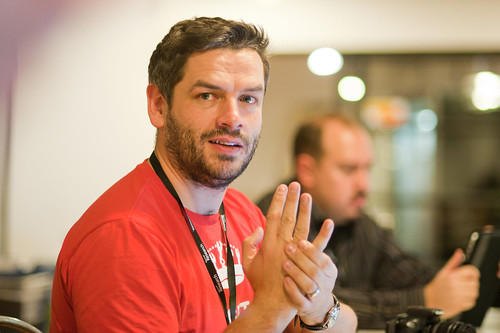
In the lead-up to Kicker Studio’s Device Design Day coming up on August 5th 2011 in San Francisco, the Kicker Studioites asked Mike Kruzeniksi, who’s giving a talk there, their Six Questions..

Kicker Studio: What is the most cherished product in your life? Why?

Mike Kruzeniski: This is one of those questions that you feel like you’re supposed to have an answer to, but nothing comes strongly to mind. Maybe I’m stuck on the word “cherished.” I do have a lot of products that I really like. Some that I might even say I love, in that way the word love gets thrown around design. I love my Prius. I love watches, Alessi and Nixon in particular. I have a lot of shoes…but love my Converse All-Stars and John Fluevog’s the most. I have a pair of classic Tom Ford sunglasses that I love. I love my Eames furniture. I have a large collection of mobile phones, and as far as products go, I spend more time with my phone and PC than anything (and maybe anyone) else. I just bought a new camera and so far that relationship is off to a very good start. But, I don’t think of any of these things as “cherished.” The emotional connection with them isn’t strong enough to deserve that. Maybe that’s being too literal with the question, but all of these things can be replaced. They will be replaced, eventually.

When I think about the objects in my life that I do actually feel a sense of “cherishing” for, there are two, but they aren’t really products. The first is a painting that my wife and I bought together on our first vacation, in Bangkok. We met the artist and ended up drinking all night with him and his friends, despite neither us being able to speak Thai, or them English. The second is the ring that I proposed to my wife with, which I folded out of paper. Yes, paper. Both of these objects have great stories surrounding them and make me happy just thinking about them—and always will. Both are fragile, by their nature won’t last, and are the only things in my apartment that I would actually feel a strong sense of loss for if they were damaged or lost. Both represent a lot more to me than just what they physically are. There is no newer or better version of those objects. And unlike a lot of other things their impermanence only increases their value, at least to me.

As a product designer though, that sort of sentimentalism and interest in stories often finds its way in to my approach toward design. I’ve always been interested in experiences where meaning unfolds, and products that aren’t “done” but leave opportunities for a relationship and a story to take place. I’m still not sure it’s something that can really be designed in, but it’s worth trying.

What’s the one product you wished you designed?

The Nokia 3310 and Twitter. What I like about both of them is that they reduced emerging trends of their time (mobile communication and social networking) to an almost absolute clarity and simplicity.

Though the 3310 wasn’t actually my first mobile phone, I tend to remember it that way. At least it was my first mobile phone that really felt right. Like all technologies in their early stages, mobile phones had mainly been comprised of complicated experiences and were sold on feature specs. But the 3310 was an impressively clear expression of what a mobile product should and could be. It was the kind of product that was so pleasant to use that you form some emotional attachment to it. It was one of the best selling phones ever, it was inexpensive, and was very early in the mobile market, so it was the first mobile phone for A LOT of people. I imagine that most of them probably look back on that product with a smile as well.

Similarly, Twitter took existing communication, interaction and networking concepts and reduced them to a very clear and simple experience. I respect their focus and how they’ve confidently avoided layering on extra features over the years. I really admire how they’ve grown around the the behaviors of their users but also elegantly guided users where they’ve evolved the experience. I love their approach to openness and how they’ve built Twitter to feel more like a platform than a product. I think that Twitter has become the most important evolution of communication since the mobile phone.

And their brand is just fun.

Both products are/were simple, focused, meaningful, have a sense of humor, well-made, beautifully designed and accessible. These are all attributes that admire and hope to bring to my own work.

What excites you about being a designer? Why do you keep doing it?

From the very beginning when I was just learning what design was, I’ve always liked the way design influenced my way of looking at and understanding the world. Once you learn it, you can’t turn it off. Everything is at once a problem and an opportunity. I like the always optimistic mindset that design provides when approaching problems. I like the constant questioning and I like the attitude that most designers have of wanting to make everything around them better. I like the opportunities that design continues to bring: I feel like every project I find myself working on is more exciting than the last. As I grow, the opportunities for influence and impact in my work increases. And as a discipline, I feel like design is continually finding its way in to more interesting industries and settings. Our collective influence and impact is increasing. Of course design itself can’t fix everything, but I do think that there is a role for designers in any of the hardest societal and industrial problems. The boundaries of what design is and does is always expanding. That’s exciting.

When do you first remember thinking of yourself as a designer.

I took to the idea of being “a designer” very quickly in school. Design wasn’t a profession that I had ever heard of growing up, but I went to Emily Carr University (an Art and Design school in Vancouver) right after high chool. My love for painting, sculpture and drawing led me there. But as much as I loved art, I didn’t believe that I’d ever make a profession out of it. I didn’t really know what I was going to do at Emily Carr. In the second semester of my first year though, I stumbled upon an introduction to Industrial Design class. I had to beg my way into the class since I had missed the sign-up date. When that didn’t work, I showed up to the class anyway and eventually the Prof let me stay. As a kid, I was never very fond of math, but I always loved physics. So, the combination of applied problem solving, making and aesthetic discourse in design struck a chord immediately. At the same time came this almost painfully naive realization that EVERYTHING around me had—in varying degrees of success—been designed by someone somewhere. It was fun to explain that to friends and family, and even more fun learning to see that there were opportunities to improve and invent things everywhere. I think that’s what eventually led me to the Interaction Design space. For products at the time, it seemed to me like the biggest problem that needed solving.

What’s the most important lesson you’ve learned, and who taught it to you?

I first studied industrial design, then went to Umeå in Sweden to study interaction design. In between my two years at Umeå I took an internship at Microsoft. My first love for design came very firmly through the perspective of industrial design and products. Though I was really excited about interaction design, as a design discipline it still wasn’t really clear what it was and I definitely had some trouble with the idea of not being an industrial designer anymore. During that summer at Microsoft I was really starting to struggle with what direction to take as a designer: Basically, was I an industrial designer or an interaction designer? Microsoft arranges mentors for their interns, and mine happened to be Horace Luke, who is now the Chief Innovation Officer at HTC. I remember explaining my career dilemma to Horace one day, and him asking me very simply: “What’s wrong with just being a designer?” At first it was hard to believe that it could be that simple, but soon after, it melted down all mental blocks I had that defined or separated those disciplines. Discussions around concretely defining design disciplines started to seem like a waste of time. It’s pretty clear that most great designers don’t care about those divisions, and are happy to play in any space that catches their interest. That idea has guided my outlook on most things since then—first in trying to bridge interaction and industrial design, then graphic design. And more recently, working for Albert Shum at Windows Phone, we spend a lot of time thinking about Design in close relation to business and engineering. I’ve been very lucky to have a few managers now that are very open minded about what design is, and are always looking for ways to expand what we do. In a few years, I’m not sure that I will really even define myself as a designer anymore.

What are the 5 things all designers should know?

1. How to tell a great story
2. How to influence, inspire, and lead others
3. How to manage projects
4. How to critique, ask questions, and brainstorm
5. The basics: form, shape, composition, hierarchy, grids, color, type…

Why do I blog this? I like Mike. He’s smart and he has porcupine hairstyles. And enormous, medievally-large wrist watches. And he makes stuff, too. And besides that, I really like his answer to the one about what kind of designer one might be — and the response from his mentor that, like..you can just be a designer and the specialization and all that seems besides the point. Disciplines suck. They’re for the feint of heart, the nervous barrier minders and those who enjoy knowing they are in..while all the others are out. Good stuff. Thanks Mike.

((For my record, this is what I said last year: http://www.kickerstudio.com/blog/2010/07/six-questions-from-kicker-julian-bleecker/

1. What is the most cherished product in your life? Why?

My most cherished product right now is my Nikon camera — or my modest Nikon camera collection. It’s what’s on my mind quite a bit these days as I spend more and more time with learning a new kind of photography. It’s easy to obsess over the gear and accessorize your accessories’ accessories and all that, which isn’t necessarily a quality I cherish — that’s a functional obsession, like being a functional drunk or something.

But, I appreciate the clarity that’s expressed in the design of a well-built camera. The camera is also something that’s been around for enough generations to comprehend what is is and where it’s going. You can also see these changes in behaviors surrounding photo-taking machines and then the camera becomes a useful prop for talking about the ways objects talk to us and inform us and shape our behaviors and expectations. I’ve been spending lots of time in skateparks near home here and sometimes I bring a crap SLR with me and give it to one of the teenage skaters to take some photos. Often enough they try to look “through” the LCD on the back of the camera, not really getting this idea of looking through a glass viewfinder. They’ll hold the whole thing at arms length and try to sort it all out, and then I’ll show them how this old-fashioned sort of photography works. They get it of course, but as a signal of evolving practices and so on, these sorts of generation-gap things reminds me that things are always changing and change is good because it means things can be otherwise.

I also cherish my bicycle. It’s one of the last USA built Cannondale’s — a black anodized Bad Boy. The other day its voice just dropped: it became a single-speed.

2. What’s the one product you wish you’d designed, and why?

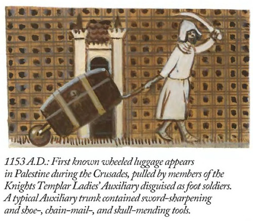
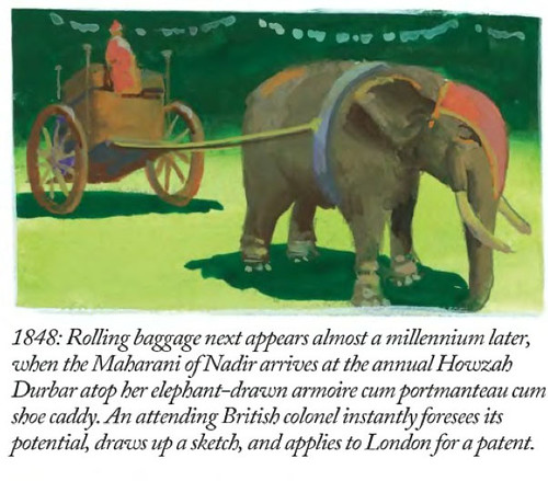
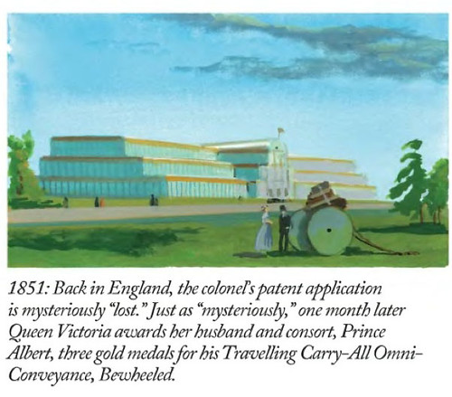
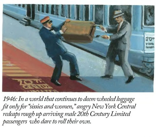
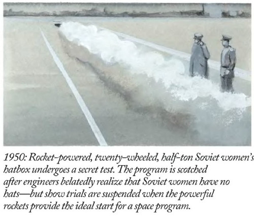
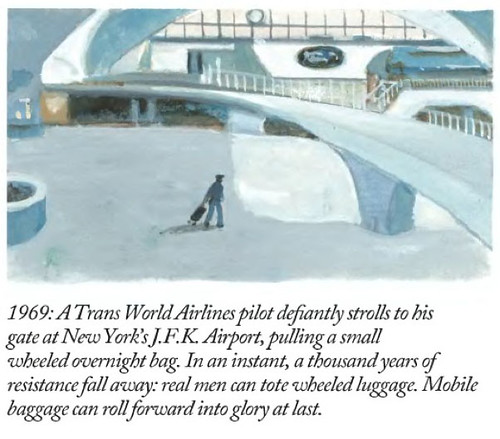
One day, someone had the imagination and clarity to put wheels on luggage. I’m sure there’s a business case study somewhere on that one. I prefer that it be told like a designer’s fairy tale because the path to that simple stroke of insight seems so simple, but then materializing that idea and making it part of the world is magical.

Sadly, good ideas can be stymied by the misalignment of goals and aspirations. The misalignment happens in-between design sensibilities to do good in the world and business priorities to make business. Together, those two things make up a maelstrom of entanglements that is often referred to, in polite company, as product design.

For me, “wheels-on-luggage” has become like an incantation to raise the spirit of design clarity in the studio. It’s a signal of a kind of perfection in design: one thing done exceptionally well that makes the world a little bit better than it used to be. Wheels on luggage is also a simple idea that somehow took 50,000 years to materialize in a widespread fashion. It’s simple, but not this capital-s “Simplicity” thing, which somehow needed a book to remind people of the idea, which ironically makes the idea more complex. The wheels on luggage thing is a wonderful marker that stands for a kind of design that makes the everyday quotidian things a little better, rather than obsessing over deeply complex, baroque mishegoss that makes things so barnacled that they just tips over and sink the whole design. So, generally speaking? When I see a product of someone’s imagination that materializes this “wheels-on-luggage” simplicity, I get a collegial, healthy jealousy and wish I had made that.

3. What excites you about being a designer? Why do you keep doing it?

I’m excited by the expectation that a designer should reflect on his practice and redesign the way the design is done. This seems to happen with quite good energy and spirit and commitment in the studio I’m in, which makes it a great place to get your design-on. That sort of self-reflection is something I learned more about studying scientists and engineers in grad school when I was learning how scientists make knowledge. The tricky thing there is that scientists and engineers couldn’t really be reflexive about what they were doing or they’d get in trouble with the knowledge cops. They couldn’t look at themselves and do the Bill and Ted thing of stopping suddenly and saying, “Dude. We’re, like..making science that’s going to change the way people understand the world. How fucked up is that?” Unlike science, Design can question itself routinely — asking about itself, questioning its assumptions and practices and redesigning itself in the midst of the design work.

The other thing that makes me excited is that one makes-to-think and thinks-to-make. There’s no hard line between wondering about something and making that thing in the machine shop. The two go together without a hard distinction between thinking it up and making it up. In a design studio — or, I should say, the one I’m in because it’s the only one I’ve been in — the making is also the thinking. We don’t figure everything out and then just build it. Both of these materialization rituals are the same and interweave in a simple, clarifying way. It seems impossible to just divorce design from either thinking or making and that translates nicely into a ruthless commitment to simultaneously do, for example, UI design at precisely the same moment as the industrial/object design. I love that sort of stuff. It tickles the generalist in me and teaches me everyday about the craft of design.

4. When do you first remember thinking of yourself as a designer?

It couldn’t have been more than a year ago — a colleague here told me to stop excusing myself for not being a properly trained designer. And he’s a designer’s designer so I did as I was told. I never went to design school and never had those sensibilities schooled into me in a formal way. I’m an engineer with a doctorate in history of ideas — with that it almost seems like I could only but be a designer, if I think about it. That or a rueful, contemplative barfly.

5. What is the most important lesson you’ve learned and who taught it to you?

Follow your curiosity, even if the weather smells like rapture, everyone around you is loosing their heads and the creek is rising pretty quick. Instinct rules out over any sense of rationality or attempts at an objective view on things. I learned this from my dad. He never said that directly — that’s a translation of decades of a good father-son relationship. But — doing what you know in your gut is right by you? That kind of sensibility and clarity is something I continue to learn from, even in the mistakes.

6. What are 5 things all designers should know?

1) Humility.
2) Listening skills.
3) How to find 3 positive, thoughtful observations about something that you dislike.
4) Designers should be more adamantine about saying “no” to PowerPoint.
5) You’re not the only one to have thought that up, ever.
Continue reading What Mike Said

The Mind & Consciousness User Interface: SXSW Proposal?

A visit to the Psyleron facility in Princeton New Jersey

A couple of years ago — 2009, I believe — my brother and I went to visit the facilities of Psyleron, a very curious research and engineering company in Princeton, a few miles from Princeton University. He piqued my curiosity about the operation, which was extending the research of the PEAR lab at Princeton — Princeton Engineering Anomalies Research. The PEAR lab has been in operation for decades and Psyleron is a kind of way of commercializing the insights and theories and all that.

They developed a random event generator and software to allow the at-home enthusiast practice their brain control skillz. It’s called the REG. You can buy one. Adam Curry at Psyleron was kind enough to loan me one. The object needs some industrial design help, which would be fun to work on.

Why is this interesting?

* It’s atemporal, I think. There’s a twist of the Cold War paranoia about mind-controlling Russkies arranged in a phalanx on the ground, specially trained to shoot brain waves to make enemy fighter pilots shove their sticks forward and crater their jets. It’s 50’s era thinking infused into something that is still futuristic. I like the history. The story of the Princeton Engineering Anaomolies (PEAR) laboratory start comes from that history — a chance encounter at a weird proto-DoD sponsored workshop on the role of consciousness in hot-shot right-stuff-y fighter jocks in the 50s who were better able to tame the barely stable faster-than-sound aircraft than other pilots. Were they more synergistically coupled to the planes, all other things being equal? It was a real question, and a contingent of the defense apparatus wanted to know and thus funded the PEAR studies.

* People are going to tire of their fascination with “gestural” interfaces. That term already sounds antique. Even thinking about it makes my mind groan and roll its eyeballs. What’s next? I’m not saying that brain control *is next — it is a logical, automatic extension to go from contact to contactless interaction, sort of like ranges of massage and body work — from the brutalist Swedish deep tissue stuff to the hands-off, chimes-and-insense Reki flavor.

* This guy Dr. Jahn who co-founded the PEAR lab lived nearby when I was growing up. That’s kinda cool to have this weird return to early days. He was squirreling away on this research in the basement of a building I used to sneak into during those easy, trouble-free adolescent years in breezy, leafy Princeton.

Cabinet Magazine has an good short article on Dr. Jahn and the background of his research.

There’s all sorts of curious artefacts and media and materials in and around the proto-Psyleron PEAR laboratory research experiments. The PEAR Proposition DVD is an epic, 3 DVD collection of lab tours, lectures, lecture notes about the project. Margins of Reality is the reading equivalent. Good “research” materials.

Psyleron also has a number of devices to activate the principles and propositions of mind-control/consciousness control and influence. An assortment of stand-alone probes and dongles — keychains, glowing lamps and that sort of thing. A robot is forthcoming!

The most curious to me — because it produces information that can be studied, allowing one to conduct experiments and because it could probably be DIY-ified — is their REG or random event generator. The REG in general stands at the center of the research as I understand it. Having a “pure” REG that is not influenced by shaking, bumping or jostling of any sort allows one to have a sort of “white noise” norm for measuring any external effects. The best way I can understand this is one needs to remove any bias on the system except for the influence of consciousness/es. A great REG is purely random data — white noise. Supposedly the white-noise randomness of this device is superlative. Who knows? It may be, or may have been before some innovation or whatever. I think there’s some quantum tunneling mojo going on in there beneath that bit of metallic shielding.

Why do I blog this? I’m *way behind on any project related to the work at Pear and my own personal affiliation with the research itself — Dr. Jahn lived in the neighborhood when I was growing up and the kids in the neighborhood all played together in the streets and yards of the neighborhood, including his daughter. I’m also thinking about writing a talk or panel proposal for SxSW 2012 on the topic, perhaps with Mike, who’s interested in looking into brain control interfaces.

I think there’s a nice continuity between the *macro interface of many minds/bodies of the Psyleron work and the more local, *micro interface of one mind with the likes of this stuff from this operation called emotiv. I like the continuity from consciousness and action-at-a-distance to the more directly coupled, sitting-on-the-head-stuff. Making a continuum from levers, knobs, switches, lights; punchcards keypads, teletype rigs; typewriter keyboards and CRTs; mice and keyboards and CRTs; 3D mice and all that up to “gestural” interfaces and touch and then into the mind could be quite and interesting graphic. A more complex graphic or an additional vector within that one could also look at the particular semantics and syntax of thought that is required to operate the devices — the ordering of knowledge necessary to frame a task or problem and then explicate it for the specific set of interface elements one is afforded by the device. Command-line interfaces, as we well-know, allow/disallow specific tasks; menuing systems are beards for what happens on the command-line — making the framing of the task more amenable to more people (?) and certainly less terse. It’s a translation effectively of what might normally go on the command line.

One possible approach to understanding this stuff is, of course — to start using it.
Continue reading The Mind & Consciousness User Interface: SXSW Proposal?

18 Miles Per Hour

Start

The diversified curiosities of creative people indicates that there is more to the world than things that run on batteries and connect to the Internet and San Franciscoans fuss over in front of bearded baristas. I celebrate this diversity by announcing that there is now a lovely series of climb category cycling stickers by my friend Rhys and Co. from their 18milesperhour.com project. For a short time, you can get a set for free in exchange for liking ’em on Facebook and sending a message or email with your address.

Worth it, if you ask me. And way better than getting twiddly trying to justify to your own brain the $700 you dropped on your iPad.

I stuck this one on last evening’s trundle around the Marina. When done, I put one on the other side of the street there which counts, officially — as The Finish. (Parenthetically, I don’t seem to have use of climb category being a flat-ground spinner. *shrug)

Finish

Continue reading 18 Miles Per Hour

You'd Be Right To Wonder

Wednesday January 12 00:17

You’d be right to wonder why there has not been much here for a couple-few weeks. Contrary to a vicious rumor, we neither adopted a needy office pet nor did we father-seed a dead pop star’s child.

It’s Annual Planning Month here in the Laboratory, when we assess what will be our near future priorities, goals, strategic themes and projects. It’s weeks of mulling, muttering, hemming, hawing, pausing, sputtering, drinking and brow-furrowing. After all the strategery comes the planning. We’re deploying a rigorous phalanx of unforgiving planning-to-do tools, reacquainting ourselves with our old avuncular friend — Mr. Gantt and his fabulous chart. Along with this is Mr. Gantt’s trusty Sancho Panza, Mr. Miles Stone.

That’s right. Planning, charting, back-filling objectives and sticking to our guns. This way, at the end of each “Q” (that’s Quarter to you non-accomplishers-of-things) we can re-assess and re-target. In fact, we might even be working at the level of the “P” (sorry, “Period” or one of your Earth “Months” to you terrestrials) and perhaps even the microscopic time element — the Week.

Where has this sudden bit of planning gluttony come from?

*Shrug. Who the fuck knows.

But, it feels right and it will help the Laboratory to say “no” because it’ll all be right there, in Mr. Gantt’s chart and resource managers can point and wag a finger and say “Uhn uhn uhhhnnn..that’s not going to happen. Back to your computation terminal!”

The ring of the ball-peen hitting the work piece on the anvil. The smell of the coke smelting the ore. Lustful, material things. Things getting done and made.

So — what’s on the plate?

Well, I can give you the *general theme, but nothing super specific, and that’s only because of the deeply sensitive nature of our work and the fact that it might have deep political affect on the ways the needle-heads upstairs in Finance & Control’s (mis)understand what exactly it is we do and how it brings incalculable value to the efficiency of the Laboratory — unlike the Bridges and Thoroughfare Systems Group which never, by the way, ever did a damn thing to contribute to our bottom line, least as best as I can tell.

Wednesday December 29 17:00

Here it is. This year’s theme: Less Yammering. More Hammering.

Let me explain. In the recently deceased year, we spent the bulk of our informal projects time talking about things that were *more than interesting to us.

It was more than interesting. Supra-interesting. Boundless interestingness. I’m talking mostly about, well — talking about #designfiction. And this will continue as a theme within whatever theme happens to be the theme-of-the-day.

At the same time, the yammering meant there was less time (despite having it on the list of the Professional Development Plan) actually making things. Now — I love to talk and have conversations around engaging, new, whacky-but-intriguing ideas. That’s the guano of innovation. It’s how things change, grow, evolve. Ideas come to life in the conversations. The conversations are that which promote and propagate; they contain the narrative logics that poke and prod and stretch and materialize those thoughts, making them more tangible and more legible. So — I love to yammer. As you may know — I also really love to hammer: to make things that are distillations and materializations of those conversations. Little props and provocative objects that help think-through and evolve those conversations.

Years ago the Laboratory wrote a tremendously short essay called Why Things Matter in which I ham-fistedly explained my thinking about the importance of “social objects” and the ways that these can become as yammer-y as normal human beings and, thereby, bring about material change to the world. It was most an interest in how things like Pigeons or Salmon suddenly connected to the *network in oftentimes simple ways could alter the terms of conversations about things like environmental issues, pollution or fishing legislation.

What I learned through that was the importance of making things — but it’s not just the made-thing but the making-of-the-thing, if you follow. In the *making you’re also doing a kind of thinking. Making is part of the “conversation” — it’s part of the yammering, but with a good dose of hammering. If you’re not also making — you’re sort of, well..basically you’re not doing much at all. You’ve only done a *rough sketch of an idea if you’ve only talked about it and didn’t do the iteration through making, then back to thinking and through again to talking and discussing and sharing all the degrees of *material — idea, discussions, conversations, make some props, bring those to the discussion, *repeat.

Friday January 14 12:04

So — we’re not done here with the #designfiction theme, but it is an idea that needs some material-making, at least here, and lots of people are doing this as well. But, generally thinking — it’s time to get back to making stuff, building little probes and provocateurs and trouble-makers. That means booting up the old software-making toolkits, breaking a few of Simon’s milling tools (sorry, again..), learning how to CNC myself so I can make my own mistakes, getting a CAD package in that old PC in the Laboratory, etc.

There’ll be posts here and status updates and of course — yammering. It’ll just be tempered with and by and through the making as it once was oh a couple-few years ago when we were making hellzalot of electronics.

This’ll be the year of trouble-making apps of various sorts, I think. The first one is the digital edition of the previous Drift Deck, analog edition which has had a sort of silver-year’d renaissance thanks to @bldgblog writing a nice, thoughtful little post about it. That’s being done by Jon Bell and Dawn Lozzi with myself being the design project equivalent of the annoying sot who wants to have “just one more.” Allegedly, so long as I *don’t have “just one more” this should be done by the new networked age’s equivalent of the finish line — South by Southwest, which’d be March 11. (Here is a printable PDF of the Drift Deck, analog edition for those who have had trouble downloading it from Slide Share.)

There are other things, of course. The completion of the Laboratory’s re-make of 2001: A Space Odyssey, finally doing the animated Death Match between Apollo LEM and Space POD, a *book project with more images than words, revisiting two old location-based software toys, and a crackapp that may hopefully get us in good trouble with parents.

Thursday January 13 17:56

Finally — this is it, really: the sub-genre of this year’s theme “Less Yammering. More Hammering.” is — “Low Brow.” In fact “Low Brow” was the original theme, but it didn’t test too well in the experts’ reviews. But, if I think about it, it lives on in a way. It provided the transposition algorithm, turning the wonderfully optimistic “Get Excited. Make Things.” that our friend Matt Jones (@moleitau) of Berg meme-seeded into a sort of by-the-scruff, morning drunkard, roughneck-ificiation — “shut up and just do it, you moron” — only I made to rhyme so that I can sing it — should things come to that.
Continue reading You'd Be Right To Wonder

A Few Things The Laboratory Did In 2010

Friday December 10 15:28

Again, mostly in the notes-to-self column, I’d just like to capture a few things that we here at the Near Future Laboratory did in the year 2010.

It was a year chock full of Design Fiction actions and activities, an exhibition of some work, talks and discussions about projects and ideas. The usual, except there was a dearth of making-of-things, something which will be remidied one way or t’other in 2011. ((I shouldn’t discount the zealous skate photography, though.))

So, just a fool’s list:

Saturday March 13 12:27

There was the panel at South by Southwest with Stuart Candy, Sascha Pohflepp, Jake Dunagan, Jennifer Leonard and Bruce Sterling. I think that was a highlight as it led to some great conversations from the dais and Bruce’s interjections and interceptions were quite inspiring. I think the best part of the panel was what we talked about getting the whole thing organized. There were some really intriguing Skype conference calls, just talking and learning from each other. That was good stuff.
(Audio Podcast of the SXSW Design Fiction Panel)

Friday September 17 17:06

Art Center’s “Made Up: Design Fiction” theme was (and continues to be) an opportunity to further stretch and elaborate the Design Fiction theme — finding new ways to actually *do design, and then sponsor a number of works exploring the idea of making things up as a way to do advanced design. I love what the Media Design Program folks are doing over there. Participating in the “As If: Alternate Realities” panel discussion and other activities over there has been good, great fun. ((I was also super excited to go to the MDP MFA Thesis Reviews and see student work first-hand, give feedback and all those other good things..))
(http://www.nearfuturelaboratory.com/2010/09/10/made-up-panel-discussion-september-17/)

Tuesday October 26 15:22

The original design fiction essay was rejiggered and reprinted in Volume Quarterly for their Issue No. 25 with the theme: The Moon. That was an interesting re-writing project because I had wanted to say a bit about how I understood architecture as perhaps the canonical design fiction enterprise — it is so imminently focused on what could be, and perhaps so finely tuned to tell a story — to *pitch what the future landscapes might look and feel like, and suggest how humanity might live and embody space. Architecture has this remarkable conundrum in that it likely spends most of its time constructing facsimiles of what could be as concrete gets poured based on most designs so infrequently. Sure — the big corporate architecture firms make their malls and condos and so on. But the speculative, richly imaginative contingent of architects — well..they enter competitions with models and renderings. In fact, I would guess that most of architecture does precisely this — it spends its time (not fruitlessly, I would say) telling stories through materialized forms: models, renderings, films, stories essentially. Designed fictions, I might say. In any case, the reviewers for this particular re-write didn’t find it substantive or something — it’s fine. It’s a theme I’d like to work on in some fashion for 2011, though. Even though I have a grumbling relationship to architecture.
(http://www.nearfuturelaboratory.com/2010/12/22/designing-fiction-in-volume-q/)

Monday December 13 14:19

Which might seem like it contradicts the fact that I participated in two reviews for USC Architecture, one in Neil Leach’s wonderful “Interactive Architecture” studio, and the other for Geoff Manaugh’s equally provocative Cinema City studio. Both were thoughtful and fun and engaging. I often felt that the students got a bit too ruffed up by the jurors/critics, but I have *no idea what the culture of that design practice is, so maybe that’s entirely normal. I always thought it was soft gloves before you went bare-knuckles in crits. Maybe its just all tough-love all the time.

My chum John Marshall and I had our essay appear in the Digital Blur: Creative Practice at the Boundaries of Architecture, Design and Art book. It’s an essay on Undisciplinarity — doing things without predefined boundaries, or without constraints and often without discipline. I think it’s a useful way of doing things differently and perhaps making new things. Just looking at the world and its possibilities from a sideways glance and without curmudgeonly bureaucracies to say you’re doing things the wrong way round. Pick up a copy, not for the essay but for the other great documentation by artists and designers.
(http://www.nearfuturelaboratory.com/2010/04/30/digital-blur-book-launched/)

Friday July 23 12:01

For the third time I was able to attend ThingM’s Sketching In Hardware event, this time held in Los Angeles at that crazy Encounter Restaurant. I’d share the presentation, but its 1GB because in 2010 I sort of went a bit crazy including film clips in my presentations. I wish there was a better way to share these enormous things.

The Laboratory had a spot presenting at Kicker Studio’s Device Design Day last August. Again, more elaborations and thinking about the Design Fiction stuff — “Design Fiction Goes From Props to Prototypes” — thinking about prototypes as ways to test ideas (not just their material forms): “Prototypes are ways to test ideas—but where do those ideas come from? It may be that the path to better device design is best followed by creating props that help tell stories before prototypes designed to test technical feasibility. What I want to suggest in this talk is the way that design can use fiction—and fiction can use design—to help imagine how things can be designed just a little bit better.”
(Kicker Device Design Day on Vimeo)

Habitar

The Apparatus for Capturing Other Points of View was exhibited at the HABITAR Exhibition in Madrid. The concept of the exhibition is something that is quite close to the hearts of the Laboratory, so I will put it here: (you can download the exhibition catalog as well)

“Utopian and radical architects in the 1960s predicted that cities in the future would not only be made of brick and mortar, but also defined by bits and flows of information. The urban dweller would become a nomad who inhabits a space in constant flux, mutating in real time. Their vision has taken on new meaning in an age when information networks rule over many of the city’s functions, and define our experiences as much as the physical infrastructures, while mobile technologies transform our sense of time and of space.

This new urban landscape is no longer predicated solely on architecture and urbanism. These disciplines now embrace emerging methodologies that bend the physical with new measures, representations and maps of urban dynamics such as traffic or mobile phone flows. Representations of usage patterns and mapping the life of the city amplify our collective awareness of the urban environment as a living organism. These soft and invisible architectures fashion sentient and reactive environments.

Habitar is a walk through new emerging scenarios in the city. It is a catalogue of ideas and images from artists, design and architecture studios, and hybrid research centres. Together they come up with a series of potential tools, solutions and languages to negotiate everyday life in the new urban situation.

(http://www.nearfuturelaboratory.com/2010/05/31/apparatus-at-the-habitar-exhibition/)

I participated in the University of Michigan’s Taubman College’s Future of Technology Conference, which was an interesting two days of sort-of lighting 15 minute presentations from a whole string of folks, mostly from in and around architecture (again!) to hold forth on the future and what it was. ((There are some good talks in there — Bruce Sterling, Usman Haque, Hernan Diaz Alonso. Note bene how mine is nearly spot-on 15 minutes. Architects love to speak, even if they go over their allotted time. I could’ve carried on. But I didn’t, out of courtesy. *shrug.) Most of them basically shared their work, which I guess is hopeful insofar as they imagine the future full of their work, I guess. I basically showed my “graphs of the future” thing — it was 8 graphs at the time. These are a few “graphs” that are sort of canonical ways of presenting what the future looks like, usually according to quantitative metrics.

Friday October 29 05:50

Then there was a nice close to the year with the Swiss Design Network Conference whose theme was Design Fiction (yesss…) It was a nice time in Basel, with a chance to meet some new friends and then people who I had only heard of or only talked to by email or phone. I gave one of the keynotes and helped Nicolas facilitate the workshop on Using Failures in Design Fictions.

I’d say in 2010 Design Fiction learned about itself as a practice of doing design, provoking and entertaining and suggesting new ways of seeing and understanding. It has been well-articulated and played with and used as a lever for all kinds of amazing work all over the place. I think the best go-to place is by @bruces wonderful Design Fiction category list — much more consistent and thorough than the Near Future Laboratory’s Design Fiction Chronicles and less-hampered by the ninnies at Vimeo who clearly don’t understand the way I was using film clips to discuss, in a scholarly sense, the role of science fiction film. *sigh. Anyway — @bruces is the real scout-about for what’s going on at the many fringes of thinking/making/doing.

Well..those are the highlights I can think of right now.

Continue reading A Few Things The Laboratory Did In 2010

A Wry Look At Wheels On Luggage

Title

Panel-1
Panel-2
Panel-3
Panel-4
Panel-5
Panel-6

Why do I blog this? The idiom “wheels on luggage” has been one we’ve been exploring here, not so much to get the precise history of it (although that is interesting), but because of what it stands for. Change from one set of circumstances to another from which you look back and wonder — how could things have ever been otherwise? Or, because the change is not due to technological innovation (which is what so much is assumed to pivot) but from an innovation that is simple, direct and requires no billion dollar budgets, scores of PowerPoints, workshops galore and team off-sites. I love this kind of change — much more than the technical variety because they remind me that big change can come from small, simple alterations that just make things better. Some people like big technical imbroglios. While I don’t not like technical things — the power of one person to just sort of *shrug* and screw a couple of wheels onto the bottom of something is quite provocative. Small things done exceptionally well. ((A line of scholarly inquiry as to the social, cultural, political and technological concerns that broadly fit within the study of Science Technology and Society, or Science and Technology Studies. Fair Use, I’d say.))
Continue reading A Wry Look At Wheels On Luggage