Salt Air

25/05/2008

One block from the Pacific the salt air takes its toll on a janky table and set of chairs. Venice Beach is very much in transformation, gentrifying even with the housing crisis in full-swing. One finds way over priced homes right next to mid-century cottages with piles of junk in the front yard and newspaper for window blinds.

Short Keys and Sheep Throwing

20080522_16-36-53

20080522_16-36-04

A hardwired, buttoned residue indicating the essentials. Some archaic (I still wince when someone, often a lawyer, asks me to send a Fax), and some now have become so vague as to be nearly meaningless in context — “Internet”?? “Extras”?? And a “Tel” short-key? Still working through interfaces for people. Close, but swinging wide in anticipation of zero-ing in on something the works, clearly.

20080522_16-34-00

20080522_16-37-27

Has Facebook style “sheep throwing” been presaged by the relic above? And what’s up with the puzzle-piece short-key? Anyone?
Continue reading Short Keys and Sheep Throwing

Theory, Practice — Art Design — Technology

I did a Pecha Kucha style presentation on some developing thoughts on the relationships between theory and practice, and the role of a hybrid, multiple art-design-technology approach to creating and circulating culture and knowledge. “Making things” can happen in lots of ways. I’ve tried two — engineering and art. And now design. It’s interesting for me to reflect on the different approaches to “making things” each discipline takes, as well as the core principles that guide doing what they do.

How do these practices deal with creating material that engages people? (Related to Nicolas’ recent post on a similar topic — how do different practices talk about people? How are they referred to, and how does that shape the nature of the research? The questions that get asked? And, then, what the outcomes mean, or how they materialized?

I think engineering as one of the preeminent, late-capital means of making things, with an operational and instrumental focus. The closest it gets to involving itself in people-practice is a rather instrumental language about “humans” and their measured abilities and tolerances. (Think, the British originated Human-Computer Interaction and Computer-Human Interaction.) Perhaps the worst description of people is as “users.” Referring to people as “users” may likely be the reason that the product of engineering work that is intended to be, well..products for people fail in their interaction design. Users are definitely not people with a large set of expectations, practices and characteristics. Users are singly-focused entities with a set of expected pre-existing knowledge and a very constrained range of possible actions based on the way engineering principles create options (opportunities) for interactions.

Art, best as I can describe in this context, is a practice that materializes dreams and engages social practice at that level ‚ fears, ambitions, aspirations, represented as “art” of some fashion. Recently, there has been some interesting collaborations amongst art and technology practice. It is in these collaborations that you find indications of that hyphen in art-technology — the places where the boundary between the practices becomes clear. Like, when an art-technology piece has you asking “how’s it work” — that’s a clear indication that there’s more techie-fetish than art or design.

Design seems to have a deep comfort and history with talking with and about people and their practices. In recent experience, this kind of helps make a few things clearer, like why there are so many chairs and lamps in the design canon. Thoughtful designed chairs that take into account not only the ergonomics of people, but the practices they engage in through a larger, richer vocabulary of possible activities that have to do with sitting (and standing from sitting) will likely do better than purely functional (engineered) objects.

What are the possibilities for a hybrid “making things” activity that takes into account the best of each of these broad knowledge and practice communities?

Design Engineering People

HeadObject..Edit

Nicolas’ post the other day got me thinking. After my first job as an engineer, I wanted to find ways to do work that had more direct implications for people. I found things like Human Factors, Human-Computer Interaction, Computer Human Interaction. They had the word “human” in them, so I figured this was the engineering way to involve itself in more directly people-focused things. A year of work in the Industrial Engineering department and the Human Computer Interface Lab (HITLab) at the University of Washington and I mostly found that this meant things that were closer to the images above. A rather instrumented, statistics-based, operational model of “humans” (not people) to shape and inform engineering work. Grips. Airline seats. Load bearing capabilities. Key-press force limits. That kind of thing. This wasn’t the kind of thing I imagined, but it was a useful experience, to understand the ways in which various engineering disciplines develop a vocabulary and set of practices that involve social actors, like “humans” or “people.”

Engineering instrumentalizes people. Art shows their dreams. Design seems to have a richer, more open language to insert people and their practices directly into its principles.

Why do I blog this? It’s not that engineering as a discipline does not know about people, or take them into account — it just does it in its operationalized, instrumented fashion. That’s not rich enough to capture and insert people-practices into the activities of engineering. Engineering could benefit from additional sensibilities and additional approaches to doing its work, just as design or art could learn from the engineering and the way its particular approach to its task has many advantages for expressing new experiences through electronics and digital networks.

Curated Fruits

20080512_13-28-15

“Fresh” fruit sold in a posh Tokyo Midtown supermarket. Brilliant symmetries and perfections and curious delicate packing. Sorted and curated specimens. At dinner that night, I was told that Japan basically imports all of its fruit, so it becomes rather like something precious. Perhaps the plastic/foam packaging implies this delicate character of the fruit, as much as it likely serves to protect the fruit from bruising during shipment from more tropical climates. Any proper farmer’s market will quickly remind you that fruit does not look like this at all. It is often quite unsymmetrical and quite more “natural” colors — not looking like a sample of Pantone process inks. The only thing fresh about this fruit, I’m fairly certain, is that it’s just ripened after a hop over from, say, the Philippines.

In the midst of a world-wide food crisis — hoarding, plain lack, prices adjusted upward to account for increasing transportation/fuel costs — such staples as fruit may likely become even more precious than what this image suggests. Soylent Green anybody?
Continue reading Curated Fruits

Design Processes

A worthwhile challenge for designers — learn how to learn. Self-evident, but I’m just sayin’. Learning the particulars of the mechanics, engineering, materials — what is often waved-off as “technology” — of the objects designed has more value than one might think at first. It’s a bit brutal at times, and daunting, and confusing. Just when you think you understand what the implications are of displays that use TFT, you realize you’ve got it all backwards. In the end, though, it gets figured out.

The advantages are that questions and parameters integral to one’s own perspective on the design get highlighted and discussed. Perhaps even new processes are introduced, even new approaches to creating the “technology”, merely based on a different perspective that engineers, marketers and others had never really considered relevant.

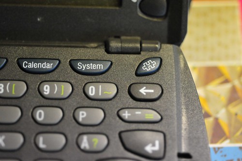
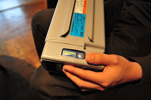
Here, above, the motivation for this design process thought. Our languages about display parameters initially stuck to the usual categories. In particular, we talked about “contrast.” The engineers had an existing, instrumental and mathematical perspective on what contrast is — a dynamic range between white and black. This is correct, of course. Duncan added a new parameter — “punchiness.” A new bit of language to the conversation about displays. Less instrumental, but valid because, in a way, perhaps unexpectedly, he was referring to the perception that people who have to use the display might have of the display’s characteristics. Something more people oriented than even “contrast.”

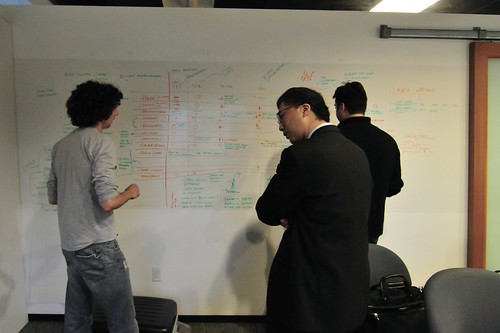
Why do I blog this? I’m curious about what happens when different practice communities come together. How does their thinking shift? How is language and gesture deployed to explain ideas and idioms that are not shared?

For example, during this get-together, the room was shared by designers, technical managers, engineers — six of us all together. There were three formal languages spoken — German, English and Japanese. There were several technical languages spoken, some specific and articulate, others broken and pidgin — materials technology, optics, electrical engineering, manufacturing technology, industrial manufacturing, industrial design, chemistry, ecology. There were some interesting extended hand gestures to indicate processes, actions and activities, all in the interest of sharing ideas and developing insights and learning and breaking down the usual disciplinary boundaries to find new vantage points from which to create new things. Part of that means, learning at least a bit about what these various languages have to say about and contribute to the design process. Design without a depth of knowledge about the materials/processes/histories one is designing with is the definition of disadvantage. To the degree that knowledge is shallow, or nonexistent is equal to the degree of disadvantage one has. (Really, time spent on the assembly line, in the design studio, in the materials lab, the clean rooms, hearing about failures — all of this is necessary to attain that depth, and the consequent advantage to design processes.)

It should be expected (if it isn’t already) that it’s not enough for a designer to pay attention only to surface and appearance. Part of the robustness of design comes from understanding the possibilities of new materials, new processes, new processors, or having the language, practice skills and moxy to suggest new possible engineering (say) processes or whole new technologies based on a unique insight that runs not just broad, but deep. As I once told students, it’s not easy, or fast, or possible to do so from day one after graduating. It’s a lifetime process to develop a breadth and depth of knowledge and practice that can make new things. That means patience, a keen eye, eager will and an aspiration to learn in every context, not just the classroom. The best thing you can get for your educational dollar is to learn how to learn.
Continue reading Design Processes

Nokia Design Needs You

20080518_14-18-53

The Service and UI Design within Nokia Design – is expanding, and they’ve got jobs going in Palo Alto and Helsinki/Espoo for both visual and interaction designers. You’d be working directly with Chris, Adam, Younghee and Raph, and just along the org chart from Jan and myself and the rest of the Design Strategic Projects studio. I just saw the org chart the other day; you’d be in a pretty sweet neck of the woods, frankly. Something’s going on at Nokia, or some kind of celestial bodies are lining up. Whatever the case, it’s a great opportunity for the right sort of designers.

There are six openings. You’ll need to apply through the Nokia recruitment site. The jobs to search for are:

Interaction designers, Espoo: ESP0000022U, ESP0000022T

Comms designer, Espoo: ESP0000022V

Interaction designers, Palo Alto: SAN000000BQ, SAN000000BP

Comms designer, Palo Alto: SAN000000BV

Continue reading Nokia Design Needs You

Action-Implications

20080513_14-59-35

20080513_14-59-42

While in Japan and discussing design and the implications it can create around action and thought. Nothing mystical, but maybe..For example, the Zero Waste charger scooting around the Design Strategic Projects studio. The design of the activation button which starts a charge cycle that is constrained by time, to account for the extra fluff in the practices around chargers. Chargers left plug in normally draw some small bit of power — around 300 milliwatts, typically — just for being plugged into the wall. Even after your phone or computer or whatever is finished charging, the charger draws some overhead power to keep itself warm and continually topping up the phone. Even if it only takes an hour or two to charge up the phone (more often than not, the battery is more than half-way charged when we plug it in to begin with) it gets left in all night. Multiply the effects of a billion chargers times 300 milliwatts and the effects are gargantuan.

But it’s not just engineering redesign — changing the circuitry inside of the charger to draw zero residual power, although that’s definitely part of it, and such electronics were constructed. It’s also the designed button — an “action-implications” button. It’s a deliberate design facet meant to contribute to a subtle awareness that you are consuming power. The button has a deliberately longer than normal travel to contribute to the quiet but rich and meaningful action. The implications should be clear — this action costs something.

At top there, another action-implications style designed interface. The action of pushing the charging button reminds you that these enormous batteries are starting to charge, and will stop charging once the battery is full, rather than continuing to draw residual power.

Next task. Construct a house that runs on a 12 volt mains rather than 120 volts, or 220 volts.

NOKIA DESIGN EVENT: Charging without waste

NOKIA DESIGN EVENT: Beyond Green

Peculiar Practices

20080518_13-57-26

Here in Venice, where there is a tight housing market (but not unaffected by the current deep downturn), if you want to knock down the ugly old and put up your new janga-box architectural, but don’t want to hassle with the permissions to do a new construction, you can leave one wall standing and call the project a remodel. Incredibly open loop-hole, that.

This is a curious relationship between design and politics. Ostensibly, city authorities want to clear specific new construction for a variety of factors, including the design of structures, their contingent aspects in relationship to existing structures, and the landscape as a whole — relative heights, home footprint, secondary resource strains, like street parking (always a factor here), noise, etc. (Many homes here, on originally tiny lots that kept small beach cottages, or modestly sized homes, occupy their entire lot with built material..literally no lawns, the houses go up to the sidewalk and the next property line so as to obtain as much “home” as possible.)

Eats In Context

20080517_21-50-53

It’s curious to think about eateries in time-context rather than categories of food types. In this case late night workers, people out after bar-hopping, people who just don’t cook at home and have midnight cravings. The neighborhood here is somewhat borderline in terms of its geography. It’s several blocks from a university and a designated buffer zone of historical significance — the West Adams section of Los Angeles. It’s a fascinating neighborhood if only for the enormous mansions — once single family, now single room occupancy or kind of dumpy shares; cars parked on the lawn; lots of bars up on windows. It’s the kind of place where a food service window will do a brisk trade.

I have a continuing and long fascination with night culture, especially in urban settings, largely for the visual impact of the small, lit oasis amongst stretches of emptiness. Urban living is difficult to imagine before street lighting, honestly.

When I first moved back to New York City in the summer of 1995, I shared a two bedroom dump at 202 Front Street in the DUMBO section of Brooklyn before it became quite posh. I was fascinated by the all-night Bodega. They were often brightly lit places, with Christmas lights set about them and stacks of cereal boxes and laundry detergent piled in the windows. I naively set out to photograph them, cruising the back end of Brooklyn (Prospect Heights, before it was posh) in my brother’s band-van — think something that looked like either a beat-up surveillance van, or the thing the guy who’s the child molester in the movie drives. I found out quite roughly that these were more often fronts for small-scale drug dealing than places where you get laundry soap in the middle of the night.