
One of a sample of “Destination Maps” presented at SIGGRAPH Asia 2010 by a team of researchers. It shows a computer-generated emulation of the canonical napkin-style hand-drawn map. The described advantages are that it highlights relevant “neighborhood” streets and diminishes the arterials and highways that are not necessary and perhaps confusing for reaching the destination. It closes in on that typical style of map that was perhaps described best in Denis Wood’s “The Power of Maps” — the rough, perhaps off-scale map that gives the contours of a place and only what is roughly right and nearly necessary to navigate a place.
Some questions around this sort of map making:
* Why the use of kitsch-y napkin texture and the recognizable human-hand-hunting for lines with pencil? This idea of having the computer draw like a human seems a little dishonest, which puts me off. But, I suppose at the same time its recognizable and legible to people, which may make it more palatable and familiar, which I guess is something kitch is good at.
* I’m sure this is in the category of “it’s a prototype, relax” sort of thing, but shouldn’t the interstate highway signs be roughly-right, too?
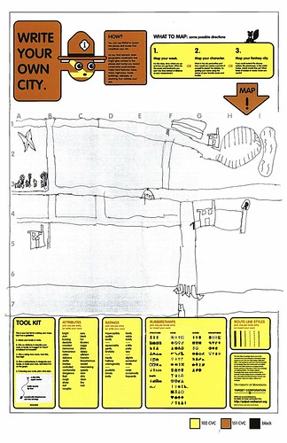
Related, just to keep the project in-mind, to the PDPal efforts to make roughly-right emotionally evocative personal maps — here’s one that was just the other day done by a friend’s young’n, by happy coincidence. I often think about this project and its relevance to what I still think is curious, intriguing and worth pondering over. Fascination with maps and cartography — mostly off-kilter, peculiar, provocative ways of making maps and exploring is super interesting to us here, especially the fellas smoothing parchment in the clean room on the 3rd floor.
cf. Mark Shepherd’s Serendipitor — an iPhone app to help you explore by creating unexpected routes from point A to point B. I’ve been mucking with this for a few weeks — very cool and fun. Not for anyone trying to just get from A to B, which isn’t always the most exciting way to explore.
cf. Designing for iPad, which has some nice remarks on the use of kitsch in interface design.
via http://johanneskopf.de/publications/destination_maps/index.html
just on the subject of hand-drawn maps, this definitely has a spot on my want list: http://blogs.nationalgeographic.com/blogs/intelligenttravel/2010/03/mapmaker-mapmaker-draw-me-my-l.html
First I think this is beautiful.
2nd I think the computer emulation of hand-drawing is a legitimate device. Making it look hand-drawn provides a powerful subliminal "clue subtext" — namely, that one should not expect the map to be complete, entirely accurate, proportional, or to scale — all thing we blithely assume about printed or on-screen maps.
3rd I think we should take every opportunity to encourage cyberneticists who are reintroducing the approximateness and imperfections of craft into computer-rendered material. The asymptotic mythology of perfectionism promoted by the plethora of computerized typography, pervasive flawless orthogonality, etc., was really starting to get out of hand (pardon the pun).
I created the Destination Maps application that you feature above.
In our first prototypes we used a more serious rendering style (it is still available in the interface). It turned out confusing to some more casual users without much experience with digital maps that we *distort* our maps. However, by turning to the non-photorealistic style we make it much more obvious that these maps are just sketches and they are not to scale. The NPR style conveys this idea nicely and makes the maps more easy to understand for non-expert users.
Oh, and it also looks cool, of course 😉
@johanna – cool map maker gig!@singular – i agree, it does..not quite there, though yet. the motivation is right but the rendering is too kitschy for me. seems like their first try and they probably focused mostly on the technology rather than the design.
@johanna – cool map maker gig!@singular – i agree, it does..not quite there, though yet. the motivation is right but the rendering is too kitschy for me. seems like their first try and they probably focused mostly on the technology rather than the design.