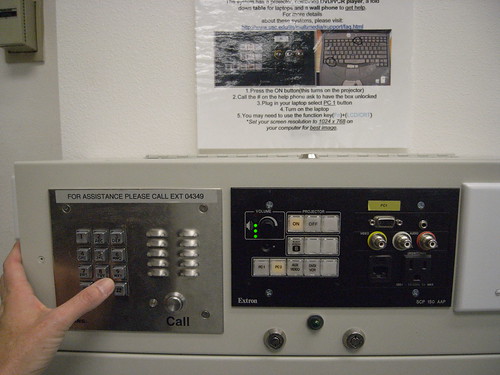
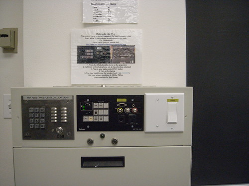
Found in a university class room is this very peculiar bricolage of interface stylings. I can see this as either four deliberately distinct interfaces — and therefore entirely transparent as to its utility because each separate interface does its own thing. Or completely baffling and, aesthetically, dyspeptic because, well — i mean, what the hell? Clearly assembled roughly DIY style based on what was lying around the shop, no?
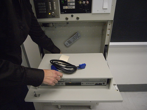
You push to call someone somewhere who has a bank of buttons that unlock the AV cabinet with that pull interface thing. Inside the cabinet is a DVD player and cord to hook things up to the projector, like a computer. The center panel appears to control switching the A/V part of the system. That wall switch that’s not mounted on a wall, but on this metal cabinet? No clue what it does.
What are the design challenges in creating an interface for projecting video in a classroom? Can you catalog the number of actuators and touch-points here? It involves not only yourself, but probably someone else alongside of you to help interpret the instructions (at least the first time you access this object), and some A/V guy in a command bunker somewhere that has the ability to remotely unlock the door panel below that hides the goods (remote controls, DVD player, etc.)
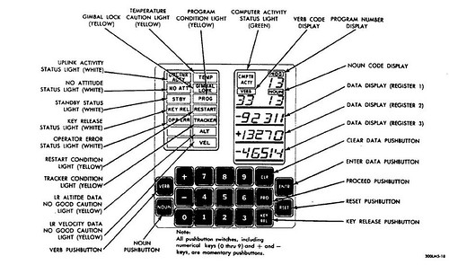
One of my personal favorite user interfaces is the Apollo Guidance Computer because of the simplicity of its face. I can imagine that it took quite some training to operate under such circumstances as traveling and landing on the moon in 1969, to say the least. 19 keys to control the “computer” — a quite different, and quite speculative, imaginary beast at the time, and one whose popular imaginary — what it meant to the larger public — has little to do with what they are today.
The idea of the user interface had very little to do with what one immediately thinks of when you consider yourself a computer operator — someone operating a computer — today. It’s, like..”okay..we’re going to design this panel to allow you to control navigation to, and landing upon, the moon..and lets do it with 19 keys and a verb/noun syntax. Right? Sounds good?”
Cripes.
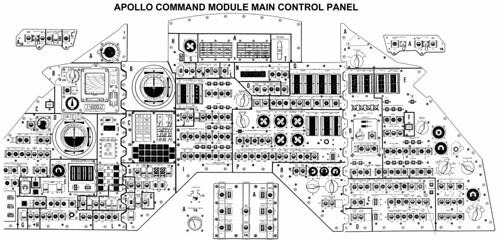
Why do I blog this? It’s curious to me how the design of interfaces occurs and the basis and considerations that go into their design. Especially the contrasts in design-for-contexts — a very simple task (opening a cabinet door that’s been secured to prevent unauthorized access that could lead to theft or vandalism) requires this horrid bricolage of styles and actions. A highly speculative, hopeful and aspirational task of getting from the earth to the moon and back is done in part with this exceptionally minimal interface object with 19 keys. Of course, there are many other components involved in this Apollo mission, as shown in the image above. For me its what the interface component simplicity of the Apollo Guidance Computer represents in terms of an historical spectrum of possible designs. There is no linear path, in my opinion, that represents a continuum towards more “intuitive” interfaces. In fact, the notion of an intuitive interface is problematic to the degree that it suggests that intuition is a shared characteristic — whose intuition under what circumstances? Apple iPhones are intuitive to people with jobs and disposable income. What is an intuitive interface for someone who carries 5 gallon jugs of water 7 miles a day?