Whittling Away at Audio

Audio Whittling

I’ve become almost over-interested in audio as a new, untapped frontier for IxD and UX. In contrast to what our quite busy, jealous, overburdened screens offer us audio has the opportunity to form a kind of interaction experience and engagement with “stuff” (sorry early days…not sure how to be more precise..) and other people seems woefully antique. Could be some good wheels-on-luggage insights and opportunities to do design that makes things better — and makes what we have now embarrassing.

This is an unfolding theme and there have been some “observations” of things that just seem like they were never really designed so much as bolted on without a care or a concern that could be done better.

Some considerations:

I need a category of aspects of audio and it’d also be nice to become a bit more expert at audio and sound and the variances, cultures and interstices of the terrain.

Screens are all well and good, and HD audio may possibly become *more HD and surround-y, but even the small, low-hanging simple stuff is super interesting, like..

* Kitchen appliances that beep like a yelping puppy what that just got its tail stepped on
* Car horns and their abusive honk when you just want a chime to summon a friend or lightly remind that sleeping wanker at the head of the red light queue to move on
* Cars and their noises in the era of purring-whirring barely noticeable electric engines — I know this is a terrain that’s being actively explored
* Audio processing to make sound more expressive — are there alternatives and extensions to volume and tone control as ways of manipulating sound without getting goofy?
* What’s the Instagram of sound?
* What would a proper sound designer do if given a brief to design the audio experience for an operating system? Or a microwave oven? Or an airplane cabin interior?
* Consider that the high water mark of sound design for devices and the like are start up tones, beeps on notifications, &c. That’s not much — there could be more.

What would the world be like if proper, thoughtful sound designers came into the UX/IxD mix?

What’s the Design Fiction for the world in which, in some future/historical moment humans have enormous ears and pin-hole eyeballs..and they needed design work done? In other words — if we were more reliant on our ears rather than our eyes what would “X” (computer/smart device/car/chair/bicycle) look & behave like?

* Software to learn more about audio:

* Max/MSP (I end up using this about once every year anyway — and now it seems like it can “talk” to Abelton Live..need to figure out why this is interesting)
* Reaktor
* Logic
* Abelton Live

These are audio making softwares, mostly tilted towards making music or composing sound into rhythmic melodic assemblages or something like that. While the idea of being a DJ with throbbing thumping crowds manipulated by my expert mixing and all that sounds like fun, I’m actually more interested in the ways these tools and playthings can help design audio experiences of other sorts — like even mundane moments of sound..a new car horn, for example — or an intriguing car alarm that brain paralyzes the would-be car-jacker into doing the polka. ((I don’t know why I’m fixated on car sounds – maybe it’s LA getting to me..))

World's Largest Max/MSP Patch
ScreenLive
ScreenReaktor

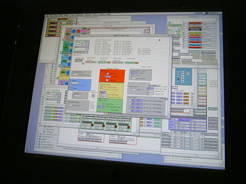
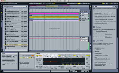
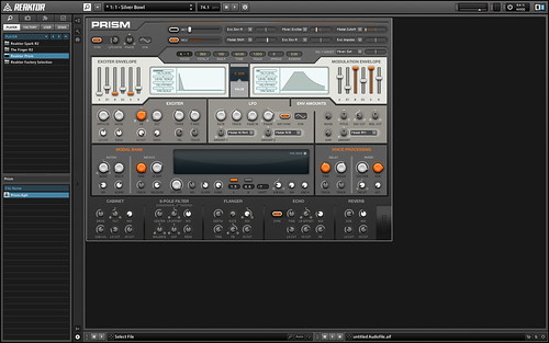
A curious side note to this world of audio software you’ll notice from those screen shots above: it’s entirely baroque in its UI design, which is both super intriguing and somewhat annoying, but actually more intriguing than annoying.
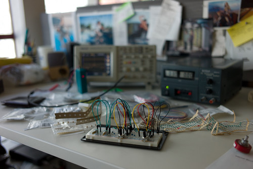
An experiment:

I’m *trying to make a DIY small, portable, audio mixer with a variety of stereo and mono inputs and some “effects sends” so that I can experiment with mixing multiple sound sources and sound sensors while on the go — walking and riding around.

Seems simple enough but I’m having a bear of a time with it. More about that in a subsequent post.

That’s it. Rough early days. I can say that its super exciting. And nice to be tagging along with Russell as he experiments with some similar questions. (cf. Secondary Attention and Little Boxes of Sound, Secondary Attention and The Background Noises. I especially like the idea in the latter post about the “Ghost Box” concept of a thing that inserted sound effects, effectively into the environment.

Why do I blog this? Because if I didn’t, I’d forget what I was doing in the past when I’m in the future. Also it’s good to share things that are going on because then you hear from other people who are working on similar threads and friends should know what friends are thinking about even when separated by the Internet.

Continue reading Whittling Away at Audio

Hand Drawn Maps..Drawn By Computer

ours

One of a sample of “Destination Maps” presented at SIGGRAPH Asia 2010 by a team of researchers. It shows a computer-generated emulation of the canonical napkin-style hand-drawn map. The described advantages are that it highlights relevant “neighborhood” streets and diminishes the arterials and highways that are not necessary and perhaps confusing for reaching the destination. It closes in on that typical style of map that was perhaps described best in Denis Wood’s “The Power of Maps” — the rough, perhaps off-scale map that gives the contours of a place and only what is roughly right and nearly necessary to navigate a place.

Some questions around this sort of map making:

* Why the use of kitsch-y napkin texture and the recognizable human-hand-hunting for lines with pencil? This idea of having the computer draw like a human seems a little dishonest, which puts me off. But, I suppose at the same time its recognizable and legible to people, which may make it more palatable and familiar, which I guess is something kitch is good at.

* I’m sure this is in the category of “it’s a prototype, relax” sort of thing, but shouldn’t the interstate highway signs be roughly-right, too?

Related, just to keep the project in-mind, to the PDPal efforts to make roughly-right emotionally evocative personal maps — here’s one that was just the other day done by a friend’s young’n, by happy coincidence. I often think about this project and its relevance to what I still think is curious, intriguing and worth pondering over. Fascination with maps and cartography — mostly off-kilter, peculiar, provocative ways of making maps and exploring is super interesting to us here, especially the fellas smoothing parchment in the clean room on the 3rd floor.

JonseyPDPalMap-08102010

cf. Mark Shepherd’s Serendipitor — an iPhone app to help you explore by creating unexpected routes from point A to point B. I’ve been mucking with this for a few weeks — very cool and fun. Not for anyone trying to just get from A to B, which isn’t always the most exciting way to explore.

cf. Designing for iPad, which has some nice remarks on the use of kitsch in interface design.

via http://johanneskopf.de/publications/destination_maps/index.html
Continue reading Hand Drawn Maps..Drawn By Computer

When Not To Use Doorknobs

3D Magazines

A familiar challenge is to translate the seemingly unyielding demand to put a specific technology into something because it is expected, or because the name of the technology is the new great thing. It doesn’t matter what it is in particular — I use “doorknob” as a stand-in for whatever the latest “doorknob” of the day might be.

For example — we’re going through an Augmented Reality “doorknob” phase presently, as most of you know. As evidenced by the recent issue of “The Skateboard Mag (78)”, we’re also continuing to go through another, another 3D “doorknob” phase. Which is fine, I guess. 3D is fun when the impact is light, like a magazine.

What do I mean by doorknob? Doorknobs are things that rarely mean anything at all to normal human beings but they mean everything in the world to doorknob enthusiasts who spend most of their time trying to put doorknobs onto everything they possibly can — coffee tables, lampposts, patio chaises, kid’s t-shirts, wrist watches, fancy cameras, car dashboards, toasters, clock radios, keychains, tea kettles, baseball hats.. I could go on, but I’ll let the “doorknob” enthusiasts go crazy themselves.

Rarely, on occasion — someone puts a doorknob on a door because, perhaps, they lead their thinking and ideas and making with principles that focus on people and their practices before they just think of shoving doorknobs on kitten collars or broom handles.

Rather than specifying design first based on technology and engineering-based *parts, fashion small, short stories around the people-based principles that might, in the end, specify that a doorknob be used. But, only at the tail end of things. If you start to feel like you’re bolting doorknobs onto stuff cause some guy in a yellow tie and blue shirt had a graph that suggests that competition is going to start using Baroque, mother-of-pearl encrusted doorknobs on their 2013 saw horses — then obviously something is backwards with the design process. Increasingly — or maybe at this point completely — my own opinion is that, for the near future at least, design can play a much larger role in fashioning and specifying and coordinating the activities between all the other participants in the making of things. Amongst engineering, marketing, operations, production, sourcing and so on. Not that all that is fun at all — but it may be crucial and necessary for creating a legible, sensible “output” at the end of a lot of hard work. Something that communicates and represents value in a people-centered way. It’s incredible how much kruft comes out at the end of markets-led decisions — it’s simply unsustainable, and often done just to keep a foot in the door and so that conversations (good or bad) continue to float around.

Alternatively is the translation of the *doorknob into something else. Doorknobs can be props that stand in for something else that is more people and experience-centric — say, access. A way in. Even an ornamental way in that suggests something wonderful lies beyond. Translating that experience could make a doorknob more than an inappropriate proboscis on something it has no business being part of, I suppose. That feels like a middle ground compromise, as opposed to starting with experiences that are legible to whomever you are hoping to make something for — making those experiences the best they can be (or even just a little better than they already are.)

*shrug*

Okay. Back to it, then.

Why do I blog this? Honestly, don’t read much into this or try to interpret what might *really be going on. I’m just capturing some caffeine-fueled notes on a thorough-going set of questions about how to effectively lead “innovation” or the making of things with design principles and design practices that then themselves specify “the parts.” How can design lead with the respect and authority that engineering and business and marketing-type activities have already? And do so without the hubris of “John H. Doe Design Agency” sort of stuff. If engineering and “research” start with, say — doorknobs that operate without touching them and business and marketing start by assessing what sort of doorknob ornamentation will the market expect down the road what is the way for design to contribute a perspective and translates that language in such a way that, perhaps — doorknobs themselves are questioned and new propositions appear that aren’t specifications based on what is available, but specifications based on what should be, that based on principles more thoroughly considered than “just ’cause.”
Continue reading When Not To Use Doorknobs

Is There Such A Thing As An Invisible Metaphors

mouseless01

This is a curious project from some students at MIT. They’ve used a laser beam and a camera sensitive to the light reflected from that beam to track the motion and articulations of one’s hand as it moves and makes mouse-like gestures. So, effectively they’ve gotten rid of the mouse. Which is why they call their project *mouseless and why they’ve given it a bit of fun by an explanatory video ripped and sewn with some Tom and Jerry cartoon wackiness.

What I find curious here is the way they’ve extended the “mouse” metaphor even when the mouse has become “invisible” — or, rather — those bits of plastic and wire and so forth that constitute the mouse are now no longer necessary. But, we’re still operating with the same movements and gestures as if the mouse were there. Which makes me wonder why go through the hassles of taking it away, losing the physical tangibility of moving something with momentum and weight and texture and feedback and all that. It’s like one of these weird engineering efforts to do *something with the technology and then backfill the rationale. I mean — it’s all tiring in a way how little refinement and design and thinking and iteration goes into things like this. I’m exhausted just looking at the invisible mouse..that I can’t see. I mean — I guess the mouse not being there is as weird as the mouse suddenly appearing attached to a computer back in the day, but it’s easier to think of manipulating something material, no matter how weird and unexpected it might be, than it is to pretend that something’s there, that could just as easily be there if we just ditched the idea of an invisible mouse and kept a visible mouse there to begin with. Or something like that.

*sigh*

JCB_22062010_164013_0784

Well, I guess this is what to expect from the best and brightest. The simple obsession with refining and refining and refining rather than just doing something “’cause” seems to yield much more subtle *wheels-on-luggage designs, just making something a little better, as they say.

Why do I blog this? Thinking about the inevitability of metaphor in design while poking through Raphael Grignani’s remarks on Home Grown’s List UI inspired by Mike Kuniavsky’s draft chapters on metaphor for UI/UX for his forthcoming book, and a recent document that pleads for the end of metaphor and direct manipulation. With regard to *mouseless, I see this as another instance of moving from one extreme to another while missing anything in-between or even off to the side, which might be typical of engineering efforts when it plays in the UI/UX sandbox. ((It also is likely not their point at all, but rather a quick sketch of an idea to refine some thinking, or just a clever computer nerd stunt, but I’ll use their work *unfairly to make a perhaps not all that interesting remark on the blog, and to try to up my blog/writing quotient for practice.)) A bit like coming up with weird doorknobs and then looking for a house to put it on. Carts before horses, or gizmos first, humans last. Maybe somewhere we’re missing the subtleties and low-hanging fruit rather than the grand theatrics (engineers) and broad oratory (chatty design gurus who talk rather than make and refine and get into the material of things.)

Continue reading Is There Such A Thing As An Invisible Metaphors