Some of you may have noticed, mostly probably not — but the Laboratory has expanded its ranks. It’s starting to feel like a proper design collective in here. One of the lovely attributes of the people in the Lab are the broad sectors of activity they cover that doesn’t make it seem like they do a zillion different things, but do many things to work though a relatively core set of interests.
Take Aaron Staup Cope. He writes algorithms that tell computers what to do. He makes maps out of paper. He makes maps out of algorithms. He makes you think about the ways that algorithms can do things evocative of map-ness..on paper.
Etc.
What I’ve learned from all of Aaron’s exploits in Dopplr-land, Open Street Maps-land, Walking Maps-land is that maps are dynamic, living things that should never be fixed in their format, style, purpose. They should never be taken for granted — even if the Google Map-ification of the world is doing just this. They should come in a bunch of sizes and shapes and colors and purposes. Etc.
Check out Aaron’s 20×200 Editions of his Pretty Maps. Get yours. I did. LA’ll go on one side of the wall. NYC will go on t’other.
Here’s what they say about Aaron over on 20×200.
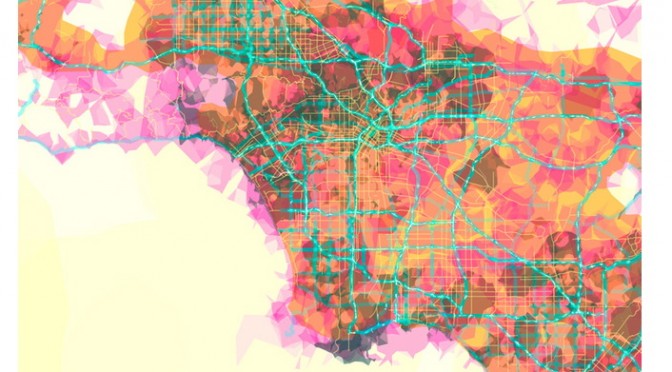
For now, let’s set our eyes West, on L.A. County. Like prettymaps (sfba), prettymaps (la) is derived from all sorts of information, from all over the internet. Its translucent layers illuminate information we’re used to relying on maps for–the green lines are OSM roads and paths, and orange marks urban areas as defined by Natural Earth. They also highlight what’s often not seen–the white areas show where people on Flickr have taken pictures. It’s an inverse of a kind of memory-making–a record of where people were looking from instead of what they were looking at, as they sought to remember a specific place and time.