Old Mapping Alternatives and New Metaphors, Please

Some curious alternatives and conscious decisions made around map materials. When do we chose the local tourist map that has down-res’d nonessential features and up-res’d features more on the mind of weekenders, such as the location of airport, town squares, likely museums and sites? How do the fancy digital alternatives — a nearby iPhone with a really slick Google Maps interface — pale in comparison, and falter in their real navi utility? When is paper — which can be marked up, annotated, maintain its tangibility and foldability and non-battery-failability and non-data-roam-chargeability? Just paper.

Have a look at Aaron Cope’s paperMMap and other work in tangible, hybrid (digital-physical) cartography. I think this is exciting, mostly because maps and cartography may be on of the good, early connectors that laminate physical-digital thinking. We need better metaphors to capture the ambiguities between the physical and the digital — even writing them right there makes me anxious. The distinctions are quite arbitrary and I think “we” pioneers living in the near future would be doing a great thing to evolve the metaphors and language to point toward new hybrid realities. First to go? Second Life. Ahhem.. What a horrid name that might be tractable to the everyday notion of online/offline, but ignoring “1st Life” the way that Virtual Reality tried to do really does a disservice to the relevance and final import of the world in which we will ultimately be buried within, Timothy Leary’s insertion into an eToy USB drive notwithstanding.
Continue reading Old Mapping Alternatives and New Metaphors, Please

Usury Virus Graph

A curious and relevant overhead slide — lovely for its low-tech — seen at the recent “Everyday Digital Money” symposium at UC Irvine. Absent the usury virus, economics looses lots of fluff and gets back to basic human fundamentals for living in the world. By itself, the graph tells a rather vague story — never got to hear exactly what the usury virus might be — but somehow, in the present context, the hashed areas of superfluous pie chunks feels like it could be substituted with overpaid bankers, greedy, wily idiots with MBAs, buffoons who are allowed to take risks without any personal jeopardy, nationalized industries, and people who think they can predict the future.

Continue reading Usury Virus Graph

*-computing

Okay, an algorithm for creating conceptual train wrecks. Think of something that normal humans do. Add a hyphen and then the word “computing.” Wait for lots of new devices and ideas to appear that require batteries, a USB cable or network jack, a deployed call center in Bangelore and few new entries in Wikipedia. Hire lawyers to write voluminous EULAs that you know no one will read. Package it in clear, sharp-edged plastic boxes that can only be opened with heavy-duty shears while wearing those metal gloves butchers use. Wait for puzzled stares. Repeat.

It doesn’t take a skeptical observer to notice how often this rule of adding -computing onto everything under the sun that a few folks think can create markets or research agendas or fill a few pages of popular press.


Ambient-computing
Cloud-computing
Mobile-computing
Ubiquitous-computing
Social-computing
Pervasive-computing
Persuasive-computing

There’s a weird conceit in here, that the activities and practices of normal human beings will involve data processing and algorithms of some sort, which is an awfully big assumption. So big, in fact, that it has distilled down to a way of seeing the world as consisting of bits of data that can be processed into information that then will naturally yield some value to people.

Why not start with people and their practices and follow this through, without the assumption that something computational or data process-y is meant to fall out from that. Don’t assume that you’re going to play the role of the high-conceit data processing and algorithms specialist and figure out some magical workflow that’ll turn someone’s life into a golden bliss of computer chips and sensors.

Design for people, practices and interaction rituals before the assumptions about computation, data structures and algorithms get bolted onto normal human interaction rituals.
Continue reading *-computing

Redundancy in Contexts

Redundancy norms here for restricted access areas, using variations in human language, which is just good to CYA, plus English twice, just in case.

I was struck by these peculiar redundant doors. The right one to pick depends on who you are and what you’re attempting to do. The curvature of the foyer on the other side of the wall causes this perspective fall off that makes this a bit disorienting.

A double instructional touch interface for this sliding door on a commuter train. Really curious, this huge, rear-illuminated instructional text — with arrow toward the button..which reinforces the instructions with its own didactic “push here to open” instructions. It may be that that rear-illuminated text has space above for a “Do Not”, and this is why it is so big. But, really..exactly what ran through the mind of the interface specialist on this one?

Multiple egress and ingress points provide a useful redundancy for what is likely a quite frantic train platform for maybe 4 hours of a 24 hour day. Now, though, a handful of travelers plopped into EWR on the last flights in for the night.

Continue reading Redundancy in Contexts

Near Future Laboratory Top 15 Criteria That Define Interactive or New Media Art

NearFutureLaboratory_Top15

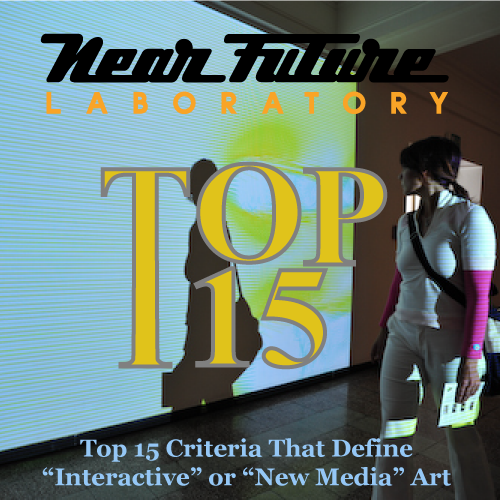
The Julianipedia entry for “New/Interactive Media Art” has been finalized by the guys and gals on the editorial floor here at the Near Future Laboratory officeplex. After several years of review, discussions with leading experts and practitioners we’re finally ready to release our conclusions. And what better place to release them — here, in Linz Austria, and after a 3 year hiatus from Ars Electronica while I was teaching at an interactive media program where I would get in trouble for missing boring faculty meetings and a class or two because I thought it’d be useful to my pedagogy to go to the world’s pre-eminent interactive media exhibition (but no one ever got the business for going to the Game Developers’ Conference, so..there’s that.)

Here at Ars Electronica is where we did an unscientific qualitative test of the criteria devised to define New/Interactive Media Art. Now we deliver to you the conclusive results, and do so in the spirit of the David Letterman Top-10 Countdown, only with a Top-15 rather than 10, cause we found 15 things.

Forget all the New Media “Theory”; we’ve got your empirically derived criteria right here.

The Near Future Laboratory Top-15 Criteria for New or Interactive Media Art are…

15. It doesn’t work

14. It doesn’t work because you couldn’t get a hold of a 220-to-110 volt converter/110-to-220 volt converter/PAL-to-NTSC/NTSC-to-PAL scan converter/serial-to-usb adapter/”dongle” of any sort..and the town you’re in is simply not the kind of place that has/cares about such things

13. Your audience looks under/behind your table/pedestal/false wall/drop ceiling or follows wires to find out “where the camera is”

12. Someone either on their blog or across the room is prattling on about the shifting relations between producers and consumers..and mentions your project

11. Your audience “interacts” by clapping/hooting/making bird calls/flapping their arms like a duck or waving their arms wildly while standing in front of a wall onto which is projected squiggly lines

10. Your audience asks amongst themselves, “how does it work?”

9. The exhibition curators insist that you spend hours standing by your own wall text so that you can explain to attendees “how it works”

8. It’s just like using your own normal, human, perfectly good eyeballs, only the resolution sucks and the colors are really lousy..plus the heat from the CPU fan is blowing on your forehead which makes you really uncomfortable and schvitz-y

7. Someone in your audience wearing a Crumpler bag, slinging a fancy digital SLR and/or standing with their arms folded smugly says, “Yeah..yeah, I could’ve done that too..c’mon dude..some Perlin Noise? And Processing/Ruby-on-Rails/AJAX/Blue LEDs/MaxMSP/An Infrared Camera/Lots of Free Time/etc.? Pfft..It’s so easy…”

6. Someone in your audience, maybe the same guy with the Crumpler bag and digital SLR excitedly says, “Oh, dude. That should totally be a Facebook app!”

5. It’s called a “project” and not a “piece of art”

4. You saw the "project" years ago…and here it is again…now with multi-touch interaction and other fancy digital bells and Web 2.0-y whistles

3. Your audience cups their hands over various proturbances/orifices at or nearby your project attempting to confuse/interact with the camera/sensor/laser beam, even if it uses no such technology

2. There’s a noticeable preponderance of smoothly shifting red, green and blue lighting effects

1. People wonder if it wasn’t all really done in Photoshop, anyway

3 Bonus Criteria!

0. There are instructions on how to experience the damn thing

-1. You can’t “collect” or buy it. Heck, if you did, you’d need to get AppleCare or hire an IT guy in the bargain

-2. Crumpler guy says, “Oh, I thought of that already..”

There it is. The Near Future Laboratory Top-15+3 Criteria Defining New/Interactive Media Art!
Continue reading Near Future Laboratory Top 15 Criteria That Define Interactive or New Media Art

Safety In A Ubicomp World

Timo et al Mediamatic have created a superb physical instantiation of safety in an era when the network leaks rather perniciously into the physical world. Their RFID safe enclosure protects your near-field communication objects from being scanned by faulty equipment or data muggers discretely consuming the swarms of RFID krill floating around most alpha tier urban centers. A lovely instantiation to help think through how people’s concerns around safety, security and trust always seem to leave opportunities for the always entrepreneurial accessories marketplace.

Well done.
Continue reading Safety In A Ubicomp World

Drift Deck

Drift Deck. For Conflux 2008, NYC
confluxfestival.org/conflux2008/.

For Analog Play (batteries not required.)

(Some production documentation above; click “Notes”.)

The Drift Deck (Analog Edition) is an algorithmic puzzle game used to navigate city streets. A deck of cards is used as instructions that guide you as you drift about the city. Each card contains an object or situation, followed by a simple action. For example, a situation might be — you see a fire hydrant, or you come across a pigeon lady. The action is meant to be performed when the object is seen, or when you come across the described situation. For example — take a photograph, or make the next right turn. The cards also contain writerly extras, quotes and inspired words meant to supplement your wandering about the city.

Processed in collaboration with Dawn Lozzi who did all of the graphic design and production.

For exhibition at the Conflux 2008 Festival, NYC, September 11-14, 2008, and hosted by Center for Architecture located at 536 LaGuardia Place, New York, NY 10012

The motivation for Drift Deck comes from the Situationist International, which was a small, international group of political and artistic agitators. Formed in 1957, the Situationist International was active in Europe through the 1960s and aspired to major social and political transformations.

Guy Debord, one of the major figures in the Situationist International, developed what he called the “Theory of the Dérive.”

“Dérives involve playful-constructive behavior and awareness of psychogeographical effects, and are thus quite different from the classic notions of journey or stroll.

In a dérive one or more persons during a certain period drop their relations, their work and leisure activities, and all their other usual motives for movement and action, and let themselves be drawn by the attractions of the terrain and the encounters they find there. Chance is a less important factor in this activity than one might think: from a dérive point of view cities have psychogeographical contours, with constant currents, fixed points and vortexes that strongly discourage entry into or exit from certain zones.”

Psychogeography was defined in 1955 by Guy Debord as the “the study of the precise laws and specific effects of the geographical environment, consciously organized or not, on the emotions and behavior of individuals.” Psychogeography includes just about anything that takes pedestrians off their predictable paths and jolts them into a new awareness of the urban landscape.” The dérive is considered by many to be one of the more important of these strategies to move one away from predictable behaviors and paths.

http://is.gd/1Gy1
http://en.wikipedia.org/wiki/Dérive
http://en.wikipedia.org/wiki/Psychogeography

The cards will be available for festival visitors to borrow and return for others to use during the Conflux Festival.

Design and Implications by Julian Bleecker and Dawn Lozzi. Creative Assistance and Support from Nicolas Nova, Pascal Wever, Andrew Gartrell, Simon James, Bella Chu, Pawena Thimaporn, Duncan Burns, Raphael Grignani, Rhys Newman, Tom Arbisi, Mike Kruzeniski and Rob Bellm. Processed for Conflux Festival 2008.

Special Joker Cards featuring compositions by Jane Pinckard, Ben Cerveny, Jane McGonigal, Bruce Sterling, Katie Salen, Ian Bogost and Kevin Slavin. Joker illustrations by Rob Bellm.

Original Proposal

www.nearfuturelaboratory.com/projects/drift-deck/

Part of a long, proud line of land mapping technologies that includes PDPal, Ubicam Backward Facing Camera and Battleship: Google Earth, and WiFiKu.

Continue reading Drift Deck