Spacesuit.

This looks like a fantastic book that will look great next to my Norman Mailer: MoonFire: The Epic Journey of Apollo 11 (GO)

Spacesuit: Fashioning Apollo

In Spacesuit, Nicholas de Monchaux tells the story of the twenty-one-layer spacesuit in twenty-one chapters addressing twenty-one topics relevant to the suit, the body, and the technology of the twentieth century. He touches, among other things, on eighteenth-century androids, Christian Dior’s New Look, Atlas missiles, cybernetics and cyborgs, latex, JFK’s carefully cultivated image, the CBS lunar broadcast soundstage, NASA’s Mission Control, and the applications of Apollo-style engineering to city planning. The twenty-one-layer spacesuit, de Monchaux argues, offers an object lesson. It tells us about redundancy and interdependence and about the distinctions between natural and man-made complexity; it teaches us to know the virtues of adaptation and to see the future as a set of possibilities rather than a scripted scenario.

Continue reading Spacesuit.

An Artist Statement To Remember

Spacesuit by Michael T. Rea

I just need to jot this down so I don’t lose it.

Mike Rea is an artist. This is his artist’s statement which brings together this wonderful relationship between fiction, underachievement, flaws, and failures. Lovely.

Standing on the shoulders of other people’s dreams could perhaps be the most pathetic of all dreams. The intent of my work is to create something short of its outcome. My goal is to create the idea of an object that remains a dream. The objects I create are based on fictions, rather than realities. I have always been interested in the ephemeral worlds established in film, or even in popular culture. Fictions or established hearsay allow for a flawed interpretation, which leads to a flawed result. The sublime is unattainable, and not an option. I further amplify this experience by only using my memory to construct my images. Failure is imminent. I find humor allows me to enjoy this experience, and I in turn build humor into the worlds established by my work. I have chosen to depict these states with unfinished wood, and other materials which convey a sense of the temporal. I find the beauty in life lies in between moments. My work offers a sense of what could be and what could never be simultaneously.

Continue reading An Artist Statement To Remember

The Interaction & Interface Design Car Wreck

Sunday November 28 10:13

For designers, clearly, surfacing, paint colors, materials and interior fabric choices rule out over interface design, which is just plain forgotten about here . Unless it can be justified as, like…Formula 1 inspired, it just doesn’t seem to get any priority as an area of innovation. Look — hybrids barely get any consideration. Even the American car makers booths were bristling with cleaved “Boss” engines reminiscent of the $0.50 a gallon days.

*Sigh.

Well, there’s work to be done. Even the luxury cars could learn a trick or two from the IxDA world..This was a two hour wonder through the subdued LA Auto Show on Sunday. It’s hard to get excited about cars these days, save for the exuberant electric or hopeful hybrid. I chose to annoy myself by noting the wretched center console designs. Who’s in charge of these things, anyway?

Sunday November 28 09:18

Seriously. I wonder who has to program their office into their car nav. I mean..after the first day, or maybe even the first week of a new job, which you got so you could afford your fuck-off Porsche Cayenne. If you need your nav system to get you to the office everyday..even if you’re coming from the club, or dropping the kids off at school, or whatever..you’re doomed from the get-go.

Sunday November 28 09:34

What can you say? If I had to look at this everyday after spending..whatever. $40,000 on something? I’d cover it with butcher paper and use it as a notepad. Maybe leave a little hole for the austere analog clock there.

Sunday November 28 09:48

This is a Volvo. This speedo console actually isn’t so bad. It gives you messages close to the idiom of an SMS on your phone. So long as it doesn’t tip into Growl-style pop-ups, I think we’re okay here. It’s actually somewhere between charming and a bit uncanny valley-y..like..has my car turned into a message receiver? Why is my car discussing things with me? On the ride home, my friend Scott, who has an edition of this Volvo, noted that his car was reminding him to take it in for service in a similarly polite way — rather than “Service Engine” which is a deceptively calm way of telling you that there’s no more oil in the crankcase and your engine is pretty much a solid block of molten metal.

Sunday November 28 10:06

God, I’d ball-hammer whoever decided that the “Eco” mode of the car — presumably an energy-sensitive mode — should get this Evergreen tree icon and then sport and normal are left to this horrid sans serif with no iconographic or color or nuthin’. Why even bother? Like..*g’aahhh..Ball-hammer!

Sunday November 28 10:07

Sunday November 28 10:13

Now our cars require codes, PINs, and passwords — the wretched baggage of cold war security protocols which barely work for humans. Who wants to guess how many 1234’s and 0000’s will start a car? What’s the future of PINS and passwords and why is it not in my fancy, from the future car? I’m not talking about retinal scanners and biometrics here. Just simple, modest, low-level security like..pick a secret picture, your daughter’s favorite animal, &c. PIN? Really?

Sunday November 28 11:22

Jeeze. I’d almost prefer the old fashioned mechanical AM/FM radio than this Kafka-esque nightmare. Two knobs. Big old preset number keys from 1-6. A “Back” button the size of two keys. A four way that’s probably got a center-select. It’s just nuts.

Sunday November 28 10:11

Holy cripes. I mean..this is like 14 different things designed by 73 committees or something. It’s got Menus, Maps, Guides. Titles, XM, “Sound” (what??), CD (really. compact “disc” technology?). Category, Tune, Sync. And that’s an EIGHT way with a center select. EIGHT! It’s just a baroque meshuggener mess trying to look cool and failing miserably. MISERABLY. And on top of all that? The build quality would make me slap my forehead in regret every time I try to adjust the climate control knobs.

Sunday November 28 10:13

Okay. Someone should probably teach the designer of this display either about Camel Case or remind them that segmented LEDs can sometimes be retro, but only for hipster clocks and calculators.

Continue reading The Interaction & Interface Design Car Wreck

Weekending 11212010

Friday November 12 12:22

Well, I haven’t done a weekending in awhile, partially because I was away in Switzerland (for the Swiss Design Network Conference) and then Italy and Spain on vacation and I almost didn’t take any kind of computer, but I did take an iPad partially as an experiment. In any case, I mostly read and photographed and walked and didn’t do any real blogging.

In the meantime, coming back I barely got home when I went off again for some friends’ wedding in Seattle, then back and then a drive down to San Diego for a team meeting with the larger international members of the Design Strategic Projects studio, which was good. We’re onto something here and if I could say more, I would. Aside from the substantial work, I’m also intrigued by the design process — mostly the translation of ideas into their material form as specifications for components and all that. I see it as a way of making the ideas legible in a specific way to those who have to make it. I should say that this is as you might think things work, except that they don’t normally when ideas are coming from advanced design, which in the past has been more involved in *vision or *concept work that rarely if ever becomes something much more tangible than a book, or short film or concept sketches. While I have been intrigued by that sort of work in the past, mostly because anything closer to the metal is often clipped in the expanse of its thinking, or is just ruled impractical or beyond scope — or whatever — now I found that it is difficult to translate, or get it closer to the making-of-things for a variety of reasons. In many cases, I think its systemic. By that I mean that it could be the case that parts of an organization are just completely unaware of another — or they don’t have the languages and linkages to communicate, or the mandate. That’s systemic or organizational. But then even when you do create the linkages you need to translate what might make complete sense in one studio into the terms and idioms of another, or into the language of code and software, or machines for making and fabricating. Whatever it might be — it’s a huge bit of work and in the process of doing the work, you refine the idea and iterate upon it, and learn from it when the gaps start showing, or when questions start coming in for clarity and refinement. Things that at one point you could ignore, or you didn’t even know about.

So — that’s what’s going on at this point. Learning about how to do advanced design thats relevant, rather than just sort of ideating or concepting or visioning.

I also went to Calgary Canada basically just for the night. It was cold. There was snow. I had to hunt around for my Patagonia Windstop, which I found just in a nick of time. And I wore sneakers, which was fine but I felt silly not thinking that snow meant more than cold. In any case, my hosts at the Faculty of Environmental Design had me up to do a talk for their “Design Matters” lecture series, which was fun. Another opportunity to refine some thinking, mostly editing together some new examples of science fiction film clips to explicate the conventions of design fiction.

Continue reading Weekending 11212010

Swiss Design Network Conference – Design Fiction Keynote

Figured

This is a notecard when I sort of figured out what I wanted to talk about at the Swiss Design Network conference held a few or four weeks ago.

I ended up with something a bit different, but I think carried on with the sentiments of these scrawled notes. The theme of design fiction continues, and what I wrote as a basis for the keynote talk and following discussions is derived a bit from the thinking that was scratched into this card. But, what I think I lost hold of was perhaps a stronger emphasis on the relationship between design, fiction and the making of knowledge — the epistemological aspects of making new things.

Tuesday November 23 08:19

Tuesday November 23 08:19

No clear way forward on that, but there are some elements yet to be explored.

In any case — I wanted to provide a link to the paper I wrote that accompanied the nicely designed conference proceedings. At the bottom of the post is a link to the PDF of my own paper submission.

I have some additional notes about the conference as well.

James Auger‘s talk was a clear description of his design/art/technology explorations that help describe why and how things/technologies become products. James is doing this from a wonderful perspective — the domestication of things, and the lineages of domestication. He provided this example — from the wolf to strange dogs dressed up like people, or with designer clothing on them. This to me is a simple, concise way of transforming the extraordinary into the ordinary, and everyday — domestication is one example of this. If you can imagine the most ferocious canine which was the great-great-great…grandfather of the variety of wierdly domesticated and kindred dogs (like the dogs people in Los Angeles carry around in their pocketbooks or in baskets) you can begin to imagine anything out of the ordinary becoming quite ordinary and even mundane. Nearly everyone can have a dog because that animal has been made normal and quotidian.

That path from extraordinary to everyday is an important process in the route to productization — making something that is almost illegible as a thing, and making it routine. James also showed the example of a computer from 1927 — and here you can imagine a complex, analog device overwhelming in its obscurity from our vantage point today — to the thing that is quite a number of homes around the world, as ordinary as you can imagine for many of us.

I found the simplicity of this point very compelling — and it is one of those conventions that I think can help in the communication and thinking-through of new ideas. Making the extraordinary ordinary. A convention of designing with fiction.

James also made the point that design fiction might be better stated as “design faction” — paraphrasing his point he said “calling it fiction you lose some of the reality of its ‘existence’ as a social object of some sort.”

Friday October 29 01:17

Saturday October 30 00:23

There were a number of other intriguing presentations — not all of which I could make as I had to decide between these and workshops which happened simultaneously. I would like to point out an intriguing talk whose paper appears in the proceedings. It is called “Spaceflight Settings as Laboratories for Critical Design” by Regina Peldszus and Hilary Dalke. (Regina and Hilary and Chris Welch also have a paper you’ll enjoy called Science Fiction Film as Design Scenario Exercise for Psychological Habitability: Production Designs 1955-2009 in which they look at the production design in Kubrick’s 2001: A Space Odyssey as a way to run through scenarios related to living in space for a long, long time.)

Overall, I enjoyed the conference and the variety of considerations about design fiction, when and where it operates were useful for my ears. It’s encouraging that design fiction could be taken up as a theme for an entire two days of an event with workshops and everything. That’s actually very encouraging. It’ll be interesting to see where and how far the idea evolves into a practice.

Design Fiction – Props And Prototypes, Swiss Design Network Conference ((PDF))
Continue reading Swiss Design Network Conference – Design Fiction Keynote

The Paradox of Intellectual Property

Sunday August 29 19:06

Mine, not yours, buster.

This might be an old one, but I just recently heard about it while catching up on my favorite economy and finance Podcast — the brilliantly home-spun Planet Money. In it they are talking about their project to tell the story of how a t-shirt is being made..by making a t-shirt, from buying the bales of cotton to getting it yarned and spun and made into fabric and cut and printed and sold. You can hear all about it in this short podcast which explains how they got this idea from The Travels of a T-Shirt in the Global Economy by Pietra Rivoli.

This is an intriguing story by itself, but I was particularly impressed with the mention and short discussion of a paper called The Piracy Paradox: Innovation and Intellectual Property in Fashion Design by Kal Raustiala and Christopher Jon Sprigman. Here is the abstract of the paper:

The orthodox justification for intellectual property is utilitarian. Advocates for strong IP rights argue that absent such rights copyists will free-ride on the efforts of creators and stifle innovation. This orthodox justification is logically straightforward and well reflected in the law. Yet a significant empirical anomaly exists: the global fashion industry, which produces a huge variety of creative goods without strong IP protection. Copying is rampant as the orthodox account would predict. Yet innovation and investment remain vibrant. Few commentators have considered the status of fashion design in IP law. Those who have almost uniformly criticize the current legal regime for failing to protect apparel designs. But the fashion industry itself is surprisingly quiescent about copying. Firms take steps to protect the value of trademarks, but appear to accept appropriation of designs as a fact of life. This diffidence about copying stands in striking contrast to the heated condemnation of piracy and associated legislative and litigation campaigns in other creative industries.

Why, when other major content industries have obtained increasingly powerful IP protections for their products, does fashion design remain mostly unprotected – and economically successful? The fashion industry is a puzzle for the orthodox justification for IP rights. This paper explores this puzzle. We argue that the fashion industry counter-intuitively operates within a low-IP equilibrium in which copying does not deter innovation and may actually promote it. We call this the piracy paradox. This paper offers a model explaining how the fashion industry’s piracy paradox works, and how copying functions as an important element of and perhaps even a necessary predicate to the industry’s swift cycle of innovation. In so doing, we aim to shed light on the creative dynamics of the apparel industry. But we also hope to spark further exploration of a fundamental question of IP policy: to what degree are IP rights necessary to induce innovation? Are stable low-IP equilibria imaginable in other industries as well? Part I describes the fashion industry and its dynamics and illustrates the prevalence of copying in the industry. Part II advances an explanation for the piracy paradox that rests on two features: induced obsolescence and anchoring. Both phenomena reflect the status-conferring power of fashion, and both suggest that copying, rather than impeding innovation and investment, promotes them. Part II also considers, and rejects, alternative explanations of the endurance of the low-IP status quo. Part III considers extensions of our arguments to other fields. By examining copyright’s negative space – those creative endeavors that copyright does not address – we argue can we can better understand the relationship between copyright and innovation.

Why do I blog this? I think this gets to the substance of many issues related to intellectual property rights and the arguments on both sides. It’s also suspicious the ways that the anomolies to the “orthodox” and rather instrumental consideration of new ideas are largely ignored, according to the authors. Of course there are going to be outlier complexities to the perceived canonical position that ideas can become property that can be protected in these ways — but the fact that they are not looked at closely as revealing new approaches is very suspicious to me. I don’t believe IP is a solid, like nature — it mutates as a concept. Gobbling it all up and protecting it — or measuring people’s performance based on their ability to create and protect IP — that’s just frustrating nonsense. People often put IP on their CVs as if it were war trophies or something like this. In many ways it reveals a lack of foresight and aspiration for their ideas to say they are protected and proprietary. G’ahhh.. It drives me nuts sometimes.

Oh, on a more happy note at the end of this podcast you’ll hear that our friends at Tinker Studios in London are going to have their t-shirt idea implemented in this Planet Money t-shirt — a QR Code on the t-shirt that links to, presumably, the story about how the t-shirt was made, which is the story that Planet Money is working on.

Here’s a link to the Planet Money Podcast.

Continue reading The Paradox of Intellectual Property

Grafikdemo by Niklas Roy

JCB_29102010_060645_9850

While in Basel a few weeks ago, Nicolas and Cris and I stole off for a few moments to check out this typically expensive art and technology exhibition in the docks region of the city. I forget the name of it, and also did not have any paper money so I didn’t get an exhibition catalog. Nicolas has a more complete description of the project on his recent post about Grafikdemo by Niklas Roy.

I just wanted to share a thought I had about the project which is the curious way it was manufactured. Interior to the display cabinet of this lovely old Commodore is a physical object — a lattice frame colored in a green florescent paint of some kind that made it look like it was the old fashioned style of CAD rendering where everything was green basically (I think) because people were using green CRTs (for those too young to remember — that’s cathode *ray tube, which now sounds quite archaic). The object can turn and tumble across the x, y and z axis by using the keys on the number pad of the CBM. It’s quite nice. It’s both an homage to an earlier day and a joke, of course, in a way. Nice project.
Continue reading Grafikdemo by Niklas Roy

Hint Fiction — Short Evocations of Larger Stories

Sunday November 14 14:54

I found this story on NPR that I heard this morning on this topic of “Hint Fiction” — fictional stories done in 25 words or less — to be quite intriguing. It’s less because it seems like the evolution of story telling in the era of 140 character Tweets and all that. That angle is quite boring, but it seems that this was not the motivation. These are like compelling little provocations that are small moments suggestive of a larger narrative. Take these examples:

J. Matthew Zoss
Houston, We Have a Problem
I’m sorry, but there’s not enough air in here for everyone. I’ll tell them you were a hero.

David Joseph
Polygamy I miss her more than the others.

The reasons I think I’m drawn to this idea is because it appears to be a provocative form — one that requires speculation about what surrounds the the larger context. Small moments that are incomplete but nonetheless highly suggestive. This is something that I feel is related to a genre convention of design fiction, especially in the forms that it has been done here in the studio — for better or worse, confidential work that I couldn’t share here. These are intimations of what might be — perhaps unexpected experiences that occur around the contours of a larger set of circumstances. Like — seeing a curiosity, something that is suggestive and evocative but not necessarily the *whole story. Rather than emphasizing the main “through line” we just show the things around the edges and allow the rest to be filled out by the imagination and shared histories and shared expectations of the audience.

Why do I blog this? Looking for new and interesting ways to design unexpected but relevant and provocative things. Being plain and straightforward may not always work in the art and practice of seducing people into a peculiar possible future.
Continue reading Hint Fiction — Short Evocations of Larger Stories

Design Fiction Workshop: Failures

Saturday October 30 05:04

I’ve been away for awhile so obviously I’m just now catching up with some notes for the events and activities of the last few weeks. One thing I want to make a note about is the fun workshop that Nicolas and I facilitated at the Swiss Design Network conference in Basel Switzerland late last month. The workshop was largely Nicolas’ organization and we took advantage of the conference theme of “Design Fiction” to consider the topic of failure in design — failure as a guide and approach and provocation together with the considerations that design fiction can offer.

Saturday October 30 02:02

Nicolas has posted the notes from the workshop

It was a relatively short workshop — a couple of hours in total. Initially I was nervous that there would be not enough guidance to allow the participants to grab onto the material enthusiastically. That proved to be wrong. After an initial presentation that went over the topic of design fiction and failures that Nicolas had prepared, we broke the approximately 30 or so participants into groups of four or five individuals. There were three assignments that we had prepared that each group was meant to conduct. After completing each assignment — which lasted from 20-25 minutes each — the group turned inward and shared some summary insights, results and conclusions. They didn’t know all the assignments ahead of time.

Saturday October 30 02:24

The first assignment was to consider where and when failure happens in design. Without a specific definition of what constitutes failure, the assignment was meant to warm things up by creating a debate and set of examples as to what failure was and when and how it occurs. From Nicolas’ notes (my notebook has escaped me temporarily):

  • #Wrong hair color, not the one that was expected
  • #Help-desk calls in which you end up being re-reroute from one person to another (and getting back to the first person you called)
  • #Nice but noisy conference bags
  • #Toilet configuration (doors, sensors, buttons, soap dispensers, hand-dryers…) in which you have to constantly re-learn everything.
  • #Super loud and difficult to configure fire alarms that people disable
  • #Electronic keys
  • #Garlic press which are impossible to clean
  • #On-line platforms to book flights for which you bought two tickets under the same name while it’s “not possible” from the company’s perspective (but it was technically feasible).
  • #Cheap lighter that burn your nose
  • #GPS systems in the woods
  • #Error messages that say “Please refer to the manual” but there is not manual
  • #Hotel WLAN not distributed anymore because hotel had to pay too many fines for illegal downloads
  • #Refrigerators that beep anxiously to indicate the door is open, but do so even when you’re busily loading groceries.

This assignment was useful to begin the thinking about failure. The goal was less about creating a definitive or definitional list and more about thinking beyond and using examples as motivators and things to think with.

Saturday October 30 02:39

The next assignment was essentially the first but to create examples that one might anticipate as a typical failure in the future — the design fiction failures. Things that could occur given that everything fails to meet our highest expectation or (as I’m particularly interested in) the highest of the hype that surrounds new designed stuff. Epic failures, or just routine annoyances were all open for consideration. How might the cloud computing promise fail in both the major disaster ways — as well as the small, wtf!? sort of ways.

Again, from Nicolas’ notes:

  • #Identity and facial surgery change, potentially leading to discrepancies in face/fingerprint-recognition,
  • #Wireless data leaking everywhere except “cold spots” for certain kind of people (very rich, very poor),
  • #Problems with space travelling
  • #Need to “subscribe” to a service as a new person because of some database problem
  • #People who live prior to the Cloud Computing era who have no electronic footprint (VISA, digital identity) and have troubles moving from one country to another,
  • #3D printers accidents: way too many objects in people’s home, the size of the printed objects has be badly tuned and it’s way too big, monster printed after a kid connected a 3D printer to his dreams, …
  • #Textiles which suppress bad smells also lead to removal of pheromones and it affects sexual desire (no more laundry but no baby either)…
  • #Shared electrical infrastructure in which people can download/upload energy but no one ever agreed on the terms and conditions… which lead to a collapse of this infrastructure
  • #Clothes and wearable computing can be hacked so you must now fly naked (and your luggage take a different flight)

I was particularly taken by the 3D printer example. There’s of course lots of excitement about the possibilities of 3D printers in the home so that everyone makes their own stuff that they need. But, making stuff is hard and inevitably open to all kinds of crazy failures such as described here. Also — what do people do with the materials when they mess something up? How is the plastic (or whatever it ends up becoming — maybe noxious nasty stuff) get recycled? Will there have to evolve an entire system of rematerializing the goop? What about the equivalent of the print failures we often experience where one document ends up printing one letter per page, after page after page and we don’t notice until fifty sheets of paper have been used? Or when we scale something wrongly and the machine blindly goes ahead and prints something at 3 meters when we meant 3 millimeters? All these sorts of things will happen — can we use these insights to help make decisions about what and how to design? Can we start to communicate these failures as a way to design not with the expectation that the world is perfect — but that the results of designs have chinks and kinks in them?

Saturday October 30 02:39

The final activity was to think about possible taxonomies for designed failures — what are the types and kinds of failures as we’ve discussed them in the previous two assignments?

  1. #Short sightedness/not seeing the big pictures
  2. #Failures and problems that we only realize ex-post/unexpected side-effects
  3. #Excluding design
  4. #Bad optimization
  5. #Unnoticed failures
  6. #Miniaturization that doesn’t serve its purpose
  7. #Cultural failures: what can be a success in one country/culture can be a failure in another
  8. #Delayed failures (feedback is to slow)
  9. #When machines do not understand user’s intentions/technology versus human perception/bad assumptions about people (”Life has more loops than the system is able to understand”)
  10. #Individual/Group failure (system that does not respond to individuals, only to the group)
  11. #System-based failures versus failures caused by humans/context
  12. #Natural failures: leaves falling from trees considered as a problem… although it’s definitely the standard course of action for trees)
  13. #Good failures: Failure need interpretation, perhaps there’s no failure… alternative uses, misuses
  14. #Inspiring failures
  15. #Harmless failures

Why do I blog this? Well — just mostly to get some notes from the workshop up to share. I’m learning quite a bit from Nicolas on the failures theme, and perhaps its a way to answer a question that Chairman Bruce has lofted — now that we “get” the idea of design fiction and it seems to be inspirational for folks and useful in that regard — witness the theme of the Swiss Design Network conference this year. But..okay. We get it. Now what? How does the idea of design fiction either operationalize or become part of specific sorts of design practices in some informal or formal ways? It’s happening of course — all over the place and not because of this idea of design fiction itself, either how I’ve discussed it over the last 18 months or so, or how it’s been described and enacted by many people and agents. It’s not just about science fiction of course — and this was the topic of a paper at the conference that I may have the energy to describe in an upcoming post. But it is useful in very direct ways with the activities and goals of design generally speaking, that much is clear.

Sketching with Data

These past weeks I had to chance to work with the alpha version of Impure, a new visual programming environment developed by my good friends at Bestiario. Impure offers a full visual language to retrieve, manipulate, process and visualize information:

Impure allows the acquisition of information from different sources, ranging from user-specific data to popular online feeds, such as from social media, real-time financial information, news or search queries. This data can then be combined in meaningful ways using built-in interactive visualizations for exploration and analysis.

Based on an event-based development structure, the software consists of 5 different modules.
1. Data Structures, which hold data coming from a data source (e.g., Number, String, List, etc.).
2. Operators, which have 1 or more receptors that enable the system to perform a specific operation (e.g., addition or subtraction).
3. Controls, which act as dynamic filters (e.g., interval selectors).
4. Visualizators, which receive data structures from operators or controls and visualize it. They usually return emitters on selected visual objects that can be used as input into another module.
5. APIs that allow real-time communication with various data sources such as Google, Twitter, Facebook, Flickr, Delicious, Ebay, etc.

The prime objective of Impure aims at bridging the gap between ‘non-programmers’ and data visualization by linking information to programmatic operators, controls and visualization methods through an easy visual and modular interface. Yet, I must admit that Impure has a lot to offer to programmers and data specialists; particularly those who necessitate to “sketch with data” as part of their practice. In other words, the type of professionals who process and visualize datasets as part of their investigation process rather than uniquely generating results.

loading data

My experience in leading investigations that aim in extracting value from network data, exploratory data visualization is crucial to quickly recognize patterns and understand complex events. But as my projects involve diverse sets of professionals (e.g. ) being able to quickly sketch an interactive dashboard is a guarantee to have a common language that helps the different actors in asking better questions, getting better feedback from them and properly focusing the investigation (some call it visual thinking or to some extend predictive analytics). Ultimately, the use of plateforms such as Impure offer that opportunity to collect insights that give a project the upper hand in decision making. Moreover, the flexibility of a visual programming environment permit to go beyond the limited possibilities for design of GIS and statistical softwares while reducing the fast-prototyping time necessary to program specific interactive visualizations (e.g. see the animations of traffic density and flows in Zaragoza, Spain, based on real-time information) produced in a few hours with Impure).

Practically, in addition to quickly share a first exploratory analysis, environments such as Impure can simplify the practice of ethno-mining particularly to co-create data with participants of the field research (see Numbers Have Qualities Too: Experiences with Ethno-Mining).

Sketching with data
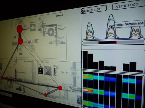
Sketching a solution for the Louvre Museum with Impure (see the complete “Sketching with data” Flickr set)

Similar approach to “sketching with data”, Stamen that has for long been leading investigative data visualization projects generally we divide their process into three distinct phases—explore, build and refine. Based on their experience, they outlined some of their common assumptions about data visualization and recommendations for how to do this kind of work; one particularly relevant to the exploration (i.e. sketching) phase:

(19) Start and End With Questions

“Traditional statistical charts can be a good first step to generate questions, especially for getting an idea about the scope of a data set. Good questions to start with include “how many things do we have”, “what do we know about each thing”, “how do the things change over time”, “how many of each category of thing do we have”, “how many things are unique” and “how many things is each thing connected to”. I don’t believe that any visualization can answer all of these questions. The best visualization will answer some questions and prompt many more.”

Apparently, they are engaged in the a similar path as Bestiario, using a Knight News Challenge grant to build a series of tools to map and visualize data that is truly Internet-native and useful. Flexible and “internet-native” environments that make easier to work with information are also emerging in the data storage end of “sketching”, for instance with the Barcelona-based FluidDB.

Zaragoza car traffic behavior @Bcn Design week
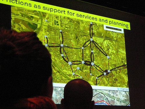
At Barcelona Design Week, sharing an animation of the traffic flows in Zaragoza sketched with Impure using real-time data feed from BitCarrier.