Unveiling Quadrigram

www.quadrigram.com
www.quadrigram.com

So for the last 8 months I have been working almost exclusively with my friends at the information visualization consulting company Bestiario on new tools to visualize information. Last year, based on our joint experience, we detected two increasing demands within innovative institutions. First the wish to think with liberty with data, outside of coding, scripting, wizard-based or blackbox solutions. Then, we perceived the necessity to diffuse the power of information visualization within organizations to reach the hands of people with knowledge and ideas of what data mean.

Our efforts have now culminated into Quadrigram, a Visual Programming Environment to gather, shape and share living data. By living data we mean data that are constantly changing and accumulating. They can come from social network, sensor feeds, human activity, surveys, or any kind of operation that produce digital information.

For Bestiario and its long track record in ‘haute couture’ interactive visualizations, Quadrigram offers ‘prêt-à-porter’ solutions for organizations, consultants, analysts, designers and programmers working routinely with these types of data. As with other services, data visualization plays a central role in the making sense and sharing of complex data.

I got the chance to work on multiple conceptual, engineering and strategic aspects of Quadrigram. In this post I summarize four most main areas I had the pleasure to shape in collaboration with Bestiario:

1) Redefining work with data

For us at Near Future Laboratory it made sense in helping Bestiario with our experience in prototyping solutions that become feedback loops where our clients can actually figure something out. Indeed, more and more results of our investigations became interfaces or objects with a means of input and control rather than only static reports. The design of Quadrigram lays on this very idea of ‘feedback loop’ and provides a WYSIWYG (What you see is what you get) interface. It is designed for iterative exploration and explanation. Each iterations or “sketches” is an opportunity to find new questions and provide answers with data. Data mutate, take different structure in order to unveil their multiple perspectives. We like to think that Quadrigram offers this unique ability to manipulate data as a living material that can be shaped in real time or as Mike Kuniavsky nicely describes in Smart Things: Ubiquitous Computing User Experience Design: “Information is an agile material that needs a medium”. And this not only concerns ‘data scientists’ but rather everybody with knowledge and ideas in a work that involves data.

With the diffusion of access to data (e.g. the open data movement), our investigation with data has become utterly multi-disciplinary. Nowadays, our projects embark different stakeholders with fast prototyped tools that promote the processing, recompilation, interpretation, and reinterpretation of insights. For instance, our experience shows that the multiple perspectives extracted from the use of exploratory data visualizations is crucial to quickly answer some basic questions and provoke many better ones. Moreover, the ability to quickly sketch an interactive system or dashboard is a way to develop a common language amongst varied and different stakeholders. It allows them to focus on tangible opportunities of product or service that are hidden within their data. I like to call this practice ‘Sketching with Data‘, others such as Matt Biddulph talks about “Prototyping with data” (see also Prototyping location apps with real data). Regardless of the verb used, we suggest a novel approach to work data in which analysis and visualizations are not the unique results, but rather the supporting elements of a co-creation process to extract value from data. In Quadrigram, the tools to sketch and prototype took the form of a Visual Programming Environment.


The teaser video summarize the vision behind Quadrigram

2) Reducing the barriers of data manipulation

Visual Programming Environments have flourished in the domain of information technologies, starting with LabVIEW in the 80s and then spreading to the emerging fields mixing data with creativity such as architecture, motion graphic and music. In these domains, they have demonstrated virtues in reducing the barrier of entry for non-experts (check the VL/HCC community for more on the topic). In the Visual Programming Environment we developed, users manipulate in an interactive way pre-programmed modules represented as graphical elements. When connected, these modules form a ‘data flow’ (also called dataflow programming) that provide a constant visual awareness the result of the program (“What You See Is What You Get”) ideal for quick “trial and error” explorations. This way the tool allows for the evaluation of multiple pathways towards the correct solution or desired result. It inspires solution-finding for non-technical professional by exposing the full flow of data.


The take a tour video presents the Visual Programming Environment that offers a transparent way of setting up a solution, that contrast with wizard-based environments and their “black boxes”.

3) Creating a coherent language

A major challenge when grouping tools to work with data within a common Visual Programming Environments has been to define basic building blocks of a language. Starting from scratch, we used an exploratory phase that led to the release of an experimental environment called Impure and its large sets (500) of diverse modules. This free solution generated a decent community of valorous 5000 users. We used Impure as testbed for our ideas and perform the necessary user studies to come up with a coherent basic language. We particularly focused on specific action verbs (what people can do see Verbs and design and verbs) that enclose the most common operations on data: sort, search, insert, merge, count, compare, replace, remove, filter, create, get, cluster, encode, decode, convert, accumulate, split, resize, set, execute, load, save. These actions are performed on Data Structures (e.g. create List, sort Table, replace String, cluster Network, compare Date, resize Rectangle, load Image, …) within specific domains (e.g. Math, Geography, Statistics, …). The language is complemented with a growing list of Visualizers categorized according to their objectives to reveal aspects about the data (e.g. compare, contextualize, relate, …). Through this structure (actions – structure – domain) user can find the appropriate module within a very dense and diverse toolset.


This exploratory analysis video shows how a unique language provides similar perspectives in the same dataset.

4) Steering the development of an environment that takes advantage of an ecosystem of great tools

Bestiario’s CEO José Aguirre always like to present Quadrigram as a sponge capable of absorbing information from many diverse sources: social networks, data bases, Internet of Things, social media tools, business analytics tools, etc. stressing that “In the wild we know that it is not the strongest who survive but rather those who best cooperate”. We brought that vision to reality with an environment based on severs ‘in the cloud’ that integrates with other sophisticated tools. Like many other platforms, Quadrigram connects to various types of data sources (databases, APIs, files, …) to load data within a workspace. But we also wanted users with detailed needs to take advantage R scripting to perform advanced statistical method or Gephi to layout large networks. The main challenge was to find and implement a protocol to communicate Quadgrigram data structure back and forth with these great tools. In other words, we wanted users to perform analysis in R as part of their data flow. Similar to the architecture of distributed systems and the used of JSON nowadays, the solution was to pass around serialized Quadrigram objects. That offers a pretty unique mechanism to store and share results of data manipulations, what we call “memories”. For instance the content of a Table stored in Quadrigram server is available publically to other tools via a URL (e.g. http://nfl.quadrigram.com/account/m/ext/memo/public/fabien/cosm/cpu store an analysis of my CPU activity)

Why do I blog this: It has been a unique opportunity to help shape a software product and bring it to market. When we created Lift Lab and now Near Future Laboratory we knew if was the kind of experience we wanted to live. This post is an attempt to keep track of the work performed to make Quadrigram a tool that we hope will open new practices around the manipulation and visualization of data. Thanks to the team at Bestiario for their talent and stimulating discussions. I will continue contributing to the project with constant technical, strategic and conceptual guidance. I have also jumped in the advisory board in company of Bernando Hernandez and Jaume Oliu.

Flawed “trends” circulation

Just saw this intriguing link called “5 Digital Trends Shaping the Consumer Experience” sent by @iamdanw and I found it fascinating.

The post lists so-called “trends” (a term commonly employed by consultants and marketing persons to refer to a particular form of culture that emerged at a certain moment in time) that can be relevant for “consumers”.

What struck me as curious here is simply the way certain concepts that appeared in different fields are defined and eventually understood by the author, whom I expect to be representative of a marketing crowd. See definition examples:

Calm technology refers to applications that cut down on the digital noise of high-volume data to show the user only enough information so that he or she is able to focus on a task. Mark Weiser is considered to be the father of “ubiquitous computing,” a synonym for calm technology.

The “one-liner” approach to define things makes the concept so basic that it’s only vaguely connected to what the persons behind it wanted to express. For people who read Weiser’s take on calm computing, this is only a pale version of the research papers.

Nothing new under the sun here, this kind of problems happen all the time. And I don’t wanna play the grumpy academic being sad about this. However, what I find fascinating is that it enables to see the various process at stake when concepts circulate.

There’s also simplication and confusion, as “game theory” seems to equal “gamification”:

Game theory is one of the key components in the theoretical research surrounding singularity. Marketers can make the argument that by having multiple people taking the same action at once, in ways that are deemed safe by them, they can drive massive change. According to Gartner’s 2011 study of Gamification,

But the best part comes when the marketing person tries to grasp a concept that is elusive and only meant to spark debate in a community of practitioners or researchers:

Currently, the new aesthetic remains fragmented and extremely hard to put into a coherent example that would allow a marketer to grasp its full potential. But, because the subject matter of aesthetics relates to how beauty is perceived and valued by us as humans, retailers are making strides to test it via digital consumer experiences.

Why do I blog this? Being interested in digital culture and the circulation of concepts in this context, this kind of blogpost is curious as it reveals various underlying assumptions: the necessity for some people to turn any concepts or novelties into something that help selling or communicating (while some notions are not intended to go beyond pure speculations) or the over-simplication of the world.

Of course this happens a million times everyday and I don’t know if it’s important to pay attention to it… but analyzing the arguments and the simplifications at stake seems important to me. That’s perhaps something I’ll add in my course next year.

Weekending 17062012

Here in Los Angeles it’s mostly been programming and book editing and talking to humans. Geoff Manaugh and Nicola Twilley stopped by to do an interview for their curious cross-country mobile blog/interview platform/landscape exploration vehicle called Venue. That was good fun to discuss the various ways landscape, urban space, data-based representations of places, things and flows of humans has informed and influenced the work we do here. Curiously — that seemed to be the topic of the weekend in one way or another. By that I mean that Sunday evening Zoe Ryan and Karen Kice to talk about the same set of topics for a forthcoming exhibition that the Art Institute of Chicago will do. It was a good opportunity for myself — to refresh my memory about a number of projects that sometimes I forget about, like Drift Deck and PDPal. So fun conversation time last week.

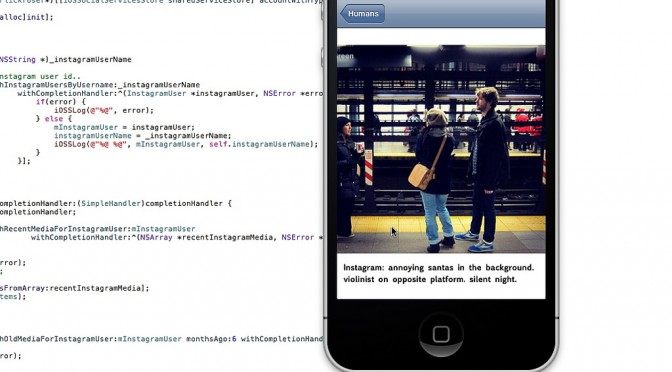
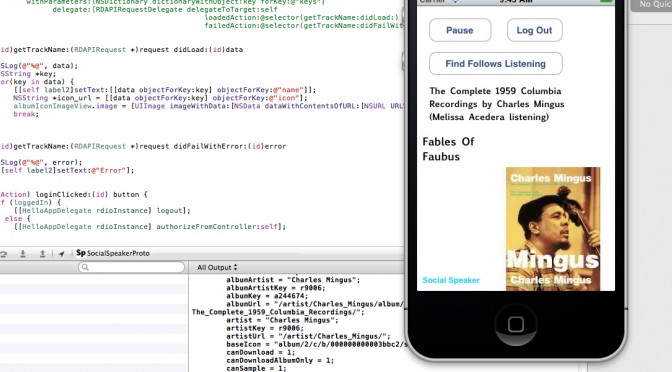
The programming has been good and fun as well. It’s quite nice to get back into that and maintain that skill as well as check off the to-do list a number of ideas and projects that have been lingering. I’m currently working on a little social browser/viewer that inverts the way I “catch-up” with my Friends — other than the “friends” that I find online or who ask me to be their friends but, really? I have little idea as to who they are and often quite a small/nil stake in what they’ve been doing or what they’ve taken a photo of. So, in the app I basically go through the social services for these true-blue Friends and show their latest photos, tweets, etc., so that I don’t have to trawl for them amongst the kruft of illegible feeds and all that crap. I go to people first rather than social services.

And then Rachel Hinman’s new book “Mobile Frontier” showed up with a little interview she did with me. So..that was fun.

Additionally, there’s been more planning and phone calls for this Design Fiction workshop we’ll be doing in Detroit this fall. More about that when I’m not rushing off.

Otherwise..looking forward to the summer with Nicolas here quite nearby in Venice Beach.

Continue reading Weekending 17062012

“I’ve been playing the same game of Civilization II for 10 years”

The other day, in a conference about video-games I co-organized in Lausanne, I instagramed this presentation by Brice Roy in which the game designer mentioned a game that can only be completed in 250 years. One of my contact (@carinaow) wondered about the very fact that “it’s longer than a lifetime” and that “nobody can vouch for it”. Sure, that’s quite big amount of time but the point of the game is to question the notion of trans-generational play.

250 years is certainly very long, especially for a digital program to continue its life on different generations of devices. However, this notion of “long play” is interesting as it’s close to another weak signal that caught my attention: the story of this guy who has been playing Civilization for ten years.

The guy said he grew fascinated with this particular game and that we wanted to see how far into the future he could get and what sort of ramifications he could encounter. Here are some excerpts of what he learnt doing this:

The world is a hellish nightmare of suffering and devastation.
(…)
The ice caps have melted over 20 times (somehow) due primarily to the many nuclear wars. As a result, every inch of land in the world that isn’t a mountain is inundated swamp land, useless to farming. Most of which is irradiated anyway.

As a result, big cities are a thing of the distant past. Roughly 90% of the worlds population (at it’s peak 2000 years ago) has died either from nuclear annihilation or famine caused by the global warming that has left absolutely zero arable land to farm. Engineers (late game worker units) are always busy continuously building roads so that new armies can reach the front lines. Roads that are destroyed the very next turn when the enemy goes. So there isn’t any time to clear swamps or clean up the nuclear fallout.
(…)
You’ve heard of the 100 year war? Try the 1700 year war (…) Every time a cease fire is signed, the Vikings will surprise attack me or the Americans the very next turn, often with nuclear weapons. Even when the U.N forces a peace treaty. So I can only assume that peace will come only when they’re wiped out.

Why do I blog this? These kinds of accounts of long-time play are so scarce that it’s great to find one of them. It would be so fascinating to watch a replay and see how a narrative of such play could be inscribed in book or movie, surely an intriguing project to be done.

These new aestheticians were a bit too literal, weren’t they?

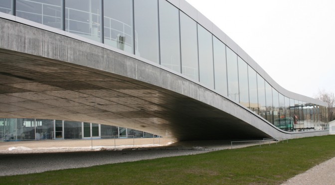
Why do I blog this? Probably because this encounter with a weird table, whose shape has been generated by a computer program, seem to exemplify the excess or the mere simplicity of adopting this approach in design/art. We’ll probably see more and more things like that.

Perhaps this signal can also be connected with some of the insights Regine brought up in her interview with Jeremy Hutchison. This artist contacted a bunch of manufacturers around the world asking them to produce an item which had to be imperfect, come with an intentional error. In this blogpost, i was fascinated by this part:

I got a frantic call in the middle of the night: Waleed was at the customs port. The authorities had seized the ball. When he explained than an Englishman had ordered a ball with errors, all hell broke loose. They said it was illegal to fabricate incorrect products, and they would revoke his company’s trading licence. I explained that this product wasn’t incorrect since it was exactly what I’d ordered. Days passed: nothing. Lost in the bureaucracy of Pakistani customs, I eventually got through to the high commissioner in Islamabad.

She was very apologetic, and explained that 20kg of heroin had recently passed under the radar at Sialkot customs. So everyone was feeling a bit paranoid. She issued a document stating that “the sculpture/artwork looks like a football but in fact is not a football and primarily this object is not for using as a football but is an artwork.” But it was too late: someone had destroyed the ball, and it disappeared without a trace. I never quite found out who.

The intentional creation of failed object and the influence they can have on people or organization’s behavior is always a fascinating research avenue.

Tom Sachs // Mars Program

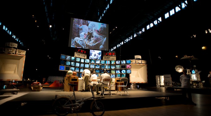
So I have just returned from a multipurpose trip, one of whose purposes was to see the Tom Sachs exhibition at the Park Avenue Armory in New York City. This is the Tom Sachs show done in collaboration with NASA (and a crop of creative partners, like Creative Time, but that’s less typical than collaborating with NASA.) Much like his studio’s “Space Program” exhibition from a few years ago at the Gagosian in Beverly Hills, this exhibition takes as its theme space travel only this time instead of a mission to the moon, it’s a mission to Mars. The specifics of the work is mostly in the details of it’s preparation and a bit in its demonstration. The way Sachs’ studio runs — as best as I can discern from the artist talk — is quite thorough. The studio treats the mission quite playfully-seriously. So, much like astronauts may work quite hard on physical fitness and the like, the studio does as well — doing morning runs, coordinated limbering exercises, weights and the like. In the videos showing the preparation work, you see the studio in appropriate era fitness clothing doing exercises idiomatic of the sort you might see in the context of astronaut preparation. They’re doing it all with a playful spirit, but evidently it’s taken quite seriously.

The script to the exhibition was fairly close to the “Space Program” — at least insofar as the space travel bits. The exploration and excavation of the martian surface had some variations of course, but otherwise it was quite similar. It’s the same Saturn V rocket and the astronauts (again, both women) travel in the LEM — I suspect it’s the exact same one as “Space Program”, but it is a lunar excursion module, rather than some speculative martian excursion module.

The collaboration with NASA brings a very intriguing “design fiction” angle to the project insofar as the studio, according to the artist talk, worked quite closely with NASA scientists. To what ends, I’m not entirely sure of course, but the collaboration is there. In a way this is somewhat like Kubrick working with the rocket scientists of his era in order to understand the needs and constraints of rocket ships basically before there were rocket ships.

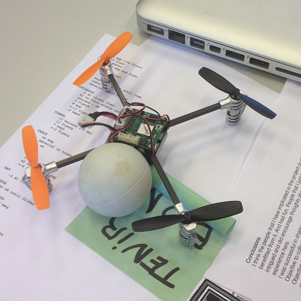
Sachs enjoys the patina of bricolage so his interpretations have a certain hand-made-ness and found-materials-that-are-perfectly-fine-ness to the work. This sculptural quality makes them deliberately playful. I find this more than simply playful though, but I can’t quite get to the bottom of it. It’s ingenious in a certain way. Ingenious craftwork. To use a basketball as the main living module of the Odyssey from 2001 is fun at the same time that is subverts the tendency I might have to make the model indiscernable from the real thing, at least as far as the material goes. This is just my own perception and interpretation of this choice, but I feel like it’s something I’d like to learn from. ((Oftentimes we’ll make thins with the same level of resolution and fidelity one would expect from a “real” object. I can think of various reasons and rationales for subverting this “reality” as a way to enter into a different set of conversations — perhaps to reflect more of the craftwork, the individuality of an idea or object, or to bring in a conversation about artisinal qualities.))

One thing Sachs said during the artist talk that was nice to hear — not a surprise, just something that brought into focus perhaps one of the reasons that I enjoy his work, aside from the fact that its about golden-era space travel — was this: “I see no problem synthesizing science with fiction”. So this statement explicates his own approach to the work and captures that relationship with ‘real scientist’ and the interpretative qualities of his demonstrations and sculptural constructions together with my own interest in designing with fiction.

Weekending 03062012

Um. Well, here in Los Angeles it’s been lots of fun/frustrating days getting back into programming the computer. I’ve been getting a bit overwhelmed by the growing list of “ideas” that I thought would be good ways to get back into it. They’re mostly exercises that I thought would be better than following on in the usual lot of slightly mundane book exercises. The one I’m most curious about is a sort of social browser that, like Windows Phone 7’s live tiles, lets me flip through my friends social service “updates” and the like — but do so without having to go to the services, search for my friend, and then see what they’ve done. So — people first, rather than service first. Nothing brilliant there in that, but more a personal preference. Plus, also being able to see stuff from ancient history (many months or even a year ago) along with the latest stuff.

Some folks have mentioned that Path does this in some fashion. I’m still trying to see how. Right now? Path seems as noisy as Twitter. I’m looking for something a bit more — calmer. And the fact that Path is a kind of mobile Facebook status update yammery thing makes me want to enforce a simple rule that limits the number of slots for people. Or puts individuals in a special “Joker’s” slot based on which of your chums are being more yammer-y. Something like this. But, a couple week’s usage of Path leaves me thinking that there’s something that I want that is missing yet still. It’s still everyone. And sometimes you don’t want to share with or hear from everyone.

I also spent a bit of time preparing for a workshop at the Walker Art Center, where the staff is doing some work on the possibilities of speculation and interdisciplinarity for their own internal work. Looking forward to that a bit — especially to try some of the techniques we use in the studio on a group of people who I basically know nothing about.

Oh, that photo? That’s me programming a networking app while flying in an aeroplane. I know it’s not a big deal, but it sorta is for me in a nostalgic sorta way. I think the last time I did that I was heading to the Walker Art Center in, like..2003. Programming in an airplane, that is. Certainly there was no networking going on at the time — but still. It’s sorta nostalgic and fun to get back to that sort of work.

On my side (Nicolas), the beginning of june is packed with different talks in Europe, the organization of a 3-days conference about video-games, preparing the Summer in Los Angeles and the writing of the game controller book… hence the quiet participation to the weeknotes here.

Lessons from teaching design approaches to engineering students

This year, I had the chance to teach a year-long course at EPFL about design and creative approaches with my colleague Daniel Sciboz. This class is part of the social science/art/design program which corresponds to a set of courses engineering students have to take as part of their general curriculum. Since EPFL doesn’t have researchers in these domains, this program is taught by external experts coming from the University of Lausanne, the University of Art and Design Lausanne (ECAL), and the Geneva University of Art and Design (HEAD) to which I belong. Since this was the first year teaching that course, I found it relevant to describe what we did and some lessons we learned in the process.

The purpose of this course was to “give students the opportunity to discover, understand and apply various creative approaches, by highlighting the diversity of methodologies and the relevance of subjectivity or intuition”. The year was divided in two parts:

  • First semester with lectures and workshop activities:
    1. Research and concepting approaches: ethnography (observation/interview), iconographic research, group brainstorm, mood boards.
    2. Creation and prototyping techniques: physical and paper mock-ups, repurposing of standard software (powerpoint, excel).
  • Second semester devoted to students personal/group projects.

In order to narrow down the possibilities and make the course more focused, we chose “reading in mobility” as a general topic.

Here are some remarks and comments I wrote down during the two semesters. They exemplify some of the issues we noticed and I describe them here as “difficulties” encountered by some of our students. They are quite interesting in terms of teaching design approaches to engineers and I think we may build upon these in next year’s course.

One-way / One-time
This is the most striking issue we noticed: when confronted with a design brief, students picked up one way to deal with it (generally the most obvious idea) and developed their answer based on that. This answer, be it a storyboard or a physical mock-up, was then implemented with lots of details without any consideration of alternative paths.

A good example of this is a student who worked on school billboards: in his “observation” phase, he noticed that they were quite messy and tedious to “update” since people had to physically go to the billboards and duct-tape his/her poster. His proposal was to design an interactive systems with displays and a web platform to update everything remotely. In this case, the student’s perspective was seemingly driven by the need to complete this project quite quickly (we’re competing with other classes in terms of students’ attention!), his interest/expertise in computer science and his belief system (that classifies digital technology as the go-to solution for problem solving). Even when we asked him to go make other observations or “users” interviews and consider alternative solutions (with or without technologies), it was hard to make him change the course of the project.

This was certainly an “edge case” but others had similar issues as well: making observations and interviews allowed another group to redefine the brief a bit better and clarify the design space. However, once the group chose his “potential solution”, they didn’t want to change their trajectory, as if it was a “one-way and one-time” course without any exploration (through research and prototyping).

I analyzed this as a difficulty to deal with uncertainty: selecting the end point of their project was a good way to have a purpose and move towards it by making incremental choices. Each time we encouraged the groups who suffered from that problem, it was hard for them to cope with these advices. Either because it may alter the outcome they had in mind and because it would require too much time/energy to do it. One of them even told me that “it can’t be changed at this point”. My hypothesis here is that designers may be more at ease with uncertainty but I thought this was also a skill would have to master (see this paper if you’re interested in the link between creativity and ambiguity/uncertainty).

A side-problem was the difficulty to use “making” as an exploration approach to problems or situations. In a very engineering-oriented way, some had to plan everything on paper (with words and sometime sketches) before building a rough prototype. Of course, we had lovely and surprising exceptions but they were less common.

The implementation bias and reluctance to iterate

Another related issue was the “implementation bias”: this happened when a group of students formulated an interesting design avenue but got sucked into creating their prototype with lots of tiny technical issues. The group then had to focus on solving these problems and not thinking about the global picture. Similarly, a student was quite pissed when we told him his web prototype was highly detailed but did not correspond with the context of use he planned it for… when we asked it to redo it in a different way, he felt that what he had did before was useless and a waste of time… it was hard for him to understand that it was an important lesson he couldn’t have learned otherwise.

Nevertheless, the reluctance to iterate might have been cause by the number of credits allocated to this class, with regards to others courses which are “more important” for them.

A lack of attention to formal elements and an intriguing relationship to details

We also noticed a tendency to consider formal elements and general aesthetic as something not really taken care of, or only thought of as the end of the project. It was as if some students took their project as writing with LaTeX: they focused on the “content”, i.e. the substance of the project and then realized at the end they had to think about shapes, colors and how potential users may use it. This was a difficulty to consider a design project as a whole, in which the discussions about the role of the proposal and the way it’s implemented (behavior, shape, aesthetic, etc.) can be inter-related.

This is quite intriguing given that some did lots of super detailed things (i.e. a list of menu items on an interface), while, at the same time, using unrealistic personas or wrong props. For instance, when a group created a video about am artifact to be deployed fifteen years ahead, the general atmosphere was not really planned to give the impression of a distant future.

Risk reluctance

When we started the projects during the second semester, what surprised me most about their ideas was the reluctance to take risks (by trying to explore weird ideas). It was as if they integrated the same risk-averse attitude as one can find in corporate culture. Especially for those who focused on direct digital transcriptions of what exist already (from visual ads to location-based ads, from messy paper-based billboards to screens). Some said things like “we have to find a real need” or “it should be based on a problem we found in the field research phase”. This led to good discussions about how observations, interviews or even brainstorming can be be deployed to find ideas, which are not necessarily conventional and related to a standard problem.

We had to push them considering alternative paths and not the sole basic ideas and solution that generally already existed. Not necessarily because we only want to have weird and off projects but simply given that the point was to invent something new, beyond the current products and services on the market.

Why do I blog this? Because we’re planing next year’s class and it’s always good to reflect on what we’ve done.

Maybe the main reason why these remarks are interesting for me is that the confrontation between design culture and engineering culture allows shedding some light on how designers’ do things and their expectations. By looking at how designers responded differently, it enabled me to see that the assumptions I have (or the one designers have) are different from the one of engineers. It would also be interesting to write a blogpost about the common traits between both cultures, but I guess this for another occasion.

The portrait painted here might be a bit critical and negative but it was actually a great class and the comments above only express my frustration to go beyond what we’ve done. Most of the projects in the end had something intriguing in them. Some were more creative than others but there was always a detail that caught our attention either in the idea explored or in the implementation. This will give us ideas go modify the course next year, for instance by giving incentives to design several design iterations and alternative paths.

Also, the problems I mentioned here are not always inherent to engineers and we encounter similar issues with design students.