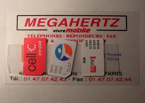
I didn’t think I could get two of these in under 24 hours — and lead to them from the same colleague, but Francois diligently commented on the Flickr page from one of the images for Idiom No. 1 with another design challenge.

Francois points out that he uses a piece of transparent tape on the back of the business card from the operation that he gets SIM cards from to keep his quiver of SIM cards — handy? un-lost? clean and un-bent, un-folded, un-mutilated?
Who’s got the mobile phone SIM card version of the bandolier?

Whly do I blog this? The mobile phone, oftentimes, has this disconnect from the practice of communicating while mobile. That is, some designs for mobile phones assume a kind of practice that is about telephony rather than mobile communication. Some designs are great, others are awful. And it’s not just the user-interface, but also a consideration as to what people do with their phones. I’m not flash-banging all phones — just pointing out the wonderful possibilities for design based on close consideration of what people do with their devices. In other words, given the chance, I’d love to do what Jan Chipchase does, only I’d be lucky to be half as good as he.