Nokia Homegrown

Homegrown Project

Today in London Rhys Newman presented the studio’s "Homegrown" project to an audience of 150 journalists. Rhys is part of the newly minted Design Strategic Projects studio that I will be joining in a few weeks.

The Homegrown presentation starts with a brief, top-level description of Design Strategic Projects. 14 people, International (I’m one of only two United Statesians — quite nice, that), 3 locales. Our (broad) mandate? Clarifying and translating business objectives through design. This is an amazing foundation, and the emphasis on design is quite significant within Nokia. It means design at Nokia is more than styling and appearances. It’s about informing and shaping the strategic direction of Nokia. Helping make decisions that are based on design principles that are also good business principles.

Why is this significant? Design can base its objectives on principles that business would not normally use as its decision criteria. Such things as so-called design thinking where creative thinking and probes into unknown areas is encouraged — even if it results in some “cost” or, in a business idiom, “red ink.” What might be seen as a preposterous experiment can yield valuable insights just by going through the process of thinking outside the box. Design can process ideas, theories, hunches and speculations much more freely and effectively that a project that is bound to hitting one’s quarterly revenue targets.

So — principles in action? Here’s what the Homegrown project entails.

Zero Waste — a charger. What? A charger? Chargers often have a persistent power draw — 300mW or there abouts. Even if it’s charging cycle is done. That’s a terrible waste across a massive scale. Through a principle of small actions, across massive scales, big changes can come about. Scale? Count one second — Nokia has just made 16 phones. Every phone comes with a charger that can be expected to consume this .3 watts of power that we’ll never turn back into the resources consumed to produce it. And that’s just phones and one phone manufacturer. What about digital cameras? Game players? Camcorders? MP3 players?

There’s strong evidence of designed simplicity and a consideration of even the most routine of human -machine interactions here — the button. It has become the sine qua non of interaction modalities. In fact, it is the button that undergirds the bulk of interaction design, I’d argue. Here, with Zero Waste, the button is an soft but emphatic reminder that one is consuming power, however little. When the charger has finished its task of topping off your device, it turns off. In order to turn it on again, you have to push the button. Push a button. Charge. Push a button. Consume. The ritual of turning your attention to the Zero Waste button is a reminder and a call to consider what one is doing. Not that people will necessarily not charge their devices. They’ll just be forced to be cognizant of what is taking place. The persistent reminder to be mindful and considerate of the resources consumed is a designed-in implication of Zero Waste.

Nokia Remade

Remade — a phone (It exists. It works. I’ve held it. It was announced by Nokia’s CEO in Barcelona a bit ago. It’s not (yet) widely available.) Continue reading Nokia Homegrown

PDPal — Mapping Without Terrain

pdpalv1_1

pdpalv1_2

pdpalv1_3

pdpalv1_4

pdpalv1_5

“To cover the world, to cross it in every direction, will only ever be to know a few square meters of it… tiny incursions into disembodied vestiges, small incidental excitements, improbable quests congealed in a mawkish haze a few details of which will remain in our memory. And with these, the sense of the worldís concreteness…no longer as a journey having constantly to be remade, nor the illusion of a conquest, but as the rediscovery of a meaning, the perceiving that the earth is a form of writing, a geography of which we had forgotten that we ourselves are the authors.”
– Georges Perec, Species of Spaces

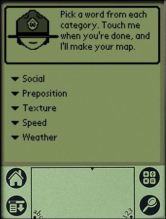
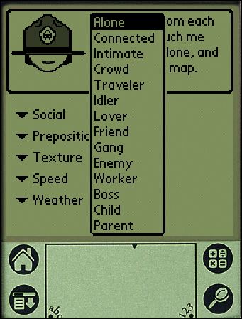
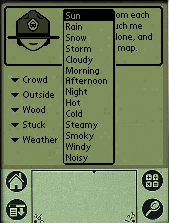
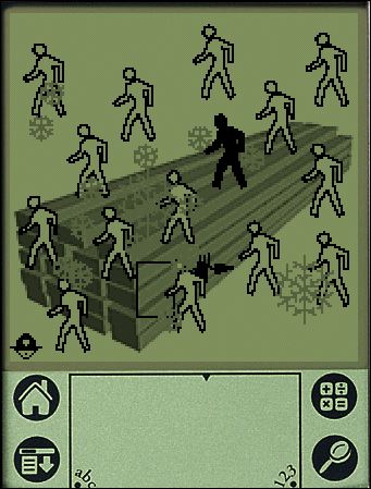
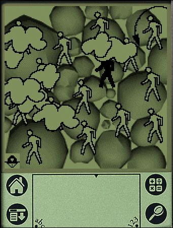
PDPal was a series of public art projects for the Palm™ PDA, mobile phone and the web. It has pushed at the notion of mapping, attempting to transform your everyday activities and urban experiences into a dynamic city that you write. PDPal engages the user through a visual transformation that is meant to highlight the way technologies that locate and orient are often static and without reference to the lively nature of urban cultural environments.
Your own city is the city composed of the places you live, play, work, and remember. Itís made of the routes and paths through which you make connections. Your city is also about the meanings you ascribe to the places you inhabit, pass through, love or hate. You imagine those places and routes as more than a street address, or directions you may give. These places have vivid, metaphorical meanings and histories that PDPal allows you to capture and visualize imaginatively, effectively writing your imaginary city.
In response to the plethora of mapping projects that have utilized GPS and measurable cartography, PDPal has been anti-geographic and anti-cartesian, preferring to experiment with the construction of relative, emotionally based systems that ask: what makes social or personal space. PDPal responds to the century-old idea of the urban explorer: from Baudelaire’s “flaneur” (late 19th c); the Dadaists’ public performances of nothing, sometimes called “deambulations” (1921); Benjamin’s texts on the urban wanderer (1920’s); the Situationists’ algorithmic “derives”; Hakim Bey’s “Temporary Autonomous Zones” that spring up in the cracks of urban regulations, and are opportunities for brief piracy of a place; and contemporary work in psychogeography – all deliberate projects of “getting lost” in the city, thus restoring it to a great dense space of wonder, not just a locus of labors.

EXHIBITION HISTORY
Eyebeam Atelier, NYC “Beta Launch” show and artists’ residency 2002
Walker Art Center, Minneapolis, MN 2003
Transmediale Festival, Berlin 2003
University of Minnesota Design Institute, “Twin Cities Knowledge Maps” 2003
Times Square, NYC “Creative Time Presents” 2003-2004
Whitney Museum of American Art, Artport 2003
Walter Phillips Gallery, The Banff Centre, Alberta Canada “Database Imaginary” 2004
MoMA, Online “Talk to Me” exhibit 2011

It’s hard to describe just with words — so here are platform emulators for the PDPal v1 that will run on a Windows machine and a Macintosh.

Here you can download a zip file of a Palm Pilot Emulation of PDPal Eyebeam Edition.

Here is the PDPal — Macintosh “Desktop” Emulator. (It’s a DMG file (mountable disk file). The README file explains the three simple steps you need to take to make it all work.)

Why do I blog this? I was thinking recently about the possibilities for mapping built environments, like cities, asynchronous — out of synchronization — with traditional “grounded” coordinates. What does the world look like when it is “un-hooked” from the earthly systems of synchronizing physical locations. If latitudes and longitudes suddenly up and floated away from us, what means would arise for coordinating our place in space? For example, for the Smalltown project, the exercise is to coordinate movement through space based not on latitude/longitude, but on the existence of Bluetooth identification beacons floating in space. If we closed our eyes, and had no GPS and could only determine our place based on unfixed beacons, what would that experience be like? And what way of looking sideways at the world would it evoke? How would it force new perspectives and new ideas for inhabiting the world?

PDPal was very much motivated from this perspective. One of the main challenges was connecting the notion of mapping to this PDA application. PDAs at the time were gadgets for people with jobs and a sense of urgency about managing the minutiae of their lives. The idea of geographically uncoordinated maps, and maps coordinated by these five peculiar categories was antithetical to the sensibilities of PDA owners. It was a cute art project, but much less a provocation. It was a fantastic project, that ultimately had three solid commissions.

Technorati Tags:

Related
Creative Time, 59th Minute
PDPal, Times Square Edition
Denis Wood Essay on PDPal
PDPal at the Walker Art Center
Marina’s PDPal page

[Event] Biggest Visual Power Show — Los Angeles May 17

The Biggest Visual Power Show is an intellectual spectacle blending a conference and a pop concert. BVPS mixes movies and live performance, morphs physical experiences into virtual imagination.

This event will be happening May 17 and takes place at the recently renovated Million Dollar Theater on 307 Broadway in downtown Los Angeles.

The theme of BVPS 2008 is Next Nature; the nature caused by human culture. Nowadays, children know more corporate logo’s and brands than bird or tree species. Our established image of nature needs to be updated. Our technological world has become so complex and uncontrollable it has become a nature of its own. Wild systems, genetic surprises, autonomous machinery and beautiful black flowers. Nature changes along with us.

Visual Power: without visualisation, no reality. Images occupy an increasingly important place in our communication and transmission of information. More and more often, it is an image that is the deciding factor in important questions. Provocative logos, styles and icons are supposed to make us think we are connected to each other, or different from each other.

Each of us is confronted with more images every day than a person living in the Middle Ages would have seen in their whole life. If you open a 100-year-old newspaper you will be amazed by the amount of text and the total lack of pictures. How different things are today: the moment you’re born, covered in placenta, not yet dressed or showered, your parents are already there with the digital camera, ready to take your picture to publish on the family blog for showing the world. Interactivity between people has become an interactivity of screens. We are visual creatures, living amid image layers.

Buy your tickets online before April 30 for only $12.

Technorati Tags: ,

Contexts for Interfaces

Bricolage

Bricolage

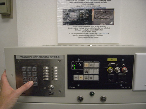
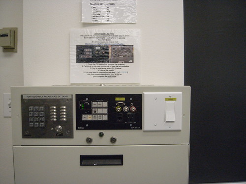
Found in a university class room is this very peculiar bricolage of interface stylings. I can see this as either four deliberately distinct interfaces — and therefore entirely transparent as to its utility because each separate interface does its own thing. Or completely baffling and, aesthetically, dyspeptic because, well — i mean, what the hell? Clearly assembled roughly DIY style based on what was lying around the shop, no?

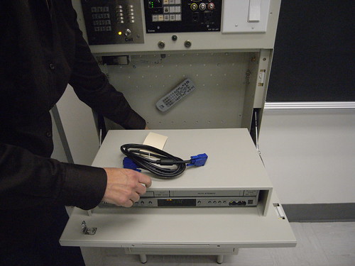
You push to call someone somewhere who has a bank of buttons that unlock the AV cabinet with that pull interface thing. Inside the cabinet is a DVD player and cord to hook things up to the projector, like a computer. The center panel appears to control switching the A/V part of the system. That wall switch that’s not mounted on a wall, but on this metal cabinet? No clue what it does.

What are the design challenges in creating an interface for projecting video in a classroom? Can you catalog the number of actuators and touch-points here? It involves not only yourself, but probably someone else alongside of you to help interpret the instructions (at least the first time you access this object), and some A/V guy in a command bunker somewhere that has the ability to remotely unlock the door panel below that hides the goods (remote controls, DVD player, etc.)

Bricolage

AGC

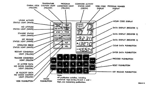
One of my personal favorite user interfaces is the Apollo Guidance Computer because of the simplicity of its face. I can imagine that it took quite some training to operate under such circumstances as traveling and landing on the moon in 1969, to say the least. 19 keys to control the “computer” — a quite different, and quite speculative, imaginary beast at the time, and one whose popular imaginary — what it meant to the larger public — has little to do with what they are today.

The idea of the user interface had very little to do with what one immediately thinks of when you consider yourself a computer operator — someone operating a computer — today. It’s, like..”okay..we’re going to design this panel to allow you to control navigation to, and landing upon, the moon..and lets do it with 19 keys and a verb/noun syntax. Right? Sounds good?”

Cripes.

ad019

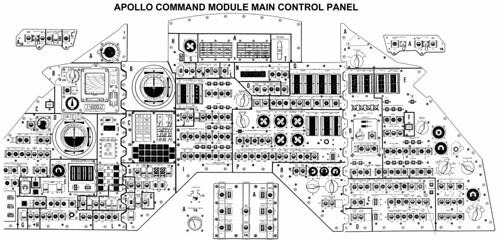
Why do I blog this? It’s curious to me how the design of interfaces occurs and the basis and considerations that go into their design. Especially the contrasts in design-for-contexts — a very simple task (opening a cabinet door that’s been secured to prevent unauthorized access that could lead to theft or vandalism) requires this horrid bricolage of styles and actions. A highly speculative, hopeful and aspirational task of getting from the earth to the moon and back is done in part with this exceptionally minimal interface object with 19 keys. Of course, there are many other components involved in this Apollo mission, as shown in the image above. For me its what the interface component simplicity of the Apollo Guidance Computer represents in terms of an historical spectrum of possible designs. There is no linear path, in my opinion, that represents a continuum towards more “intuitive” interfaces. In fact, the notion of an intuitive interface is problematic to the degree that it suggests that intuition is a shared characteristic — whose intuition under what circumstances? Apple iPhones are intuitive to people with jobs and disposable income. What is an intuitive interface for someone who carries 5 gallon jugs of water 7 miles a day?

Services Offered

20080416_072851

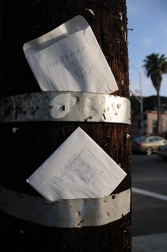
Advertising services for a handyman, improvising placement and using available/upcycled materials — in this case, a paper sleeve for a compact disc.

This is a peculiar instance of advertisement by an individual (“mike”) to find a bit of work for himself, presumably. For risking an invasion of privacy by sharing his phone number (personal? home? business? mobile?), he is able to announce his service and a means of contact — all without incurring a substantial financial risk that might occur with a more traditional, less improvised means of advertising.

I’ve done a stretch in advertising. First at Messner Vetere Berger McNamee Schmetterer Euro RSCG when they were kicking off an “interactive” agency (great learning experience — I had no idea how the trade worked, practically and at a “top-level”. Then — well, at Organic, Liquid Digital, Sterling Brands. Nutty days.

During all of that, I was never particularly excited by what were considered “innovations” in advertising and brand marketing. One always got a whiff of sulfar when a slick agency partner announced some revolution or another. Whether it was ad banners that appear on..web pages! Or SMS messages that tickle your phone when you walk by a Starbucks with a discount on something you hadn’t even considered buying. It was all “communication” designed to compel one to spend money — more often than not, it was to spend money on things that one could reasonably live without. The cycle of consumption has very little principles beyond perpetuating and accelerating spending — even to the point of spending money in a way that drives one towards serious financial distress.

What are the various practices for circulating one’s ability to perform paid services? How can these be organized across schemas of cost, location, metrics of performance? Are there alternatives to traditional means of announcing oneself and one’s willingness and ability to perform services, or other kinds of transactions? What distinguishes “mike’s” strata of communication from others — both more formal (“professional advertising”) and informal? If advertising is a form of communication

Why do I blog this? I am wondering — is it possible to imagine a world in which the dominant form of advertising operates according to principles other than the perpetuation of cycles of spending? I come up short when I try to imagine such a world. Is it because advertising is the world? Is it so imbricated into the essence of what “our” lives are that its existence defines what life is? Questions ahead.

Pixel Pour (By Kelly Goeller)

Pixel Spout

(By Kelly Goeller — http://www. kellotron.com)

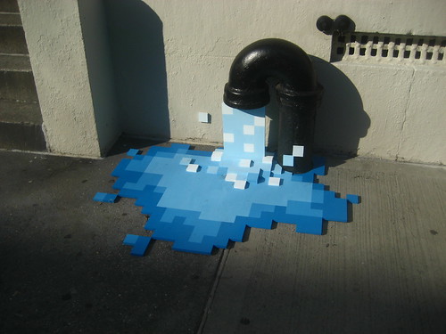
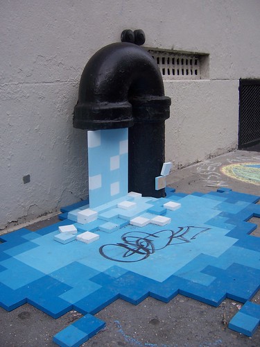
A wonderful instance of hybrid realities. Here, of course, the pixels are materialized through some medium that is not electronic and the hybridity is more about a semantic cross-over from pixel worlds of electronic games to the real world.

Why do I blog this? We normally think of first-life/second-life hybrids, or mixed realities or virtual-physical cross-talk, as connected mixes. For example, augmented realities wherein you see digital overlays through glasses or a screen that are perfectly registered to first-life. As in — hold up this special augmented reality viewer and see digital “heads-up display” indicators of data that has location or place-specific relevance to whatever you are looking at. Hold it up to a supermarket and you can see what the price of milk is inside, or hold it up to an historic building and see tourist information about its historic relevance and stories.

In this example, the cross-talk is completely non-electronic, non-databased, and is all the more compelling for that. It evokes immediately the 8-bit aesthetic and this aspect is whap makes it a “digital” incarnation. Simply wonderful.

If anyone finds out where this is in NYC’s Lower East Side, and who did it — I would be glad to know.

Updates

This just in — evidently it was at 9th Street between 2nd and 3rd Avenues.

Tagged!
Pixel Pour Tagged

Gone!

Pixel Pour Gone

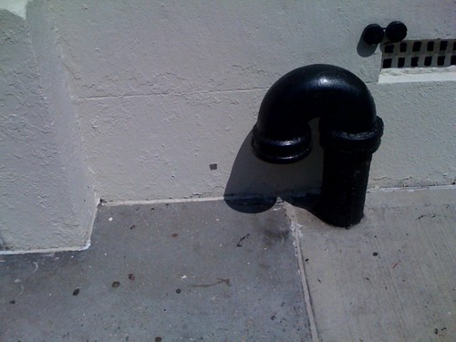
This is doubly interesting here. Now this spigot — which I think is an exhaust for an underground furnace or boiler, or perhaps a way to off-gas fumes that might accumulate under the sidewalk — is a completely different object — not even what it was before. It looks like a drained tap, not an exhaust vent (or whatever it is “really.”) This is the transformative part of that little provocation. Not to over think this street intervention, but it was truly transformative in the sense that it took a mundane, very ordinary, barely existent object and made it resonant. It was a real disruption — not in the sense of causing consternation or harm, but disruption in the sense of opening a hole in space and re-writing reality.

Brilliant.

Okay, back to the usual grumble..

Continue reading Pixel Pour (By Kelly Goeller)

Reverso

20080419_122201

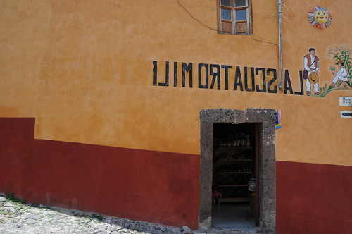
A hand-painted sign marking this restaurant/bar, curious reversed. I puzzled over this — it seemed not particularly in keeping with the generally sensible and utilitarian graphic design of most everything else in San Miguel de Allende. This seemed to have a peculiar sensibility that serves no specific purpose other than to be different and noticeable for being odd.

My best guess for this is that the streets that run left/right in this orientation are steep side streets and not heavily trafficked. The streets running into/out-of the frame are roughly level and would fit more into my category of “main drags.” This restaurant is right at the corner, but the entrance is on the side street. The street that runs perpendicular to this entrance is a one-way, with trafficking flowing away from the entrance. You would not see the restaurant entrance or the sign as you trundle in your Volkswagon or pick-up truck..unless you caught it in your rear-view mirror as you drove away. In this case, the sign is exceptionally utilitarian and sensible.
Continue reading Reverso

Re-Write Infrastructure — Diablitos Instantiated

20080418_142612

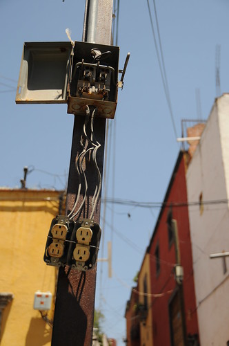
Seen in San Miguel de Allende, a re-routed, altered infrastructures adapted to more convenient, local activities. They are, according to one commentor here, "Diablitos" — little devils. In portugal they are "gato," according to Younghee. Both are idioms for illegally drawn electric cables. Here an overhead mains line is retrofitted with a conventional North American plug to accommodate..? This could easily be a private and perhaps illegal improvisation by an enterprising citizen or perhaps a sanctioned retrofit for temporary access to power by local authorities.
Continue reading Re-Write Infrastructure — Diablitos Instantiated

Territory

20080418_133905

20080418_134031

A cordon of "road turtes" repositioned to define an area for a vendor’s cart of refreshing fruit cups. The road turtles stake out an informal, semi-permanent "home" for the vendor’s cart, but closer to permanent in that they’re nailed into the softer material between the broad cobblestones that make up the street. I found this practice in a couple of instances. Semi-permanence in a bustling context where finding a place to conduct business probably requires some sort of territorial negotiation, including making material adjustments/improvements to public space.

Continue reading Territory