This Is What I Sent — The Ear Freshener PCB Design

Here’s the current PCB CAD for the Ear Freshener. It’s sorta got two sides, but on the top I basically have a carrier for another board that contains the audio codec device. The components around it are all the brains that control track selection from the potentiometer/knob — that people will think, hopefully, is the volume knob, but actually it isn’t.

The gag/provocation is that knob. It’s an audio thing with a knob..but the knob isn’t an on-off thing. Rather, it’s some kind of semantic intensity knob. You turn it “up” and you get more-of. You turn it “down” and you get less-of.

There’s also a spot to hook up a little button. The button switches the Ear Freshener sound idiom. So you can go through the seasons; or cities; or airports.

((We should figure out a good name for the gag/provocations that we always build into our little devices.))

To do this, I’m probably a little over-engineered, maybe. Maybe not. I use two Atmel Attiny25‘s that basically do the track selection through a data port control on the audio codec. Basically counting in binary, with the track selection one doing the low-order bits and the high-order bits selecting the sound idiom you’ll be freshening your earballs to.

There’s also a bit of circuitry for a step-up regulator. I want to run this off of a single, readily available battery cell — AAA or AA. I’m over USB charging for the time being. At least now. The extra crap you need is a headache. Sorta. I guess I just wanted to get back to that thing where your audio devices take a battery. Not that I want more batteries in the world, but the rechargeable ones? They’re fantastic nowadays. Lots of capacity.

You’ll notice there’s a bunch of nothing on the right. I put that there for mechanical mounting of a battery holder for now. I just didn’t want the battery dangling off in nowheresville. This way I can double-sided sticky tape it to for testing and carrying around.

That’s the deal. I sent off the data to AP Circuits for the first time. It was about $40 with shipping for two boards. The boards are about 2.1in by 2.3in, so sorta small. There was a bit of back and forth to get the data they needed, especially for the board outline. This always ends up being something I leave out — my CAM Processor script doesn’t have that layer built in as output. Need to look into that.

Why do I blog this? I need to keep going on making logs of activity for the various projects that go on here, even if it’s a quick note.

Weekending 28012012

Here in Barcelona, we continue fine tuning Quadrigram, with now a meticulous work on the coherence of pre-programmed modules the tool will provide to access, manipulate and visualize data flows. It also means some backstage cleaning and improvements of the engine that supports the visual programming language.

We have also been busy joining forces with our new friends at the user experience & data visualization studio Interactive Things. They have been mandated to produce visualization mobile phone network traffic and we do our best to provide the cleanest and more meaningful pieces of data. Their magic will be presented at Lift 12.

In the meantime, Yuji Yoshimura traveled to Helsingborg, Sweden to present at ENTER2012 a study of the visiting experiences at the Louvre Museum. His paper New tools for studying visitor behaviors in museums: a case study at the Louvre is the result of a collaboration between Universitat Pompeu Fabra, MIT SENSEable City Lab and us. It builds on the data we collected in 2010 to measure hyper-congestion phenomena in the busiest areas of the Louvre.

In Geneva, the week was focused on various projects. It was the last week of teaching at HEAD-Geneva this semester. Last Monday, I gave a course about innovation and usages and another one about design ethnography (which was actually made of students presentation). Tuesday was devoted to meetings in Saint Etienne (France) at Cité du Design, a quite big Design Center located in an old and beautiful manufacture. Then I (Nicolas) gave a presentation there about human-robots interaction (slides are on Slideshare). The rest of the week was spent in meetings with Lift speakers, students (time to discuss their masters thesis!) and watching video material for the current field study about head-mounted displays. The end of this project is pretty soon and we are currently working on the final presentation for the client.

In Los Angeles, Julian was a busy-bee trying to get PCB’s fabricated for the Ear Freshener’s

Pretty Maps – 20×200 Editions

Some of you may have noticed, mostly probably not — but the Laboratory has expanded its ranks. It’s starting to feel like a proper design collective in here. One of the lovely attributes of the people in the Lab are the broad sectors of activity they cover that doesn’t make it seem like they do a zillion different things, but do many things to work though a relatively core set of interests.

Take Aaron Staup Cope. He writes algorithms that tell computers what to do. He makes maps out of paper. He makes maps out of algorithms. He makes you think about the ways that algorithms can do things evocative of map-ness..on paper.

Etc.

What I’ve learned from all of Aaron’s exploits in Dopplr-land, Open Street Maps-land, Walking Maps-land is that maps are dynamic, living things that should never be fixed in their format, style, purpose. They should never be taken for granted — even if the Google Map-ification of the world is doing just this. They should come in a bunch of sizes and shapes and colors and purposes. Etc.

Check out Aaron’s 20×200 Editions of his Pretty Maps. Get yours. I did. LA’ll go on one side of the wall. NYC will go on t’other.

Here’s what they say about Aaron over on 20×200.

For now, let’s set our eyes West, on L.A. County. Like prettymaps (sfba), prettymaps (la) is derived from all sorts of information, from all over the internet. Its translucent layers illuminate information we’re used to relying on maps for–the green lines are OSM roads and paths, and orange marks urban areas as defined by Natural Earth. They also highlight what’s often not seen–the white areas show where people on Flickr have taken pictures. It’s an inverse of a kind of memory-making–a record of where people were looking from instead of what they were looking at, as they sought to remember a specific place and time.

Interaction Awards 2012: Drift Deck for People's Choice

Drift Deck is up for the IxDA Interaction Awards in the “People’s Choice” category. Which isn’t the “Jury’s Choice” but — whatev. It’s the People, so we’re hustling to make you, the People, aware of this chance for you to choose what is the Choice of the People. For Interaction Design Awards.

Please give it a vote.

What makes Drift Deck chooseable? Well — it does something different and provocative in the world of interaction design for the things we do when we’re going/finding. The canon of interaction design for what were once fondly called “maps” is pretty stuck in the mud. Nothing extraordinary going on there that you wouldn’t expect from the next generation of mapping things.

What we did with Drift Deck was look at the world a little sideways and imagine a world in which the map was a bit dynamic and the act of going/finding was a bit less, you know — purposeful in a tedious, dogmatic sort of way.

It’s an otherworldly map app, if you will. Drift Deck is meant partly to be pragmatic for those times I find myself somewhere and have no idea what to do if I have an hour to wander about. (Sometimes we all need a bit of a start, or a script to follow.) And of course, it’s playful in it’s nod to the Situationists and their experiments with re-imagining urban space.

The principles led directly from the Drift Deck: Analog Edition that you can find here and more here.

These are the kinds of projects we do here. They’re not “Conceptual.” That cheapens the hard work that goes into them. We write code. We do illustrations of things that get properly printed on big Heidelberg presses. We put together electrical components and have printed circuit boards made and populated with parts to create new sorts of interaction rituals, new sorts of devices — new things that are different from the old things. These are ways of evolving the ordinary to make possibily otherworldly, extraordinary things. They come from ideas that we then evolve into material form so that the ideas can be held and dropped and switched up, on and off to be understood properly.

So, just to be clear — Drift Deck isn’t a conceptual bit of wankery. It’s a thing that got made. Ideas turned into lines of code turned into compiled bytecode. Oh, look! It’s running on my iPhone! Doesn’t feel very concept-y to me.
Continue reading Interaction Awards 2012: Drift Deck for People's Choice

Weekending 21012012

Fabien and Nicolas went to Madrid for a workshop at BBVA innovation about Smart Cities. Organized by Urbanscale (and more specifically by Jeff Kirsh, Adam Greenfield and Leah Meisterlin), it focused on opportunities to use networked data for the client. It basically followed up on the previous work we have done with this bank last year.

The workshop went well, with a combination of short talks, field observations (qualitative and quantitative) and discussions. This workshop was followed by an open session entitled “Beyond Smart Cities” at BBVA’s Innovation Center, with Adam Greenfield, myself (Nicolas) and Kevin Slavin. My slides are on Slideshare. There’s a write-up of the event at the following URL. As described by Kevin on his tumblog, “As surely as it feels like a movement has a name (“Smart Cities”) it also feels like the critique of said movement is collectively more articulate and persuasive. Now the key is to find language to describe what it should be, to go beyond popping the balloon and figuring out what the party really needs.“.

Here in Los Angeles Julian has been hard at work puzzling over an incredibly simple problem of making a little audio device called an Ear Freshener avoid having a power switch and a volume knob. He thinks the solution was intimated by a generous comment poster who told him to slap a couple of transistors in strategic locations in the circuit. So he tried that. It seems to make sense. Hopefully it won’t destroy everything.

Related to this were discussions about the principles behind/between things that make sound — such as sound should just come out of them, rather than be all fussy with settings, configurations and network connections. And that tied into an ongoing thinking thing about latter day considerations about “simplicity”, “one thing done well” and skinny Williamsburg/Brick Lane 23 year olds with full beards who’ve done nothing to deserve a full beard but rock Holgas and fetishize film/vinyl/casette tapes fixed-gear bikes and the like. Thus, we’ve been working on a short essay on the topic of the Cult of the Analog Cult. Or something like that.

Meanwhile, on the East side of L.A. Jayne (with Kickstarter funding in hand) has been getting back to making new Portals. They’re still in the physical draft/sketch phase of things but making the upgrade from end-table-foam-core to mdf feels quite satisfying. The insides are still very rough and she’s still getting started with hooking up the magic/technology bits, but at least now a pair of Portal boxes exist in the world, ready to be filled with interactive goodies.

Continue reading Weekending 21012012

privatesquare

I’ve been working on, and testing out, a new thing for the last couple of weeks. It is called privatesquare. It is a pretty simple web application that manages a private database of foursquare check-ins. It uses foursquare itself as a login service and also queries foursquare for nearby locations. The application uses the built-in geolocation hooks in the web browser to figure out what “nearby” means (which sometimes brings the weird but we’ll get to that later). On some levels it’s nothing more than a glorified check-in application. Except for two things:

First, when you do check in the data is stored in a local database you control. Check-ins can be sent on to foursquare (and again re-broadcast to Twitter, etc. or to your followers or just “off the grid”) but the important part is: They don’t have to be. As much as this screenshot of my activity on foursquare cracks me up it’s not actually representative of my life and suggests a particular kind of self-censorship. I don’t tell foursquare about a lot of stuff simply because I’m not comfortable putting that data in to their sandbox. So as much as anything privatesquare is about making a place to file those things away safely for future consideration. A kind of personal zone of safekeeping.

Second, privatesquare has its own internal taxonomy of event-iness. It is:

  • I am here
  • I was there
  • I want to go there
  • again
  • again again
  • again maybe
  • again never

The first item maps the easiest to foursquare’s model of “checking in”. It is what it says on the tin. The second is the thing that you can’t do on foursquare but everyone does anyway: Checking in after the fact if only to have a personal record of things you’ve done. This just makes the act explicit. The third is not unlike the “lists” feature that was introduced on foursquare, last year. It is also the one flavour of check-in that is not forwarded on foursquare. I suppose I could figure out how to add things to a list, but I haven’t yet.

The last four are a long overdue love song to Chris Heathcote and a plaintive desire for something like the Dopplr Social Atlas (not to mention Dopplr itself) but one that isn’t held hostage to the seeming neglect of its parent company, Nokia. Once upon a time, I went to Helsinki for Important Business Meetings ™ involving Flickr and Nokia while Chris still lived and worked in Finland. I asked him where I should eat during my stay and he sent back a long list of restaurants (all lunch places, I think) each flagged as “again”, “againagain” and so on.

The Social Atlas was a feature added somewhere around year two at Dopplr and is a list of places to eat at, stay in or explore. Places are added by the users and organized by city. It remains a lovely example of how to do this sort of thing though there’s not much going on there these days. You can flag as place as somewhere you’ve been, somewhere you like but not someplace you dislike. Which always seemed like a shame because I would find it helpful to know that someone I know and trust dislikes a restaurant in London as much as I despise Herbivore, in San Francisco.

Chris’ is a genius classification system. It does not get lost in the weeds of weird similes and absurd metaphors (wine tasting, anyone?) and by and large captures the experience of asking someone where you should go to eat in a place you’re not all that familiar with. It is also entirely bound to the relationship of the person telling and the person asking. It is not a recommendation engine.

It assumes that although two people would both do something again, or do it enthusiastically (“againagain”), they are just as likely not to do the same thing. Those details are left out of the equation (read: the computer) because it will never be able to account for the subtlety and history of experience between two people.

The “again” ratings (markings, like on a tree?) are an odd lot in that they don’t go out of there way to distinguish themselves in time. Is it just an indication that you went there some time in the past and want some record of the event? Or does it mean that you wait to check-in until you’ve decided how you feel about it? Or do you check-in and then say whether it was good or not?

I am very consciously punting on these questions for the time being in order to see how the thing actually gets used and what I find myself wishing it did. I suspect that most of the confusion that may be generated by these kinds of blurry and overlapping assignments can be overcome by displaying dates and times clearly.

It is worth nothing that privatesquare does almost nothing that foursquare doesn’t already do, and better. privatesquare is not meant to replace foursquare but is part of an on-going exploration of the hows and whens and whys of backing up centralized services with bespoke shadow, or parallel, implementations of the service itself. It is designed to be built and run by individuals or as a managed service for small groups of people who know and trust one another.

privatesquare remains a work in progress and I am not planning to run it as a public service any time soon but it is available as an open-source project, on Github, that you can run yourself:

http://straup.github.com/privatesquare/

The documentation and installation process still remains out of bounds for most people who don’t self-identify with the nerd squad but that will sort itself out over time. For what it’s worth my copy is running on insert a vanilla shared web-hosting provider that can run WordPress here so that’s a promising start, I think.

The site is built on top of Flamework, which is a whiteroom re-implimentation of the core libraries and tools that a bunch of ex-Flickr engineers used to build Flickr, the same way that parallel-flickr is. Meaning that some part of all these projects is just putting Flamework through its paces to find the stress points and to better understand the hows and whats of the process (installation, documentation, gotchas and so on) should be. And like parallel-flickr “it ain’t pretty or classy (yet) but it does work.”

Here’s an unordered list of the things privatesquare still doesn’t do:

  • Sync with the foursquare API. For a whole bunch of reasons you might find yourself checking in to foursquare using another client application. privatesquare should be able to fetch and merge all those check-ins that it didn’t handle first.

  • The “nearest linear” cell-tower problem. This is one of those problems that gives credence to all the hyperbolic hand-waving done by companies driving around mapping latitude and longitude coordinates for wifi networks. Without this data determining geographic location for a web application running on a phone is often handled by assuming that whatever cell tower your phone is connected to is “good enough”. Sometimes it is but just as often it’s not. You have a line-of-sight, a signal, back to a cell tower that exceeds the maximum radius in which to query for venues. Because your phone thinks you are somewhere else you always end up falling outside the hula-hoop of places that are actually near you.

    The map that’s displayed with venue listings (there’s a screenshot at the bottom of this post) is one possible alternative. As I write this the map isn’t responsive. It’s just there to try and help you understand why a particular list of places was chosen. Eventually you should be able to re-center the map to a given location and use that when looking up nearby venues, for those times when your web browser can’t figure out who is on first by itself.

  • There is no ability to delete (or undo) check-ins.

  • There is no ability to add new venues. Nor is there any way to record events offline or when you don’t have a network connection. I’m not sure whether either of these will ever happen. At the moment there are just too many other things going on. Beyond that I sort of like the fact that privatesquare doesn’t try to do everything.

  • There is no way to distinguish duplicate venues (same name, different ID).

  • Export, which is probably the single most important thing to add in the short-term. This includes a plain old web view of past check-ins.

  • Pages for venues, though I’m really sure what I was thinking when I was blocking out this blog post and wrote that. It’s probably related to what I wrote about cities (below) and the idea that the really interesting aspect of a venue page is seeing a user’s arc of again-iness for that spot over time.

  • Pages for cities. The other nice thing that privatesquare does when you check-in is “reverse geocode” the location of the venue and store the Where On Earth (WOE) ID of the city the venue is in. Which will make it possible to build something that looks like the Social Atlas. For example, if you were going to Montréal I might send you a link to all my check-ins in that city (WOE ID 3534) tagged “again”, “againagain” and “I want to go there”.

In a way privatesquare is just the foursquare version of parallel-flickr: a tool to backup your check-ins, albeit pre-emptively. Which is sort of an interesting idea all on its own. The differences between the two applications are that parallel-flickr doesn’t let you upload photos (yet) and privatesquare doesn’t really provide any mechanism for sharing your check-ins with a restricted set of users. Currently, it’s all or nothing (read: “nothing” because the code forces you to be logged in before you can see anything).

I am also thinking about forking; piggybacking; hijacking (piggyjacking?) some or all of the work that Stamen has done with the Dotspotting project. For two reasons: First they are both built on Flamework so it ought to be possible to make them hold hands without too much fuss. Second, there’s a nice un-intended feature in the way the code for browser things and the code for database things handle the data that people upload to the site: HTML tables.

In theory (and I haven’t tested this out yet) anything that can generate an HTML table, with the relevant semantic attributes, and send it to the browser along with the relevant JavaScript code will be able to take advantage of all the lovely display and interaction work that Sean Connelley and Shawn Allen did for Dotspotting. Just like that!

The reason this all works is that when we started writing Dotspotting it was during a time when Flamework was still pretty green and lacking any code for doing API delegation or authentication. Rather than trying to shave that particular yak we simply opted to use the HTML sent to the browser and jQuery as a kind of internal good-enough-for-now API.

Once it’s sorted for privatesquare it should be easy enough to swap out the table parsing code with proper API calls, now that Flamework has its own API delegation code, and then it could be dropped in to parallel-flickr as an alternative view of your geotagged photos.

It’s all still magic-pony talk and none of it addresses mobile (tiny) web browsers or anything but a pretty conventional linear paginated view of the data (no clustering or other fancy stuff) but, still: This pleases me.

In the short-term I’m going to continue to focus primarily on the data input side of things trying to make it as easy and fast as possible to record the data along with the simplest of CSV or GeoJSON exports, so that you could at least look at your data in tools like Dotspotting or Show Me the GeoJSON respectively.

And if I can get that part squared then it also might be possible to re-use some of the same work to make things like Airport Timer easier since the two projects are each a kind of side-car to the other, when you stop and think about it.

Weekending 15012012

I spent quite a deal of time in workshops evolving some ideas around location and tracking. We had Marc Tuters come by the studio. Marc’s written and created quite a number of locative media projects over perhaps the last decade. Along with that, he’s written some of the canonical bits of text on the topic, including The Locative Commons and Beyond Locative Media: Giving Shape to the Internet of Things with Kazys Varnelis.

The talk/discussion that Marc led weaved through a forthcoming essay called “From Mannerist Situationism to Situated Media that he wrote that will appear in a forthcoming special issue of Convergence on Locative Media.

Will Carter also came in to talk about his thesis project, Location33. Together we got a nice overview of the state of the state of where and why related to Locative Media.

There was a *little time for noodling on the Ear Freshener project which really needs to get a PCB done ASAP.

That’s it from Los Angeles.

Continue reading Weekending 15012012

Sound Should Just Come Out Of It

I think going forward I should do a better job of talking around what we’re working on from a technical point of view, until such time as it’s okay to talk about what we’re doing from a principles, rituals and practices point of view. And, also — sometimes in the thick of a design-making-schematic-and-hot-air-baking fire-fight, I do something that I”ll likely have to do again, but without a good, thorough practice of writing things down to remember I, like..forget.

Here’s the thing. I’m making a little tiny audio device. It’s tiny and meant to be simple to use. Like Russell taught me — the thing about audio? You should be able to just turn it on and sound comes out.

I like that rule. That’s what radios used to do before all the knobs, settings, configuration preferences, long vertical scrollable lists and Internet connections fucked things up. You turn the little serrated rotary dial and *click* — radio sound. At worse? Static. But sound started. No swipes. No multi-finger gestures. No tyranny of the 10,000 hours of music & sound in the palm of your hand..and no idea what you want to hear.

There’s something lovely about that that is just pragmatic from an IxD and UX design point of view. I’m not being nostalgic.

So — translating this principle and making it active and not just a sweet, essentialist sounding statement into the guts of the things we’re making, I spent most of yesterday pondering how to make Ear Freshener exhibit and embody and be an exemplar of this design rule. Even to the point of saying, okay..no on-off switch.

Huh?

Yeah, well — the Ear Freshener has the advantage of being a plug-y thing. No speaker. It’s an intimate audio headphone thing. You’d only expect sound out of it when you plug in your headphones. Otherwise — it’s just a little thing that’s quite opaque. There’s only the tell-tale 3.5mm hole that indicates — audio/sound/plug-in-y-ness.

So — simple enough. I decided that plugging-in should equal sound-coming-out. That means that the plug action should turn the actual electronics on. In the world of audio connectors, CUI, Inc. is the go-to operation — along with what I’m sure is a thriving, teeming “ecosystem” of knock-off competitors who may even produce a superior product. They make all sorts of audio connectors for the world of audio devices. There’s a collection of them that have more than the three connectors that are necessary for a Tip Ring Sleeve style stereo audio signal, including the SJ-43614 which is a 3.5mm plug with four signals. The extra one switches from floating (not connected to anything) to ground (or the “sleeve” of the connector, which is normally connected to ground) when you plug a plug into it.

Brilliant. Something changes when you plug the plug into the SJ-43614. One of those signals on that connector gets shorted to the GND rail of the circuit.

Now..what to do with that state change in order to turn the whole circuit on and make sound come out of it with no fuss, no muss.

I pondered and scritched and screwed my face and looked for the answer somewhere on the ceiling over there. I thought of lots of overly-complicated things (as it turns out..in hindsight..) like using a low-power comparator to activate the chip-enable pin of the little 200mA step-up switching regulator I’m using so I can run the circuit off a single 1.5V battery cell.

In that over-designed scenario the NCP1402 step-up regulator is effectively the power supply for the circuit, which wants at least 3.0 volts to operate properly (and draws about 40mA). I can get an NCP1402 hard-wired to output 3.3v, although I may get the 5v version to have a bit more headroom with volume. In any case, this chip is fab cause you can take a little 1.5v cell and it’ll tune up the voltage. Of course, it’s not 100% efficient. Nominally, it’s about 80-ish% efficient at 40mA. So..you lose a little, but you can’t get something (5v) for nothing (1.5v) without giving up something in the trade.

NCP1402SN50T1 efficiency versus output current


So, I have a 1.5v battery of some sort which sits behind the NCP1402. The NCP1402 has an active high chip-enable (CE) pin that turns the chip on — effectively powering the rest of the Ear Freshener circuit. In my overly-complicated scenario, I figured I could use a comparator to sense when the 3.5mm plug had been plugged-into because that one switched pin would go from floating to ground. If I had a simple little 10k resistor between the positive 1.5v side of the battery, the comparator inputs could go on either side of that resistor, with the IN- of the comparator on the side of the resistor that would get shorted to ground when the plug is plugged in. And then the IN+ of the comparator would go on the side of the resistor that is connected directly to the positive side of the 1.5v battery. When the plug goes in, the IN- of the comparator goes to GND, the 10k resistor has a little, negligible-y minuscule current draw and the voltage difference between IN- and IN+ causes the output of the comparator to saturate to pretty close to IN+, or +1.5v. The NCP1402 chip enable would trigger (specs say anthing about 0.8v means “enable” and anything below 0.3v means “disable”) and the whole thing would turn on.

Click the image to expand it and make it easier to read. This is the lousy, over-designed circuit.


How convolutedly and moronically clever is that, especially when you stop to think (as I did, after proudly building the schematic) that you could just use that pin from the plug shorting to ground as a way to close the GND rail of the whole circuit. I mean..if you disconnect the NCP1402 from GND, it should turn off. Basically, it’d have no complete, closed, power supply circuit. It’s as if you pulled the battery out — or half of the battery out. Or ripped out the ground wire.

Anyway. It was clever to get all busy with a comparator and stuff. Simple’s better, though.

This is the simple, no-brainer one that eliminates the need for several additional components.


That’s it. I like the principle and I like even better the fact that I can translate a lovely little design principle into action — materialize it in a circuit that exhibits a fun little unassuming behavior. I can imagine this’d be a bit like wondering if the light stays on in the fridge after closing the door, you know?

So sound stops coming out, the circuit powers down and you no longer need an on-off switch. Stop listening? Turn off. So much nicer than long-press, id’nt it?

Why do I blog this? Cause I need to capture a bit more about the production of this little Ear Freshener-y gem.

Update


Here’s my update on the power circuit. I hope it works. I added two transistors in place of the comparator. The idea here is that the transistor on the right would switch the CE of the step-up switching regulator. When the base goes low — i.e. when the 3.5mm plug is plugged in — the switch opens and CE gets switched to roughly VBATT and enables the step-up regulator. For the transistor on the left, plugging in opens the transistor and VBATT gets connected to the step-up regulator and it, like..steps-up VBATT to VCC. When the plug gets pulled out and floats at VBATT, the two transistors saturate and are on. So on the right, CE is at Vce or effectively ground and shuts the step-up regulator off. The transistor on the left does similar and VBATT drops over R6 and VBATT_SWITCHED is at GND and there’s no longer any supply to step-up, even if the step-up regulator were enabled.

That’s the idea.

We’ll see. I haven’t computed the values for the discretes around the transistors as of yet.

Related — I’ve just sent off the PCB to get fabricated. It’ll be a 2-off prototype. I’m using AP Circuits for the first time because my usual go-to guys Gold Phoenix are off for the Chinese New Year and I need to get this done for some building & testing next week.


But I think I mucked up the CAM data files I sent them, which appear to be slightly different from Gold Phoenix. They want other stuff, like the NC Tool list which I’ve never sent to Gold Phoenix. I guess we’ll see what they say.
Continue reading Sound Should Just Come Out Of It

Ceci n'est pas une caméra

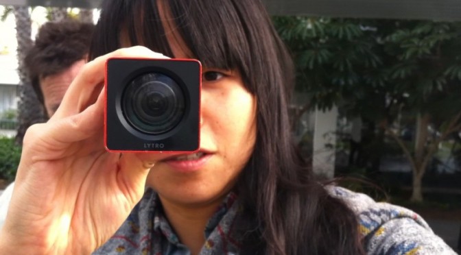
Yesterday while leaving the LA Photo exhibition in Santa Monica — a kind of catch-all retail event of photography through the commercial curatorial world of private galleries — I happened across a small scrum of people with anodized extruded rectangles holding them close to bush leaves, flowers and tiny bits of dirt on the ground. Lytro was in town somehow — or stalking about doing a bit of half-assed DIY guerrilla marketing.

There. I’m a Lytro hater. And maybe I’m getting old and cranky and beginning to catch myself thinkign — “I just don’t understand what kids are up to these days..” That’s a sign of something, I suppose. Oftentimes I can riddle it through and understand, even if I wouldn’t do the “whatever it is” myself.

Nevertheless, I don’t understand what Lytro‘s doing. Let me try and riddle it through.

For those of you, unlike me, who don’t scour the networks for any sign or hint of an evolution in photography and image making generally, you may not know about Lytro’s weirdly optimistic talk about “light field imaging” techniques that is meant to revolutionize photography.

Well, this is it. Effectively, a proper bit of patent gold that allows one to capture a light field (their stoopid way of basically saying “image” or “photograph”) and derive the path of every light ray in such a way that you can focus *after you’ve captured your light field. What that means practically is that you never have to worry about focus ever again, and you can recompose the focus point forever afterwards. So — all that lovely, soft, bokeh (nez depth of field) that has come to mean “professional” photography because you previously could only get nice, lovely, soft depth of field with an expensive, “fast” lens and a big sensor? Well — now you can walk around with an anodized extruded rectangular tube and get it as well. It’ll cost you a bit less than that fast lens would’ve, and you get all the advantages of touching a little postage stamp sized screen to control the camera, and you can run your finger along a side of the rectangle to access zoom controls, and — best of all — you can shove the extruded rectangle at your friends and capture *their light field.


Seriously though — if I were to do a less snarky critique, I’d say that they a few things all turned around here.

First, they missed a serious opportunity to play up on the apparent fascination with analog, or retro-analog, or analog-done-digital. People seem to be in love with cameras that are digital, but harken back clearly to pre-digital photography. I’m talking about the industrial design mostly — but cameras like the Fuji X100 are beautiful, digital and, in their form, signal image-making/image-taking. Things like Instagram filters — whatever you may think about them — signal back to the vagaries and delights of analog film chemistry and the fun of processing in the dark room to achieve specific tonal and visual styles. There’s something about the analog that’s come back. That’s a thing. Perhaps its digital getting more thoughtful or poetic or nostalgic and then we’ll move onto a new, new comfort zone with our gizmos and gadgets and they’ll become less fetish things than lovely little ways to capture and share our lives with pleasing accents and visual stylings. Pixel-perfect will mean something else. Roughness and grit will be an aesthetic.


The extruded rounded rectangle isn’t bad, but it’s not so much camera as it is telescope. And if it’s signaling telescope, I’ll want to hold the thing up flush to my eyebeall, like a pirate or sea captain. And that’s fun as well. More fun, I’d suggest, than holding it out like I was getting ready to chuck a spear at someone.

The fact that I have to hold it several inches so I can pull focus on the display? Well, that’s several inches away from my subject and that little physical alignment schema of photographer —> intrusive-object —> subject is a bad set up. It ruins the intimacy of imaging making. I think that’s well-appreciated if thoroughly ignored aspect of the history of the camera design that the viewfinder makes a difference in the aesthetic and compositional outcome of picture taking. That’s a little bit of lovely, low-hanging fruit in the IxD possibilities for the future of image-making. It’s less a technology-feature, than a behavior feature that can be enabled by some thoughtful collaboration amongst design+technology.

The posture some folks take now of holding their camera out at nearly arms length to compose using the LCD screen on the back of many cameras? That’s bad photography form. You’re taking an image of what your eye sees, not what your camera sees. The intrusion of the visual surround that your peripheral vision naturally takes in when you don’t compose with your eye up to the viewfinder changes the way you compose and how you compose. I’m not saying there are rules, but there are better practices for the rituals of photography that lead to better photography and better photographers. Leastways — that’s what I think. It’s why I prefer an SLR or a rangefinder over a little consumer camera with no viewfinder, or a gesture to the viewfinder that’s barely usable.

You should try taking an image using the viewfinder if your camera has one and then never turn back to the LCD. Use the LCD for image sharing — that’s fine. Or for checking your exposure — that’s awesome and maybe one of the best advantages of the LCD. But to compose using the LCD, you’ve effectively lost the advance that the viewfinder brought to photography, which is to compose the view and do so in a way that makes that composition intimate to the photographers eye. Everything around is removed and blocked out. There are no visual distractions. What you see is basically what you get. (Some viewfinders don’t have 100% coverage, but they are typically quite close.) When the consumer camera manufacturers introduced thin cameras they had to do away with all the optics that allowed the image coming through the lens to do a couple of bends and then go to the photographers eye. And, anyway — all that is extra material, weight, glass, etc. So people started taking photographs by, ironically, moving the camera further away from themselves forever changing photography.

Well, that’s okay. Things change. I like looking through a viewfinder and grouse whenever I see people not using their viewfinder. And, I suppose I don’t use one many times when taking snaps with the happy-snappy or the camera on my phone. Whatever.

The point is that Lytro missed a fab opportunity to redo that compositional gaff that a dozen years of consumer electronics innovation dismissed out of hand.

That’s the Industrial Design gaff. There’s more.

Then there’s the interface. To *zoom you slide your finger left-and-right along an invisible bit of touch-sensitive zone on the gray plastic-rubber-y bit on the near end of the extruded tubular rectangle. Like..what? Okay — I know we’re all into touch, so Lytro can be forgiven for that. But — hold on? Isn’t zoom like..bring it closer; move it further away? Shouldn’t that be sliding towards me or away from me? Or, wait — I get it. The zoom gesture people may be used to is the circular turning of a traditional glass lens. Zoom out by turning clockwise. Zoom in by turning counter-clockwise. Well here I guess you’re sort of turning from the top of the barrel/rectangle — only you’re not turning, you’re finger-sliding left and right. So, I have no idea how this one came about. While a mechanical interface of some sort was probably not considered practical given the production requirements, tooling, integration and all that — I think this begs for either a telescoping zoom feature, or a mechanical rotating zoom feature. At a minimum, a rotating gesture or a pull-in/pull-out gesture if they’re all hopped up on virtual interfaces mimicking their precedents using things like capacitive touch.

Me? I’ve been into manual focus lately. It’s a good, fun, creative challenge. And even manual exposure control. Not to be nostalgic and old-school-y — it’s just fun, especially when you get it right. (Have I game-ified photography? N’ach.) Now with Lytro, the fact that I can focus forever after I’ve taken the image means I’ve now introduced a shit-ton of extra stuff I’ll end up doing after I taken the image, as if I don’t already have a shit-ton of extra stuff I end up doing because the “tools” that were supposed to make things easier (they do, sorta) allow me to do a shit-ton of extra stuff that I inevitably end up doing just cause the tools say I can. And now there’ll be more? Fab.

And further related to the interface is the fact that they introduced a new dilemma — how to view the image. Just as we got quite comfortable with our browsers being able to see images and videos without having to download and install whacky plug-ins, Lytro reverses all that. Because the Lytro light field image is weird, it’s not a JPEG or something so browsers and image viewers have no idea how to show the data unless you tell them how — by installing something/installing/maintaining else, which isn’t cool.

And now I suspect we’ll see a world of images where people are trying to do Lytro-y things like stand in close to squirrels so you can fuck around with the focus and be, like..oooOOooh..cool.

I don’t want to be cranky and crotchity about it, but I take a bit of pride in composing and developing the technical-creative skills to have a good idea as to what my image is going to look like based on aperture and shutter speed and all that. I know Lytro is coming from a good place. They have some cool technology and, like..what do you do if you developed cool technology at Stanford? You spin it off and assume the rest of the world *has to want it, even if it is just a gimmick disguised as a whole camera. Really, this should just be a little twiddle feature of a proper camera, at best — not a camera itself. It’s the classic technologist-engineer-inventor-genius knee-jerk reaction to come up with a fancy new gizmo-y gimmick that looks a bit like a door knob and then put a whole house around it and then say — “hey, check it out! i’ve reinvented the house!”

*shrug.

Why do I blog this? Cause I get frustrated when engineer-oriented folks try to design things without thinking about the history, legacy, existing interaction rituals, behaviors and relevancy to normal humans and basically make things for themselves, which is fine — but then don’t think for a minute about the world outside of the square mile around Palo Alto. It could be so much better if ideas like this were workshopped, evolved, developed to understand in a more complete way what “light field imaging” could be besides something that claims camera-ness in a shitbox form-factor with an objectionable sharing ritual and (probably — all indications suggest as much) a pathetic resolution/mega-pixel count.

A Few Things The Laboratory Did In 2011

LOS ANGELES

Projects
* It was a year of mostly audio creations ahead and around of Project Audio for Nokia. Some very exciting little bits of design, fiction and design, fact. These will continue into 2012 with some more public than others, necessarily. The over-arching theme of creating a renaissance of Audio UX across the board and to say — listen, we’ve been very screen-y over the last, what? 50 years. Our screens a nagging jealous things. What about our ears? Has design fallen short in this regard and actually is design incomplete insofar as it relies so heavily on what we see and what we touch, sit in and so forth without regard to the studied appreciation and elevation of what and how we hear? Effectively, sound is an under-appreciated and, from within the canon of even just UX and Interaction Design — basically ignominiously ignored.
* Made a couple of little electronic hardware things, but not as much as I would’ve liked. An incomplete portable audio mixer; an incomplete portable Ear Freshener. Those’ll go into the 2012 pile.
* We worked on a bit of Radio Design Fiction for Project Audio at Nokia. The conceit was to work with and understand radio as something that possibly everyone did and had — rather than centralized broadcasting, such as big commercial radio stations — everyone had a radio and possibly radio was a viable and successful alternative to personal communication such that point-to-point communication (e.g. cell phones) never took off because a bunch of powerful men met in a high-desert compound in New Mexico and conspired to make Zenith and RCA the largest corporations in the world. Cellular never takes off and AT&T becomes a little lump of spent coal in the global economic smelter.

Presentations & Workshops
* At the beginning of the year was the Microsoft Social Computing Symposium. I went, and mostly listened. I think I got happily wrangled into facilitating something.
* There was the 4S conference where I presented on a panel to discuss the relationship between science, fact and fiction. David Kirby was on the panel, so that was tons of fun. Discovered this book: Science Fiction and Computing: Essays on Interlinked Domains, but then realized I had it already.
* I participated in a fun panel discussion for the V2__ Design Fiction Workshop in Rotterdam
* I went to The Overlap un-conference outside of Santa Cruz
* I went to Interaction 11 to see about the world of interaction design.
* Australian Broadcast Corporation interview on Design Fiction — Transcript and here’s the actual audio and stuff.
* Interview on Vice – Talking to the future humans with Kevin Holmes.
* Interview on Steve Portigal’s The Omni Project
* UX Week 2011 Design Fiction Workshop
* Fabulous Project Audio workshop in London with the fine folks at Really Interesting Group.
* And there was Thrilling Wonder Stories event at the Architectural Association in London in October.

That’s all the stuff that I can remember right now. I’ll add to it for the Laboratory log as things return to my memory.

BARCELONA

Projects
Our main investigation line on network data (byproducts of digital activity) brought us in direct contact with the different actors of the urban environment (e.g. city authorities, service providers, space managers, citizens) jointly exploring the opportunities in exploiting this new type of living material. Our projects strategically split into self-supported initiatives initiatives and client works with a common objective to provide new tools to qualify the built environment and produce new insights for its actors. We experimented complementary approaches with observations and prototyping mutually informing our practice. For instance, along our investigations we like to employ fast-prototyped solutions (see Sketching with Data) to provoke and uncover unexpected trails and share insights with tangible elements such as interactive visualizations and animation. We found it to be an essential mean to engage the often heterogeneous teams that deal with network data around a shared language. Practically, we teamed up with:

* A real-time traffic information provider to produce innovative indicators and interactive visualizations that profile the traffic on key road segments.

* A multinational retail bank to co-create its role in the networked city of the near future with a mix of workshops and tangible results on how bank data are sources of novel services

* A large exhibition and convention center to perform audits based on sensor data to rethink the way they manage and sells their spaces.

* A mobile phone operator and a city council to measure the pulse at different parts of the city from its cellphone network activity and extract value for both city governance and new services for citizens and mobile customers.

* elephant path is a pet project to explore the actual implementation of a social navigation service based on social network data. Would love to develop it more, automate it and port it to mobile. It won the 2nd price at the MiniMax Mapping contest.

Product
The second part of the year was also dedicated to collaborating with our friends at Bestiario to land a product that provides tools for individuals and organizations to explore and communicated with (big) data. Our role consists in supporting Bestiario in matching market demand with product specifications, orchestrating the design of the user experience and steering the technical developments. Quadrigram has integrated now our data science toolbox.

Presentations
* After staying out of the stage for most of the year (expect a lecture at ENSCI in Paris), I entered the polishing phase on the work with data with a talk at the Smart City World Congress.

Publications
* Our friends at Groupe Chronos kindly invited us to participate to an issue of the Revue Urbanism. We contributed with a piece on the ‘domestication’ of the digital city. I also wrote a text for Manual Lima’s recent book Visual Complexity. The text was not published eventually, but I appreciated the opportunity to write about my domain for a new audience.

We have been actively collaborating with academic entities such as:

* Yuji Yoshimura at UPF on a follow-up investigation of our study of hyper-congestion at the Louvre. The first fruit of this collaboration that also involved Carlo Ratti at MIT has been published in the ENTER2012 conference proceedings: New tools for studying visitor behaviours in museums: a case study at the Louvre
* Jennifer Dunnam at MIT for which we collected Flick data used in her Matching Markets project.
* Francisco Pereira at MIT for the article Crowdsensing in the web: analyzing the citizen experience in the urban space published in the book From Social Butterfly to Engaged Citizen.
* Boris Beaude at EPFL who helped us run a the co-creation workshop on open municipal data at Lift11
* Bernd Resch at University of Osnabrueck who spent endless hours developing and run models for our specific needs for spatial data analysis

and studios and individuals:
* Urbanscale for their effective and beautifully crafted maps
* Olivier Plante who designed Elephant Path
* Bestiario, the team behind Quadrigram
* Brava, our german graphic designers

GENEVA

Projects
* Three field studies about the appropriation of various digital technologies: Shadow Cities (a location-based game), 3D interfaces on mobile displays, the use of head-mounted displays in public settings. While the first one has been conducted internally (and will result in a presentation at the pre-ICA conference), the two others have been conducted for a French laboratory in Grenoble. Although field research about this has been conducted in 2011, it’s quite sure that the insights we collected in these 3 projects will be turned into various deliverables (speech, articles, report…).
* Interestingly, the Geneva bureau has more and more request for projects out of the digital sphere. This year we worked with a cooking appliance manufacturer, a coffee machine company and a electricity utility on various things ranging from new product development (the near future of …) to co-creation workshops or training the R&D team to deploy design research approaches (based on ethnography).
* I also took part to the “Streets of BBVA” project with Fabien, contribution to the workshop series about the use of networked data for a spanish bank.
* My second book, about the recurring failure of digital products, has been released in French. It eventually leads to various interviews and speeches (See below).
* For Imaginove, a cluster of new media companies in France, I organized a series of lectures and workshops about digital technologies.
* The game controller project is slowly moving forward (discussion with editors, writing, drawings…). Laurent Bolli and myself not only work on the book but there will be also an exhibit at the Swiss Museum of Science Fiction (planned for March 2012).
* I wrote a research grant with Boris Beaude (Choros, EPFL) about the role of networked data in social sciences. It’s a quite big project (3 years long!) and we’ll have the answer by April 2011.

Various speeches and workshops
* Des usages au design: comprendre les utilisateurs pour améliorer les produits, Talent Days, December 1, Lyon, France.
* Panelist at Swiss Design Network Symposium 2011, November 25, Geneva.
* Mobile and location-based serious games? At Serious Game Expo, November 22, Lyon, France.
* Les flops technologiques, ENSCI, PAris, November 17.
* My interaction with “interactions” in interaction design, ixda Paris, November 16.
* User-Centered Design in Video Games: Investigating Gestural Interfaces Appropriation, World Usability Day, Geneva, November 10, 2011.
* Fail fast. Learn. Move on, Netzzunft, Zürich, October 27.
* Wrong is the new right, NEXT 2011, Aarhus, Denmark, August 31.
* Robot fictions: entertainment cultures and engineering research entanglements, Secret Robot House event, Hatfield,, UK June 16.
* Tracing the past of interfaces to envision their future, Yverdon, June 9.
* Traces and hybridization University of the Arts, London, June 19.
* PostGUI: upcoming territories for interaction design, Festival Siana, Evry, May 12.
* The evolution of social software, April 7, Lyon, France.
* De l’ethnographie au game design, Brownbag Tecfa, April 15, Geneva
* interfaces & interactions for the future” Creative Center, April 8, Montreux.
“The evolution of social software”, April 7, Lyon, France. Gamification Lift@home, March 3, Lyon.
* Smart Cities workshop with Vlad Trifa and Fabien Girardin, Lift11, Geneva, Switzerland
* Culture et numérique : la nécessité du design, L’Atelier Français, January 27, Paris, France.

Teaching
* At HEAD-Geneva, at masters level, I taught a semester-long class about user-centered design (how to apply field research in a design project) for two semesters. This fall, I also taught interaction design and acted as tutor for 9 masters students (which is obviously time-consuming!).
* At ENSCI, I conducted two week-long workshops/courses: one about reading in public places, one about the use of rental bikes with Raphael Grignani (from Method).
* At Zurich school of design, I gave a day-long course and workshop about locative media last June.
* At Gobelins Annecy, I gave a three day course about innovation and foresight, last June.
* At HEG Geneva, I also gave 3 lectures about innovation and foresight last fall.