These are definitely the droids you are looking for..
Lili Cheng from Microsoft Research’s Social Computing Group wrangled the student design competitors for MSR’s annual competition. I have to say, this is my bias which shouldn’t be surprising — the design work was much more interesting than the chatter from the Jedi Council about computational thinking stuff. Computational thinking makes me nervous I mean, I understand social groups want to establish that their way of thinking about the world is the way to think about the world, but the epistemological guffaws here are nerve-wracking. I mean, I’m a compute guy, born and raised. I used to snoop around the Princeton University computer lab and all that. But when you start confusing the way you think with the suggestion that that way of thinking describes how every system in the universe operates, you’ve become the little picture in the dictionary next to the definition of hubris. Even the discussion about “interdisciplinary” research or scholarship plainly stated that that meant that computer science would be at the center of the conversation. Like, we’ll write computer programs that will model the computational approaches to, take your pick, economics. And of course we work best with those economist who are inclined to think computationally to begin with, rather than anyone who may think or model in a way that does not fit well within a framework that can be modelled..computationally. I mean..what gives?
Anyway, the saving grace was the design expo and the student design competition. With a close second being the discussions and presentations around the topics of teaching approaches to computer science, even if they were all so computer specific. Sigh..
The competition gave students the challenge to consider health related issues. The student design projects were insightful and playful and had the eagerness of good design ideas (except most did not actually create prototypes beyond screen graphics, a point Bill Moggridge mentioned as criticism on a couple of projects.)
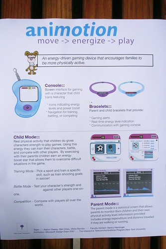
The project that was most intriguing to me was the animotion which is motivated similar to the Flavonoid project. The tagline for animotion goes like this:
An energy-driven gaming device that encourages families to be more physically active.
It consists of a little Console toy, very Tomogotchi-like, that’s a screen interface for gaming with a character that the child trains. And then there are the Bracelets, one for the child and one for the parent. The Bracelets communicate over WiFi (mmmm..) to allow communication with the Console, for real-time energy level indication and for gaming alerts. In Child Mode real physical activity gives characters strength to play games. Move and get power-up. The Parent Mode is a statistical screen that allows parents to monitor their children and their physical activity level. Information provided includes energy expenditure and distance traveled if they are walking or running. I thought this project was interesting obviously because I am working in this area of translating first life activity into second life expressions.
(Usefully, I also learned about this device called Actical which sounds like a data logging three-axis accelerometer. This was some interesting prior art that I had not known about before, so that’s great. It’s a device that can be attached to the hip or ankle or whatever, has a waterproof enclosure and can datalog for days. You then extract the data and do something with it. There are also some studies done to correlate this data to other energy expenditure measures.
The Actical is also way overpriced, or maybe correctly priced for overpriced research studies — I got a quote of $1682 (I’d have to supply my own USB to Serial Adapter). Sheesh. The PC Interface Reader software was $725 — more than the hardware itself, which was $450! Anyway..)
No web page links to the project, but supposedly forthcoming.
(Aislinn Dewey, Ben Chao, Vibha Bamba and Faculty Advisor Nancy Hechinger, ITP NYU)
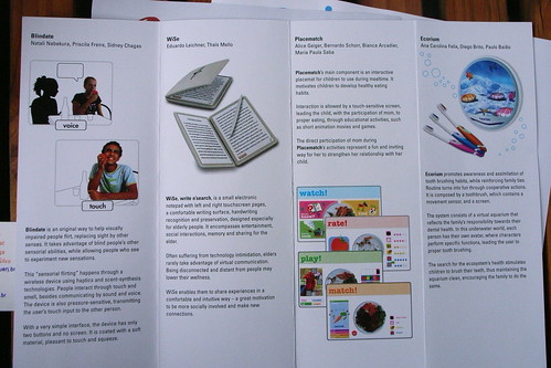
Placematch (in the third column of the brochure above — you can zoom in by clicking the image through to flickr) is a kind of place mat for kids that’s interactive. It has touch-sensivite screens leading the child with the participation of a parent to learn about food and such things through educational activities and short games and animations.ESDI Escola Superior de Desenho Industrialhttp://www.esdi.uerj.br/english
(Alice Geiger, Bernardo Schorr, Bianco Arcadier, Maria Paula Saba)
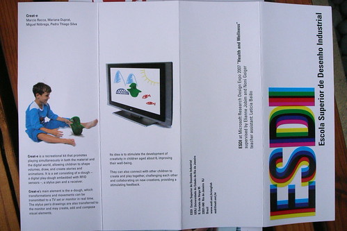
Creat-e is a recreational kit that promotes playing simultaneously in the material and the digital world, allowing children to shape volumes, draw, and create stories and animations. It is a set consisting of e-dough — a digital playdough embedded with RFID sensors — a stylus pen and a receiver.Create-e‘s main element is the e-dough, whose transformations and movements can be transmitted to a TV set or monitor in real time. The stylus pen’s drawings are also transferred to the monitor and may create, add and compose visual elements.Its idea is to simulate the development of creativity in children aged about 6, improving their well-being. They can also connect with other children to create and play together, challenging each other and collaborating on new creations, providing a stimulating feedback.
ESDI Escola Superior de Desenho Industrial
http://www.esdi.uerj.br/english
(Marcio Racca, Mariana Duprat, Miguel Nobrega, Pedro Thiago Silva)
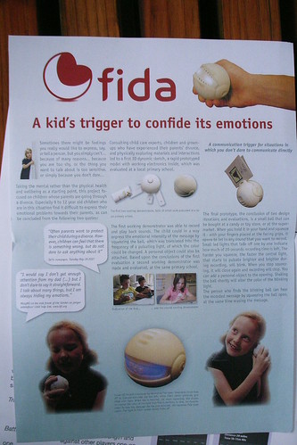
fida
A kid’s trigger to confide its [sic] emotions
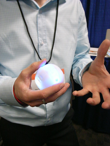
fida is a little org that allows kids to talk to their parents about emotionally challenging things (divorce, etc) that they may be uncomfortable talking about to them directly. So the little org is able to record the child’s voice, and allow them to shake them to show degrees of anger or anxiety. Of course they are illuminated with different colors depending on their state. There devices are articulated so you can squeeze them to open the little clamshell and activate them. They also have these flanges with clips that allow you to add a written note if you want.
This project was interesting because the students constructed a prototype and carefully documented the process and iterations, which I would applaud. They also constructed a prototype that was functional.
It was also curious in the way that it became a kind of note leaving device. As a social practice that’s interesting to me — constructing an asynchronous note that isn’t an instant message similar to Slow Messenger — leaving it behind for someone to find or receive later. The physicality is also quite intriguing — this constructed form and the design + technology work.
More photos of other stuff from the event are here.
Why do I blog this? This was easily the most engaging session of the MSR Faculty Summit. All of the ideas were bright and well-presented. I think there should have been much more emphasis on prior-art. None of the project summarized work that had been done before and how they learned from that earlier work. As Naimark always says on this topic — in the age of Google, there’s really no excuse not to engage and even be in conversation with other people who are shaping the And screen-based designs and concept illustrations are great for evolving the ideas and presenting them, but sketching should include creating some sort of prototype, I believe. It’s part of the design process that should not be excused from concept development.

