
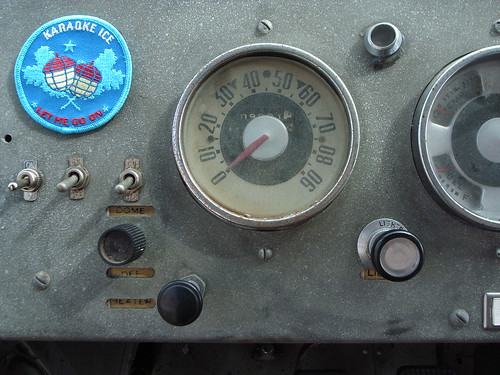
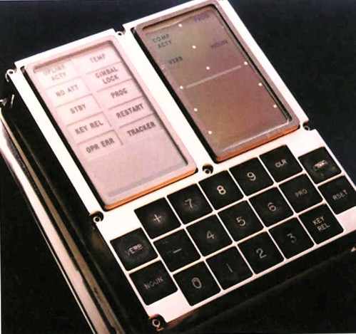
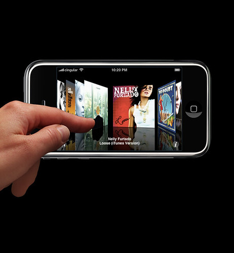
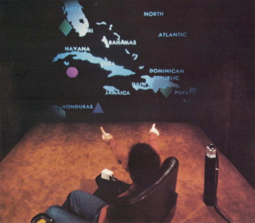
What are the boundaries of interfaces for our digital lives? Our fingers? How can the gestures we use to interact with our devices extend to create new sorts of interaction rituals and interactive experiences that go beyond the digit interface? From simple switches found in old trucks, to the 19 tactile buttons on the guidance computer that took a few men from the earth to the moon, to the current fascination with a different form of tactile “touch” interface, to finger gestures for sign-language interactions to the early experiments with pre-Wii gesture interface — how we interact is all caught up in the interface between intent and action that is very much wound up in the same desire for connection as Michelangelo’s imagination rendered on the ceiling of the Sistine Chapel.
I’m interested in how this interface can be changed to create a new idiom for connected digital lives that are more playful and less burdensome. How can the core elements of the interface syntax be stretched and reformed into a new style and meaning for computation that reflects upon the fact that were beings who live in space and time and sometimes enjoy the friction of social engagement? Can there be a kind of interaction where time actually counts? Where it is not instantaneous email download style time? What happens when the gesture is consumed by time — so that one gesture “unit” extends over an period of several minutes or even hours? What about space? Can there be a way that digital experiences are not about conquering space and diminishing it to a blink of packet switched gigabyte optical fiber speeds? Sometimes covering ground is a good thing, and doing so at a human pace can be a welcome reminder of our physical selves. Suppose that hike counted for something in a different model of computing? Or passing by a familiar landmark — a street corner or pedestrian overpass — is like the gesture of moving a game piece in a video game?
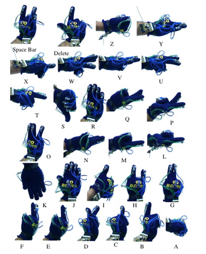
Nice helicopter view. I think we need to keep a clear head when ‘gesture recognition’ is concerned. In a way turning a knob is as much a gesture as dragging a scrollbar or ‘pinching a picture’. The point is whether the interaction between people and technology is smooth or difficult. A traditional usability approach is still required to create effective and efficient interfaces using gestures. Even if gesture supporters may claim ‘a more natural’ interaction style, this is not self-evident. Speech recognition was claimed to be ‘more natural’ too, nut the current state-of-the-art does not allow for a very ‘natural’ interaction. The same goes for video-based or glove-based gesture recognition. But it is still good to develop such technologies further for various reasons. However, as HCI designers, you need to stay critical and sober about these things. The Wii is a good example of well designed technology, where game designers have been able to finetune the motions used for commands in an iterative way (prototype and test, and again). That is expensive but necessary to get the right ‘feeling’. With a dial or a knob that sort of optimisation has long ago been done (though some suppliers will still fuck up the force feedback on a simple button).
..on the other hand, I see lots of the same kind of interface reworked and pivoting on the basis of somewhat vague but convenient tropes like “more natural” and such all. Frankly, I think many of these ideas are good ways to think about the possibilities, but often fail horribly for a variety of reasons when they attempt to become something that many many people are given. I have trouble finding one of all the dozens of devices surrounding me that doesn’t fail on a variety of interface accounts.
But, here I’m mostly curious about the ways our fingers and hands are used as interface touch points. And why interface gestures are constrained this way. Where does the gesture “unit” cut off? At the button click? Why is that? I’m just wondering — can walking down the street be a gesture unit? And if it is, how does the model for the interface change? How can you experiment with this kind of “mobile” computing that isn’t just about typing the same sort of keys on a smaller device with a smaller screen doing the same old email, only more awkwardly because you’re walking? Should mobile computing include other kinds of tasks that are more “mobile” than the normal fixed, sitting down desktop style tasks? What would mobile computing be if the tasks were things that were only appropriate in mobile contexts (i.e. not desktop style typing tasks?)