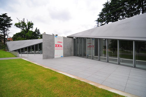
On Paul’s suggestion I went to the “XXI Century man” Exhibition 3 at 21_21 Design Sight in Roppongi. The exhibition theme was about the challenges posed to “man” (us living here in this world) eight years into the millennium. The question posed is where are we headed, now that we live in the century once hailed as the future?
This I find interesting as a theme, especially given the general interests here at the Laboratory on the future, especially the future-now or near future. How do we assess the state of things? What are the practices for creating the future we want, and not just the possibly uninhabitable future it sometimes seems we deserve, based on our bad acts.
The exhibition focuses on the 21st century and its people and is supposed to explore ideas for building a better future for this century and beyond.
The theme is important, and its setting within a curiously architected design space had me naively hoping for an exhibition that brings together art, technology and design. Art because it’s the practice that explodes existing boundaries and explores the dreamspaces of possible near future worlds. Technology because that is the preeminent practice of the 20th and, in the vision of the 21st century as “the future”, what is often considered the disciplines that will help us escape into a more habitable, sustainable and life-affirming world. Design, as I’m coming to understand it, is the thread that knits together curiosity and exploration, the operational instrumentality of technology and people-principles — the idioms and language that make art pragmatic and allow technology and engineering to understand people and their practices, customs and beliefs.
What was here more than my naive hopes was a group art exhibition. Not a bad one, but neither grounded in the pragmatism that shows instruments of a better near future, nor an unbounded exploration of artistic dreams of a better world.
That’s okay. It’s a tall order, perhaps more easily expressed in the exhibition curator’s statement than in the execution of an art-technology-design piece. I enjoyed it anyway, and it gave me some good food for thought for this almost-concluded research into innovation through art-technology and design.

Perhaps the closest to my fantasy exhibition was Ben Wilson’s “Monocycle” piece. It was the most “designed” object there. It didn’t really help me dream about better future except — with deference to my new studio mates who prattle on about gear ratios and chain slack all day — insofar as such a future will have to be devoid of carbon combusting vehicles. But, it had the kind of hand-craft and DIY sensibilities that I think the best design-technology puts forward. Showing what can be done with a bit of ingenuity and a bunch of skill in the shop is refreshing in an exhibition, and what I enjoy seeing in design works.
The other pieces — well, okay art. There was a preponderance of paper pieces, not unsurprisingly by Japanese artists. The penultimate piece was a bizzaro collection of cyborgish statues, all cobbled together from pieces of Dyson vacuum cleaners. That was an interesting collage of the designer-y festish-y Dyson cult. (What can you say about a guy who has deliberately insinuated his overly-designed vacuum cleaner into high design culture as part of a business strategy?) I was fascinated by the forms (and would’ve shot some pics, but the drowsy museum attendants were quick to hover) and their uncanny resemblance to Rosie, the Jetson’s maid. Turns out — no surprise — Dyson is plugged into 21_21 to begin with as a kind of director or something.
Technorati Tags: art-technology, design
