Took a jaunt through the UCLA Design Media Arts MFA 2nd Year MFA Thesis Show this evening, titled “Exit Strategies.” There were a couple of pieces that stood out to me in the exhibition, which ranged from rather cerebral to playful, all with a good scoop of design sensibilities. There was a good range of work here and this is just some notes to myself and a remark or two in context.
The statement for the show is speaks directly to the multivalent meanings of exiting as cultural and political action. I’m not entirely sure I saw this framing statement in the work and, absent wall text, it was a bit difficult to do much more than “be” with the material and experience what it is on its own. Which is fine, perhaps even preferable for my own personal way of seeing work, which is to not reflect too heavily in the moment of experiencing it.
(The show included no wall text, and the descriptions of the projects on the Exit Strategies page are either quite plain about what project was done by what artist, or are completely vague. A serious shortcoming of the exhibition in my humble opinion.)
Ours is the era of the exit strategy. Whether in military, commercial, or personal engagements, exit strategies inject planned obsolescence into every human action. Exit strategies collapse history into instrumentality: the ends justify not only the means but also the beginnings. They sacrifice openness, complexity, and sustainability to the gods of the closed, the simplistic, and the disposable. They are meager attempts to convince ourselves of the possibility for absolute control and computability in all areas of life.
We see the current cultural obsession with exit strategies as an opportunity. Our work destabilizes the concept of the exit strategy by recasting it as an ethics of escape, subversion, and nomadism. Our exit strategies are material mechanisms for prying open hermetic systems of power and representation. Our practices discover ways out. Our works plot paths for others to follow.

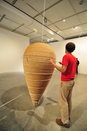
The most fascinating piece in my opinion was this gigantic spinning top by Jacob Tonski
called “Big Top.” Bit as in Gigantic. It exuded mass and angular momentum and the force of that gigantic, hard to move and hard to stop things — war once engaged, promises once given, debts once incurred. The piece was tactile, silent and alluring while also having a quiet danger to it. It was also quite an intriguing apparatus, with a large articulating pulley and weight system to set it on its way. The set up involved holding pins inserted into the huge top and rope wound and wound around the top, while a block of weights rose, partially assisted by a small electric motor connected to a car battery. Once set in motion, the top quietly spun heavy and fast. During the set up, we were cautioned to step back — the holding pins would fly loose under centrifugal force once the weights were released.
Big Top Jacob Tonski from Julian Bleecker on Vimeo.


With the top spinning it become impossible not to get as close as possible — even to touch its rather knotted wooden surface (like..ouch.) To me it was a bit like the moment in Kubrick’s 2001 when the black monolith first appears — it was big, silent and entirely compelling.

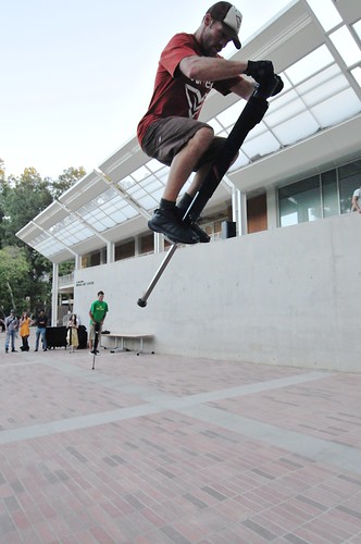
Gil Kuno (GII K) Pogophonic was a rather large and apparently physically demanding pogo stick that triggers sound samples. (Another) connection between physical action and digital control of sound and music. (Similar in that regard to probably many other projects, somewhat like Skatesonic.) I enjoyed the playfulness of the project and its physicality quite a bit and it was genuinely fun to watch. It didn’t even matter that there was a somewhat vague association between the stick’s actions and the sound — it need not have been the “mechanics” of the interaction for all I care. Even if GII K said so, and there really wasn’t, that would have been fine in some sense. What I mean is that the artists or performers of pogo’rs merely pogo’d to the sound, or if the sound was live dj’d and the pogo’rs pogo’d to that, I think the effect would’ve been the same for the audience, in fact. In that regard, it could’ve had a somewhat theory-oriented angle in that it made fun of the usual audience response to interactive art, which is to ask, almost before everything — “how does it work?” Which seems to me to be the central departure for “interactive art” or “art-technology” from unwired art. Lately, this point and the question — how does it work? — has become almost annoying and a bit of a distraction from the experience of creative wired work. Where are the wires? How does this connect to my action or activities? The effort is to “figure out” the work at the instrumental level. In some sense, that may be a mark for me (just sayin’..) of what is compelling art-technology versus Make Magazine style hacking.

What else?
I was initially quite excited by Zach Blas design-product piece called Queer Technologies. The installation was set-up as a provocation at the intersections of consumerism, art and politics. Queer Technologies was the name of the piece, as an “organization” (like a company) that produces products, like theory products, that are tools for “queer agency, interventions and community building.”
Projects [products] include transCoder, a queer programming anti-language; ENgenderingGenderChangers, a “solution” to cable gender adapters’ male/female binary; Gay Bombs, a technical manual manifesto that outlines a “how to” of queer political action through terrorist assemblages of networked activism; and the Disingenuous Bar, a play / attack on apple computer’s genius bar for tech support that offers a heterotopic space for political support for “technical” problems.
This is very intriguing to me — working within the representational tactics and logics of consumer capitalism with boxed software that is a “queer programming anti-language”, the (not terribly original, but still interesting) “Gender Changes” (the name given to devices that switch “male” plugs to “female” plugs as is sometimes necessary when connecting devices together), and a technical manual that is a kind of mainifesto of queer political action.
Okay, interesting — initially very exciting conceptually. Sadly this piece entirely knocked the wind out of the experience I had (I literally was upset, and no longer interested in sticking around) because the artist was selling these items at ridiculous prices. The software was $150 and the manual $100. When I asked — “one hundred what?” I was told that these were “art prices.”

Boy, there’s a lot to say about this. Besides the fact that the piece ended up being such a downer for this reason, I saw an incredibly obvious disconnect between the objective of a critique of consumer capitalism and the artist’s attempt to insert themselves directly within the hyperbolic market of ridiculously priced mass produced items. I mean..these weren’t even hand-crafted goods. The boxed software contained some sort of optical media with the software (presumably) on it. The books were in meter high stacks. For the sake of my intrigue with the piece, I would’ve spent maybe $30 for the software (and likely just kept it without any expectation of it doing anything — just for the spirit of the pieces anti-product productness) and about the same for the manual. I certainly wasn’t going to fork over $250 for these two things, even if I happened to have that kind of scratch just sitting in my wallet to buy a piece of mass-produced something.
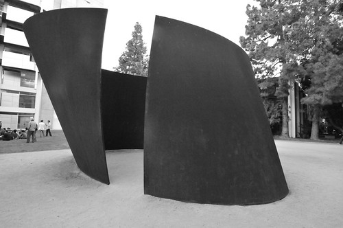
Exit Strategies indeed. I went straight out the door, saluted the Serra and headed home.

Continue reading Exit Strategies. UCLA Design Media Arts 2008 MFA Exhibition
