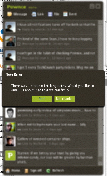
I noticed this while running the little Pownce desktop applet. It moved the window into “the background” by blurring it out a bit as if there were depth to the screen. I’m not 100% sure I like this. I haven’t seen it ever before I don’t think — and it made me wonder if I was getting ready to pass out or something.
I guess I have even more questions about Pownce itself. You know..the service.

Hmmm. It would take some getting used to. One of my pet peeves is when you go back to some app and when you click on it, all it does is flicker a few times and make a ‘ploink’ noise; because you have some dialog box open. [ Dialog boxes which only have an ‘Ok’ button are particularly evil.] If the background is blurred then you may realize that there is some dialog box open, somewhere, which is craving attention/needs ‘dealing to’.
I would like to see some app with a interface a bit like this http://www.vuw.ac.nz/design/ [click on one of the links at the top to see what I mean] I like the way it shifts focus. It may be possible to give some spatial awareness to your app. e.g., that do-dacky open file part of your app is always over to right [try clicking on one of the gray squares, and then a green one]. Your thoughts?
It would definitely take some getting used to. I’m not convinced about the effect in general. Depth cues in flat interfaces make sense if the metaphor holds up across applications. And its more cinematic as an effect than it is something that the human eye is doing all the time. I mean, I never really see something go into soft focus in front of me unless I’ve gotten particularly boozy. 😉 But, I think its interesting enough and curious enough to call out and say something about.
I have an interesting applet called MenuShade that dims out the top menu bar of my Mac, which is kind of nice when you want to just focus on the application and not the somewhat cluttered and bright application menu bar. Small things like this are where I see lots of possibilities for evolving the computer interface, particularly in the basic surface sorts of features. Keeping a small running log of what works and what doesn’t is one way to start thinking through these questions!