The Mind & Consciousness User Interface: SXSW Proposal?

A visit to the Psyleron facility in Princeton New Jersey

A couple of years ago — 2009, I believe — my brother and I went to visit the facilities of Psyleron, a very curious research and engineering company in Princeton, a few miles from Princeton University. He piqued my curiosity about the operation, which was extending the research of the PEAR lab at Princeton — Princeton Engineering Anomalies Research. The PEAR lab has been in operation for decades and Psyleron is a kind of way of commercializing the insights and theories and all that.

They developed a random event generator and software to allow the at-home enthusiast practice their brain control skillz. It’s called the REG. You can buy one. Adam Curry at Psyleron was kind enough to loan me one. The object needs some industrial design help, which would be fun to work on.

Why is this interesting?

* It’s atemporal, I think. There’s a twist of the Cold War paranoia about mind-controlling Russkies arranged in a phalanx on the ground, specially trained to shoot brain waves to make enemy fighter pilots shove their sticks forward and crater their jets. It’s 50’s era thinking infused into something that is still futuristic. I like the history. The story of the Princeton Engineering Anaomolies (PEAR) laboratory start comes from that history — a chance encounter at a weird proto-DoD sponsored workshop on the role of consciousness in hot-shot right-stuff-y fighter jocks in the 50s who were better able to tame the barely stable faster-than-sound aircraft than other pilots. Were they more synergistically coupled to the planes, all other things being equal? It was a real question, and a contingent of the defense apparatus wanted to know and thus funded the PEAR studies.

* People are going to tire of their fascination with “gestural” interfaces. That term already sounds antique. Even thinking about it makes my mind groan and roll its eyeballs. What’s next? I’m not saying that brain control *is next — it is a logical, automatic extension to go from contact to contactless interaction, sort of like ranges of massage and body work — from the brutalist Swedish deep tissue stuff to the hands-off, chimes-and-insense Reki flavor.

* This guy Dr. Jahn who co-founded the PEAR lab lived nearby when I was growing up. That’s kinda cool to have this weird return to early days. He was squirreling away on this research in the basement of a building I used to sneak into during those easy, trouble-free adolescent years in breezy, leafy Princeton.

Cabinet Magazine has an good short article on Dr. Jahn and the background of his research.

There’s all sorts of curious artefacts and media and materials in and around the proto-Psyleron PEAR laboratory research experiments. The PEAR Proposition DVD is an epic, 3 DVD collection of lab tours, lectures, lecture notes about the project. Margins of Reality is the reading equivalent. Good “research” materials.

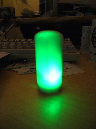
Psyleron also has a number of devices to activate the principles and propositions of mind-control/consciousness control and influence. An assortment of stand-alone probes and dongles — keychains, glowing lamps and that sort of thing. A robot is forthcoming!

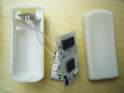
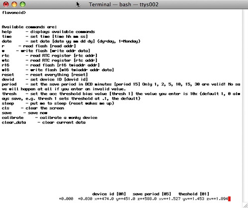
The most curious to me — because it produces information that can be studied, allowing one to conduct experiments and because it could probably be DIY-ified — is their REG or random event generator. The REG in general stands at the center of the research as I understand it. Having a “pure” REG that is not influenced by shaking, bumping or jostling of any sort allows one to have a sort of “white noise” norm for measuring any external effects. The best way I can understand this is one needs to remove any bias on the system except for the influence of consciousness/es. A great REG is purely random data — white noise. Supposedly the white-noise randomness of this device is superlative. Who knows? It may be, or may have been before some innovation or whatever. I think there’s some quantum tunneling mojo going on in there beneath that bit of metallic shielding.

Why do I blog this? I’m *way behind on any project related to the work at Pear and my own personal affiliation with the research itself — Dr. Jahn lived in the neighborhood when I was growing up and the kids in the neighborhood all played together in the streets and yards of the neighborhood, including his daughter. I’m also thinking about writing a talk or panel proposal for SxSW 2012 on the topic, perhaps with Mike, who’s interested in looking into brain control interfaces.

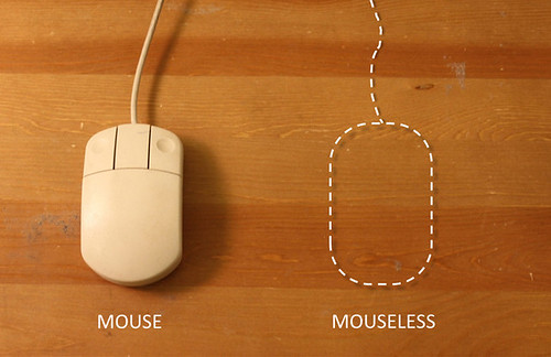
I think there’s a nice continuity between the *macro interface of many minds/bodies of the Psyleron work and the more local, *micro interface of one mind with the likes of this stuff from this operation called emotiv. I like the continuity from consciousness and action-at-a-distance to the more directly coupled, sitting-on-the-head-stuff. Making a continuum from levers, knobs, switches, lights; punchcards keypads, teletype rigs; typewriter keyboards and CRTs; mice and keyboards and CRTs; 3D mice and all that up to “gestural” interfaces and touch and then into the mind could be quite and interesting graphic. A more complex graphic or an additional vector within that one could also look at the particular semantics and syntax of thought that is required to operate the devices — the ordering of knowledge necessary to frame a task or problem and then explicate it for the specific set of interface elements one is afforded by the device. Command-line interfaces, as we well-know, allow/disallow specific tasks; menuing systems are beards for what happens on the command-line — making the framing of the task more amenable to more people (?) and certainly less terse. It’s a translation effectively of what might normally go on the command line.

One possible approach to understanding this stuff is, of course — to start using it.
Continue reading The Mind & Consciousness User Interface: SXSW Proposal?

The Interaction & Interface Design Car Wreck

Sunday November 28 10:13

For designers, clearly, surfacing, paint colors, materials and interior fabric choices rule out over interface design, which is just plain forgotten about here . Unless it can be justified as, like…Formula 1 inspired, it just doesn’t seem to get any priority as an area of innovation. Look — hybrids barely get any consideration. Even the American car makers booths were bristling with cleaved “Boss” engines reminiscent of the $0.50 a gallon days.

*Sigh.

Well, there’s work to be done. Even the luxury cars could learn a trick or two from the IxDA world..This was a two hour wonder through the subdued LA Auto Show on Sunday. It’s hard to get excited about cars these days, save for the exuberant electric or hopeful hybrid. I chose to annoy myself by noting the wretched center console designs. Who’s in charge of these things, anyway?

Sunday November 28 09:18

Seriously. I wonder who has to program their office into their car nav. I mean..after the first day, or maybe even the first week of a new job, which you got so you could afford your fuck-off Porsche Cayenne. If you need your nav system to get you to the office everyday..even if you’re coming from the club, or dropping the kids off at school, or whatever..you’re doomed from the get-go.

Sunday November 28 09:34

What can you say? If I had to look at this everyday after spending..whatever. $40,000 on something? I’d cover it with butcher paper and use it as a notepad. Maybe leave a little hole for the austere analog clock there.

Sunday November 28 09:48

This is a Volvo. This speedo console actually isn’t so bad. It gives you messages close to the idiom of an SMS on your phone. So long as it doesn’t tip into Growl-style pop-ups, I think we’re okay here. It’s actually somewhere between charming and a bit uncanny valley-y..like..has my car turned into a message receiver? Why is my car discussing things with me? On the ride home, my friend Scott, who has an edition of this Volvo, noted that his car was reminding him to take it in for service in a similarly polite way — rather than “Service Engine” which is a deceptively calm way of telling you that there’s no more oil in the crankcase and your engine is pretty much a solid block of molten metal.

Sunday November 28 10:06

God, I’d ball-hammer whoever decided that the “Eco” mode of the car — presumably an energy-sensitive mode — should get this Evergreen tree icon and then sport and normal are left to this horrid sans serif with no iconographic or color or nuthin’. Why even bother? Like..*g’aahhh..Ball-hammer!

Sunday November 28 10:07

Sunday November 28 10:13

Now our cars require codes, PINs, and passwords — the wretched baggage of cold war security protocols which barely work for humans. Who wants to guess how many 1234’s and 0000’s will start a car? What’s the future of PINS and passwords and why is it not in my fancy, from the future car? I’m not talking about retinal scanners and biometrics here. Just simple, modest, low-level security like..pick a secret picture, your daughter’s favorite animal, &c. PIN? Really?

Sunday November 28 11:22

Jeeze. I’d almost prefer the old fashioned mechanical AM/FM radio than this Kafka-esque nightmare. Two knobs. Big old preset number keys from 1-6. A “Back” button the size of two keys. A four way that’s probably got a center-select. It’s just nuts.

Sunday November 28 10:11

Holy cripes. I mean..this is like 14 different things designed by 73 committees or something. It’s got Menus, Maps, Guides. Titles, XM, “Sound” (what??), CD (really. compact “disc” technology?). Category, Tune, Sync. And that’s an EIGHT way with a center select. EIGHT! It’s just a baroque meshuggener mess trying to look cool and failing miserably. MISERABLY. And on top of all that? The build quality would make me slap my forehead in regret every time I try to adjust the climate control knobs.

Sunday November 28 10:13

Okay. Someone should probably teach the designer of this display either about Camel Case or remind them that segmented LEDs can sometimes be retro, but only for hipster clocks and calculators.

Continue reading The Interaction & Interface Design Car Wreck

Design Fiction Chronicles: Before the iPad There Was the PADD

Saturday October 24, 19.35.51

Your author, considering his solution to the Kobayashi Maru during a shake-out run on a Class D starship.

There was recently a wonderful article on Ars Technica interviewing the production and prop designers for Star Trek. I highly recommend giving it a read, even if you’re not a Trekkie. What I find most curious is the creative constraints that the production design was under and their solution. With a limited budget for doing lots of physical design, they decided to draw the user interfaces, rather than assemble them from hardware like knobs and buttons and so on. The idea of a screen-based display that would change based on what it needed to do — a “soft” interface — arose.

“The initial motivation for that was in fact cost,” Okuda explained. “Doing it purely as a graphic was considerably less expensive than buying electronic components. But very quickly we began to realize—as we figured out how these things would work and how someone would operate them, people would come to me and say, ‘What happens if I need to do this?’ Perhaps it was some action I hadn’t thought of, and we didn’t have a specific control for that. And I realized the proper answer to that was, ‘It’s in the software.’ All the things we needed could be software-definable.”

(via http://arstechnica.com/apple/news/2010/08/how-star-trek-artists-imagined-the-ipad-23-years-ago.ars)
Continue reading Design Fiction Chronicles: Before the iPad There Was the PADD

Hand Drawn Maps..Drawn By Computer

ours

One of a sample of “Destination Maps” presented at SIGGRAPH Asia 2010 by a team of researchers. It shows a computer-generated emulation of the canonical napkin-style hand-drawn map. The described advantages are that it highlights relevant “neighborhood” streets and diminishes the arterials and highways that are not necessary and perhaps confusing for reaching the destination. It closes in on that typical style of map that was perhaps described best in Denis Wood’s “The Power of Maps” — the rough, perhaps off-scale map that gives the contours of a place and only what is roughly right and nearly necessary to navigate a place.

Some questions around this sort of map making:

* Why the use of kitsch-y napkin texture and the recognizable human-hand-hunting for lines with pencil? This idea of having the computer draw like a human seems a little dishonest, which puts me off. But, I suppose at the same time its recognizable and legible to people, which may make it more palatable and familiar, which I guess is something kitch is good at.

* I’m sure this is in the category of “it’s a prototype, relax” sort of thing, but shouldn’t the interstate highway signs be roughly-right, too?

Related, just to keep the project in-mind, to the PDPal efforts to make roughly-right emotionally evocative personal maps — here’s one that was just the other day done by a friend’s young’n, by happy coincidence. I often think about this project and its relevance to what I still think is curious, intriguing and worth pondering over. Fascination with maps and cartography — mostly off-kilter, peculiar, provocative ways of making maps and exploring is super interesting to us here, especially the fellas smoothing parchment in the clean room on the 3rd floor.

JonseyPDPalMap-08102010

cf. Mark Shepherd’s Serendipitor — an iPhone app to help you explore by creating unexpected routes from point A to point B. I’ve been mucking with this for a few weeks — very cool and fun. Not for anyone trying to just get from A to B, which isn’t always the most exciting way to explore.

cf. Designing for iPad, which has some nice remarks on the use of kitsch in interface design.

via http://johanneskopf.de/publications/destination_maps/index.html
Continue reading Hand Drawn Maps..Drawn By Computer

Is There Such A Thing As An Invisible Metaphors

mouseless01

This is a curious project from some students at MIT. They’ve used a laser beam and a camera sensitive to the light reflected from that beam to track the motion and articulations of one’s hand as it moves and makes mouse-like gestures. So, effectively they’ve gotten rid of the mouse. Which is why they call their project *mouseless and why they’ve given it a bit of fun by an explanatory video ripped and sewn with some Tom and Jerry cartoon wackiness.

What I find curious here is the way they’ve extended the “mouse” metaphor even when the mouse has become “invisible” — or, rather — those bits of plastic and wire and so forth that constitute the mouse are now no longer necessary. But, we’re still operating with the same movements and gestures as if the mouse were there. Which makes me wonder why go through the hassles of taking it away, losing the physical tangibility of moving something with momentum and weight and texture and feedback and all that. It’s like one of these weird engineering efforts to do *something with the technology and then backfill the rationale. I mean — it’s all tiring in a way how little refinement and design and thinking and iteration goes into things like this. I’m exhausted just looking at the invisible mouse..that I can’t see. I mean — I guess the mouse not being there is as weird as the mouse suddenly appearing attached to a computer back in the day, but it’s easier to think of manipulating something material, no matter how weird and unexpected it might be, than it is to pretend that something’s there, that could just as easily be there if we just ditched the idea of an invisible mouse and kept a visible mouse there to begin with. Or something like that.

*sigh*

JCB_22062010_164013_0784

Well, I guess this is what to expect from the best and brightest. The simple obsession with refining and refining and refining rather than just doing something “’cause” seems to yield much more subtle *wheels-on-luggage designs, just making something a little better, as they say.

Why do I blog this? Thinking about the inevitability of metaphor in design while poking through Raphael Grignani’s remarks on Home Grown’s List UI inspired by Mike Kuniavsky’s draft chapters on metaphor for UI/UX for his forthcoming book, and a recent document that pleads for the end of metaphor and direct manipulation. With regard to *mouseless, I see this as another instance of moving from one extreme to another while missing anything in-between or even off to the side, which might be typical of engineering efforts when it plays in the UI/UX sandbox. ((It also is likely not their point at all, but rather a quick sketch of an idea to refine some thinking, or just a clever computer nerd stunt, but I’ll use their work *unfairly to make a perhaps not all that interesting remark on the blog, and to try to up my blog/writing quotient for practice.)) A bit like coming up with weird doorknobs and then looking for a house to put it on. Carts before horses, or gizmos first, humans last. Maybe somewhere we’re missing the subtleties and low-hanging fruit rather than the grand theatrics (engineers) and broad oratory (chatty design gurus who talk rather than make and refine and get into the material of things.)

Continue reading Is There Such A Thing As An Invisible Metaphors

A Curious Crosswalk Clarification

Friday January 08, 14.46.08

Friday January 08, 14.46.21

A curious inscription left by someone to clarify which button expedites which crosswalk signal. Someone has written with an indelible marker “B” and “W” on each button (for Broad Street and Watchung Avenue respectively), as well as writing an abbreviation on the pole (“WAT”, for example.) What is interesting here is that an official sign also indicates which direction is controlled by the button (“Push button to cross *arrow* Watchung”) making me wonder if this was an addition made after some complaints about the confusing buttons. What made this confusing initially was probably the fact that there are two crossings in roughly a straight line. You cross a small bit of one-lane street that subsequently does an easy turn onto Broad Street from Watchung, and then stand on this island with the buttons. Then you cross a larger street — Watchung Avenue proper — with several lanes. Approaching the island after a nervous crossing and then looking out into a daunting sea of fast-moving traffic on your way to a quick sugar fix at Holsten’s, you might think the first button you see is the one to hit, which would be wrong.

Why do I blog this? I find these sorts of thoughtful, improvised inscriptions fascinating. A different kind of “read-write” city or read-write urbanism, where people in their everyday moments take it upon themselves to make additions, hacks, DIY improvements and adjustments to make the city more livable and agreeable to their sensibilities. The points where urban design from the top-down meets urban living from the bottom-up.
Continue reading A Curious Crosswalk Clarification

When Engineers Design

When Engineers Design

..respectfully. I’m an engineer, too, who is learning Design. But these sorts of things — not done on purpose of course — reveal the seams between purely functional and designed-with-love. This isn’t fun. It works. It gets the job done. But it’s robotron to the point of disrespectfully, especially nowadays. I could understand this if we were in the good old Univac or VAX days. But, ‘cmon.

Anyway. Off to reboot 10 for a day or two of decompiling..

Continue reading When Engineers Design

Coffee Interfaces

Bizarre interface syntax here. On the bottom left it’s Large, Small, Medium. That’s sort of peculiar — I’m never entirely sure what button to press. The Small and Medium seem almost identical when you’re feeling in need of a cup of coffee. Once, I pressed Large and it overflowed the cup. What are the contexts here for sizing, anyway? And why the mis-ordered buttons and icons?

Kombolói: An Anti-Anxiety Device

R0010572

This is a quick, quick sketch for an idea I had for a intimate personable device that is best described as a digital worry bead or Kombolói — not so much a worry bead as something to capture and diffuse your anxiety. It works by capacitively linking your tension through a unique capacitive touch sensor and then harnessing that energy, turning it into light and then diffusing it into more soothing energy.

It’s just an idea I had on the plane. I don’t think I was having an anxious feelings on the plane, but I thought — what would an “activated” (digital/electronic) version of the Kombolói look like? What would it do? What would it make me feel?

I happened to see a few of these over the last couple of months in peoples’ palms — maybe some where actually prayer beads. And in at a breakfast meet-up with Linda Stone last week in Munich at DLD08, I learned of some of her very interesting vectors of research beyond her fascinatingContinuous Partial Attention that has to do with the deleterious physical downsides to simply reading email. (Evidently, we go into the wrong sort of state when engaging in what can be an anxious moment — opening your email program. We hold our breath and/or our breathing state goes into a non-flow state that has these terribly noxious effects on our body chemistry. The various levels of oxygen and nitrogen and all kinds of things I should’ve learned more about if I had paid attention during high school biology — they just go nuts with really bad consequences. Who would’ve known? Well, Linda does, and so does the NIH which is taking this stuff seriously.)

R0059379

R0059378

R0010570

I wanted to find a way to make it luminesce brightly. I’m still working on that — because of the fittings inside and the printed circuit board, etc. — it’s proving difficult to make it glow exceptionally bright, and without shadows. I may have to lower my expectations and change things around in some fashion. Perhaps only a small part of the object will glow. I’m also thinking about ways to make the interior reflective to bounce light around and mitigate the effects of shadows on the surface.

I started with a simple form for the object that was quite small, just to try it in the hand. Generally, people thought the shape and form was right in this early shape. I sort of awkwardly modeled the form in as few strokes as possible, but clearly I need to learn how to be more patient with the modeling stage of the sketch, including allowing myself multiple steps for each larger feature — sketch, revolve, cut, extrude steps, for example, for just one articulation in the form. In other words, just getting the basic overall shape and then cutting away to get more detail. I had been trying to get most of the form in one quick step, with an extrude or whatever, and not paying attention to where tangents were falling, etc. For example, when I started with this form (the small thumb-sized transparent model below) and then moved to a second version (the white plastic one above) I tried to make small improvements to account for the engineering that had to happen inside (mountings, slots, clips, etc) and ended up breaking many of the external features, and making hard points that defeated my goal of a smooth, informal form.

Today's Desktop

R0059380

R0059384

This of course yet another mechanism through which I am exploring how Touch, Motion and Time can become the basis for experiencing different sorts of interactive experiences. My conceit is that these are elemental forms of human experience that are largely dismissed in the digital era, but they are crucial and distinct aspects of how we humans experience and make sense of the world around us. So, to understand this more completely, and to have a stronger basis for discussing it and creating new things that are more than button clicks and mouse florishes, I have been making some template components that articulate these elements in various ways. This is just one more that occurred to me a couple of weeks ago. The touch aspect of these Kombolói — that you hold them and they can be seductive enough in the hand to compel you to roll them in your palm or run your thumb along them as a gesture that soothes and calms; the motion of moving them around and such in the same fashion; and the durational aspect of them, that you spend time, slowing yourself and focusing and loosing yourself as time passes and as you begin to relax, rather than the immediate and instantaneity of many digital and networked interactions — these all seemed to be captured in this social object. So, the question is — what would be a way to explore these elements in my small catalog of devices?

I made a variation of the template component I’ve been making for many months now. This time, I tried to find some simplifications and tweaks to change the geometry of the component. Yet again. (Sigh..) The process of iterating these designs is both exhilirating and exhausting. I end up taking very similar electrical schematics and sweeping them through physical changes, moving components around in the printed circuit board to try and compress things, sourcing alternative replacement components or learning new little tradecraft tricks.

I quickly redid some circuits and board layouts on the flight back and got the form factor down to a geometry that’s got one long axis and was as narrow as I could make it. I’m still trying to find easy ways to program the ATMega microcontroller without taking up a big footprint on the circuit board. Haven’t quite found the right way yet. But, I’ve foregone putting the FT232RL device on the board, which was the rather large chip to do USB to serial conversions. Very convenient, but very large. My strategy now, such as it is, is to use a small external breakout board that the FTDI people manufacture that does the same thing, only with a much smaller footprint version of that chip (one that’d be a challenge to place by hand on my board) and which includes a mini USB connector on it. So, using that breakout board, I only need to run a few wires to it, and I can put it off to the side in the device with a simple mounting bushing or slot into which it fits.

R0010537

R0010539

The overall design is meant to be something that feels good to hold — comforting or soothing.

Moving Forward

There’s a strange anomaly with the electrical circuit that I need to figure out — it appears to drain the battery completely even when it is “off.” I have a kind of untested mechanism for shutting off power to the main logic rail (VCC) while keeping the output of the regulator powering the real-time clock’s battery backup input so that it maintains the time. Perhaps there is a problem there, although I’m a bit puzzled that this design would cause a problem. This part of the design process is less interesting to dwell on, so I won’t. Suffice it to say that there is some problem, and part of documenting the design process is to mention and ponder problems, so, well..there you go.

I also had some good feedback from folks yesterday regarding some technical issues and design issues. It seems that the illumination aspect is still a bit krufty — it’s tricky to illuminate the body, particularly with the translucent material, because because of the shadows cast by the internal parts. I am going to try making some sort of light guide to help mitigate this problem — perhaps a tube or some such that runs along the long axis of the part. Jed suggested this, and it immediately made good sense. Something that caps at the LED and fits on it. Also, this provision for two LEDs — one on either end, facing towards each other — means that I can make the light guide attach to both of them along the long axis.

Semaphore Communication

For communication to the data network, I am thinking about a color-based semaphore system using the built-in camera that many computers come with. The idea is that a simple color sequence can relay certain information could encode the state of the device which could be interpreted by a simple Processing sketch or something. It wouldn’t communicate the kind of robust information that the current firmware is able to do over USB (or..maybe it could?), but it would be a compact mechanism for doing this, and eliminate the necessity for USB hardware and so forth. I’m looking forward to exploring this further. We were discussing it in relation to Veronica Perdes class project on this very exciting idea of a "Fugitive Object" and how we could create a simple mechanism for communication back to the mothership.

The Face of the Faceless User Interface

User Interface

User Interface

Ironically, a typing command user interface to do set-up stuff and manage the Flavonoid device itself. There were enough unknown variables in the design of the device and enough of my own obsession with preferences and configurations and such all, that I spent some time creating a configurable device.

Atavistic

Here at the Near Future Laboratory, Nicolas and I are interested in digital devices that are essentially faceless. Just blank, “blind” devices, like Sascha’s awesome “Blind Camera” project. They are intriguing because of the way they run counter to intuition and thereby raise questions and immediately make their expression curious and unknown, hopefully opening the possibility for accepting new kinds of interaction rituals besides just pressing little plastic squares and such sorts of interactions that we’ve come to expect.

The irony is that there are enough variables for parameterizing the device’s functionality that I needed some way to manipulate them, at least at the start. So, I created this behind-the-scenes interface for adjusting the properties and behaviors of the object. Most of the time you would not access this at all, certainly not while carrying the Flavonoid device with you.