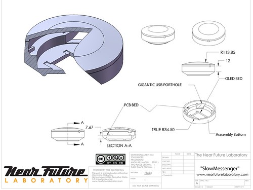
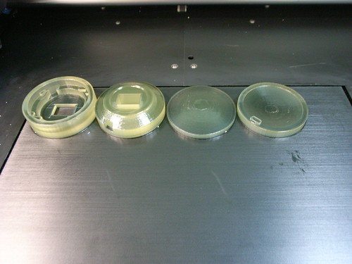
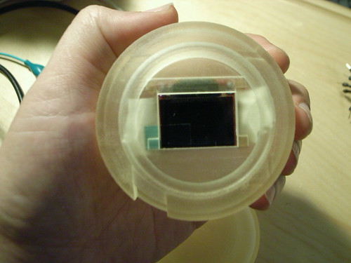
Well, this was fun. Right now, I’d rather be making little ironic, provocative things to think about nearly-real near future worlds than just about anything else. This is very satisfying. Way more satisfying than just writing about such things, and much more satisfying than making the same old stuff for some big gigantic military-academic-corporate-industrial light and gadgets megaplexoid.
It just seemed quicker to go ahead and design some enclosures on my own. Plus, it’s on my ’08 list to learn how to do some design of this sort — just getting an early start here.
I spent the last few weeks learning Solidworks, enough to create a few simple designs which I could share with some real experts and get little crits and suggestions and tips and so forth. Turns out most of the design process is shaped by the means by which the design will be produced. I’ve been thinking of both rapid prototyping and machining — machining so I can play with different materials other than plastic.
This was printed on an Objet Eden 350, which is a pretty slick bit of kit.
What happened here? Well, I flipped back through the design sketches I had been for the enclosures for Slow Messenger and Flavonoid. The consensus has been something that is definitely not particularly close to the mobile phone box — something curious and round. But, it was important that it not evoke too many preconceived design notions of that device — just wanted it not to get too tangled up in the assumptions and history of the mobile. It defines mobile design/mobile media/etc with too many constrictions. So, something that could fit in a pocket, something without any keys or buttons — just a simple display to show the message.
This design gets close — I’m eager to get something that I can give to people and get notes on for the book. But, I also think this has been a great way to learn how to close the gap between ideas and things that help express those ideas. There’s something about designing away from existing forms to make new contexts for experience. Sure, I could pursue this “Slow Messenger” project using stuff like a cell phone and some server software and SMS or email channels — but it’s more intriguing to me to start from some first principles, and also to create this different physical form that defies conventional expectations and assumptions. The form of the object has as much to say about the context of experience as the “theory” behind the experience. I was starting to feel a bit stuck in the context of mobile experiences, particularly when you have to arm-wrestle with cell phone carriers, the cost of network access and a general lack of interest in creating anything much more exciting than weird advertising schemes.
This Slow Messenger thing may not make much sense in the context of corporate telephony mobile experiences, but the place for making things for new mobile interaction rituals will never come from there.


I say continue the “curious and round” design to the screen area and make it around instead of rectangular. You lose some pixels at the corners, but the continuity of the concentric circles would look very neat I think.
Hey — yeah..I had been thinking about that — a round display, thanks for encouraging me..I think I’m going to try a slightly larger display and do just that to see what it looks like. I gave a talk a few months ago and one of the pictures was Douglas Engelbart’s patent drawing for the mouse — the display is like an old radar screen or something, like a porthole on a boat. I thought that was pretty fascinating and sort of provocative — round displays.