“Sketching”, as I’ve learned from Mike Kuniavsky/ThingM’s Sketching in Hardware workshops and from Bill Buxton’s Sketching User Interfaces is a useful trope to help capture some of the fresh ways that design, physical and functional prototyping can be stitched together. Bringing together user experience, hardware prototyping and appearance design through sketching seems like it could be a powerful approach to a broader kind of design practice. More “function” than what surface design achieves (beautiful finish but inert zombie models), and more appearance finish than what you find in some of the hardware sketching communities (spot-on, functioning prototypes shoved in an old cigar box.)
I’m eager for new practice idioms, besides the connected-boxes that separate engineering from user-interface design, from marketing, for example. The “sketching” notion might at least loosen up the approaches to making new things by making it less formal and more exploratory.
At the edges of the various practices is where they’re being brought together in a way that compresses time, expertise and tools so that rapid prototyping becomes rapid production. For example, I’ve written about how amazing it is that I can take an idea that sort of jumps into my head, quickly “sketch” an electrical circuit that articulates that idea, send about 10k of files off to a guy in Toronto who sends it to his guy in China who makes the thing and sends it to me FedEx. The whole loop takes 48 hours. The critical path is the delivery time and my own ability to design the circuit.
That’s the electrical engineering. On the other end, the surface engineering, rapid plastic printing makes it possible to do the equivalent production process as the printed circuit board, only you’re designing/engineering the thing that the circuit board fits into — an enclosure, or a toothbrush handle, or a game controller..whatever it is.
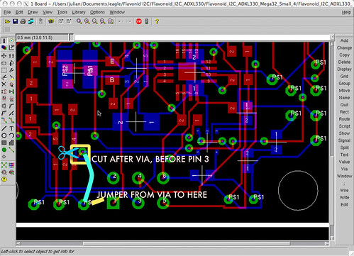
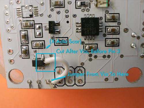
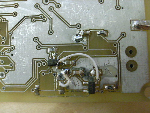
Sketching implies iterating — erasing, redoing, trying again, fitting new ideas into a prototype with whatever is at hand. Often — more often than I’d like — something comes back that has a problem, probably because I’m moving so fast. With the printed circuit boards, a bit of rework can be done which makes things look messy, but in a good way — it shows the hand-crafted aspect of these things, that there’s something human about them, both in the design mis-take and in the “patch” to close a bit of material.
I’m finding the same possibility for ⌘-X and ⌘-Z in the physical object world. Things come out slightly larger or smaller than you expected — although the machines are spot-on, I often am not — or I’ll make something with a bit more material with the expectation that I’ll whittle it away with a bit of sand paper or an X-Acto.
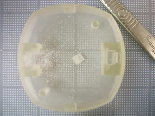
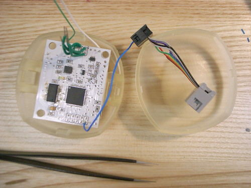
For example, here I made these two sort of mounting bosses that hold the PCB in place with a sort of snap fitting and that are also used to hold an external on/off slide switch on one side, and the USB receptacle on the other. They’re straight through extruded cuts, with all four sides closed so the fit is nice and snug.
While I was assembling the first unit I realized that having that closed cut makes it so that you can’t easily remove everything if you need to, like..remove everything. For whatever reason. Basically you thread the connecting wires through, insert the switch or USB receptacle, solder the wires to the board and you’ve handcuffed everything in place.
That’s no good.
So, I scalpaled one wall out to see if I could get a good fit with the USB connector with closer to 3ish walls. It’s better, but still a bit loose.
