Nokia Remade

Remade

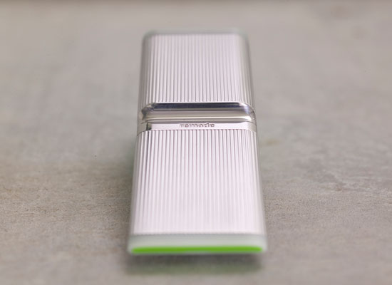
Nokia Design’s Calabasas Studio has done something fantastic. They’ve taken design thinking and created an impactful concept initiative called &quote;Remade". It’s what I would call a Theory Object — it is a provocation for serious conversations at the tippy-top of the Nokia enterprise to seriously consider how upcycling can become part of the design, construction and consumption of mobile phones. Materialized ideas on a really impactful concept.

The fantastic folks there at the Studio who worked on this include Andrew Gartrell, Duncan Burns, Rhys Newman, Raphael Grignani, Pascal Wever, Tom Arbisi, Simon James, Pawena Thimaporn and Peter Knudsen.

Raphael Grignani has a better description than I could put together on his blog. I’ll steal a paragraph or two here (see, also, Jan Chipchase’s remarks on Future Perfect)

The intent was to create a device made from nothing new.

We drew on a simple insight that in the not too distant future humanity will have extracted and worked much of the valuable minerals once buried in planet Earth. We will be compelled to reuse and celebrate what is essentially “above ground”. Thus we explored the use of reclaimed and upcycled materials that could ultimately change the way we make things.

In remade, recycled materials from metal cans, plastic bottles, and car tyres are used beautifully; whilst helping reduce landfill and preserving natural resources. The concept also addresses cleaner engine technologies, and energy efficiency through power saving graphics.

This is important stuff, particularly when you consider that Nokia makes a phone, like..every two seconds. They have to go somewhere — better they get “remade” than tossed in a heap somewhere.
Sliding Friction: The Harmonious Jungle of Contemporary Cities

Sliding Friction: The Harmonious Jungle of Contemporary Cities:

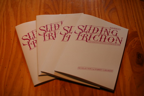
It has finally arrived! After months of fun labor, Nicolas and Fabien released Sliding Friction: The Harmonious Jungle of Contemporary Cities. This pamphlet assembles photos and annotations we took here and there along our dérive through the many cities they lived in and visited. Sliding Friction is an attempt to showcase the curious aspects of contemporary urban spaces. Through 15 topics and 4 themes they focus their lenses on the sparkles generated by the many frictions between ideas, practices and infrastructures that populate cities. They hope to provide some raw food for thoughts to consider the city of the future. Do we want to mitigate, or even eliminate these frictions?

Here’s a “flip book” of it:

Sliding Friction: The Harmonious Jungle of Contemporary Cities
Nicolas Nova and Fabien Girardin

And here’s a normal, human PDF.

in Walabab editions, Designed by Bread and Butter, Preface by Bruce Sterling, Postface by Julian Bleecker.

sliding friction

Your Imagination Leaves Digital Traces (Latour)

A wonderful little essay Beware, your imagination leaves digital traces by Bruno Latour on the imagination in a digitally networked world. Fabien Giardin blogged this a month or so ago, and I feel the need to echo his insights.

I find two relevant things here. One is the relationship of the virtual to the material that is often drawn forward as a distinguishing characteristic of the digital era. In fact, there are incredibly deep imbrications and largely no reasonable argument for any distinction whatsoever. If anything, the relationship is more pernicious for the fact that it appears easy to cloak the physical costs of the digital era. Whether the costs of producing the massive amounts of electricity necessary, or the costs in labor, or the costs in incurred because of the digital divide, the digital is not divorced from the material world in which we must live, fantasies of full-uploads notwithstanding.

Imagination no longer comes as cheaply as it did in the past. The slightest move in the virtual landscape has to be paid for in lines of code. If you want your avatar to wear a new golden helmet or jump in the air, gangs of underpaid software engineers somewhere in Bangalore have to get out of bed to work on your demands. The fancies of our brains have shifted so little from the real to the virtual that tens of thousands of children in China are earning a living by causing avatars to graduate to higher levels in various digital games before reselling them for a good prize to boys in America who like to play those games but have not the time nor patience to earn enough “points” for their aliases. When Segolène Royal, the French presidential candidate, bought a piece of real estate on Second Life to start a campaign headquarters there she paid for it in hard cash.

If it is rather useless to try to decide whether we are ready to upload our former selves into these virtual worlds or not, it is more rewarding to notice another much more interesting difference between the two industries and technologies of imagination. Apart from the number of copies sold and the number and length of reviews published, a book in the past left few traces. Once in the hands of their owners, what happened to the characters remained a private affair. If readers swapped impressions and stories about them, no one else knew about it.
The situation is entirely different with the digitalisation of the entertainment industry: characters leave behind a range of data. In other words, the scale to draw is not one going from the virtual to the real, but a scale of increasing traceability. The stunning innovation is that every click of every move of every avatar in every game may be gathered in a data bank and submitted to a second-degree data-mining operation.

Paul Dourish's Lift2008 Talk

Paul’s talk at Lift2008 is a great encapsulation of many of the most important insights on the imbrication of technology-and-design and some of the difficulties of being a technologist who is challenged by the expectations that social sciences are supposed to provide fuel in the form of “implications” to inform engineering. Pfft. I was with him 110%. Give this one a close listen.

Variations

20080203_131208

20080203_131123

20080203_131311

20080203_130546

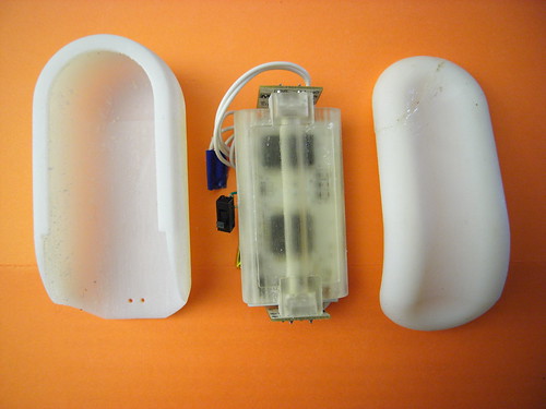
I got an instructive challenge to one of the hand-held forms I’ve been modeling. It’s a bit hard to see in white plastic, but the form is basically smaller, with some simple articulations that in my early days here, have been difficult to execute in software.

I like this form — it’s compact and smooth and feels comfortable to hold. I’d like it in wood, frankly, so I’m starting to think about how to design for milling rather than for printing. Like a buffoon, I cracked the top fitting while I was trying to remove a small section of this swept guide that keeps the thing closed. I should have either sawed or filed it down. Instead, I took a pair of snips to it and, even thinking that it might break, went ahead and tried to snip it. So, that crack? With the gobs of glue? That’s that.

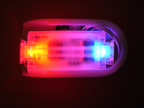
I whipped up a small mounting package to help contain the loosey-goosey bits — the PCB could fit in clips and such, but I’m thinking that it may be easier to fit things in one “fixed” package and then allow the package to go into a variety of things that may have different geometries. There are a bunch of problems with this particular design, or challenges — mostly trying to get the light to be as ambient and non-directional (or to not appear like it’s coming from these very bright sources). The white plastic helps, but I think a lot more can be done. The shadows created by the mounting package itself is a distraction.