Merit Badges for Things

I was awed for some reason today by this power brick for a Lenova ThinkPad thingie. The assemblage of certifications, warrants and authentication badges almost defines how large the brick can be. What this made me think of is the thicket of contested hurdles objects and devices must vault over in order to become certificated, first-class citizens in the world. Each of these indications are backed, I’m fairly sure, by thick volumes of rules, parameters, minimums and maximums and costs for laboratory verifications, all part of the knotted assemblages of social-political-technical blessings that make a thing into a Thing.

Why do I blog this? Been reading and listening to quite a good bit of Latour these days. Stumbled across this from Peter Ryan, a Ph.D. student at the University of Toronto while looking for Latour’s statements about visualization.
Continue reading Merit Badges for Things

Apologies

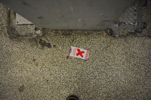
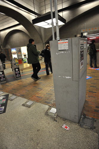
An intriguing juxtaposition between machine and this unusually emotional sticker, desolé drew me in. At first, looking at this scene in the Underground City of Montreal network — a hybrid space that occupies many square blocks underneath the city and consisting of mostly retail spaces interconnected with tunnels and escalators and subway train stops — I was drawn to the sprout of infrastructure awkwardly placed in the midst of an area where people approach a ticket booth to purchase tickets or make inquiries and so forth.

This box was just sprouting like a weed in the middle there, clearly the result of either a system upgrade which required some additional infrastructure, or perhaps it was always there of necessity and was built around. Either way, it’s undesigned because it takes into account only the functioning of the infrastructure and not people and the ways they participate in the network of underground flows. Sure, it’s absolutely instrumental and utilitarian, but there is where the design component leaves the solution. Without thinking about people, you have a bunch of boxes and wires that makes the engineers proud, but forces the machines, as in this instance, who participate as social objects always and never just as instrumentalities, to plead to the people who must walk around it — sorry. I’m really sorry that I have been introduced as a nasty, sharp edged box right in the midst of your path. I can only imagine the flows here during a busy morning or evening commute!

With this post, I introduce a new category — Undesign — to capture the observations I come across in which instrumentality and the lack of people-thinking is so clearly the guiding principle of the object or activity that I need to annotate and continue to work through my thinking about design and people and their relationships.

Continue reading Apologies

Touch Keyboard

Interface Fail

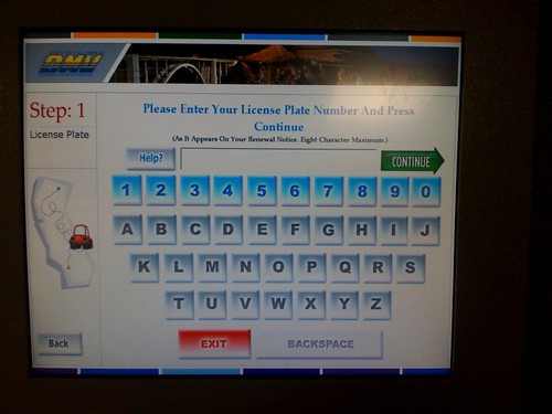
A curious touch keyboard interface that was a bit confusing. This was found at a Department of Motor Vehicles location here in California this morning. The keyboard was there in this kiosk so I could type in my car’s license plate and be issued a renewed vehicle registration certificate. The geometry of the keyboard’s outline is evocative of a standard QWERTY layout, tapered toward the bottom as it is. And I hunted as if it were a QWERTY but, obviously, it’s not — the keys are alphabetically organized in rows by columns.

Why would Nicolas blog this? A curious reorientation of a keyboard meant to evoke what the standard keyboard look like, but without making assumptions about peoples’ knowledge of it’s standard key layout. An interesting design decision here. What elements from keyboards suggest their use (the geometry of the keyboard’s outline) and when can you ignore attributes for the sake of usability? What makes something usable? What assumptions can you make about familiarity and knowledges of use for things that are pervasive and whose use is implied in the design?
Continue reading Touch Keyboard

Design for Cardinality

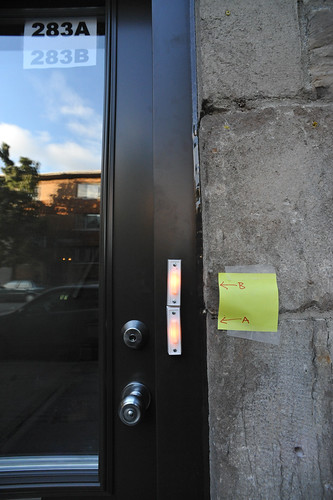
Interface fail. Evidently, the ordering of the apartments inside here is different from the screwed-on doorbells so one of the tenants improvised a new user interface. Hysterical.

The implied cardinality here of apartments — top to bottom? alphabetical? — must have been poorly communicated. But the question is — why not take the more robust and fault-tolerant solution to swap the order of the paper signs taped to the inside of the door’s glass? A passing prankster might find a small bit of amusement in putting up a new post-it, perhaps with “C” and “D” instead of “A” and “B”..(ahem..)

Why would Nicolas blog this? To consider when cardinal ordering schemas do or do not imply specific interface templates. Is it a design principle that letters lower in the cardinal alphabetical “scale” go on top? Or, do they go on the bottom, as in the heuristic that basement, underground apartments always have letters, such as the dingy Apt. B, next to the boiler room?

Continue reading Design for Cardinality

Design Fiction @ Design Engaged 2008

03102008_132802

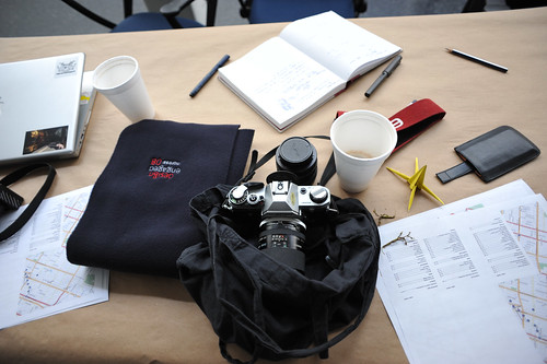
Design Engaged 2008 winds down with a series of quite enjoyable “wrap-up” presentations from some real-world adventures amongst four groups who went out into the field yesterday after the last of the presentations on Saturday. Thanks to everyone and especially Andrew, Boris, Mouna, and Jenn for their hard work and especially for the invitation! Now we wait for Ben’s wrap-up presentation with some discussion.

In the meantime, I’ll quickly post the slides from my really, really early-days presentation called “Design Fiction” where I look at various kinds of prototyping as kinds of prop-making whereby objects are speculations and “conversation pieces” helping to craft and author stories about what the world could be like. This work reaches back to my dissertation, or a chapter of it, where I investigate the role that special-effects play, particularly in sci-fi film, in heping create a convincing story. It goes deeper though — there’s a precedent for film props to be quite slippery in their cultural power, with the props serving as conduits between the “laboratory” and the “set” as locales of meaning-making.

Design is a kind of authoring practice (but different in important ways that have yet to be worked out in my mind from writing words on paper — writing is not the same as what design does when working with material, and the histories and specifics of the practices are quite distinct), crafting material visions of different kinds of possible worlds. Design’s various ways of articulating ideas in material to create social objects and experiences can be seen as a kind of practice close to writing fiction. This is a presentation about the relationship between design, science fiction and the material elements that help tell visual stories about the future — props and special effects. The questions here are this: How does design participate in shaping possible near future worlds? How does the integration of story telling, technology, art and design provide opportunities to re-imagine how the world may be in the future?

What are the ways we imagine and represent the near future? How can we use design and designed artifacts of various sorts to shift our representations of the future to encompass multiple futures? How can design become the prop-making craft for hopefully more habitable, sustainable near-future worlds?

Continue reading Design Fiction @ Design Engaged 2008

Ticket Vending Machines

04102008_161133

04102008_161118

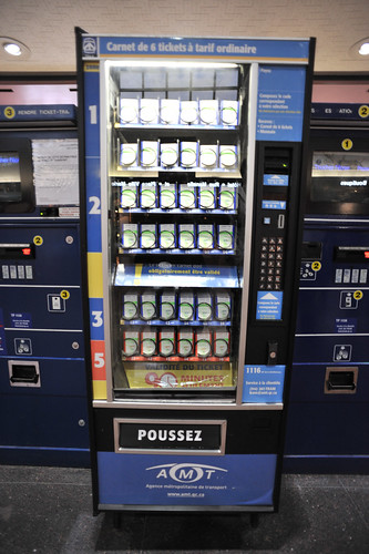
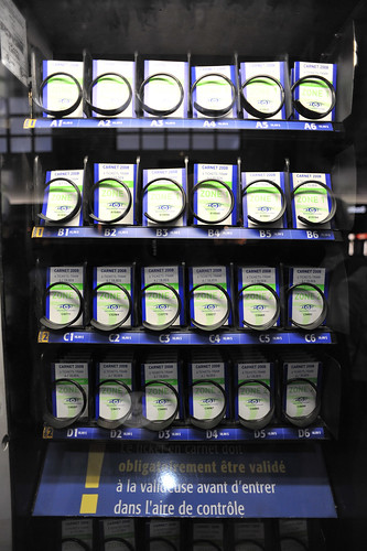
A peculiar analog ticket dispenser machine found in Montreal. Rather than printing tickets on-demand, a whole bunch of physical, paper tickets are pre-stocked in the machine and, like buying candy bars from a vending machine, you select your route and the machine drops a ticket down for you.

I’m curious why this exists. Was it a re-purposed vending machine? Or a sense that pre-printing was perhaps prone to failure?

I think this is quite fantastic and a curious reversal of common technophilic trends, where you might expect a machine to be linked to a larger network of databases and algorithms and printing machines. It’s post-optimal in this way; running against trends that assume just-in-time is the appropriate optimization strategy.

Continue reading Ticket Vending Machines