Documenting the State of Contemporary Technology

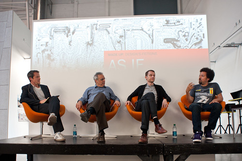
Or how the observations of mundane technological glitches and frictions offer a complementary form of inspiration to the multitude of glamorous utopian design visions.

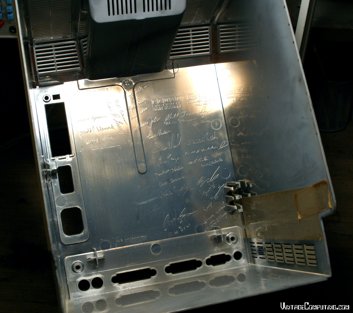
At the Near Future Laboratory we are fascinated by the co-evolution of humans and technology, how technology is changing and how it is changing people. Practically, this means we constantly observe this interplay, and we love to question, design and create the future of this relationship. We are persistent stalkers of the partially broken, the tinkered, the seamful, the annoying, the absurd and any other awkward ways technologies surfaces in our modern lives. These observations offer us a complementary form of inspiration to the multitude of glamorous utopian design visions.

TV Control instruction for my fictional AirBnb guests. Courtesy of Nick Foster.
TV Control instruction for my fictional AirBnb guests. Courtesy of Nick Foster. #TUXSAX

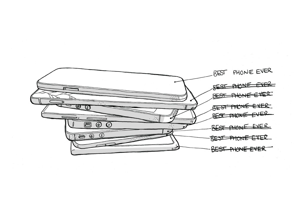
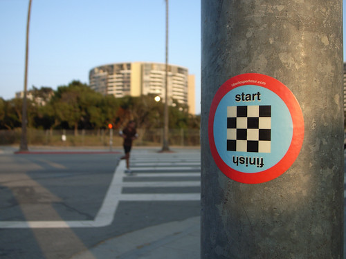
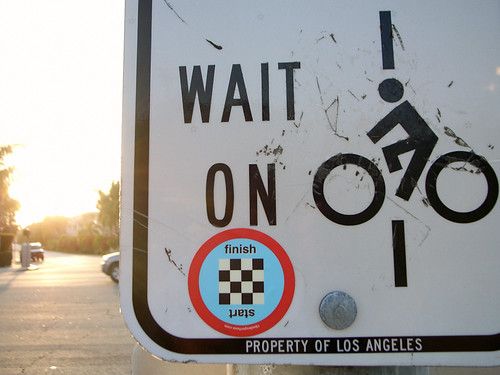
In a recent project in the form of the fanzine TUXSAX: the user experience will be as shitty as expected we highlight that perfection, prediction and seamlessness are biased goals for the design of future technologies. They describe an ultimately unattainable and arguably undesirable world.

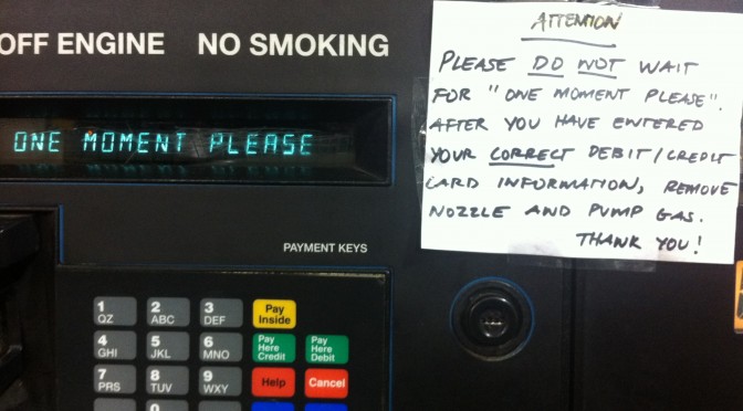
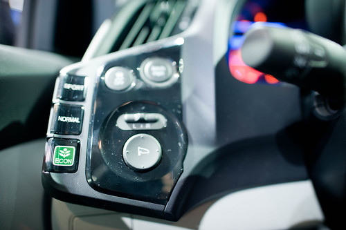
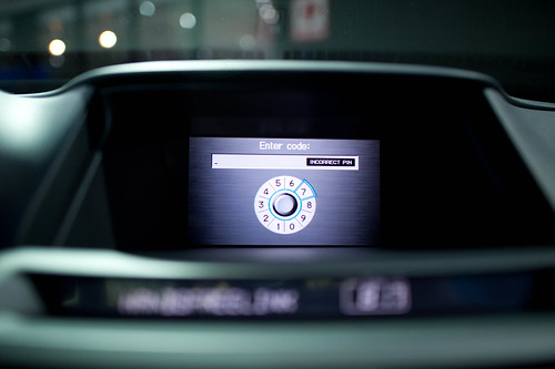
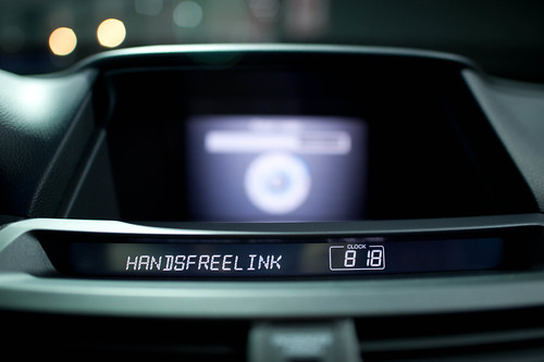
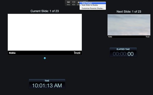
Our observations are not meant to accuse or mock the institutions or people that are behind all the little digital glitches and frictions that all connected humans must deal with in their daily life. Rather they act as documentation of the state of contemporary technology, how we as a society experience a constantly postponed future, how the promises of tech giants are never really met and more importantly how people deal with the implications: cleaning memories from a bulging cloud storage service, finding out that your USB cable was planned for obsolescence, entering a 16 characters password handwritten on a small piece of paper to access the hotel WiFi, mastering a living room system with 5 different remote controls…

Image courtesy of Nick Foster.
Image courtesy of Nick Foster. #TUXSAX

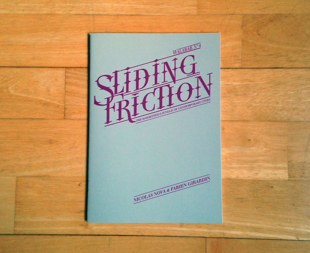
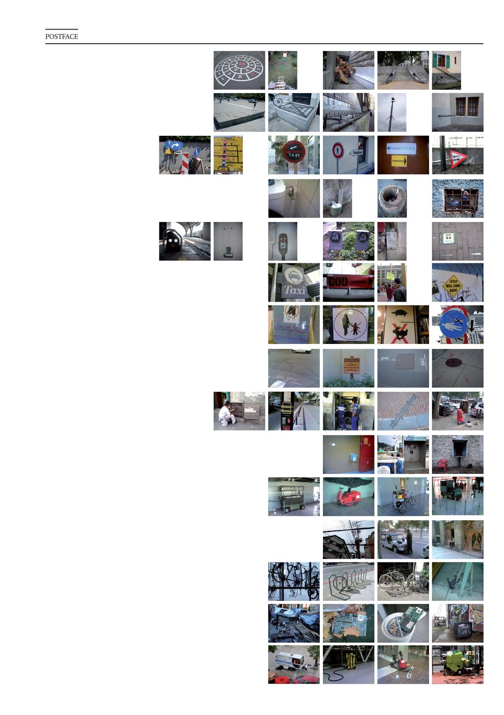
This work echoes with Sliding Friction: The Harmonious Jungle of Contemporary Cities a pamphlet that assembles photos and annotations we took here and there along our dérive through the many cities we lived in and visited. Published 8 years ago but still very contemporary, Sliding Friction was an attempt to showcase the curious aspects of contemporary urban spaces and question the visions of the ‘smart city’. Through 15 topics and 4 themes we focused our lenses on the sparkles generated by the many frictions between ideas, practices and infrastructures that populate cities.

sliding-friction

Both TUXSAX and Sliding Frictions, are invitations to engage with the knotty, gnarled edges of technology that say ‘there is humanity here’. We aim to provide some raw food for thoughts to consider the mundane frictions between people and technologies. Do we want to mitigate, or even eliminate these frictions? Or as Julian argues in the postface of Sliding Friction:

sliding_friction36

Friction is a force exhibited at the point of contact between two objects. As a metaphor, friction is a powerful image describing where life happens. The effect of contact between ideas, practices, infrastructures is seen at the points where that contact squeaks and groans or throws sparks. We operate from the perspective that friction is something that should be mitigated, even eliminated. But friction is absolutely necessary, especially even as a metaphor. Without friction, our shoes would not allow us to walk. Without friction, airplanes and birds would drop from the sky. Without accepting friction and its effects as necessary, we would be fooling ourselves into thinking perfection were the ideal.

Our aspirations should be to embrace the humanity that is imperfection — the humanity that friction echoes. Whether in the imperfection of broken and exposed wires that suggest net- works of communication, the faulty and imperfect WiFi zones that require a very human kind of improvisation or the rewriting of infrastructures with human faces, friction effects are an enduring mark of human and individual action, rather than systemic, technocratic and faceless agency.

Friction is the sinews of the world as we know it. It holds things together even in its messiness. Friction is the rough edge of planned social space and the mark of social activity — it is part of the lived social world where humans live, play, argue and pay taxes. Improvised trash bins in hollow tree stumps, and service personnel trying their best to keep street surfaces clean are evidence of these rough edges. Friction is part of the “real world” — the world of individual action resisting seamless, smooth perfection to inscribe the presence of its occupants. Perfect, planned, frictionless operation is a faulty perception that some hold as the goal for the future city. In my mind, it describes an ultimately unattainable world. I’d much rather see the knotty, gnarled edges as exhibitions that say “there is humanity here.”

Fosta's Ye Olde Aesthetic

(Nick wrote this over on his blog. It deserves more blogginess, so I’m re-blogging it here as well. – Julian)

The New Aesthetic. People are all over this one. It’s Bridle’s baby and a worthwhile endeavour it is too. The main issue with the New Aesthetic appears to be in defining it, and a swathe of heavyweights have stepped up to give their view. Rather than join them, I want to try and frame the New Aesthetic a little, give it some context perhaps.

So what do we know?

The New Aesthetic is a crowd generated lucky dip in the shape of a tumblr. Some of the content makes sense and some of it doesn’t, but there’s enough there to make out a theme: machine intervention. From pixellated architecture (which might have simply been considered mosaics prior to the New Aesthetic tag) to glitch-laden pop promos, there’s the whiff of technology about all of it. But in order to understand the art (if that’s what it is), perhaps we need to understand the artists.

I work in San Francisco, at the heart of the new technology revolution. Everywhere one turns there’s a feisty startup, technology hot-house, or band of programmers hunting for a VC. In a very real sense this place is where the future is being made. One could expect to see folks in Cardin costumes, zipping around on neon bedecked segways through some proto-Tron grid. But no, the people crafting the future aren’t ‘futuristic’ in any tangible sense. The futurists I know are more interested in hearty pies, farmer’s markets, fine wines, old bicycles, hand-made clothes, leather shoes and hard-backed books. The futurists are retronauts. This isn’t solely a San Francisco phenomenon. From London to New York and beyond, one cannot fail to notice the rapid growth of heritage manufacture, and a diet of artisanal bread, heirloom tomatoes and fine-tuned coffee have fueled a growing obsession with with the old. Not the old per se, but a version thereof, a simulacrum even. The ‘Olde’. This has led to an emerging paradox in the world of objects. We love the perfection, modernity and reliable consistency of our iThings, but we also feel the need to pop them into a handmade leather pouch.

In case any of you are unsure what I mean, take a look at this: fuckyeahmadeinusa

Some of these little movies are lovely, but watch five or six of them and it’s clear that there’s a strong thread of values running throughout. The delivery aesthetic is also consistent: the short focal length; the folksy soundtrack; the slow tracking shots; the gnarled old signs; the well worn tools – they’re all there. If ever there was a well defined current aesthetic, it’s this. The Olde Aesthetic is organic, it’s slow, it’s irregular, it’s ethical. The Olde Aesthetic is worthy, has longevity, has heritage. The Olde Aesthetic is expensive.

Speaking of expensive, a lot of brouhaha has been made of the recent sale of Instagram to facebook, much of which has focused on the addition of filters to make photos appear older, as if taken with a classic camera from a bygone era. Nostalgia aside, a level of imperfection is becoming a noticeable focus in design. The creation of something consistent, elegant and ‘perfect’ is no longer as much of a manufacturing challenge as it once was. Somewhat counter-intuitively, signs of human intervention are now increasingly difficult to achieve in the era of mass automation. As a result, people are becoming numb to technological perfection and are increasingly seeking out products which evidence the skill and actions of a human, with all the associated flaws, faults and individuality.

In the world of digital products quality means consistency. If paint colors don’t match, if fit and finish is misaligned, if the product functions differently to it’s neighbor, the product is considered a failure and is dispatched to a waiting dumpster (or more likely shipped off to a grey market street seller). The same is true of digital content. Consistency is king across platforms, applications and operating systems. Tools are put in place to achieve this very goal.

But let’s look at the finer things in life, those RedWing boots, heritage style clothes, fine food, furniture and bicycles. Signs of mass production, consistency and homogeneity are undesirable in these products. The movies of the Olde Aesthetic fetishize the machines used in production, but also feature loving portraits of the wise old owls who operate them. Contrast this with the dustmasked anonymity of the Foxconn workers, tethered to their machines producing a blur of cookie cutter devices. Perhaps futurists need to live in the Olde Aesthetic in order to more clearly visualise, synthesize and ultimately understand the New Aesthetic? Perhaps the Olde Aesthetic has arisen as a counter to the reliable fast-food repetitiveness of the digital world? Perhaps the comfort of an Olde Aesthetic life leads to better clarity of thought when considering the future? Maybe they should remain polar opposites, but I think it’s important to understand potential overlaps in the Venn.

When the team at Apple signed the inside of the casing of the mac plus computer they did a very powerful and emotional thing – they stated “this thing was made by people”. Whilst the signatures were etched into the injection molding tool and reproduced with the same reliable regularity of the neighboring screw bosses and air vents, it’s still one of the most beloved elements in Apple’s design history. The very notion of electronics is repetitive and binary, but the overall product experience needn’t be. Let’s be clear here, I’m not talking about personalization, widgets or custom fonts, just as I’m not talking about dropping circuit boards into hand carved teak encasements. There must be something deeper.

Back when we lived in London we arranged a regular delivery of vegetables. In that peculiarly middle class way, they arrived in a drab cardboard box, wrapped in brown paper. They were muddy, and every now and then we would find a grub. Far from complaining, it actually added to the experience, as if the reality of our position at the end of a very long production line of human beings was suddenly made evident. In a world of perfection we actively sought out imperfection, with the express intent of breaking free from the reliable, regular produce from the supermarket. In a world of machine-perfect digital objects, are there any which have grubs? Are there any digital experiences where finding the grub is actually considered a plus? Are there artisanal, organic or heirloom digital products?

If you have anything to add, I’d love to know. In Olde Aesthetic style, send your contributions not via tumblr, but by postcard: Nick Foster – 200 South Mathilda Avenue, Sunnyvale CA 94086.

One Moment Please

A curious addendum to account for a UI/UX muck up at a nearby gasoline station. These moments reveal these hybrid displays — both purposeful, and one made to accomodate for failures in the machine. And this second one — how peculiar. My new laser printer to replace the 10 year old one what that I printed my dissertation on back in 2004..it’s fine. A bit noisy. And it’s got a whole slew of LEDs to indicate status and all that. The one it replaced? It had a light that was either green (“all good”) or flashed amber (“something’s wrong..paper jam!”) In the last days of the old printer’s life — that light just stayed amber and never went back green. This new one? Well — it’s got lights for days and a sticker it came with so you can figure out what all the flashing codes mean.

Why do I blog this? Just trying to understand the complexities and vagaries of the interfaces to our devices. This complex of things that we need to know about when/where/how to operate them — how long to wait before doing something (slow machines? slow networks?), how to know what’s going on with the machine and the obscure ways they want to talk to us..flashing lights.

Continue reading One Moment Please

18 Miles Per Hour

Start

The diversified curiosities of creative people indicates that there is more to the world than things that run on batteries and connect to the Internet and San Franciscoans fuss over in front of bearded baristas. I celebrate this diversity by announcing that there is now a lovely series of climb category cycling stickers by my friend Rhys and Co. from their 18milesperhour.com project. For a short time, you can get a set for free in exchange for liking ’em on Facebook and sending a message or email with your address.

Worth it, if you ask me. And way better than getting twiddly trying to justify to your own brain the $700 you dropped on your iPad.

I stuck this one on last evening’s trundle around the Marina. When done, I put one on the other side of the street there which counts, officially — as The Finish. (Parenthetically, I don’t seem to have use of climb category being a flat-ground spinner. *shrug)

Finish

Continue reading 18 Miles Per Hour

Superstructures

Super Structure

A view from the bottom while transiting through Newark International Airport last week..or two weeks ago. Fuzzy on that. A visit home and then to see some friends and do some touring around Massachusetts and New Hampshire, which reminds me that the American North East can be lovely to visit. Um..take my word for it even if I just share an architectural photograph of the airport..
Continue reading Superstructures

The Interaction & Interface Design Car Wreck

Sunday November 28 10:13

For designers, clearly, surfacing, paint colors, materials and interior fabric choices rule out over interface design, which is just plain forgotten about here . Unless it can be justified as, like…Formula 1 inspired, it just doesn’t seem to get any priority as an area of innovation. Look — hybrids barely get any consideration. Even the American car makers booths were bristling with cleaved “Boss” engines reminiscent of the $0.50 a gallon days.

*Sigh.

Well, there’s work to be done. Even the luxury cars could learn a trick or two from the IxDA world..This was a two hour wonder through the subdued LA Auto Show on Sunday. It’s hard to get excited about cars these days, save for the exuberant electric or hopeful hybrid. I chose to annoy myself by noting the wretched center console designs. Who’s in charge of these things, anyway?

Sunday November 28 09:18

Seriously. I wonder who has to program their office into their car nav. I mean..after the first day, or maybe even the first week of a new job, which you got so you could afford your fuck-off Porsche Cayenne. If you need your nav system to get you to the office everyday..even if you’re coming from the club, or dropping the kids off at school, or whatever..you’re doomed from the get-go.

Sunday November 28 09:34

What can you say? If I had to look at this everyday after spending..whatever. $40,000 on something? I’d cover it with butcher paper and use it as a notepad. Maybe leave a little hole for the austere analog clock there.

Sunday November 28 09:48

This is a Volvo. This speedo console actually isn’t so bad. It gives you messages close to the idiom of an SMS on your phone. So long as it doesn’t tip into Growl-style pop-ups, I think we’re okay here. It’s actually somewhere between charming and a bit uncanny valley-y..like..has my car turned into a message receiver? Why is my car discussing things with me? On the ride home, my friend Scott, who has an edition of this Volvo, noted that his car was reminding him to take it in for service in a similarly polite way — rather than “Service Engine” which is a deceptively calm way of telling you that there’s no more oil in the crankcase and your engine is pretty much a solid block of molten metal.

Sunday November 28 10:06

God, I’d ball-hammer whoever decided that the “Eco” mode of the car — presumably an energy-sensitive mode — should get this Evergreen tree icon and then sport and normal are left to this horrid sans serif with no iconographic or color or nuthin’. Why even bother? Like..*g’aahhh..Ball-hammer!

Sunday November 28 10:07

Sunday November 28 10:13

Now our cars require codes, PINs, and passwords — the wretched baggage of cold war security protocols which barely work for humans. Who wants to guess how many 1234’s and 0000’s will start a car? What’s the future of PINS and passwords and why is it not in my fancy, from the future car? I’m not talking about retinal scanners and biometrics here. Just simple, modest, low-level security like..pick a secret picture, your daughter’s favorite animal, &c. PIN? Really?

Sunday November 28 11:22

Jeeze. I’d almost prefer the old fashioned mechanical AM/FM radio than this Kafka-esque nightmare. Two knobs. Big old preset number keys from 1-6. A “Back” button the size of two keys. A four way that’s probably got a center-select. It’s just nuts.

Sunday November 28 10:11

Holy cripes. I mean..this is like 14 different things designed by 73 committees or something. It’s got Menus, Maps, Guides. Titles, XM, “Sound” (what??), CD (really. compact “disc” technology?). Category, Tune, Sync. And that’s an EIGHT way with a center select. EIGHT! It’s just a baroque meshuggener mess trying to look cool and failing miserably. MISERABLY. And on top of all that? The build quality would make me slap my forehead in regret every time I try to adjust the climate control knobs.

Sunday November 28 10:13

Okay. Someone should probably teach the designer of this display either about Camel Case or remind them that segmented LEDs can sometimes be retro, but only for hipster clocks and calculators.

Continue reading The Interaction & Interface Design Car Wreck

Weekending 09192010

Friday September 17 18:56

Okay. There was some more fussing about to pull together a reading list / viewing list for a new project I’ve been thinking about that is in and around augmented reality. The viewing list includes the usual suspects — Terminator 2, They Live (which I showed in the studio — and only three or four people showed up to, which is lame), Until the End of the World, Iron Man, and 2081, although that last one may be a stretch. There may also be some of the important “boot-up” moments from RoboCop that are relevant.The point is to look sideways at the topic from the get-go and not assume the outcome before things get started, which can happen very easily when the project is quite specific. ((It’s not broad at all — as a matter of fact, the name basically says what it wants to produce, which is the wrong way to do any project, I think.))

Friday September 17 17:06

I scrambled over to Art Center College of Design Friday afternoon to participate in their As If.. / Made Up research residency on a panel discussion with Norman Klein and Sascha Pohflepp, which was good fun and engaging and helpful for my own questions. I think I’m now more-or-less set on creating a catalog of genre conventions for design fiction, especially as it happens in film. Getting a copy of that book “Cinematic Storytelling: The 100 Most Powerful Film Conventions Every Filmmaker Must Know” (bleechh..these titles..)) made me think about how I might structure such a catalog and then of course I’m forced to think of why this might be useful. Part of it is just the process of forcing myself to identify what might be curious, useful or intriguing visual patterns and story telling techniques that make it possible to imagine the future, or some aspect of it. I was thinking this could make a curious DVD of some sort.

Get the flash player here: http://www.adobe.com/flashplayer

var so = new SWFObject(“http://www.db798.com/pictobrowser.swf”, “PictoBrowser”, “500”, “500”, “8”, “#EEEEEE”); so.addVariable(“source”, “sets”); so.addVariable(“names”, “2010 01SJ Biennial – Build Your Own World”); so.addVariable(“userName”, “julianbleecker”); so.addVariable(“userId”, “66854529@N00”); so.addVariable(“ids”, “72157625004848614”); so.addVariable(“titles”, “on”); so.addVariable(“displayNotes”, “on”); so.addVariable(“thumbAutoHide”, “off”); so.addVariable(“imageSize”, “medium”); so.addVariable(“vAlign”, “mid”); so.addVariable(“vertOffset”, “0”); so.addVariable(“colorHexVar”, “EEEEEE”); so.addVariable(“initialScale”, “off”); so.addVariable(“bgAlpha”, “90”); so.write(“PictoBrowser100921100902”);

Saturday, went up to 01SJ, ran into everyone and a barricade. It was fun, engaging a little scattered and far-flung and lonely in spots and great to see many friends and their peculiar provocative projects.

Get the flash player here: http://www.adobe.com/flashplayer

var so = new SWFObject(“http://www.db798.com/pictobrowser.swf”, “PictoBrowser”, “500”, “500”, “8”, “#EEEEEE”); so.addVariable(“source”, “sets”); so.addVariable(“names”, “Silly Girl Pirate Bowl”); so.addVariable(“userName”, “julianbleecker”); so.addVariable(“userId”, “66854529@N00”); so.addVariable(“ids”, “72157624994149716”); so.addVariable(“titles”, “on”); so.addVariable(“displayNotes”, “on”); so.addVariable(“thumbAutoHide”, “off”); so.addVariable(“imageSize”, “medium”); so.addVariable(“vAlign”, “mid”); so.addVariable(“vertOffset”, “0”); so.addVariable(“colorHexVar”, “EEEEEE”); so.addVariable(“initialScale”, “off”); so.addVariable(“bgAlpha”, “90”); so.write(“PictoBrowser100921105429”);

Closed the weekend out with a fantastic Silly Girl skate event at the secret Iguana Bowl — Pirate Bowl, for talk like a pirate day!
Continue reading Weekending 09192010

When Not To Use Doorknobs

3D Magazines

A familiar challenge is to translate the seemingly unyielding demand to put a specific technology into something because it is expected, or because the name of the technology is the new great thing. It doesn’t matter what it is in particular — I use “doorknob” as a stand-in for whatever the latest “doorknob” of the day might be.

For example — we’re going through an Augmented Reality “doorknob” phase presently, as most of you know. As evidenced by the recent issue of “The Skateboard Mag (78)”, we’re also continuing to go through another, another 3D “doorknob” phase. Which is fine, I guess. 3D is fun when the impact is light, like a magazine.

What do I mean by doorknob? Doorknobs are things that rarely mean anything at all to normal human beings but they mean everything in the world to doorknob enthusiasts who spend most of their time trying to put doorknobs onto everything they possibly can — coffee tables, lampposts, patio chaises, kid’s t-shirts, wrist watches, fancy cameras, car dashboards, toasters, clock radios, keychains, tea kettles, baseball hats.. I could go on, but I’ll let the “doorknob” enthusiasts go crazy themselves.

Rarely, on occasion — someone puts a doorknob on a door because, perhaps, they lead their thinking and ideas and making with principles that focus on people and their practices before they just think of shoving doorknobs on kitten collars or broom handles.

Rather than specifying design first based on technology and engineering-based *parts, fashion small, short stories around the people-based principles that might, in the end, specify that a doorknob be used. But, only at the tail end of things. If you start to feel like you’re bolting doorknobs onto stuff cause some guy in a yellow tie and blue shirt had a graph that suggests that competition is going to start using Baroque, mother-of-pearl encrusted doorknobs on their 2013 saw horses — then obviously something is backwards with the design process. Increasingly — or maybe at this point completely — my own opinion is that, for the near future at least, design can play a much larger role in fashioning and specifying and coordinating the activities between all the other participants in the making of things. Amongst engineering, marketing, operations, production, sourcing and so on. Not that all that is fun at all — but it may be crucial and necessary for creating a legible, sensible “output” at the end of a lot of hard work. Something that communicates and represents value in a people-centered way. It’s incredible how much kruft comes out at the end of markets-led decisions — it’s simply unsustainable, and often done just to keep a foot in the door and so that conversations (good or bad) continue to float around.

Alternatively is the translation of the *doorknob into something else. Doorknobs can be props that stand in for something else that is more people and experience-centric — say, access. A way in. Even an ornamental way in that suggests something wonderful lies beyond. Translating that experience could make a doorknob more than an inappropriate proboscis on something it has no business being part of, I suppose. That feels like a middle ground compromise, as opposed to starting with experiences that are legible to whomever you are hoping to make something for — making those experiences the best they can be (or even just a little better than they already are.)

*shrug*

Okay. Back to it, then.

Why do I blog this? Honestly, don’t read much into this or try to interpret what might *really be going on. I’m just capturing some caffeine-fueled notes on a thorough-going set of questions about how to effectively lead “innovation” or the making of things with design principles and design practices that then themselves specify “the parts.” How can design lead with the respect and authority that engineering and business and marketing-type activities have already? And do so without the hubris of “John H. Doe Design Agency” sort of stuff. If engineering and “research” start with, say — doorknobs that operate without touching them and business and marketing start by assessing what sort of doorknob ornamentation will the market expect down the road what is the way for design to contribute a perspective and translates that language in such a way that, perhaps — doorknobs themselves are questioned and new propositions appear that aren’t specifications based on what is available, but specifications based on what should be, that based on principles more thoroughly considered than “just ’cause.”
Continue reading When Not To Use Doorknobs

*Wheels On Luggage

Luggage without wheels

A short-hand expression used in and around the studio to describe that one, usually small, unexpected and deceptively obvious designed feature that makes an artifact suddenly transformatively useful/helpful/up-graded. The kind of transformation that makes you look back and wonder how the heck you ever schlepped that awkward, sagging Samsonite with one arm across entire airports..cities..continents. Like..what took them so long to put wheels on luggage, anyway? I mean — I’m sure there’s a business case study on it ((if you know, please share with me..I’m curious..))

SwapDisplays

SwapDisplays_Zoomed

Above is just one example I came across and was prompted to mention briefly after Ian blogged about his feelings towards presentation software. This is a simple button to do the switch-a-roo between displays that is inevitably a big bump in getting set up to present from Keynote. Often enough, almost inevitably, your presentation notes screen gets piped to the audience display and you have to hunt about in display system settings to switch them. Always awkward to have people staring at your notes, or, worse — your desktop or email. Here’s a quick ejection button that toggles the displays right from within Keynote. No hunting for your System Settings, losing track of where the display mode modal dialog has gone, etc.

*Wheels on luggage.

More generally this idea of *wheels on luggage is useful to remind ourselves that things have not always been as they are — things have been different and they’ll be different again. It’s useful, to me at least, to think that we are in the Jurassic era for *something. Where are the exemplars around us that are waiting to have a set of four wheels put on to make things work a little bit better, a bit more humanely, or sanely? What is the relationship to all our “new” things today to what they will become sooner than we expect — E-waste? Something squirreled away in another bin of lost-and-forgotten things that we once thought we couldn’t live without? bits-and-bobs in a vintage shop display case?

Why do I blog this? I find it a very useful approach to design to imagine that I am making the past for some future, rather than the future itself. Artefacts that reflect ideas and inspiration but are things that someday will be quite ordinary, quotidian and unspectacular. Normalizing heroic ideas to the everyday yet exceptionally useful — such that they are impossible to imagine a world without. Like wheels on luggage.
Continue reading *Wheels On Luggage

Predictably Not Quite Failing

Sunday February 07 14:25

Since the *winter holidays here in Los Angeles, which is a strange thing for an East Coast boy, especially as I hear reports of epic dumps of man-killing snow in New York City, my favorite photography spot has been the recently opened Venice Beach Skate Park and the equally awesome Venice Skatepark. I’m not a skater, nor a Sk8r, nor a photographer inclined to action-y things, but being in the mix, under threat of kicked out boards and lawless aerials

Sunday January 03, 16.09.24

Saturday January 23 18:23

Saturday January 30 14:52

makes the park an invigorating and challenging photography playground — and quite addictive.

I don’t want to attempt a rough-shod bit of metaphor-stretching — or at least not too much — to try and rationalize sharing this *non sequitur of a post, except to say that, as pertains the last photo, I have been obsessed with these moments when something tried..fails. The failure has this curious, no-fear character to it. Trying the thing that seems impossible, over and over again. Getting closer, or moving away from the original idea and into something else, &c. It’s never a failure out right, at least as I see it through a viewfinder. There’s always something quite lovely about the moment when the board stays where it is, and the skater goes somewhere else.

Why do I blog this? *shrug.
Continue reading Predictably Not Quite Failing