
A fascinating poster encountered few days ago in the wholesale district of Los Angeles. A very straight-forward way to indicate the evolution of objects/technologies. Let's appreciate the examples chosen by this local tech historian.
I just got off the phone with Julian.
I’m still obsessed with the role of objects in a world with Artificial Superintelligence (ASI). It’s a tough field, as it requires a wholesale restructuring of everything we currently associate with objects, their affordances, what they mean, how they work and who owns them. I will continue to wrangle with this, but let’s begin with this thought:
You have long been told that software is the key to the future, and indeed it is, but software always needs to be delivered through a thing. Even if the future of software is ephemeral and audio (à la Her), it will still require a speaker and a microphone, housed in a thing. Things are the most vital part of any software.
(In the world of software, things are referred to as hardware. This cannot continue. It’s not a term which needs replacing it’s just too narrow, too outmoded. If software becomes the pervasive enabler of our future then ‘hardware’ encompasses absolutely everything else on the planet).
The importance of things must not be underestimated. To a piece of software things are just input and output, and if we look at human/computer interaction as a linear relationship then this is true. However, humans are not linear beings and we have irrational behavioral traits such as envy, hatred and lust.
If an ASI is to be successful it will need to produce things which humans desire and want to use. If the purpose of an ASI is to harvest and process information, then it needs to create the best possible data harvesting conditions. If human behavior is the crop, then the devices need to be considered as fertilizer, promoting use and interaction.
Things need to be desirable.
Now it would be fair to suggest that the best course of action for any aspirational intelligence would be to develop a unifying morphological algorithm. Indeed there are many studies and some commercial products which aim to do just that, but something even more curious is happening. Rather than trying to understand the mathematics of human desire, we are being drawn into an aesthetic of machine making.
Remember those videos you watched of robots producing Apple things? Remember how that felt? Remember how you lusted after those things made by machines that could never be made by a human. Remember how you marveled the first time you saw a 3D printed thing? Your first laser etched thing? The aesthetic of machine manufacture is already heavily imprinted on our collective aesthetic sensibility. It’s another piece of the ASI puzzle already in place.
CES, the Consumer Electronics Show, has become the stuff of legends. As a designer of many things, (sometimes including consumer electronics), it’s been on my radar for many years, but I’ve never had the opportunity or reason to visit.
I have long known the horror stories, the hours of trudging, thousands of exhibitors crammed into endless halls, all vying to get precious column inches for their new doohickey. I decided to attend this year, partly as a way to get a benchmark for the state of the industry (whatever that means, more later) and partly out of curiosity.
CES was a fairly interesting affair, not least due to the location. I’ve not visited Las Vegas before and it proved a fascinating place. To be clear, this isn’t a recommendation, Las Vegas represents everything that might be wrong with the world, but in some way it’s admirable. The sheer endeavor of it all, it’s like seeing one of those Carnival Cruise ships up close, it’s hideous but awe inspiring. My friend Mark Delaney described Vegas as ‘unchecked’, which is just about perfect.
The show itself is a sprawling beast, set across two main arenas (with a third, strange media center, which i didn’t visit). One of these is at the Las Vegas Convention Center, which is a charmless place set amongst ailing casino hotels and vacant lots. The other is in the belly of the Venetian hotel (yes the one with the indoor gondoliers). The Convention Center feels like every other large exhibition hall you’ve been to. A cavernous space filled with bellowing brands, punctuated by a little café selling pricey slices of pizza and muffins, like an oasis of shit in a desert of screaming infants. This is where the big boys play. The likes of Sony, Samsung, Panasonic and Intel peg out vast territories and construct elaborate environments in which to peddle their wares. To be honest I didn’t mind the scale of the place. Sure it’s big, but if you take it easy and skip the bits that don’t grab your attention, it’s OK. The highlight was undoubtedly Sony, who had constructed an impressive arena, filled with all the products you know, but had also dedicated a large section to new, experimental projects. As a contrast to the polish of rest of the show, it made a nice change to see some sketchier stuff. Elsewhere the exhibition was as you might imagine. Big, bright stands, populated by marketing personnel in matching polo shirts, peppered with hired hunks and babes to draw in the eye with a demo.
Down at the Venetian, things were pretty similar, but my absolute favorite area was downstairs, at the back. Here is where the cheapest stands are to be found, off the beaten track, and it’s here where you will find the eager startups. The weird first round fundees with their 3D printed, connected, smart things. This was amazing, and well worth the trip alone. Tiny little stands staffed by desperate looking folks with expressions which can only be gained by committing the survival of ones family to a calorie counting connected fork (see spün). It feels like strolling through the abbatoir behind a sausage factory, if the sausage factory is a late night shopping channel. I wish I had spent more time in there.
The main output from shows such as these seems to be a collection of aggregated ‘trends’ so here goes:
All in all, It was a fascinating trip (in all senses of the word), but people were right: it is way too big. I’ve been thinking about this and it maybe because it’s becoming increasingly difficult to define what constitutes ‘consumer electronics’. We are constantly being told that everything will be smart, connected and appified, so the remit for such a show becomes hard to pin down. At this years CES were TV’s, tablets, cameras and hifi, but also pillows, cars, cutlery and insoles. It makes the whole event feel like walking through a giant amazon logistics center. It’s not really a show about anything in particular.
It’s hard to stand out at such a show, and most manufacturers are still making the mistake of cramming flashy demos into every corner of their space. It just doesn’t work. Again sony got it right here, with a large open space with quiet, knowledgeable staff on hand to explain the products.
I’m not sure I learnt a great deal in going to CES, given the torrent of coverage the event receives, but for any designer it’s undoubtably a fascinating experience. The event, and Las Vegas are good to visit, but better to leave.
I might go back.
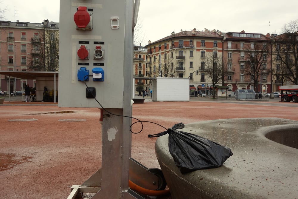
Geneva (Switzerland), December 21, 2015.
The power plugs available for the flea/farmers market in Geneva are often used by people to recharge their mobile phones. The rain sometimes prevents them from using the plugs, but some guy obviously found a protection. Interestingly, the owner, who's fifty meters away, do not seem to care much about his device, only observing it from the distance.
Most connected humans suffer from poor ‘data hygiene’. For instance, we are plainly grotesquely overfed on social media with its ‘anytime’ ‘anywhere’ experience and there is no rational end in sight. In this article, I introduce the reasons why I developed Humans, an app that offers a way to rationally manage too many social media contacts and slows down the consumption of status updates, tweets, selfies, and photos of all kinds.
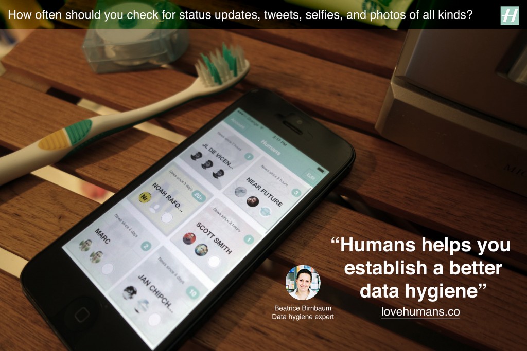
We live in a society that captures the moment, refashions it to ‘share’ across a network of social media endpoints containing algorithms and human, perpetually. Social media, its algorithms and its humans are highly optimized to never stop the cycle. Consequently, we experiencing an unprecedented increase in the rate of this ‘anytime’ ‘anywhere’ consumption cycle. As of 2014, according to the Nielsen US Digital Consumer Report almost half (47%) of smartphone owners visited social networks every day. On top of that, it is not uncommon for a Facebook user to have 1,500 posts waiting in the queue when logging in. Yet, the perpetual consumption yields to very little and there is no rational end in sight. We are quite plainly grotesquely overfed on social media.
Social media needs its consumption cycle. It depends on ‘views’, ‘eyeballs’, ‘reshares’, ‘likes’, ‘comments’ — the euphemism used by the media mavens is the optimistic word ‘engagement’. We are bloated on ‘engagement’ to the point where we sleep with our nodes, wear them on our wrists, clip them to our dashboards, autistically shove them in pockets only to immediately remove them only to shove them back in our pockets only to immediately remove them in order to slake our thirst for more content. This ‘too much, too fast’ consumption cycles has reduced an ability to pay sustained attention, have a meaningful conversation, reflect deeply — even be without our connected devices.
The fact is that each major revolution in information technology produced descriptions of humans drowning in information unable to face tsunamis of texts, sounds, images or videos. For instance, in the 15th century Gutenberg’s printing press generated millions of copies of books. Suddenly, there were far more books than any single person could master, and no end in sight or as Barnaby Rich wrote in 1613:
“One of the diseases of this age is the multiplicity of books; they doth so overcharge the world that it is not able to digest the abundance of idle matter that is every day hatched and brought forth into the world”
Besides a Luddite position of some that rejected technological change, the invention of printing began to generate innovative new practices and methods for dealing with the accumulation of information. These included early plans for public libraries, the first universal bibliographies that tried to list all books ever written, the first advice books on how to take notes, and encyclopedic compilations larger and more broadly diffused than ever before. Detailed outlines and alphabetical indexes let readers consult books without reading them through, and the makers of large books experimented with slips of paper for cutting and pasting information from manuscripts and printed matter — a technique that, centuries later, would become essential to modern word processing.
Historically, humans have adapted to the increasing pace of information exchange with the appropriation of new practices and means to filter, categorize and prioritize information feeds.
Similarly, a couple of centuries later, the increasing presence of the telegraph multiplied the levels of stress among merchants used to more local, slower and less competitive transactions. They eventually adapted to the new pace of information exchange with new practices and means to filter, categorize and prioritize information feeds.
What today’s most connected people share with their ancestors is the sense of excess and related discomfort, and stress linked to information load. In many ways, our behaviors for coping with overload have not changed. Besides the promises of AI and machine learning that trade control for convenience, we still need to filter, categorize and prioritize, and ultimately need human judgment and attention to guide the process.
These behaviors perspires in popular media and the many articles that share tips to follow successful social media diets, detox, or cleansing programs. The authors typically advise their readers to move away from being constantly ‘on top of things’ and to give up on concerns of missing out or being out of the loop. The diets are about replacing one behavior with another more frugal by pruning the many social networks (‘quit’, ‘uninstall’, ‘unplug’, ‘remove profile’) and contacts (‘mute’, ‘unfollow’). Yet they target a temporal improvement and fail to promote a more profound sustainable behavior with positive reinforcement.
Besides the promises of AI and machine learning that trade control for convenience, we still need to filter, categorize and prioritize, and ultimately need human judgment and attention to guide the process.
Social media platforms have also slightly updated the interfaces to support these behaviors. For instance Facebook recently started to allow users to specify the certain friends and pages that should appear at the top of the feed and Twitter introduced a ‘while you were away’ feature to its home timeline. Yet, social media feeds still feel like an endlessly accumulating pile of messy dirty laundry.
There is an opportunity to reconsider how we use social media and how we build it. Social media that gives human control to prioritize certain feeds over others, but without normalizing content into something less messy, and less complicated than a human. In fact, adapting to social media overload is not about being ‘on a diet’ than having a good ‘data hygiene’ with a set of rituals and tools. This is what I explored along with my colleagues at Near Future Laboratory with the design and development of Humans.
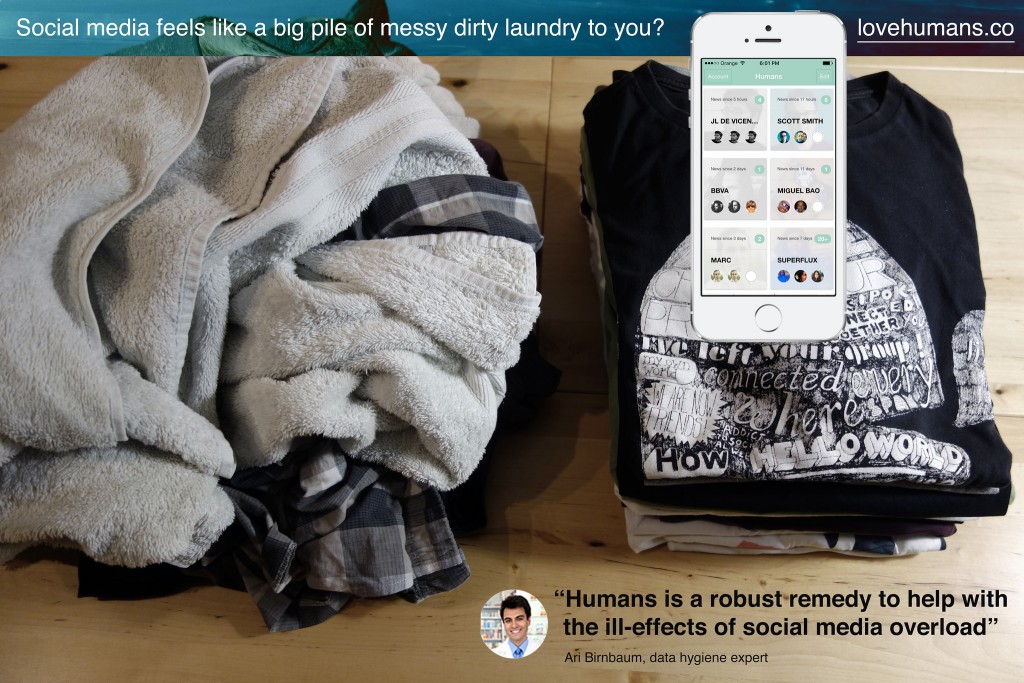
Humans is an app that offers a way to rationally manage too many contacts and slows down the consumption of status updates, tweets, selfies, photos of all kinds. Its design inspires from observations on how humans adapt to the feelings of information overload with its related anxieties, obsessions, stress and other mental burdens. Humans is the toothbrush for social media you pick up twice a day to help prevent these discomforts. It promotes ‘data hygiene’ that helps adjust to current pace of social exchanges.
First, Humans gives means to filter, categorize and prioritize feeds spread across multiple services, like Twitter, Instagram, and Flickr. The result forms a curated mosaic of a few contacts, friends, or connections arranged in their context.
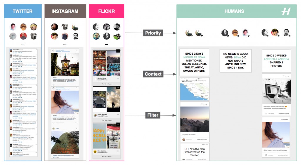
Additionally Humans strips social network interfaces and algorithms from their ‘toxic’ elements that foment addictions and arouse our desire to accumulate rather than abstract. And that without altering the fascinating dynamics of social networks. One inspiration this ‘data hygiene’ design pattern is the Facebook Demetricator provocative project that removes any number present in the Facebook interface. Its developer Benjamin Grosser advocates for the reduction of our collective obsession with metrics that plays out as an insatiable desire to make every number go higher. Another inspiration is the Little Voices app that removes the ‘noise’ from Twitter feeds and that is ‘ideal for those who like their feeds slightly quieter’.
Taken together, the benefits of using Humans are:
A frequent use of multiple social media services reduces our ability to contextualize and focus. With Humans, you can mitigate that online social service schizophrenia and establish a rational regimen for following without the constant barrage and noise of too many extraneous strangers’ updates. It works with the main social media platforms.
Get access to content stripped out of the social media distractions. Humans removes visual noise and arrange in their context the many status updates, links, selfies, photos of all kinds.
If you have been away from your screens or too busy, Humans creates digestible doses of context that will get you up to date.
I designed and developed Humans to exemplify a new mean for ‘data hygiene’ with an interface and algorithms that adapt to human pace and do not uniquely focus on the real-time, the ‘now’, and the accumulation of ‘likes’ and ‘contacts’. Or as our fictional experts in ‘data hygiene’ would suggest:
Check lovehumans.co for more information and request the app.
At Near Future Laboratory, we like to investigate alternative paths for technology. As data and connectivity augment our lives, hygiene might no longer only relate to maintaining a healthy body. Connected humans produce ‘data doppelgängers’ and consume data ‘anywhere’ and ‘anytime’ at an unprecedented rate. Consequently, they start to experience discomforts such as social media overload that Humans helps mitigate.
Like other information technology revolutions, there is a necessity for people to adopt new rituals and tools. In the near future we might see emerge interfaces, experiences, algorithms, design patters that reshape our social practices and for instance:
More on these topics in upcoming projects.
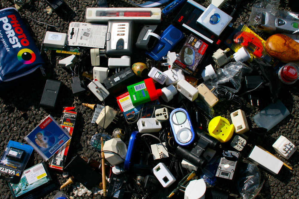
At some point the Internet of Things is going to look like this: a bunch of discarded plastic artefacts in a flea market.
Strangely enough, I had to come to the Southwest part of Madeira to discover Crap Future, an insightful new blog "about futures, innovation, politics, technology" by Julian Hanna and James Auger. The premise looks great as can be seen from the About page:
"Crap Futures casts a critical eye on corporate dreams and emerging technologies. It asks questions about where society is heading, who is taking us there, and whether ‘there’ is where we really want to end up."
Perhaps the most fascinating entry so far is the one about their critique of "smartness"... which looks quite close to long-time research interests here.
Why do I blog this? Knowing James' work for a long time, I'm curious about their analyses. Also, like the two authors of Crap Future, I also believe it's preferable to explore near future worlds by investigating islands. As they say:
"escaping from a big city to a distant island also reminds you of how far we’ve been brought down by technology: how inhuman many aspects of our lives have become, how much we’ve lost or traded away in a few quick swipes. From here on the margins of Europe, what we’re promised by advertisements and political manifestos looks even less shiny than it does in the steel-and-glass centre. We know intuitively that the smart home is not our home; for the margins it’s cast-offs, afterthoughts, crap phones. "
Given the news from Las Vegas' CES – with smart fridges among other products that may or may not appear on the now infamous @internetofshit twitter stream – it's definitely wise to adopt a more critical perspective, and I guess Crap Future may be helpful for this.