After answering the questions of architects in Mosaic, I have recently responded to an interview for the monthly periodical of the Spanish geographer association. The result of the discussion is now online: La leyenda del mapa mudo – Abril 2013
Category: Methodology
Contribution to Ethnography Matters
I have recently contributed to the April edition of Ethnography Matters on Ethnomining and the combination of qualitative & quantitative data. My story describes the overall process of our work with sensor data at the Louvre Museum in Paris. I particularly focus on the importance of mixed-methods when its comes to give full answers about behaviors and people usage of technology.
Here is the full text: Insights from network data analysis that yield field observations.

In Mosaic
Recently the independent culture research lab ZZZINC interviewed me for the Mosaic online magazine. It was a pleasure to answer Paco González‘ questions on our practice at Near Future Laboratory and our work on urban data. The result is now online: Entrevista a Fabien Girardin (English version).
At O’Reilly Strata Conference
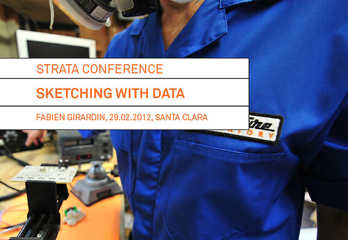
Last week I participated to the O’Reilly Strata Conference with a 40-minutes talk in the session on ‘visualization & interfaces’. My contribution suggested the necessity to quickly answer and produce questions at different stages of the innovation process with data. I extended the material presented at Smart City World Congress by adding some narrative on the practice of sketching by major world changers and focussing on Quadrigram as an example of tools that embraces this practice with data. The abstract went as follow:
Sketching with data
Since the early days of the data deluge, the Near Future Laboratory has been helping many actors of the ‘smart city’ in transforming the accumulation of network data (e.g. cellular network activity, aggregated credit card transactions, real-time traffic information, user-generated content) into products or services. Due to their innovative and transversal incline, our projects generally involve a wide variety of professionals from physicist and engineers to lawyers, decision makers and strategists.
Our innovation methods embark these different stakeholders with fast prototyped tools that promote the processing, recompilation, interpretation, and reinterpretation of insights. For instance, our experience shows that the multiple perspectives extracted from the use of exploratory data visualizations is crucial to quickly answer some basic questions and provoke many better ones. Moreover, the ability to quickly sketch an interactive system or dashboard is a way to develop a common language amongst varied and different stakeholders. It allows them to focus on tangible opportunities of product or service that are hidden within their data. In this form of rapid visual business intelligence, an analysis and its visualization are not the results, but rather the supporting elements of a co-creation process to extract value from data.
We will exemplify our methods with tools that help engage a wide spectrum of professionals to the innovation path in data science. These tools are based on a flexible data platform and visual programming environment that permit to go beyond the limited design possibilities industry standards. Additionally they reduce the prototyping time necessary to sketch interactive visualizations that allow the different stakeholder of an organization to take an active part in the design of services or products.
Slides + notes (including links to videos)
Sketching with data (PDF 15.7MB) presented at the O’Reilly Strata Conference in Santa Clara, CA on 29.02.2012.
At the Smart City World Congress
This week was dedicated to the Smart City World Congress in Barcelona. It was my first outing in a comfy Near Future Laboratory jumpsuit. With Nicolas, we are indeed slowly shutting down the mainframes at Lift Lab and relocating our immaterialities to the Near Future Laboratory facilities. These things take their good share of time and energy, but we are pretty excited to merging our operations with a new gang of scouts dispersed hither and yon. The event collided with two other important milestones of projects steered these past few months.
First our client BBVA, presented publicly some of the measures and indicators of commercial activities in cities we have been producing and investigating. The visual supports of this project take the forms of maps (pdf), dashboards, and tools that each reveal a city and its quantified streets under new spatio-temporal lights.
Second, my peeps at Bestiario have working endlessly to release Quadrigram, a tool for individuals and organizations that work intensively with data and information. We are now running in private beta. More on that later.
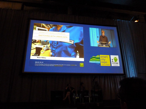
Captured preaching the word and proudly exposing a near future laboratory jumpsuit
So, in the margin of the multiple discussions on the definitions of a *smart* city, I could not help but contribute to the congress with my experience on the field in making urban data work. My discoursed focused on the necessity to treat data as a living material that must be crafted and manipulated at the different stages of knowledge and service production. I name that “sketching with data” and as with any creative work with digital technologies, it comes with tools and an undisciplinary process. Here are the slide deck + notes of my talk:
Sketching with urban data (PDF 6.9MB) presented at the Smart City World Congress in Barcelona on 29.11.2011.
In the audience, Alexandra Etel Rodriguez, Partner at Connected Brains produced visual notes of my talk. Thanks Alexandra for sharing this graphic recording!
Thanks to the organizers for the invitation!
In the polishing phase
There is this influential dispatch “Follow Curiosity, Not Careers” by Julian Bleecker that I love to refer to. In a few paragraphs he argues for the importance of shifting ones practices and area of activity of 3-5 years cycles. Cycles that are driven by curiosity with phases that link sometimes consciously and sometimes in unplanned and disruptive manners.
Two years ago, I engaged into a Making/Creating/Building phase after the feeling that my “voice” of my academic journey needed a renewal. At that time, I was shaping a project for the Louvre on the evolution of “hyper-congestion” levels in key areas of the museum. An investigation directed at the urban informatics era when few people had experience of actually working with local authorities or decision makers on a large scale that affect either governance or built fabric (reminding me of Dan Hill indication of shortcoming of the Microsoft Research Social Computing Symposium 2010).
At the Louvre experimenting with sensors to measure levels of hyper-congestion.
Since then, I have persisted working on the ground, observing clients and partners practices, responding to opportunities and glitches with new data tools and experimenting with research methods. I was particularly focused in understanding how the exploitation of network data could integrate and complement traditional processes. It means confronting my evolving practice, plotting in unknown territories, or tinkering the business and financial aspects of a product “go to market” strategy. The phase has been extremely enriching that I only start to grasp coherently. Along the path, I got to lead the making/creation/building for the multiple actors of the ‘smart city’:
- A geographical information provider: a GIS model that generate a novel type of street data based on social media content for cities with very limited information layers.
- A real-time traffic information provider: innovative indicators and interactive visualizations that profile the traffic on key road segments.
- A multinational retail bank: co-create its role in the networked city of the near future with a mix of workshops and tangible results on how bank data are sources of novel services.
- A large exhibition and convention center: with audits based on sensor data to rethink the way they can manage and sells their spaces.
- A mobile phone operator and a city council: to measure the pulse at different parts of the city from its cellphone network activity and extract value for both city governance and new services for citizens and mobile customers.
- It has been equally important to independently explore the ideas shared at Lift Lab either through academic collaborations with UPF, MIT, EPFL or through the actual experimentation of services like elephant-path.com that I would love to develop more.
Today, my trousers are scuffed. This accumulated experience on the field requests a move to a next phase to what Julian would describe as:
And subsequent years, refining and polishing that “voice”. Keep moving, refining, finding ways to continue to learn and bringing all the other bits of learning, the other “fields”, the other ways of knowing and seeing the world, all the other bounded disciplines — let them intrude and change things.
Practically, I will continue to push Lift Lab in imagining fast-prototyping ‘stuff’ and explore their implications as a core element our investigation. But the most exciting feeling is that I can start polishing a “voice” in company of a growing list of friends I admire who now run their own boutiques/studios/collective/structure to operate on the field and practically contribute in shaping the urban near future. They are the Bestiario, Urbanscale, City Innovation Group, Everythng. We share an approach that dramatically contrast with the data-driven ‘smart city’ marketing ploy. We come from practices that integrate the importance of learning from both history and fiction, that understand the implication from the long-running theoretical and practical challenges of using data to improve urban life. We are aware of the shortcoming of data models (see The “Quants”, their Normalizations and their Abstractions), we experimented the value of Mixed Methods and are becoming fluent in both design and research approaches as sources of knowledge as so elegantly described by Kevin Walker Design Research and Research Design.
The shift of phase comes naturally with attempts of finding coherence in the contributions of the last two years or simply “polishing my practice”. So practically: I have been exploring the exploitation of network data (byproducts of digital activity) as material to qualify the built environment and produce new insights for the different actors of the urban space (e.g. city governments, service providers, citizens). These stakeholders have approached Lift Lab to a) find unknown benefits in data they already exploit or b) investigate specific problems they instinctively feel network data will help them solve.
There is one specific methodological aspect to emerge from my work. A year ago, I described it as “Sketching with data“. I found it extremely useful to go beyond the traditional ways of sharing the exploration of network data and avoid the contemporary experience with data as described in the recent review of the IBM’s “Think” exhibition in New York.
“But we get no practical sense of how traffic information might be useful.”
[…]
“It would have been far more powerful to have an interactive display that led viewers on a path of interpretation and mapping, so we could experience the process instead of simply sampling images. “
The exhibition is actually quite insightful and I value the effort of IBM to communicate. However in projects involving multiple stakeholders, the ability to rapidly sharing interactive information visualizations is a key practice to transform information into a tangible and imperfect material. Recently I attempted to describe it in an abstract submitted to a practitioners’ conference sub:
Since the early days of the data deluge, Lift Lab has been helping many actors of the ‘smart city’ in transforming the accumulation of network data (e.g. cellular network activity, aggregated credit card transactions, real-time traffic information, user-generated content) into products or services. Due to their innovative and transversal incline, our projects generally involve a wide variety of professionals from physicist and engineers to lawyers, decision makers and strategists. Our innovation methods embark these different stakeholders with fast prototyped tools that promote the processing, recompilation, interpretation, and reinterpretation of insights. For instance, our experience shows that the multiple perspectives extracted from the use of exploratory data visualizations is crucial to quickly answer some basic questions and provoke many better ones. Moreover, the ability to quickly sketch an interactive system or dashboard is a way to develop a common language amongst varied and different stakeholders. It allows them to focus on tangible opportunities of product or service that are hidden within their data. In this form of rapid visual business intelligence, an analysis and its visualization are not the results, but rather the supporting elements of a co-creation process to extract value from data. We will exemplify our methods with tools that help engage a wide spectrum of professionals to the innovation path in data science. These tools are based on a flexible data platform and visual programming environment that permit to go beyond the limited design possibilities industry standards. Additionally they reduce the prototyping time necessary to sketch interactive visualizations that allow the different stakeholder of an organization to take an active part in the design of services or products.
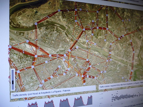
Sketching with mobility data in Impure
Why do I blog this: The idea of shifting ones practice and area of activity is quite important to me. It comes with phases similar to the pursue of a PhD (listen, propose, experiment, contribute with a voice, confront the contributions). The shift of phase is sometimes planned and sometimes affected by external event. This polishing phase occurs with pleasant evolutions the name, structures and focus of Lift Lab. More on that later…
Slide Deck of Lecture at ENSCI
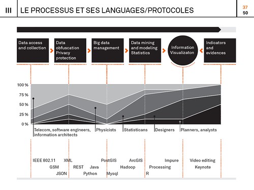
Below are the slides of a lectures I gave a couple of weeks ago at the ENSCI (Ecole nationale supérieure de création industrielle) in Paris. The content (in French) is mainly directed to design students and practitioners intrigued about the new digital urban actors and the process to materialize layers of network data into information. I based my discourse on the recent investigations and experimentations we perform at Lift Lab (e.g. study of hyper-congestion, mobility, social navigation). Particularly, I highlighted the bestiary of practices, tools, languages and protocols that we articulate our approach with:
Un nouveau monde de données, ENSCI, May 18, 2001 (15.8MB)
The ENSCI offers a particularly compelling approach to its student by confronting them with concepts and practices at the frontiers of design. Thanks to David Bihanic and Licia Bottura for the invitation!
Introducing Elephant Path
It is rewarding to see some our areas of investigation at Lift Lab burgeoning in relation with our clients and partners. For instance, we now have a good set of tools and reasonably well-documented processes that help qualify and profile territories from their network activity (e.g. GSM, WiFi, Bluetooth, mobility infrastructures, social networks). One specificity of our approach is to produce visualizations that characterize the data at hand very early in the analysis process. It tremendously helps bring the different actors of a project on the same page by opening a dialogue and their interpretations of what they see is often great material for early insights to focus the investigation (see Exploration and engage in the discussion in the Data City essay).
This ability to sketch with data is particularly fruitful when dealing with multidisciplinarity. Indeed, data visualization brings together over a same language very diverse practices and methodologies (e.g. in our projects on network data, we deal with a bestiary of physicists, network engineers, marketing directors, salesmen, architects, geographers, social scientists, innovation specialists, …). Over the last months, we have been very fortunate to partner with our friends at Bestiario who share a common vision : data visualization is part of an innovation process not its outcome. They applied this perspective in their latest product Impure, an engine with an intuitive visual programming language. Impure has particularly revolutionized our ability to quickly communicate the early results our investigation. In a few weeks we have been able to swiftly create interfaces in collaboration with designers that did not have prior programming skill. One outcome of the use of our set of tools is Elephant Path, a concept by Lift Lab, designed and implemented by the young designer Olivier Plante in Impure :
Elephant Path, a social navigation interface based on he thousand of pieces of information inhabitants and visitors share publicly on the web
Our idea of Elephant Path germinated years ago with the emergence of new ways of reading and discovering a territory through its digital activities (see my PhD thesis). It collided with our long interest in the principles of social navigation (see rss4you developed by Nicolas and Robi in the early days of content syndication) that leverage traces of activities with the goal to facilitate locating and evaluating information. In the physical world, a classic example of social navigation is a trail (called elephant path, desire line, social trail or desire path) developed by erosion caused by people making their own shortcuts (a phenomenon we like to observe).
Taking that concept into the informational layers of our cities and regions, we sketched in Impure the possibility to reveal unofficial routes and beaten tracks through the thousand of pieces of information inhabitants and visitors share publicly on the web. Technically, we deployed our own algorithms to extract travel sequences using collections of user-generated content from Wikipedia, Flickr and Geonames. For each region, Elephant Path lists Wikipedia entries and selects some of the monuments, parks, and other popular sites with a story. It consolidates the the Wikipedia entries with geographical coordinates via the Geonames API. Then, it uses the Flickr API to collect the information photographers share at these locations. Finally is applies our own network data analysis algorithms to filter the data, produce travel sequences and measure photogenic levels.
We have done it for both Paris and Barcelona. For each city, Elephant Path provides measures on the main trails, on the photogenic attractions and the months of activity. For instance the information reveals that:
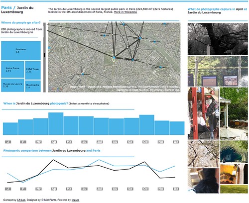
Paris seems to be a “summer” destination according to their monthly photographic activity. If you are in Paris during that period, the parks (Bois de Boulogne, Parc Monceau and Jardin du Luxembourg) might not be you visiting priorities. Indeed, these sites seem to be more photogenic in Spring and Fall. But if you are at Jardin du Luxembourg, there is some chances that you were in the St-Germain des Prés neighborhood (e.g. Café de Flore) previously and that your stroll there might very well bring you to Centre Pompidou that links the nearby Panthéon with the trendy Marais neighborhood. Barcelona seems to be more of “fall” destination according to the monthly photographic activity. Discover it yourself. [More screenshots]
An interface designed for you to copy and adapt it
But Elephant Path doesn’t end with data visualization, maps and graphs that can be embedded into web pages. It is meant to be open and be appropriated in unexpected ways. The Impure platform offers numerous data access, information processing and visualization capabilities. You can copy the code and data of Elephant Path and improve it in your workspace. Content of the work content is under the terms of a Creative Commons License. Do not hesitate in ripping and adapting it!


