There is this influential dispatch “Follow Curiosity, Not Careers” by Julian Bleecker that I love to refer to. In a few paragraphs he argues for the importance of shifting ones practices and area of activity of 3-5 years cycles. Cycles that are driven by curiosity with phases that link sometimes consciously and sometimes in unplanned and disruptive manners.
Two years ago, I engaged into a Making/Creating/Building phase after the feeling that my “voice” of my academic journey needed a renewal. At that time, I was shaping a project for the Louvre on the evolution of “hyper-congestion” levels in key areas of the museum. An investigation directed at the urban informatics era when few people had experience of actually working with local authorities or decision makers on a large scale that affect either governance or built fabric (reminding me of Dan Hill indication of shortcoming of the Microsoft Research Social Computing Symposium 2010).
At the Louvre experimenting with sensors to measure levels of hyper-congestion.
Since then, I have persisted working on the ground, observing clients and partners practices, responding to opportunities and glitches with new data tools and experimenting with research methods. I was particularly focused in understanding how the exploitation of network data could integrate and complement traditional processes. It means confronting my evolving practice, plotting in unknown territories, or tinkering the business and financial aspects of a product “go to market” strategy. The phase has been extremely enriching that I only start to grasp coherently. Along the path, I got to lead the making/creation/building for the multiple actors of the ‘smart city’:
- A geographical information provider: a GIS model that generate a novel type of street data based on social media content for cities with very limited information layers.
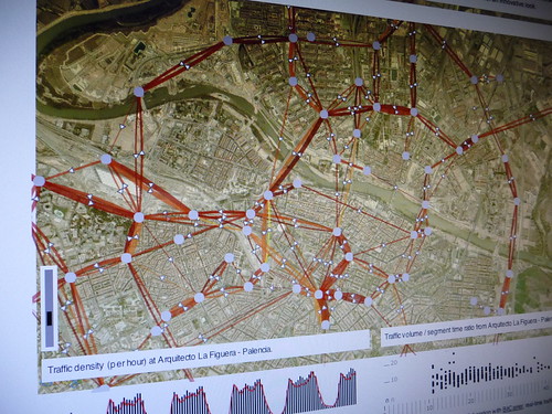
- A real-time traffic information provider: innovative indicators and interactive visualizations that profile the traffic on key road segments.
- A multinational retail bank: co-create its role in the networked city of the near future with a mix of workshops and tangible results on how bank data are sources of novel services.
- A large exhibition and convention center: with audits based on sensor data to rethink the way they can manage and sells their spaces.
- A mobile phone operator and a city council: to measure the pulse at different parts of the city from its cellphone network activity and extract value for both city governance and new services for citizens and mobile customers.
- It has been equally important to independently explore the ideas shared at Lift Lab either through academic collaborations with UPF, MIT, EPFL or through the actual experimentation of services like elephant-path.com that I would love to develop more.
Today, my trousers are scuffed. This accumulated experience on the field requests a move to a next phase to what Julian would describe as:
And subsequent years, refining and polishing that “voice”. Keep moving, refining, finding ways to continue to learn and bringing all the other bits of learning, the other “fields”, the other ways of knowing and seeing the world, all the other bounded disciplines — let them intrude and change things.
Practically, I will continue to push Lift Lab in imagining fast-prototyping ‘stuff’ and explore their implications as a core element our investigation. But the most exciting feeling is that I can start polishing a “voice” in company of a growing list of friends I admire who now run their own boutiques/studios/collective/structure to operate on the field and practically contribute in shaping the urban near future. They are the Bestiario, Urbanscale, City Innovation Group, Everythng. We share an approach that dramatically contrast with the data-driven ‘smart city’ marketing ploy. We come from practices that integrate the importance of learning from both history and fiction, that understand the implication from the long-running theoretical and practical challenges of using data to improve urban life. We are aware of the shortcoming of data models (see The “Quants”, their Normalizations and their Abstractions), we experimented the value of Mixed Methods and are becoming fluent in both design and research approaches as sources of knowledge as so elegantly described by Kevin Walker Design Research and Research Design.
The shift of phase comes naturally with attempts of finding coherence in the contributions of the last two years or simply “polishing my practice”. So practically: I have been exploring the exploitation of network data (byproducts of digital activity) as material to qualify the built environment and produce new insights for the different actors of the urban space (e.g. city governments, service providers, citizens). These stakeholders have approached Lift Lab to a) find unknown benefits in data they already exploit or b) investigate specific problems they instinctively feel network data will help them solve.
There is one specific methodological aspect to emerge from my work. A year ago, I described it as “Sketching with data“. I found it extremely useful to go beyond the traditional ways of sharing the exploration of network data and avoid the contemporary experience with data as described in the recent review of the IBM’s “Think” exhibition in New York.
“But we get no practical sense of how traffic information might be useful.”
[…]
“It would have been far more powerful to have an interactive display that led viewers on a path of interpretation and mapping, so we could experience the process instead of simply sampling images. “
The exhibition is actually quite insightful and I value the effort of IBM to communicate. However in projects involving multiple stakeholders, the ability to rapidly sharing interactive information visualizations is a key practice to transform information into a tangible and imperfect material. Recently I attempted to describe it in an abstract submitted to a practitioners’ conference sub:
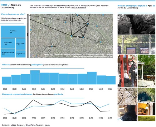
Since the early days of the data deluge, Lift Lab has been helping many actors of the ‘smart city’ in transforming the accumulation of network data (e.g. cellular network activity, aggregated credit card transactions, real-time traffic information, user-generated content) into products or services. Due to their innovative and transversal incline, our projects generally involve a wide variety of professionals from physicist and engineers to lawyers, decision makers and strategists. Our innovation methods embark these different stakeholders with fast prototyped tools that promote the processing, recompilation, interpretation, and reinterpretation of insights. For instance, our experience shows that the multiple perspectives extracted from the use of exploratory data visualizations is crucial to quickly answer some basic questions and provoke many better ones. Moreover, the ability to quickly sketch an interactive system or dashboard is a way to develop a common language amongst varied and different stakeholders. It allows them to focus on tangible opportunities of product or service that are hidden within their data. In this form of rapid visual business intelligence, an analysis and its visualization are not the results, but rather the supporting elements of a co-creation process to extract value from data. We will exemplify our methods with tools that help engage a wide spectrum of professionals to the innovation path in data science. These tools are based on a flexible data platform and visual programming environment that permit to go beyond the limited design possibilities industry standards. Additionally they reduce the prototyping time necessary to sketch interactive visualizations that allow the different stakeholder of an organization to take an active part in the design of services or products.

Sketching with mobility data in Impure
Why do I blog this: The idea of shifting ones practice and area of activity is quite important to me. It comes with phases similar to the pursue of a PhD (listen, propose, experiment, contribute with a voice, confront the contributions). The shift of phase is sometimes planned and sometimes affected by external event. This polishing phase occurs with pleasant evolutions the name, structures and focus of Lift Lab. More on that later…

