After answering the questions of architects in Mosaic, I have recently responded to an interview for the monthly periodical of the Spanish geographer association. The result of the discussion is now online: La leyenda del mapa mudo – Abril 2013
Category: My Projects
Year-Ending 2012
As the year ends, tradition calls for a review of the several initiatives I engaged in during 2012. The exercise entails looking back in time with the support social network activities and more personal logs (e.g. ical, emails) to keep track of gratifying rencontres and significant milestones at the Near Future Laboratory (see last year’s A Few Things the Laboratory did in 2011).
If this year had a mantra it would be: “sketching with data”, an approach to innovate with data I presented in various conferences and institutions from the high-tech cabarets such as Strata in San Francisco; or Red Innova in Madrid to the more cozy settings of the IAAC architecture school in Barcelona. These speaking engagements were part of a polishing phase that reports on the my evolving practice fed by the accumulated experiences on the ground. For instance, I discussed our investigation on the roles of a retail bank in the ‘smart’ city of the near future. Our client had fairly good ideas of the potentials of a real-time information platform. This is the kind of service a bank is extremely familiar with. However, they had limited knowledge on the specific information that could feed and emerge from this kind of platform. As part of our consulting work, we regularly sketched advanced dashboard for participants of the project to explore and interrogate their data with fresh perspectives. The use of the prototypes helped the client craft and tune indicators that qualify commercial activities. This experience still feeds the future bank services and products based on data.
Another gratifying outcome of the work around “sketching with data” was the release in June and November of the alpha and beta versions of Quadirgram (see Unveiling Quadrigram). The product resulted from a collaboration with my friends at Bestiario and responds to the increasing demand of clients to think (e.g. sketch) freely with data. The tool is meant to diffuse the power of information visualization within organizations and eventually reach the hands of people with knowledge and ideas of what data mean. I had the unique opportunity to influence many aspects of the product development and release process (engineering, user-experience, go to market strategy, client/investor/provider meetings) and now proudly sit in the advisory board of the company.
Other fruitful collaborations took place along the year, each of them bringing their unique set of experiences. I am particularly grateful to have joined forces with Urbanscale, Claro Partners, Interactive Things, Lift, Data Side and Pop-up Urbain. While a good share of the work stayed within confidential settings, I reserved efforts for self-started initiatives such as:
- Ville Vivante: an ‘urban demo’ that took the form of a visual animation and eight posters deployed at the Geneva central station (project led by Lift Conference, in collaboration with Interactive Things).
- Footoscope: a deciphering tool for football amateurs developed in collaboration with Philippe Gargov of Pop-up Urbain. Its interface provides a perspective on the morphology and tactics of a football team according to raw data on its passing game transformed into indicators and visualizations.
Finally, I kept some quiet moments to contribute to academia with reviews for Sensors, CHI, CSCW and Just-In-Time Sociology, teach a postgraduate course on the design of ‘data services’ and published of the paper New tools for studying visitor behaviors in museums: a case study at the Louvre co-authored with Yuji Yoshimura, UPF and MIT on a follow-up investigation of our hyper-congestion study at the Louvre.
Footoscope: a deciphering tool for football amateurs
Sports have always kept a tight relationship with data to measure performances. It has been particularly the case to improve athletes capabilities with motion analysis or objectify team sports that are easily fragmented into single events (e.g. Sabermetics). With new means of producing statistics through video and sensor technologies, other sports have started the search for objective knowledge. In the domain of football (i.e. soccer) companies such as Prozone and Opta Sports have led the innovation in data collection. In parallel, some academics have been exploring this new terrain to apply their statistics-led methodology (see A network theory analysis of football strategies). Similarly, designers have also started to transform these new measures (often in real-time) into sophisticated visualization to augment the spectator’s experience (see In-screen sports graphics).
At Near Future Laboratory, we regularly investigate the implications of the emerging presence of data particularly in the domain of the city and its services. Our work requires the joint understanding of space (e.g. a territory, its rules, cultures, history), of the networks that compose the space (both physical infrastructures and digital activities) and the human behaviors manifasted in that space. As part of our self-started initiatives, we enjoy employing these prisms to explore other intriguing domains such as football. In this ‘pet project’, we collaborated with the prospective consultant Philippe Gargov of [pop-up] urbain, connoisseur and writer on the use of statistics in football (see Passer aux stats supérieures) to augment his knowledge of football and tactics with prototyped visualizations that revealed the layout of teams through the average position of players, the key players in the passing game and the orientation each player gives to the game. We called this experiment Footoscope.
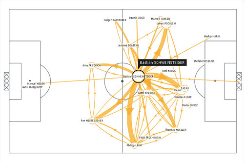
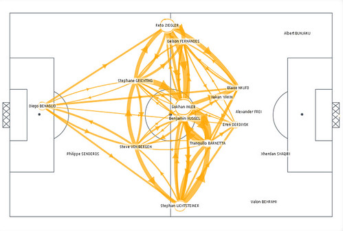
Footoscope provides a perspective on the morphology and tactics of a football team according to raw data on its passing game (e.g. passes between players, positions of the players when receiving the ball, playing time) transformed into indicators (e.g. “betweenness”) and visualizations (e.g. flows in the passing game, orientation of the propagation of the ball, layout of the team). We prototyped it with Quadrigram in order to share the tools with amateurs who want to become ‘footoscopists’ and decipher data on team they know or want to explore. We tested to tool with Philippe Gargov based on the raw statistics of the World Cup in South African accessible on the FIFA web site. Philippe did a great job in mixing his knowledge on the competition with the use of Footoscope. The results (in French) discuss, for instance, the key role of Bastian Schweinsteiger in Germany’s midfield that other players such as Stankovic or An Yong Ha failed to reproduce; or the incapacity for Switzerland to manage the distances between its lines. Read more (in French) on the Footoscope web site.

The key role of Bastian Schweinsteiger in Germany’s midfield, perfectly centered and well-connecter. More on Footoscope.

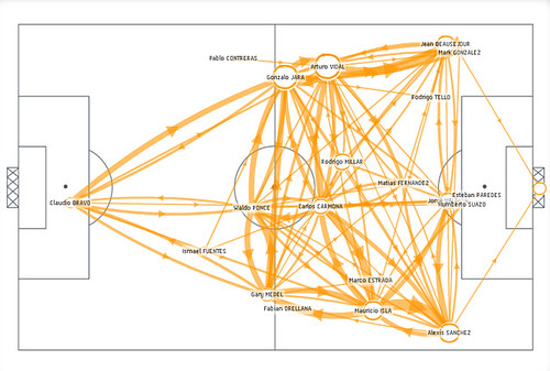
The incapacity for Switzerland to manage the distances between its lines, with its defense and strikers compacted at a short distance. This contrasts with a more balance team that takes a greater advantage of spaces such as Chile below. More on Footoscope.

Why do I blog this: Our pet projects are meant to explore new domains and ideas. Like other domains (e.g. cities, organizations) the analysis of football request the understanding of space, networks (data) and behaviors (observations). The collaboration with Philippe Gargov revealed some early insights on generating the dialogue between statistics and amateur knowledge of the terrain to produce a new apprehension of the game.

