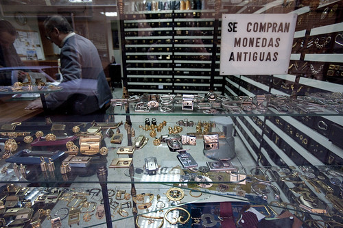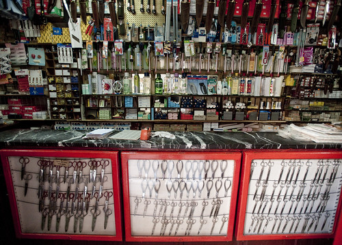


Been thinking about the relationship between things over-burdened, trying to do too many things at once, and the elegance and simplicity inherent in doing one thing, and doing it very well. I get a bit miffed and muddled about long lists of features on most any consumer gadget, especially things like telephones and computers — that sort of thing. They lure you end and make distinctions with the other guy based on the number of extra bits and bots listed on the box, often forcing that as the primary decision making criteria. Why would you get the other thing when this thing costs the same and has four extra megabits and two extra, um..things..even if you have no idea why you’d need the extra thing and the megabits?

I’d be happy with only one capability, and that capability done with extra emphasis on the singularity of the task, rather than on all the extra things that I may never need to get into. Or the decision making criteria contoured and cordoned by the nuances of experts and dilettantes. Let the over-users determine what makes good sense, not the marketing wonks.
Why do I blog this? It is interesting to me to think about the movement from single purpose trades to one-stop-shop operations reflect some aspect of consumer culture that is paralleled in the design of over-burdened, multi-purpose devices. Do we want to go one place to have everything done — our butchery, fish market, vegetables and dry goods from Whole Foods, in the same way that we want our iPhones to do email, web, twitter, weather, photos and, oh yeah..make phone calls? And what are the implications of stripping devices down to their core simplicity? What about a phone that makes phone calls..and that’s it? Is there a case to be made for back-to-basics designed experience?
Continue reading One Thing, Done Well
