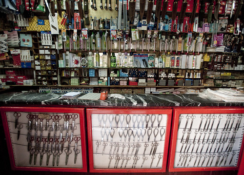
Two curious examples of “everything-ness.” The first is this “Everything Electrical” company which does, well — everything having to do with electrical installations and so forth. They also have these interesting trucks which are made to be easily loaded and off-loaded at work sites or at the warehouse. I like this design, where the “black box” of the normally closed, obscured truck is opened from three sides. Transparency and efficiency of some sort are in effect here. There’s something quite intriguing about this. Similarly, the knife/scissor/tool shop found in Madrid attempts a similar sort of draw, showing all the fascinating kinds of cutters and so forth are displayed in the open, behind glass and in enormous, visual assortment.
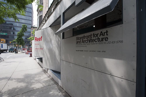
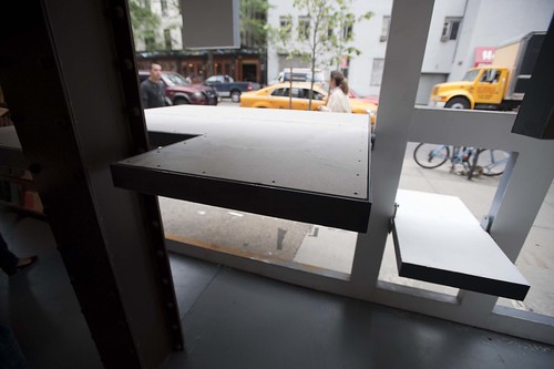
Finally, the intriguing architectural frontice of the Storefront for Art and Architecture in New York City, with its mechanisms for opening itself up to the street in an atypical manner, with flaps and square portholes raises this question itself. What are the ways that digital contexts can learn from the physical mechanisms of transparency, openness and an ability to draw people’s attention in creative ways? How does openness and transparency translate to frankness and trust.
Why do I blog this? Some visual examples of different strategies for creating physical transparency, something that is strangely absent in digital contexts. Things are either there in front or have to be rooted around for — the “storefront” metaphor in a digital setting hits a number of, err…brick walls when translating these settings. The question here to consider are strategies and tactics for creating digital forms of transparency and display.


