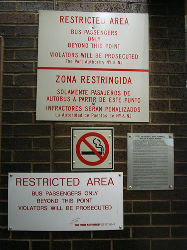
Redundancy norms here for restricted access areas, using variations in human language, which is just good to CYA, plus English twice, just in case.
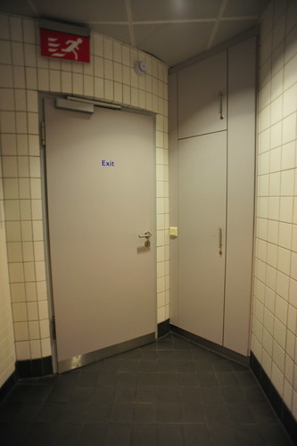
I was struck by these peculiar redundant doors. The right one to pick depends on who you are and what you’re attempting to do. The curvature of the foyer on the other side of the wall causes this perspective fall off that makes this a bit disorienting.
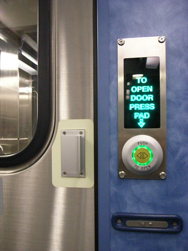
A double instructional touch interface for this sliding door on a commuter train. Really curious, this huge, rear-illuminated instructional text — with arrow toward the button..which reinforces the instructions with its own didactic “push here to open” instructions. It may be that that rear-illuminated text has space above for a “Do Not”, and this is why it is so big. But, really..exactly what ran through the mind of the interface specialist on this one?
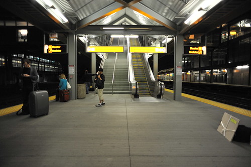
Multiple egress and ingress points provide a useful redundancy for what is likely a quite frantic train platform for maybe 4 hours of a 24 hour day. Now, though, a handful of travelers plopped into EWR on the last flights in for the night.


