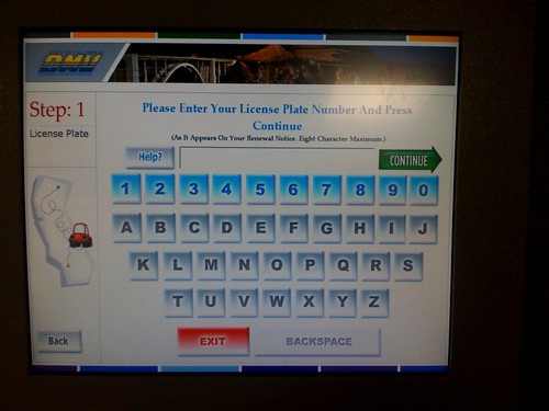
A curious touch keyboard interface that was a bit confusing. This was found at a Department of Motor Vehicles location here in California this morning. The keyboard was there in this kiosk so I could type in my car’s license plate and be issued a renewed vehicle registration certificate. The geometry of the keyboard’s outline is evocative of a standard QWERTY layout, tapered toward the bottom as it is. And I hunted as if it were a QWERTY but, obviously, it’s not — the keys are alphabetically organized in rows by columns.
Why would Nicolas blog this? A curious reorientation of a keyboard meant to evoke what the standard keyboard look like, but without making assumptions about peoples’ knowledge of it’s standard key layout. An interesting design decision here. What elements from keyboards suggest their use (the geometry of the keyboard’s outline) and when can you ignore attributes for the sake of usability? What makes something usable? What assumptions can you make about familiarity and knowledges of use for things that are pervasive and whose use is implied in the design?
Continue reading Touch Keyboard
