Social Media at Human Pace

Most connected humans suffer from poor ‘data hygiene’. For instance, we are plainly grotesquely overfed on social media with its ‘anytime’ ‘anywhere’ experience and there is no rational end in sight. In this article, I introduce the reasons why I developed Humans, an app that offers a way to rationally manage too many social media contacts and slows down the consumption of status updates, tweets, selfies, and photos of all kinds.

A fictional Humans ad suggesting a better practice of ‘data hygiene’

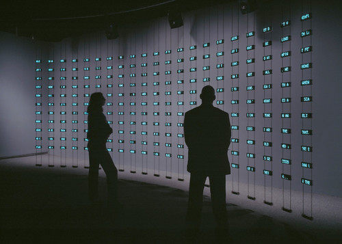
We live in a society that captures the moment, refashions it to ‘share’ across a network of social media endpoints containing algorithms and human, perpetually. Social media, its algorithms and its humans are highly optimized to never stop the cycle. Consequently, we experiencing an unprecedented increase in the rate of this ‘anytime’ ‘anywhere’ consumption cycle. As of 2014, according to the Nielsen US Digital Consumer Report almost half (47%) of smartphone owners visited social networks every day. On top of that, it is not uncommon for a Facebook user to have 1,500 posts waiting in the queue when logging in. Yet, the perpetual consumption yields to very little and there is no rational end in sight. We are quite plainly grotesquely overfed on social media.

Social media needs its consumption cycle. It depends on ‘views’, ‘eyeballs’, ‘reshares’, ‘likes’, ‘comments’ — the euphemism used by the media mavens is the optimistic word ‘engagement’. We are bloated on ‘engagement’ to the point where we sleep with our nodes, wear them on our wrists, clip them to our dashboards, autistically shove them in pockets only to immediately remove them only to shove them back in our pockets only to immediately remove them in order to slake our thirst for more content. This ‘too much, too fast’ consumption cycles has reduced an ability to pay sustained attention, have a meaningful conversation, reflect deeply — even be without our connected devices.

Humans create technologies, adapt their behaviors to them and vice-versa

The fact is that each major revolution in information technology produced descriptions of humans drowning in information unable to face tsunamis of texts, sounds, images or videos. For instance, in the 15th century Gutenberg’s printing press generated millions of copies of books. Suddenly, there were far more books than any single person could master, and no end in sight or as Barnaby Rich wrote in 1613:

“One of the diseases of this age is the multiplicity of books; they doth so overcharge the world that it is not able to digest the abundance of idle matter that is every day hatched and brought forth into the world”

Besides a Luddite position of some that rejected technological change, the invention of printing began to generate innovative new practices and methods for dealing with the accumulation of information. These included early plans for public libraries, the first universal bibliographies that tried to list all books ever written, the first advice books on how to take notes, and encyclopedic compilations larger and more broadly diffused than ever before. Detailed outlines and alphabetical indexes let readers consult books without reading them through, and the makers of large books experimented with slips of paper for cutting and pasting information from manuscripts and printed matter — a technique that, centuries later, would become essential to modern word processing.

Historically, humans have adapted to the increasing pace of information exchange with the appropriation of new practices and means to filter, categorize and prioritize information feeds.

Similarly, a couple of centuries later, the increasing presence of the telegraph multiplied the levels of stress among merchants used to more local, slower and less competitive transactions. They eventually adapted to the new pace of information exchange with new practices and means to filter, categorize and prioritize information feeds.

From social media ‘diets’ to ‘data hygiene’

What today’s most connected people share with their ancestors is the sense of excess and related discomfort, and stress linked to information load. In many ways, our behaviors for coping with overload have not changed. Besides the promises of AI and machine learning that trade control for convenience, we still need to filter, categorize and prioritize, and ultimately need human judgment and attention to guide the process.

These behaviors perspires in popular media and the many articles that share tips to follow successful social media diets, detox, or cleansing programs. The authors typically advise their readers to move away from being constantly ‘on top of things’ and to give up on concerns of missing out or being out of the loop. The diets are about replacing one behavior with another more frugal by pruning the many social networks (‘quit’, ‘uninstall’, ‘unplug’, ‘remove profile’) and contacts (‘mute’, ‘unfollow’). Yet they target a temporal improvement and fail to promote a more profound sustainable behavior with positive reinforcement.

Besides the promises of AI and machine learning that trade control for convenience, we still need to filter, categorize and prioritize, and ultimately need human judgment and attention to guide the process.

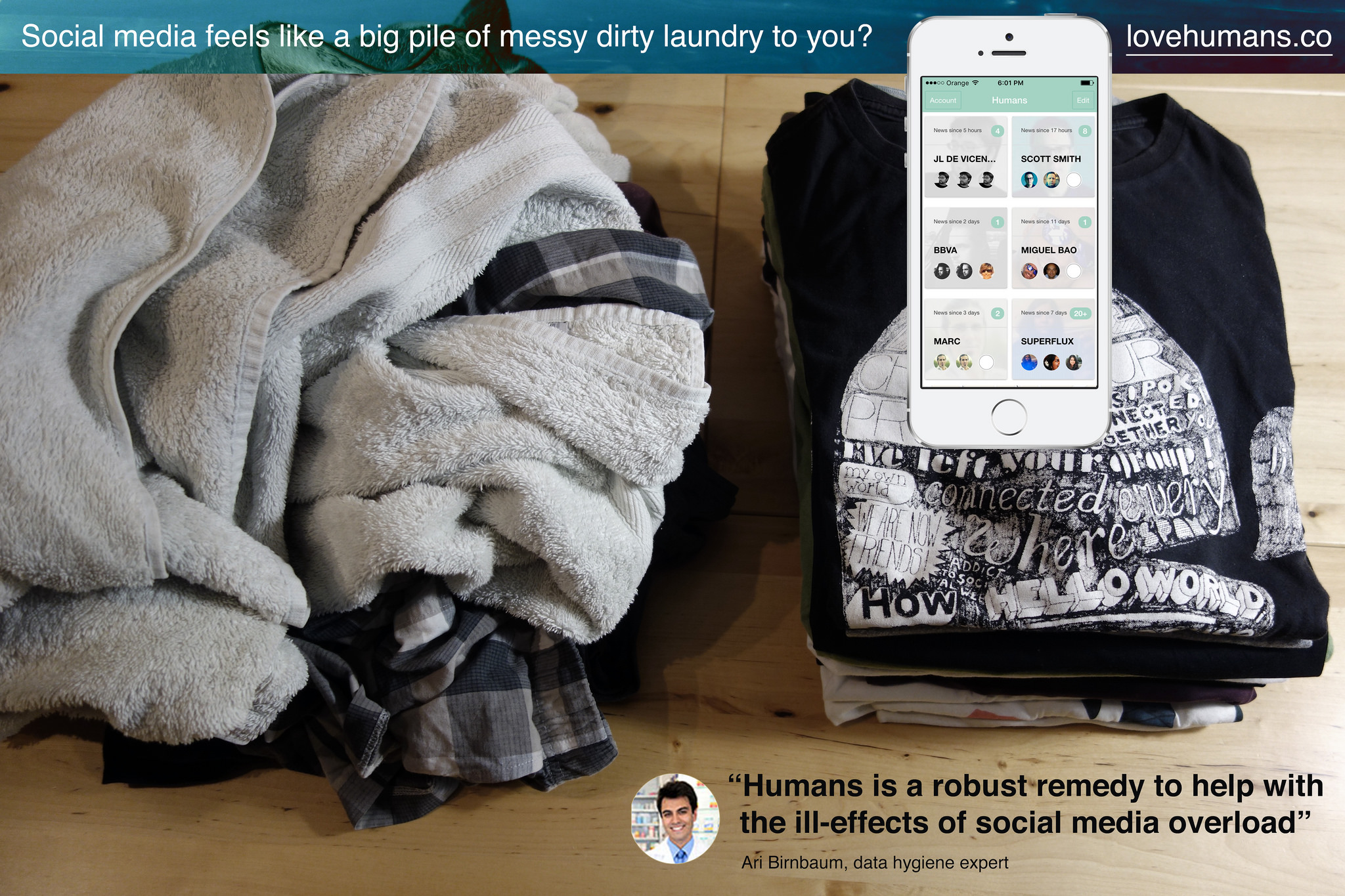
Social media platforms have also slightly updated the interfaces to support these behaviors. For instance Facebook recently started to allow users to specify the certain friends and pages that should appear at the top of the feed and Twitter introduced a ‘while you were away’ feature to its home timeline. Yet, social media feeds still feel like an endlessly accumulating pile of messy dirty laundry.

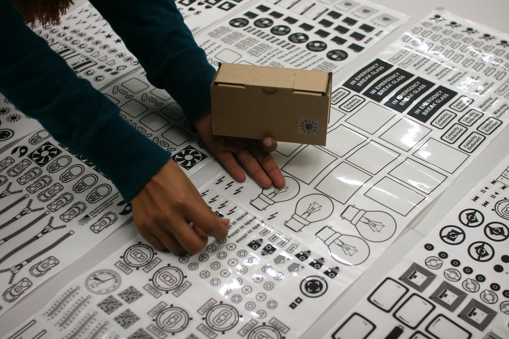
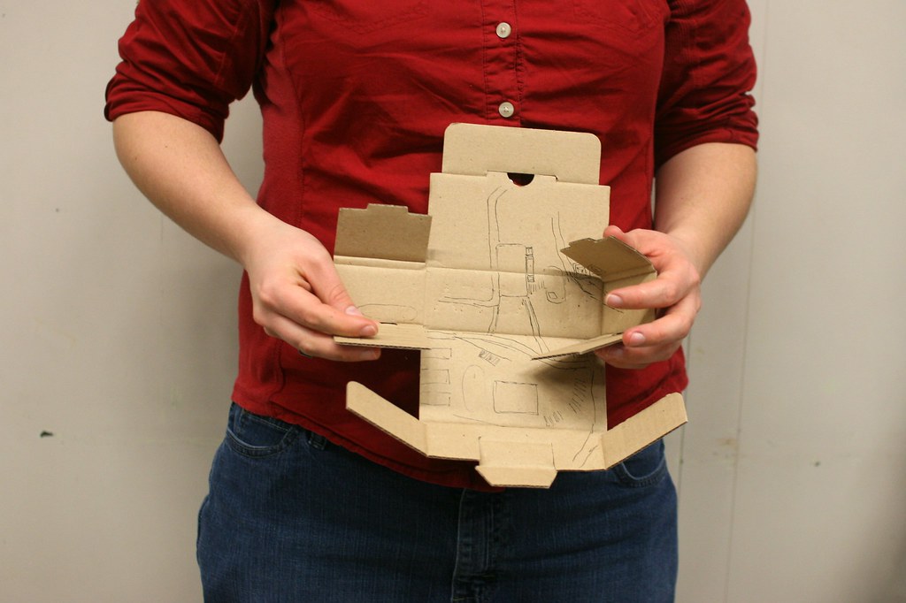
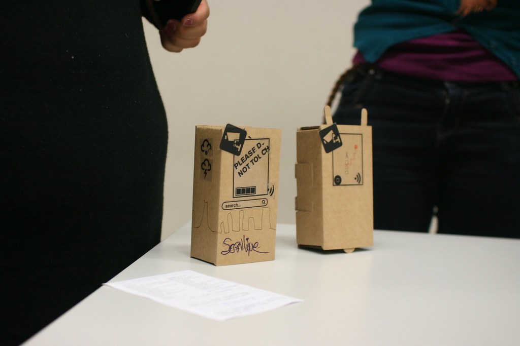
There is an opportunity to reconsider how we use social media and how we build it. Social media that gives human control to prioritize certain feeds over others, but without normalizing content into something less messy, and less complicated than a human. In fact, adapting to social media overload is not about being ‘on a diet’ than having a good ‘data hygiene’ with a set of rituals and tools. This is what I explored along with my colleagues at Near Future Laboratory with the design and development of Humans.

A fictional Humans ad suggesting a proper ‘data hygiene’.

Introducing Humans

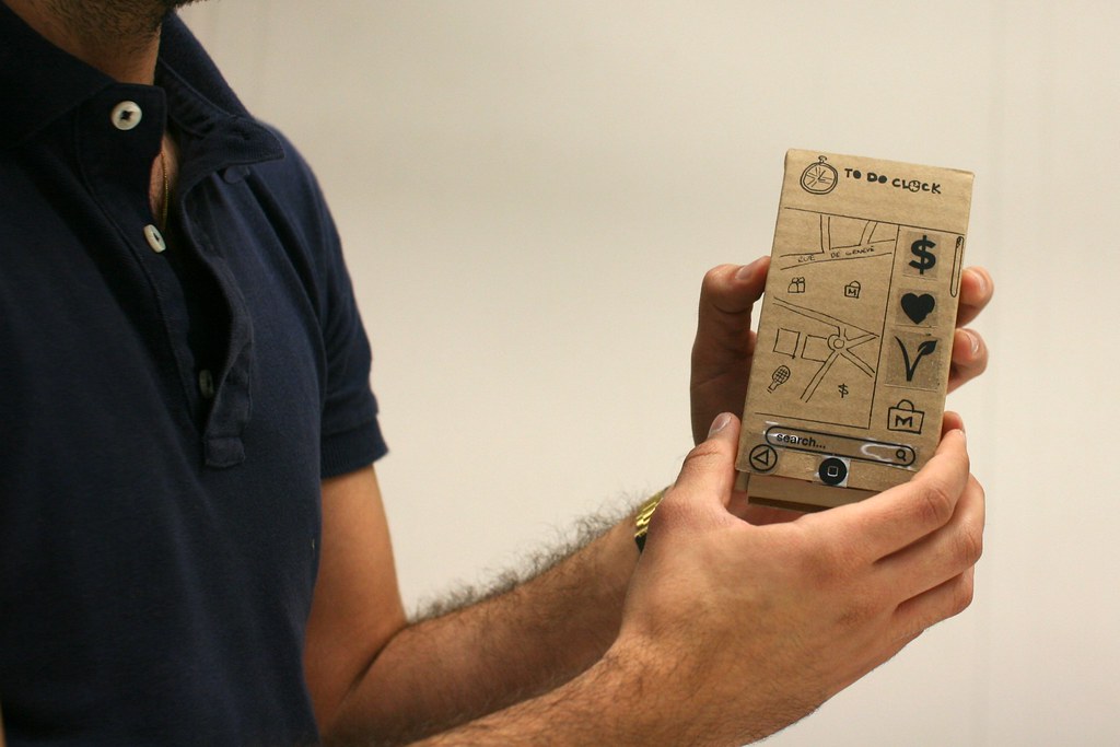
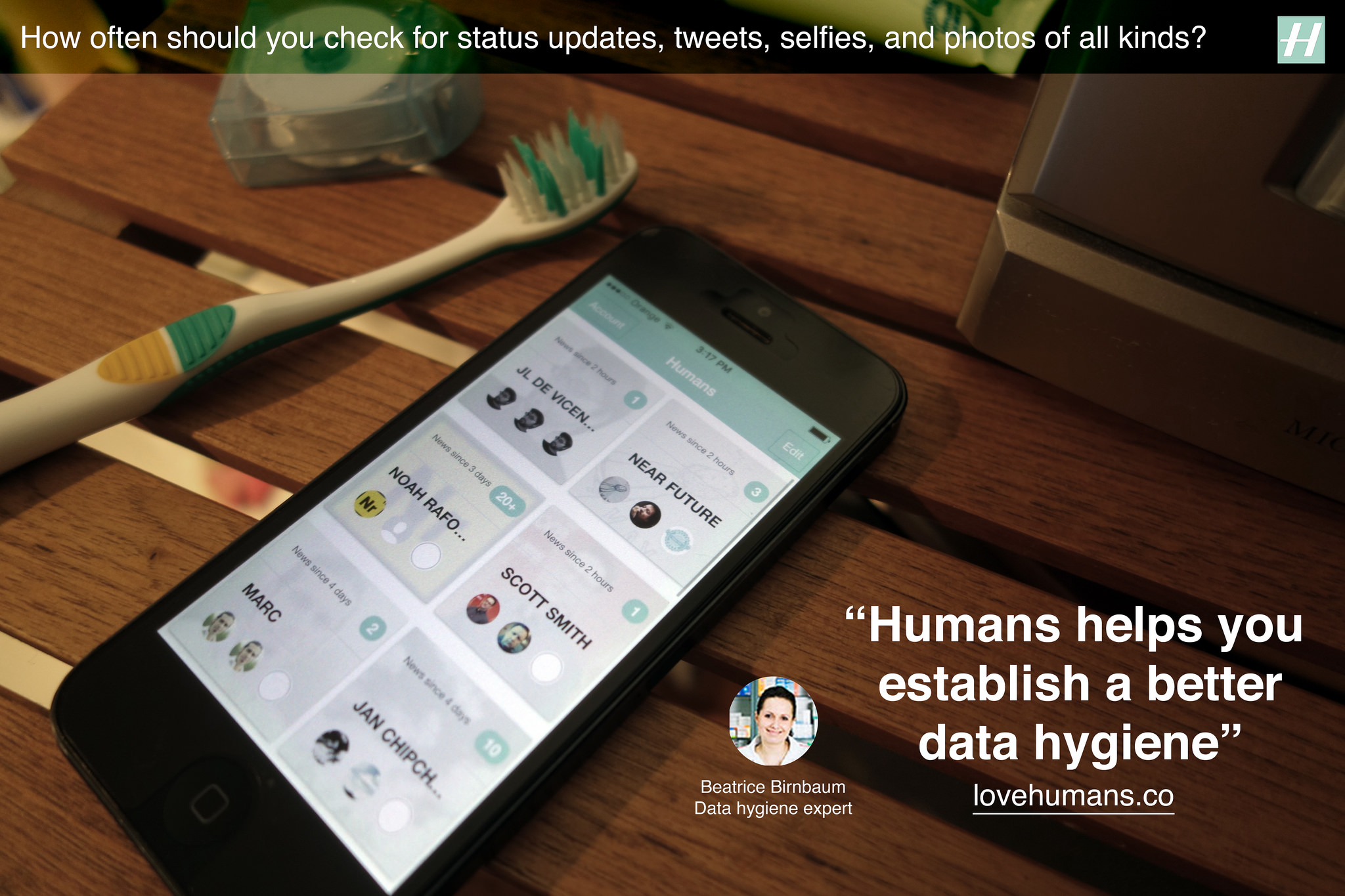
Humans is an app that offers a way to rationally manage too many contacts and slows down the consumption of status updates, tweets, selfies, photos of all kinds. Its design inspires from observations on how humans adapt to the feelings of information overload with its related anxieties, obsessions, stress and other mental burdens. Humans is the toothbrush for social media you pick up twice a day to help prevent these discomforts. It promotes ‘data hygiene’ that helps adjust to current pace of social exchanges.

First, Humans gives means to filter, categorize and prioritize feeds spread across multiple services, like Twitter, Instagram, and Flickr. The result forms a curated mosaic of a few contacts, friends, or connections arranged in their context.

Humans gives means to filter, categorize and prioritize feeds spread across multiple services, like Twitter, Instagram, and Flickr.

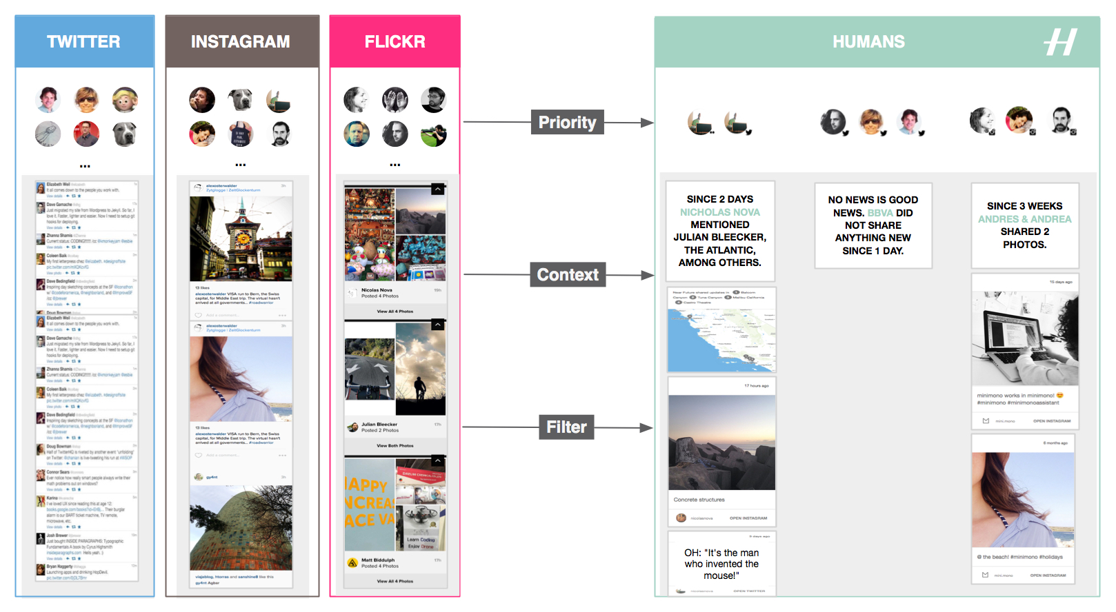
Additionally Humans strips social network interfaces and algorithms from their ‘toxic’ elements that foment addictions and arouse our desire to accumulate rather than abstract. And that without altering the fascinating dynamics of social networks. One inspiration this ‘data hygiene’ design pattern is the Facebook Demetricator provocative project that removes any number present in the Facebook interface. Its developer Benjamin Grosser advocates for the reduction of our collective obsession with metrics that plays out as an insatiable desire to make every number go higher. Another inspiration is the Little Voices app that removes the ‘noise’ from Twitter feeds and that is ‘ideal for those who like their feeds slightly quieter’.

Taken together, the benefits of using Humans are:

Reduce the compulsion to perpetually check Instagram, Twitter and Flickr

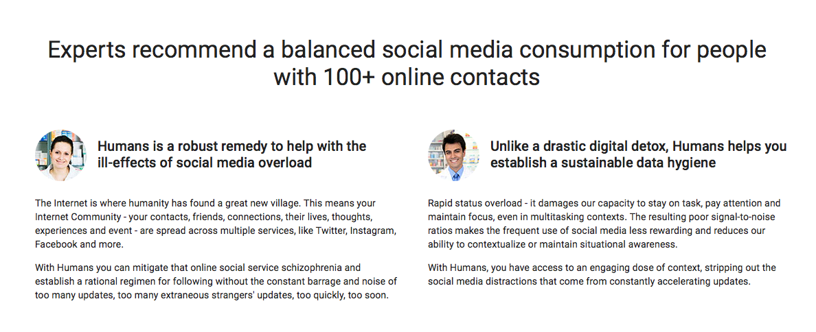
A frequent use of multiple social media services reduces our ability to contextualize and focus. With Humans, you can mitigate that online social service schizophrenia and establish a rational regimen for following without the constant barrage and noise of too many extraneous strangers’ updates. It works with the main social media platforms.

Keep away from the distractions in social media feeds

Get access to content stripped out of the social media distractions. Humans removes visual noise and arrange in their context the many status updates, links, selfies, photos of all kinds.

Mitigate feelings and symptoms of remorse whilst taking short or long offline breaks

If you have been away from your screens or too busy, Humans creates digestible doses of context that will get you up to date.

I designed and developed Humans to exemplify a new mean for ‘data hygiene’ with an interface and algorithms that adapt to human pace and do not uniquely focus on the real-time, the ‘now’, and the accumulation of ‘likes’ and ‘contacts’. Or as our fictional experts in ‘data hygiene’ would suggest:

Humans data hygiene experts

Check lovehumans.co for more information and request the app.

The near future of data hygiene

At Near Future Laboratory, we like to investigate alternative paths for technology. As data and connectivity augment our lives, hygiene might no longer only relate to maintaining a healthy body. Connected humans produce ‘data doppelgängers’ and consume data ‘anywhere’ and ‘anytime’ at an unprecedented rate. Consequently, they start to experience discomforts such as social media overload that Humans helps mitigate.

Like other information technology revolutions, there is a necessity for people to adopt new rituals and tools. In the near future we might see emerge interfaces, experiences, algorithms, design patters that reshape our social practices and for instance:

  • moderate our collective obsession with metrics and the pervasive evaluation and comparison of one self.
  • reclaim space for conversation over the illusion of the connection, its ‘retweets’ and ‘likes’.
  • reduce the social cost to ‘unfollow’.
  • promote solitude as a good thing.
  • regulate our insatiable desire to capture ‘moments’ and accumulate ‘contacts’.
  • help us overcome the ineluctable situations of digital amnesia.
  • empower our skills for abstraction and generalization from the ‘moments’ we capture.
  • help us forget to better remember.
  • invite us to expect less from technology, and more from ourselves and each other.

More on these topics in upcoming projects.

Missed Opportunity – A Crank on a Camera

An idiomatic miss here with this little, darling, silly little camera. First read says to me that crank+camera equals either, like..advance-the-image or, like..crank-the-moving-film through.

The Sun & Cloud is a unique and innovative lo-fi camera designed to take simple and creative images. The creator said it best: “We never wanted cameras as precision machines, rather we imagine the camera as a sort of sketchbook, something with which you easily record bits of your life.”

What strikes you immediately about the Sun & Cloud is its unusually cubic shape and the the folding hand crank and solar panel, already making this a camera not like others you have seen. Superheadz wanted to give users ultimate freedom, so they built a camera that can be charged without needing to be tethered to a wall. Even with a completely dead battery, crank the Sun & Cloud for just one minute and you’ll have enough juice for between 4 and 8 pictures. With three customizable quick access buttons, you can easily select your favorite color and B&W filters. The Sun & Cloud is philosophically pure, and the lo-fi photos it takes reflect just that.

I’d much rather that if my imaging thing is going to have a crank on it. Like a moving film camera. Or even a still image camera with a crank..that advances the film. A bit heavy with irony, but a better start at the least. There are all sorts of new practices for image making that would come from enforcing old, relevant mechanical rituals in the age of digital things.

The hug-chest-palmss-on-cheeks // isn’t it darling? sensibility of a camera that needs the sun to see makes me want to throw up forever.

I suppose the fact that this darling little thing lets me crank a bit to take a photo when, otherwise — a camera’s battery may’ve gone flat is a bit of a thing. Like, when I used to shoot with an old Nikon F2A, I always knew I could take a photo even if the meter battery went out because it’s 100% mechanical otherwise. But, still..

Continue reading Missed Opportunity – A Crank on a Camera

Prototyping session with post-its and cardboard at EPFL

It’s the second year I am teaching the HUM-401 class at EPFL with Daniel Sciboz. The course is about creative processes and tricks employed by designers in their work. Our aim is to show engineers from various areas (IT, biology, chemistry, material sciences, architecture) a different approach than the one they have through various means: short lectures, basic assignments and crits. The first semester is devoted to techniques and methods, and the second semester corresponds to a personal project. This course is extremely refreshing for me as it allows to understand the various frictions between “designerly” of doing. I blogged about this last year here and this new class will have will certainly lead me to new findings.

One of the most interesting moment of the first semester is the prototyping phase (which follows the observation and the ideation series of sessions). More specifically, there is course devoted to “quick and dirty prototyping” that we always try to renew, finding original ways to make students understand the relevance of iterating their ideas via basic techniques. The class starts off with a short intro about the underlying rationale to prototyping:

  • We discuss what we found in the field study conducted at the beginning of the semester, and highlight the categories of findings: problems (pain points, lack of something, bad functionality), expressed or observed needs, constraints (physical, social, cultural), general interaction principles, existing solutions, weird ideas. These findings are presented as starting points for “creating something”.
  • Then we discuss the importance of using tangible material to “test” ideas. The funny part of the discussion here, with engineers, is to make them understand that there is no “silver bullet” and the importance of iterating. I introduce here the notion of “thinging” (Pelle Ehn), the practice of using rough things to decide collectively where to go. Mock-ups or props can be seen as “experience prototypes”, to “understand, explore or communicate what it might be like to engage with the product, space or system we are designing” (J.F. Suri).

The idea that mock-ups to test things not only in talk but also through richer bodily, social and contextualized interactions, is easily grasped by the students but not necessary easy to put in place. This is why we then apply these ideas with two exercises.

Exercise 1: the post-it phone

This design exercise is a common assignment in design schools and I found some inspiration at at CIID about how to apply it:

Students worked in teams of three to imagine new mobile interaction scenarios around a theme/context. Each partner applied a stack of twenty or so post-it notes to the screen of their personal hand-held and draw interface states on each. As the interaction scenario was acted out, the notes were peeled off as the reciprocal actions unfolded.

Our brief was the following:

Form a team of 2 persons. Each team has to imagine a new mobile service based on the results of your field study (observation/interview): a map/orientation app. Using a stack of 15 post-its, you have to prototype the 3 core functionalities of this mobile app. Each post-its represents a screenshot of the graphical user interface (drawn by hand), create a treemap of the User Interface flow and then stick your post-its on top of each others. At least ONE of the feature must be audio!. You have 45 minutes, you will have to present this in front of the class in 5 minutes

That brief is straight-forward the the exercise went well. It’s always hard to have the students role-playing the presentation. Most have the tendency to do a demo (it may be more natural with such an audience) and not to show a real-interaction.

Exercice 2: stickers on boxes

The second exercise uses the marvelous sticker on boxes prototyping toolkit created by Anvil. The materiality of these elements enables to accelerate and improve the sharing and development of ideas in collaborative contexts. It’s a set of cardboard, boxes and stickers (with tons of different shapes, interfaces, logo) for for generating objects that communicate ideas quickly and simply:

The tool currently consists of cardboard boxes in 3 ‘handheld’ sizes, and a sticker catalogue of over 300 different symbols, shapes and icons. From current and past technologies to body parts, we have attempted to make these descriptors cover as broad and comprehensive a range of things as possible. By selecting, arranging and attaching the stickers you can begin to build up a sketch of an object, its potential features and uses.


For this part, the brief was the following:

Same team of participants. Now design a physical mock-up of your project using cardboard shapes and stickers. Create a way to present the use of this prototype in front of the class (role-play). You have 45 minutes, you will have to present this in front of the class in 5 minutes.

See the 5 projects designed by the different groups

Project 1: FYND (Find Your Next Destination)
Context of use: find new places to visit and spatially organize your day.
What it does: the app guides you to the destination you choose (from A to B)

Project 2: Find It Easily
Context of use: during leisure time
What it does: foldable 3D screen on both side of the device, it shows maps and objects’s location

Project 3: To Do Clock
Context of use: daily life/urban environment
What it does: the app allows to create “to do lists” by dragging icons of tasks to a map of the city you are at. The user gets points if he/she gets on time to every places where a todo item is located.

Project 4: GeoCrisis
Context of use: urban street
What it does: a location-based game with a map of where the user is. 3 game modes: survival, capture the flag, and run.

Project 5: Scanline
Context of use: find something (POI, restaurant…) in an urban context
What it does: the service allows to locate you on a map (as well as POIs) by scanning the skyline of the city in which you are located.

Some comments about the activity:

  1. The fact that we had both exercises was a good thing, it allowed to have a final discussion about the relative merits of the two, and the importance of using different types of material to iterate and test ideas in different directions.
  2. The tools themselves lead to intriguing ideas, sometimes in a divergent way (new features enabled by tons of stickers!), or by narrowing down the possibilities (the form factor of the cardboard boxes in the second exercise leads to lots of smartphone app ideas).
  3. Only two students (out of 16) realized they could use the cardboard box as a sort of foldable device!
  4. As usual with such kind of assignments with non-designers, there is a tendency to treat it as fun and almost absurd. This leads to participants using weird post-its or thinking about odd features for the sake of it. This is of course problematic but I think it’s a starting point for a discussion about the difference between having fun creating something (targeted to a certain user) and not making weird choices because it’s simply funny.

Why do I blog this? Debriefing the use of new tools is interesting for upcoming workshops.

The iPod Time Capsule – Notes on Listening + Time + Design of Things That Make Sound

Over the week’s end I was in the back studio tearing down and rebuilding the wall of photos for the Hello, Skater Girl “side” book project. I was tasked with this particular endeavor by the guy I hired to do the book design. I knew I’d have to do it all along which is why I had put up sound board many, many months ago.

It was going to be an all-afternoon-into-the-evening effort, which is fine. Making a book is hard fun work. I needed music but I didn’t want to suffer the tyranny of choosing or even curating a list of things. I just wanted music to come out of the stereo.

And then I remembered — I have my old dear friend’s ancient 2004 iPod. She gave it to me when she upgraded and I’ve never even looked at it. It’s just followed me around from city to city and house to house. There it was.

I plugged it in and it booted up just fine. And then I just pressed play and got to work.

It was a sea of past era music. Not super past — early 2000s. Perfectly fine. Some songs I may not have chosen. Some songs I didn’t know. Whatever. It was somewhat enthralling to realize I was listening to a frozen epoch of sound, incapsulated in this old touch wheel iPod. I sorta wish I had my original iPod. As it is, I still use my 80gb model, although that’s becoming a bit obsolete as a device in this era of having all-the-music-in-the-world-in-the-palm-of-your-cloud-connected-device.

I find it a bit incredible that this thing still works. I mean, it’s a hard drive with a little insect brain — so there aren’t firmware drivers to suffer incompatibilities with a future it was never destined for. Even though it has become obsolete in the consumer electronics meaning of obsolete — it can still work and sound just comes out of it the way an audio device should function.

That’s significant as a principle of audio and sound things, so I’ll say it again sound just comes out of it — and it does. The old trusty 3.5mm jack delivers amplitude modulated signaling in a way that is as dumb as door knobs — and that is as it should be. Not every signal should or needs to be “smart”..just like every refrigerator need not be smart. It’s back to basics for very good reason, I would say. (Parenthetically, I’ve been assaying a fancy new mixed-signal oscilloscope which can take an optional module to specially handle audio signaling — there are audio processing…)

What’s the future of that for the collective of things? How many things will work beyond their time? What are the things that won’t need an epic support system of interfaces, data, connectivity to *just work* after their time in the light? What of the cloud? When it breaks, grows old, has an epic failure that makes us all wonder what the fuck we were thinking to put everything in there — will my music stop coming out of my little boxes?

As I pinned up lots of little photos and every once and again checked the iPod to see what was playing, I thought about some stuff related to the design of audio and design of things that make sound.


iPods and music players generally are great single-purpose devices from the perspective of their being time capsules of what one once listened to. You’ll recall the role the iPod played in the apocalyptic tale “The Book of Eli” — it becomes a retreat to a past life for the the messianic title character. And despite the end of the world (again) the device will still work with a set of headphones the (potentially unfortunate) propriety dock connection and means to charge it through that dock connection. Quite nice for it to show up as a bit of near future design fiction.

What will happen to the list of music, which already seems to be a bit of a throw-back to hit parades and top 100s sorts of thigns. Those are relics from the creaky, anemic, shivering-with-palsy, octogenarian music industry which gave you one way to listen and one thing to listen to — broadcast from the top down through terrestrial radio stations that you could listen to at the cost of suffering through advertisements.

Now music (in particular, lets just focus ont that) comes from all over the place, which is both enthralling and enervating. Where do you find it? Who gets it to you and how? How do you find what you don’t even know is out there? Are there other discovery mechanisms to be discovered? Is this “Genius” thing an algorithmic means of finding new stuff — and who’s in charge of that algorithm? Some sort of Casey Kasem AI bot? Or the near future version of a record play graft scam? Or do we tune by what we like to listen to?

And despite the prodigious amount of music on this flash-frozen iPod from some years ago — now kids are growing up in a world in which many orders of magnitude *more music is available to them just by thinking about it..almost. It’s all out there. Hype Machine, Spotify, Last.fm, Rdio, Soundcloud..in a way YouTube — new music players and browsers like Tomahawk, Clementine — whatever. These new systems, services, MVC apps or whatever you want to call them — they are working under the assumption that all the music that is out there is available to you, either free if you’re feeling pirate-y or for a 1st world category “small fee” if you want to cover your ass (although probably still mug the musicians.) The licensing guys must be the last one’s over the side on this capsizing industry.

Listening rituals must be evolving as well, I’d guess. Doing a photography book about girl skaterboarders means that you end up hanging out with girl skateboarders and you end up observing what and how they listen to music. What I’ve noticed is that they do lots of flipping-through. They’ll listen to the hook and then maybe back it up and play it again. And then find another song. It’s almost excruciating if it weren’t an observation worth holding onto. I wonder — will a corner of music evolve to nothing but hooks?


Spotify Box project on IxDA awards thing is interesting to consider. I love the way the box becomes the thing that sound just comes out of. And the interaction ritual of having physical playlists in those little discs is cute. The graduate student puppy love affair with Dieter Rams is sweet in an “aaaahhh..I remember when..” sorta way. It’s a fantastic nod to the traditions and principles of music. And the little discs — well, to complete the picture maybe they should be more evocative of those 45 RPM adapters some of you will remember — and certainly plenty of 23 year old boys with tartan lumber jack flannels and full-beards are discovering somewhere in Williamsburg or Shoreditch or Silver Lake. They’ll love the boo-bee-boo sound track that the project video documentation comes with. Great stuff. Lovely appearance model. For interaction design superlativeness — there’s some good work yet to be done.

Okay. So…what?

It is interesting though to think of the evolution of things that make sound. And I suppose there’s no point here other than an observation that lists are dying. I feel a bit of the tyranny of the cloud’s infinity. If I can listen to *anything and after I’ve retreated to my old era favorites — now what? The discovery mechanisms are exciting to consider and there’s quite a bit of work yet to be done to find the ways to find new music. It definitely used to be a less daunting task — you’d basically check out Rolling Stone or listen to the local college radio. Now? *Pfft. If you’re not an over eager audiophile and have lots of other things to do — you can maybe glance around to see what friends are listening to; you could do the “Artist Radio” thing, which is fine; you could listen to “artist that are like” the one you are listening to. Basically — you can click lots of buttons on a screen. To listen to new music, you can click lots of buttons on screen. And occasionally CTRL RIGHT-CLICK.

Fantastic.

In an upcoming post on the design of things that make sound, we’ll have a look at the interaction design languages for things that make sound.

Before so, I’d say that clicking on screens and scrolling through linear lists have become physically and mentally exhausting. Just whipping the lovely-and-disruptive-at-the-time track wheel on an old iPod seems positively archaic as names just scrolled by forever. The track wheel changed everything and made the list reasonable as a queue and selection mechanism.

But, can you imagine scrolling through *everything that you can listen to today? What’s the future of the linear list of music? And how do we pick what we play? What are the parametric and algorithmic interaction idioms besides up and down in an alphabetically sorted list of everything?

Good stuff to chew on.

More later.

Why do I blog this? Considerations to ponder on the near future evolution of things that make sound and play music in an era in which the scale of what is available has reached the asymptotic point of “everything.” What are the implications for interface and interaction design? What is the future of the playlist? And how can sound things keep making sound even after the IEEE-4095a standard has become obsolete. (Short answer — the 3.5mm plug.)

Continue reading The iPod Time Capsule – Notes on Listening + Time + Design of Things That Make Sound

Janet Cardiff Sound Art

JCB_25072011_080845_9970

Just a quick note on some material in this hard-to-find catalogue resume of Janet Cardiff‘s work.

It’s called Janet Cardiff: A Survey of Works, with George Bures Miller

Cardiff is well-known for her early-days “sound walks” where participants were given a Walkman or similar device to listen to as they walked about. Stories were told or experiences recounted in the audio track. The idea is simple, but from what I understand (never had the pleasure..) it was the story that made the experience engaging.

I first came across Cardiff’s work while doing sort of informal background research for the PDPal project where we were trying to understand interaction in the wild — away from desks and keyboard and all that.

What I find curious about her work is the way it augments reality before people even really thought about all this augmented reality stuff — but, it does not fetishize little tiny screens and orientation sensing and GPS and all that. It uses our earballs rather than our eyeballs — and somehow that makes it all much less fiddly. Although — if you look carefully at the bottom image you’ll see an image from a project in which one does use a screen — from a small DV camera which is playing a movie for you as you go along.

Janet Cardiff

Parenthetically, I think Cardiff had one of the best augmented reality projects with her telescopes. I’ve only seen this as documentation when I saw Cardiff talk in Berlin at Transmediale 08. There should be more documentation of this somewhere, but the effect was to look through the telescope and see a scene in a back alley that was the back alley — only with a suspicious set of activities being committed — perhaps a crime. The illusion was in the registration but the story was in the sequence of events that one saw, effectively the story. So much augmented reality augments nothing except coupons and crap like that. There is no compelling story in much augmented reality, but I don’t follow it closely so maybe things have changed.

JCB_25072011_080858_9971
JCB_25072011_080945_9972

Continue reading Janet Cardiff Sound Art

The Mind & Consciousness User Interface: SXSW Proposal?

A visit to the Psyleron facility in Princeton New Jersey

A couple of years ago — 2009, I believe — my brother and I went to visit the facilities of Psyleron, a very curious research and engineering company in Princeton, a few miles from Princeton University. He piqued my curiosity about the operation, which was extending the research of the PEAR lab at Princeton — Princeton Engineering Anomalies Research. The PEAR lab has been in operation for decades and Psyleron is a kind of way of commercializing the insights and theories and all that.

They developed a random event generator and software to allow the at-home enthusiast practice their brain control skillz. It’s called the REG. You can buy one. Adam Curry at Psyleron was kind enough to loan me one. The object needs some industrial design help, which would be fun to work on.

Why is this interesting?

* It’s atemporal, I think. There’s a twist of the Cold War paranoia about mind-controlling Russkies arranged in a phalanx on the ground, specially trained to shoot brain waves to make enemy fighter pilots shove their sticks forward and crater their jets. It’s 50’s era thinking infused into something that is still futuristic. I like the history. The story of the Princeton Engineering Anaomolies (PEAR) laboratory start comes from that history — a chance encounter at a weird proto-DoD sponsored workshop on the role of consciousness in hot-shot right-stuff-y fighter jocks in the 50s who were better able to tame the barely stable faster-than-sound aircraft than other pilots. Were they more synergistically coupled to the planes, all other things being equal? It was a real question, and a contingent of the defense apparatus wanted to know and thus funded the PEAR studies.

* People are going to tire of their fascination with “gestural” interfaces. That term already sounds antique. Even thinking about it makes my mind groan and roll its eyeballs. What’s next? I’m not saying that brain control *is next — it is a logical, automatic extension to go from contact to contactless interaction, sort of like ranges of massage and body work — from the brutalist Swedish deep tissue stuff to the hands-off, chimes-and-insense Reki flavor.

* This guy Dr. Jahn who co-founded the PEAR lab lived nearby when I was growing up. That’s kinda cool to have this weird return to early days. He was squirreling away on this research in the basement of a building I used to sneak into during those easy, trouble-free adolescent years in breezy, leafy Princeton.

Cabinet Magazine has an good short article on Dr. Jahn and the background of his research.

There’s all sorts of curious artefacts and media and materials in and around the proto-Psyleron PEAR laboratory research experiments. The PEAR Proposition DVD is an epic, 3 DVD collection of lab tours, lectures, lecture notes about the project. Margins of Reality is the reading equivalent. Good “research” materials.

Psyleron also has a number of devices to activate the principles and propositions of mind-control/consciousness control and influence. An assortment of stand-alone probes and dongles — keychains, glowing lamps and that sort of thing. A robot is forthcoming!

The most curious to me — because it produces information that can be studied, allowing one to conduct experiments and because it could probably be DIY-ified — is their REG or random event generator. The REG in general stands at the center of the research as I understand it. Having a “pure” REG that is not influenced by shaking, bumping or jostling of any sort allows one to have a sort of “white noise” norm for measuring any external effects. The best way I can understand this is one needs to remove any bias on the system except for the influence of consciousness/es. A great REG is purely random data — white noise. Supposedly the white-noise randomness of this device is superlative. Who knows? It may be, or may have been before some innovation or whatever. I think there’s some quantum tunneling mojo going on in there beneath that bit of metallic shielding.

Why do I blog this? I’m *way behind on any project related to the work at Pear and my own personal affiliation with the research itself — Dr. Jahn lived in the neighborhood when I was growing up and the kids in the neighborhood all played together in the streets and yards of the neighborhood, including his daughter. I’m also thinking about writing a talk or panel proposal for SxSW 2012 on the topic, perhaps with Mike, who’s interested in looking into brain control interfaces.

I think there’s a nice continuity between the *macro interface of many minds/bodies of the Psyleron work and the more local, *micro interface of one mind with the likes of this stuff from this operation called emotiv. I like the continuity from consciousness and action-at-a-distance to the more directly coupled, sitting-on-the-head-stuff. Making a continuum from levers, knobs, switches, lights; punchcards keypads, teletype rigs; typewriter keyboards and CRTs; mice and keyboards and CRTs; 3D mice and all that up to “gestural” interfaces and touch and then into the mind could be quite and interesting graphic. A more complex graphic or an additional vector within that one could also look at the particular semantics and syntax of thought that is required to operate the devices — the ordering of knowledge necessary to frame a task or problem and then explicate it for the specific set of interface elements one is afforded by the device. Command-line interfaces, as we well-know, allow/disallow specific tasks; menuing systems are beards for what happens on the command-line — making the framing of the task more amenable to more people (?) and certainly less terse. It’s a translation effectively of what might normally go on the command line.

One possible approach to understanding this stuff is, of course — to start using it.
Continue reading The Mind & Consciousness User Interface: SXSW Proposal?

The Interaction & Interface Design Car Wreck

Sunday November 28 10:13

For designers, clearly, surfacing, paint colors, materials and interior fabric choices rule out over interface design, which is just plain forgotten about here . Unless it can be justified as, like…Formula 1 inspired, it just doesn’t seem to get any priority as an area of innovation. Look — hybrids barely get any consideration. Even the American car makers booths were bristling with cleaved “Boss” engines reminiscent of the $0.50 a gallon days.

*Sigh.

Well, there’s work to be done. Even the luxury cars could learn a trick or two from the IxDA world..This was a two hour wonder through the subdued LA Auto Show on Sunday. It’s hard to get excited about cars these days, save for the exuberant electric or hopeful hybrid. I chose to annoy myself by noting the wretched center console designs. Who’s in charge of these things, anyway?

Sunday November 28 09:18

Seriously. I wonder who has to program their office into their car nav. I mean..after the first day, or maybe even the first week of a new job, which you got so you could afford your fuck-off Porsche Cayenne. If you need your nav system to get you to the office everyday..even if you’re coming from the club, or dropping the kids off at school, or whatever..you’re doomed from the get-go.

Sunday November 28 09:34

What can you say? If I had to look at this everyday after spending..whatever. $40,000 on something? I’d cover it with butcher paper and use it as a notepad. Maybe leave a little hole for the austere analog clock there.

Sunday November 28 09:48

This is a Volvo. This speedo console actually isn’t so bad. It gives you messages close to the idiom of an SMS on your phone. So long as it doesn’t tip into Growl-style pop-ups, I think we’re okay here. It’s actually somewhere between charming and a bit uncanny valley-y..like..has my car turned into a message receiver? Why is my car discussing things with me? On the ride home, my friend Scott, who has an edition of this Volvo, noted that his car was reminding him to take it in for service in a similarly polite way — rather than “Service Engine” which is a deceptively calm way of telling you that there’s no more oil in the crankcase and your engine is pretty much a solid block of molten metal.

Sunday November 28 10:06

God, I’d ball-hammer whoever decided that the “Eco” mode of the car — presumably an energy-sensitive mode — should get this Evergreen tree icon and then sport and normal are left to this horrid sans serif with no iconographic or color or nuthin’. Why even bother? Like..*g’aahhh..Ball-hammer!

Sunday November 28 10:07

Sunday November 28 10:13

Now our cars require codes, PINs, and passwords — the wretched baggage of cold war security protocols which barely work for humans. Who wants to guess how many 1234’s and 0000’s will start a car? What’s the future of PINS and passwords and why is it not in my fancy, from the future car? I’m not talking about retinal scanners and biometrics here. Just simple, modest, low-level security like..pick a secret picture, your daughter’s favorite animal, &c. PIN? Really?

Sunday November 28 11:22

Jeeze. I’d almost prefer the old fashioned mechanical AM/FM radio than this Kafka-esque nightmare. Two knobs. Big old preset number keys from 1-6. A “Back” button the size of two keys. A four way that’s probably got a center-select. It’s just nuts.

Sunday November 28 10:11

Holy cripes. I mean..this is like 14 different things designed by 73 committees or something. It’s got Menus, Maps, Guides. Titles, XM, “Sound” (what??), CD (really. compact “disc” technology?). Category, Tune, Sync. And that’s an EIGHT way with a center select. EIGHT! It’s just a baroque meshuggener mess trying to look cool and failing miserably. MISERABLY. And on top of all that? The build quality would make me slap my forehead in regret every time I try to adjust the climate control knobs.

Sunday November 28 10:13

Okay. Someone should probably teach the designer of this display either about Camel Case or remind them that segmented LEDs can sometimes be retro, but only for hipster clocks and calculators.

Continue reading The Interaction & Interface Design Car Wreck

Design Fiction Chronicles: Before the iPad There Was the PADD

Saturday October 24, 19.35.51

Your author, considering his solution to the Kobayashi Maru during a shake-out run on a Class D starship.

There was recently a wonderful article on Ars Technica interviewing the production and prop designers for Star Trek. I highly recommend giving it a read, even if you’re not a Trekkie. What I find most curious is the creative constraints that the production design was under and their solution. With a limited budget for doing lots of physical design, they decided to draw the user interfaces, rather than assemble them from hardware like knobs and buttons and so on. The idea of a screen-based display that would change based on what it needed to do — a “soft” interface — arose.

“The initial motivation for that was in fact cost,” Okuda explained. “Doing it purely as a graphic was considerably less expensive than buying electronic components. But very quickly we began to realize—as we figured out how these things would work and how someone would operate them, people would come to me and say, ‘What happens if I need to do this?’ Perhaps it was some action I hadn’t thought of, and we didn’t have a specific control for that. And I realized the proper answer to that was, ‘It’s in the software.’ All the things we needed could be software-definable.”

(via http://arstechnica.com/apple/news/2010/08/how-star-trek-artists-imagined-the-ipad-23-years-ago.ars)
Continue reading Design Fiction Chronicles: Before the iPad There Was the PADD

Is There Such A Thing As An Invisible Metaphors

mouseless01

This is a curious project from some students at MIT. They’ve used a laser beam and a camera sensitive to the light reflected from that beam to track the motion and articulations of one’s hand as it moves and makes mouse-like gestures. So, effectively they’ve gotten rid of the mouse. Which is why they call their project *mouseless and why they’ve given it a bit of fun by an explanatory video ripped and sewn with some Tom and Jerry cartoon wackiness.

What I find curious here is the way they’ve extended the “mouse” metaphor even when the mouse has become “invisible” — or, rather — those bits of plastic and wire and so forth that constitute the mouse are now no longer necessary. But, we’re still operating with the same movements and gestures as if the mouse were there. Which makes me wonder why go through the hassles of taking it away, losing the physical tangibility of moving something with momentum and weight and texture and feedback and all that. It’s like one of these weird engineering efforts to do *something with the technology and then backfill the rationale. I mean — it’s all tiring in a way how little refinement and design and thinking and iteration goes into things like this. I’m exhausted just looking at the invisible mouse..that I can’t see. I mean — I guess the mouse not being there is as weird as the mouse suddenly appearing attached to a computer back in the day, but it’s easier to think of manipulating something material, no matter how weird and unexpected it might be, than it is to pretend that something’s there, that could just as easily be there if we just ditched the idea of an invisible mouse and kept a visible mouse there to begin with. Or something like that.

*sigh*

JCB_22062010_164013_0784

Well, I guess this is what to expect from the best and brightest. The simple obsession with refining and refining and refining rather than just doing something “’cause” seems to yield much more subtle *wheels-on-luggage designs, just making something a little better, as they say.

Why do I blog this? Thinking about the inevitability of metaphor in design while poking through Raphael Grignani’s remarks on Home Grown’s List UI inspired by Mike Kuniavsky’s draft chapters on metaphor for UI/UX for his forthcoming book, and a recent document that pleads for the end of metaphor and direct manipulation. With regard to *mouseless, I see this as another instance of moving from one extreme to another while missing anything in-between or even off to the side, which might be typical of engineering efforts when it plays in the UI/UX sandbox. ((It also is likely not their point at all, but rather a quick sketch of an idea to refine some thinking, or just a clever computer nerd stunt, but I’ll use their work *unfairly to make a perhaps not all that interesting remark on the blog, and to try to up my blog/writing quotient for practice.)) A bit like coming up with weird doorknobs and then looking for a house to put it on. Carts before horses, or gizmos first, humans last. Maybe somewhere we’re missing the subtleties and low-hanging fruit rather than the grand theatrics (engineers) and broad oratory (chatty design gurus who talk rather than make and refine and get into the material of things.)

Continue reading Is There Such A Thing As An Invisible Metaphors

Design Fiction Chronicles: The Dark Knight's Ubicomp Mobile Phone Sonar

Here’s that scene from The Dark Knight where Batman has secretly installed a surveillance system that traces the legal, moral and ethical contours iconic to ubiquitous computing networked devices of this sort. What’s going on — as explained in the short bit of dialog — is that all of the mobile phones used by all of Gotham’s citizens have been secretly connected to this rig that is able to produce sonar-like visualizations of their surroundings to such a level of resolution that one can *see and *hear everything. Batman is asking Lucius Fox / Morgan Freeman to man the rig and listen out for The Joker and direct Batman so he can capture him and end his felonious shenanigans. Lucius plays the moralist here, drawing issue to the fact that Batman would be invading people’s privacy and, moreover, misusing the system that Lucius constructed.

As pertains the Design Fiction motif, what I enjoy about this scene is how quickly it is able to center the pertinent extradiegetic debate on surveillance technologies. Whatever one feels about ubiquitously networked devices and their implications for issues such as the possibilities for over-arching surveillance, state control, and so on — this one scene and its spit of dialogue, together with a suggestive and fairly easily explained and dramatic apparatus — together all of this is able to summon forth the debate, frame its rough contours and open up a conversation. Nice stuff.

Listening Post

Parenthetically is this device shown above. Called, suggestively, Listening Post, one might be forgiven for mistaking it for a prototype of the surveillance device in The Dark Knight which it may be, or not, or may be both a *real prototype and a probe or a propmaster’s prototype for the film. Or something. In any case, it is a sculpture done by Mark Hansen and Ben Rubin. Listening Post “is an art installation that culls text fragments in real time from thousands of unrestricted Internet chat rooms, bulletin boards and other public forums. The texts are read (or sung) by a voice synthesizer, and simultaneously displayed across a suspended grid of more than two hundred small electronic screens.”

It’s quite curious and depending on what is going on in the world — lovely to listen to. When I first saw it at The Whitney in New York City it was in February of 2003 very shortly after the Columbia Space Shuttle disaster — and the tone of the snippets of chat room conversations were echoing the sentiments of that event. In a sense the device anticipates the aggregation of *chatter that comprises or can be cohered into *trends or *trending topics as the year of Twitter has made increasingly legible.

In any case, the similarity of these two devices — The Dark Knight apparatus and Hansen and Rubin’s “Listening Post” are clearly in some sort of conversation with one another, both provoking similar discussions and considerations, whether or not anyone except me is raising these points.

Why do I blog this? This is a useful example of the way a small, short scene — barely even a story — can help raise an issue to a more tangible and more legible level, making it perhaps more intriguing to grapple with abstractions like the ethics of surveillance. It provides a hook for these conversations in material form.