Zip In, Reach Over, Zip Out

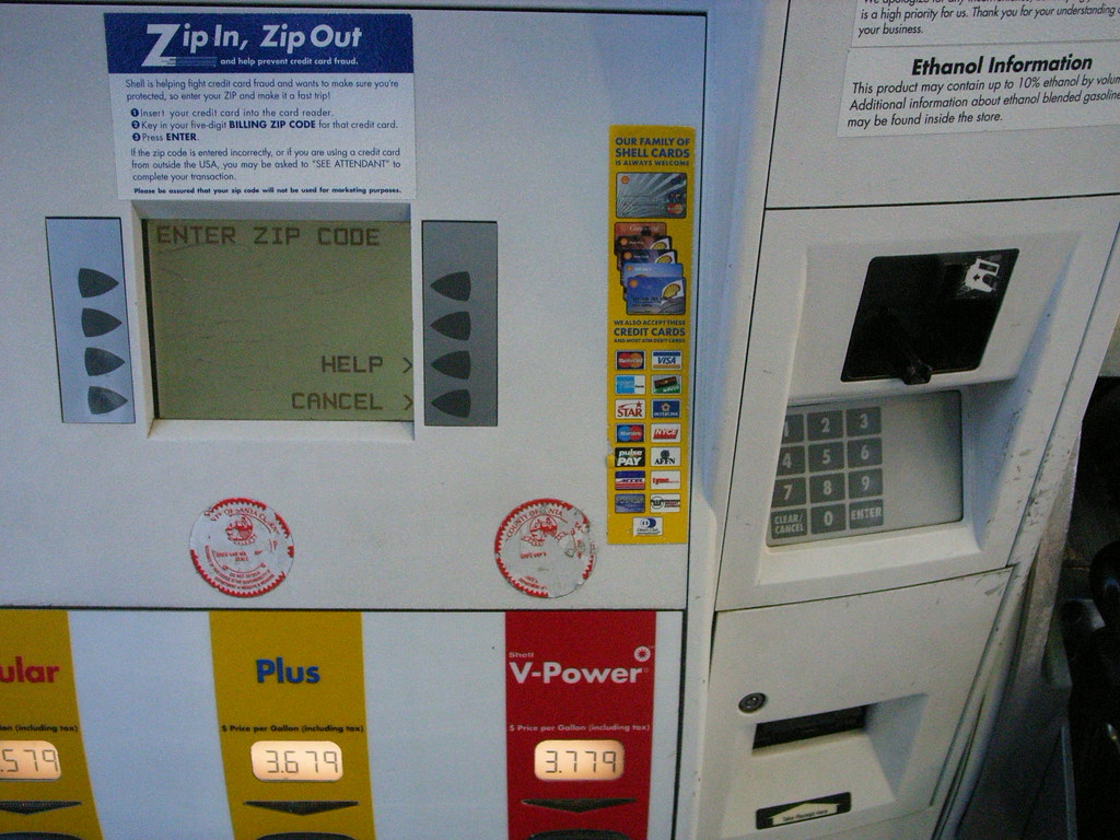
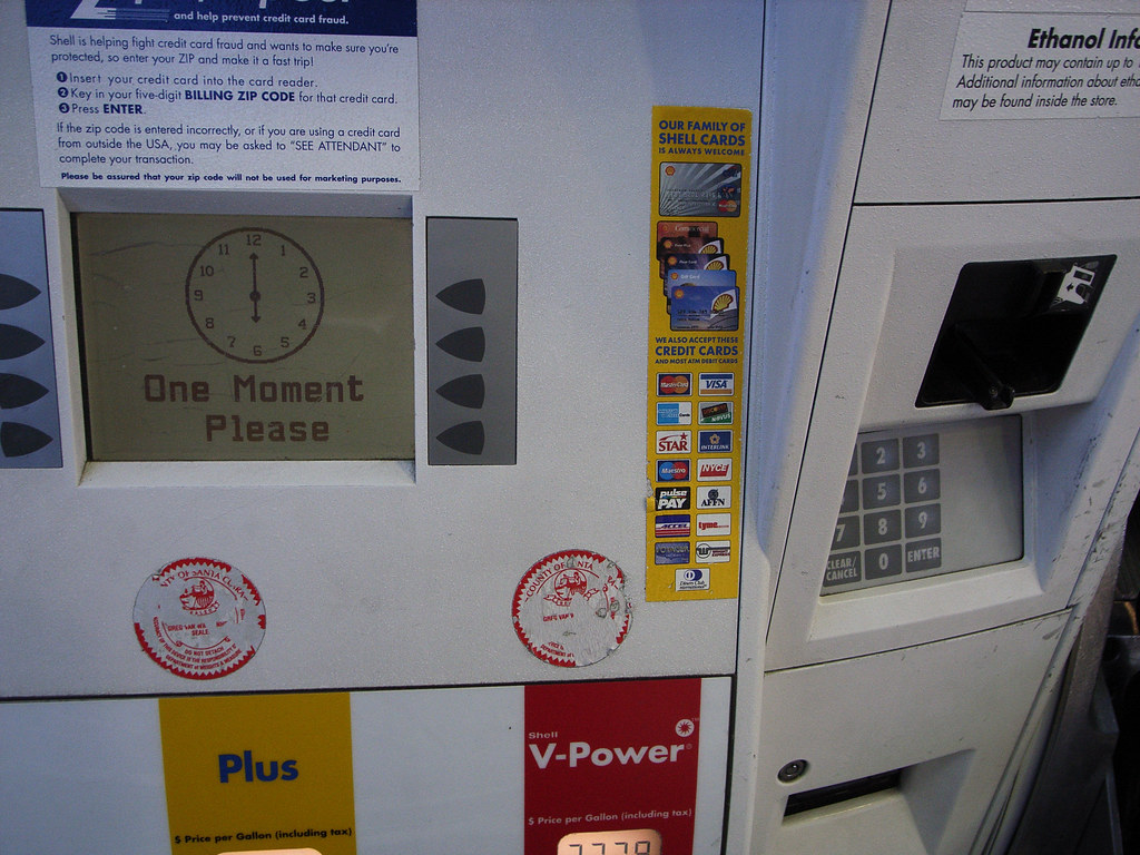
Seen just south of San Jose, California, another curious pragmatic interface that allows me to use my speedy, trusty debit card to complete a transaction without cash, but with a little dose of poor interaction design. After swiping my card, for security purposes (presumably) I must enter my postal zip code. So I can “Zip In, Zip Out.” This is all good stuff. If I were a thief who was a bit of a bungler, I might have swiped someone’s card and attempt to use it, but be stymied if I didn’t have the foresight to get their zip code, such as would likely be found on their drivers license, which is probably also in the wallet I just stole, or found, or whatever. So, I may have a consequential hurdle to charging up a $50 or $60 tank of gas. But the bigger hurdle might be searching for the obvious place to enter the zip code which is, of course, on the panel over around the little articulation in the otherwise flat-front of the pump. Now, this is nit-picky. Anyone would figure this out, that the entry point for numbers and such all is over on the number pad. But, I mean..why is it there and not as any considered design would place it — below or at least beside the display? And why, in a “Zip In, Zip Out” interaction should a “wait just a moment..” wait..wait..wait..clock appear at all? Even if it does take time to transact and validate, some other sort of graphic idiom that suggests zippiness seems like it would be more in keeping with the principle of fast service here.

Sigh.

Why do I blog this? Another in the continuing stream of design observations of failures, successes and imperfections to be considered.
Continue reading Zip In, Reach Over, Zip Out

Touch Keyboard

Interface Fail

A curious touch keyboard interface that was a bit confusing. This was found at a Department of Motor Vehicles location here in California this morning. The keyboard was there in this kiosk so I could type in my car’s license plate and be issued a renewed vehicle registration certificate. The geometry of the keyboard’s outline is evocative of a standard QWERTY layout, tapered toward the bottom as it is. And I hunted as if it were a QWERTY but, obviously, it’s not — the keys are alphabetically organized in rows by columns.

Why would Nicolas blog this? A curious reorientation of a keyboard meant to evoke what the standard keyboard look like, but without making assumptions about peoples’ knowledge of it’s standard key layout. An interesting design decision here. What elements from keyboards suggest their use (the geometry of the keyboard’s outline) and when can you ignore attributes for the sake of usability? What makes something usable? What assumptions can you make about familiarity and knowledges of use for things that are pervasive and whose use is implied in the design?
Continue reading Touch Keyboard

Coffee Interfaces

Bizarre interface syntax here. On the bottom left it’s Large, Small, Medium. That’s sort of peculiar — I’m never entirely sure what button to press. The Small and Medium seem almost identical when you’re feeling in need of a cup of coffee. Once, I pressed Large and it overflowed the cup. What are the contexts here for sizing, anyway? And why the mis-ordered buttons and icons?

Short Keys and Sheep Throwing

20080522_16-36-53

20080522_16-36-04

A hardwired, buttoned residue indicating the essentials. Some archaic (I still wince when someone, often a lawyer, asks me to send a Fax), and some now have become so vague as to be nearly meaningless in context — “Internet”?? “Extras”?? And a “Tel” short-key? Still working through interfaces for people. Close, but swinging wide in anticipation of zero-ing in on something the works, clearly.

20080522_16-34-00

20080522_16-37-27

Has Facebook style “sheep throwing” been presaged by the relic above? And what’s up with the puzzle-piece short-key? Anyone?
Continue reading Short Keys and Sheep Throwing

Mixing Realities

20080106_Sun_160125

Human Frogger

Can I imagine an interface consisting of computational elements, digital semantics, networks that bridge and connect social elements that do not consist of screens and keys? Can the imagination of digital kids imagine a different set of interaction rituals that are not just about touching little plastic squares and staring at glowing, power-hungry screens? Or is it just inconceivable that digital kids could know anything else — the ones who have only ever known millions of colors and 1280×800 and learned to touch-type when they were 4. Can human-scale time, physical movement through urban paths, suburban cul-de-sacs or backcountry trails contain elements of possibility for digital experiences that are not just the hackneyed PDA/GPS/GSM tour guide blindly explicating the relevance of this or that locale? What do you even call that, when all the possibility for anything new has been bled out from all the idioms surrounding computation? Does anyone else think it’s positively moronic and fully lacking in any foresight that “mobile computers” are just little, battery draining desktop computers?? I heard of a project meant to research mobile computing that was precisely a mindless projects to get mobile phones handle advertising presentation technologies. I mean..