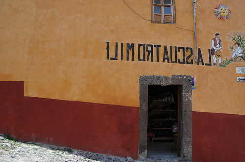
A hand-painted sign marking this restaurant/bar, curious reversed. I puzzled over this — it seemed not particularly in keeping with the generally sensible and utilitarian graphic design of most everything else in San Miguel de Allende. This seemed to have a peculiar sensibility that serves no specific purpose other than to be different and noticeable for being odd.
My best guess for this is that the streets that run left/right in this orientation are steep side streets and not heavily trafficked. The streets running into/out-of the frame are roughly level and would fit more into my category of “main drags.” This restaurant is right at the corner, but the entrance is on the side street. The street that runs perpendicular to this entrance is a one-way, with trafficking flowing away from the entrance. You would not see the restaurant entrance or the sign as you trundle in your Volkswagon or pick-up truck..unless you caught it in your rear-view mirror as you drove away. In this case, the sign is exceptionally utilitarian and sensible.

i believe its originally called “Las Cuatro Milpas” but for some reason, they re-painted over the last part of the name.