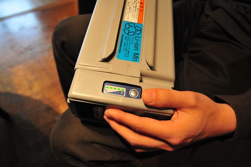
While in Japan and discussing design and the implications it can create around action and thought. Nothing mystical, but maybe..For example, the Zero Waste charger scooting around the Design Strategic Projects studio. The design of the activation button which starts a charge cycle that is constrained by time, to account for the extra fluff in the practices around chargers. Chargers left plug in normally draw some small bit of power — around 300 milliwatts, typically — just for being plugged into the wall. Even after your phone or computer or whatever is finished charging, the charger draws some overhead power to keep itself warm and continually topping up the phone. Even if it only takes an hour or two to charge up the phone (more often than not, the battery is more than half-way charged when we plug it in to begin with) it gets left in all night. Multiply the effects of a billion chargers times 300 milliwatts and the effects are gargantuan.
But it’s not just engineering redesign — changing the circuitry inside of the charger to draw zero residual power, although that’s definitely part of it, and such electronics were constructed. It’s also the designed button — an “action-implications” button. It’s a deliberate design facet meant to contribute to a subtle awareness that you are consuming power. The button has a deliberately longer than normal travel to contribute to the quiet but rich and meaningful action. The implications should be clear — this action costs something.
At top there, another action-implications style designed interface. The action of pushing the charging button reminds you that these enormous batteries are starting to charge, and will stop charging once the battery is full, rather than continuing to draw residual power.
Next task. Construct a house that runs on a 12 volt mains rather than 120 volts, or 220 volts.

