Design Fiction Studio for Young Minds

Friday July 23 18:16

The Innovation Center for Young Minds as an enviable-sounding studio for Fall 2010:

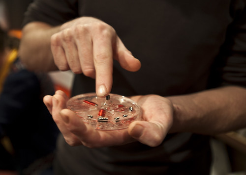
In “Design Fiction Studio,” we will focus on experimental ways to combine science fiction story telling with new forms of media production. The students will be asked to write a short science-fiction story and expected to illustrate it in an experimental book. We will explore ways to combine alternative materials –such as very basic electronic elements, conductive inks, phase- and color-changing materials– with new kinds of fabrication and production techniques to learn both about the materials and the way they can be used in different kinds of fictional products.

Topics to be covered:
– Basic science fiction writing skills to develop a short story or concept that will address a problem we may have in the near future.
– Experiment with new kinds of smart materials, design and interaction techniques to build an interactive book to illustrate the story.
– Discuss how writing fiction and building fictional objects can contribute to our thinking and allow us to bring into attention problems before they may even emerge.

Why do I blog this?Curious to see the ways science-fiction is used in design to think, write and make speculative new stuff. And I’m looking for good examples of design-fiction beyond the theory and principles behind it. Also — this is one of the first times I’ve seen the design-fiction stuff connected so directly to science-fiction writing — I mean, besides those folks who are already science-fiction writers. The idea that basic science fiction writing skills are taught as well as the gooey, arduino-y making-of-things.
Continue reading Design Fiction Studio for Young Minds
And the time it takes to make them is the time taken to mean it.

Monday February 09


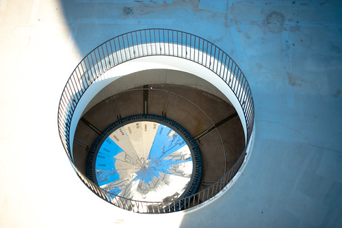
[Martin Puryear’s] sculptures look the way they do because they need to in order to mean what they do. The labor that is compressed into them allows them to work over time, and the time it takes to make them is the time taken to mean it. That they so often employ specialized tradesmen’s skills in their making allows them to work at the edges of utility—vessels that might be dwellings in the shapes of bodies—and in that fertile seam between representation and abstraction.

A quote from “From Head to Hand: Art and the Manual” by David Levi Strauss.

Why do I blog this? I like the way that time is emphasized here rather than the outcome. The emphasis is on the practice and process, which have so much to say about the sculpture. This distinction comes up often while materializing ideas. So often we can throw away ideas but once the idea becomes material, we’re less inclined to consider getting rid of it, likely because of the commitment of time and the costs of tangible materials. Some material things are still prototypes of an idea and not yet the right expression of an original idea, or stated intent. This means that it’s okay to put them aside as an expression of an idea because it doesn’t feel complete or does not “mean” what they are fully or satisfyingly. The gap between ideas and their materialization perhaps too often is a commitment rather than a looped path for refinement.

Continue reading And the time it takes to make them is the time taken to mean it.

Design Fiction Chronicles: Apollo 11 Owner's Manual

Friday July 23 15:48

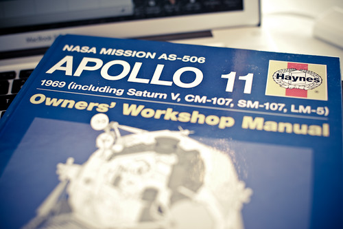
Found another design fiction in the form of an Apollo 11 Owners’ Workshop Manual, published by the folks at Haynes. I remember having Haynes service manuals for the two service-it-yourself buckets I had — a 1980 VW Rabbit and that 1972 Toyota Landcruiser which probably spent more time being made drivable than driving around.

The curious thing to note here is the playful distortion of the genre convention of a service and owner’s manual. One would only reasonably have such a manual if you owned the thing you mean to service, or are planning to get it. Making it a routine sort of technical guide puts you in the position of a service technician or even an astronaut who perhaps bought one of these things and now needs to sort out how to get the glitchy STS Antenna system to reboot.

I’d put this in the same category of design fictions as the Star Trek Starfleet Technical Manual and the myriad Star Wars “Essential Guides”, although these take themselves less seriously.

Many of the technical manuals, operators guides and service manuals for the Apollo, Shuttle and Skylab programs are available online — the real-deal. Packaged in this way as a Haynes manual puts this in a whole different category. The manual itself is more of a Time-Life style book as was pointed out to me when I shared this at the recent Sketching in Hardware 2010 event. Inside are many technical diagrams and explanations of systems — as well as astronaut photographs, descriptions of the program and so on. The cover provides the design fiction device of making the extraordinary possibility of owning this thing quite ordinary — oh? that thing in the driveway? Yeah..that’s my lunar lander..stuck valve in the intake manifold I gotta sort out.

Why do I blog this? Trying to capture some of the genre conventions of design fiction to be a little more articulate about what design fiction is and how it works and what it is for.
Continue reading Design Fiction Chronicles: Apollo 11 Owner's Manual

Weekending 07232010

Thursday July 15 20:05

Okay, well..Now the week is ending today. Whatever.

Couple of things to note this week.

I finally finished the Kicker Studio’s Six Questions. They’ll put it up coming up here. I really didn’t make a big thing about it, just finished it, but it was a good set of questions to think about why I’m doing this design thing. I’ll be sharing some thoughts and stuff at their upcoming Device Design Day up in San Francisco in August.

There were some fascinating all-day review sessions in the studio for some in-development stuff. It’s quite fascinating to see things as they’re being made and refined and perfected. The conversations themselves and the sort-of meta discussions about what makes compelling, usable, engaging UI/UX/ID are for me great learning experiences. There were some related discussions in the studio more generally about the impossibility of distinguishing the “industrial design” (which generically and perhaps wrongly only means the physical material of something) and the “interface design.” Sort of a design philosophy thing. It bakes my brain when people stare blankly and don’t get this idea.

The Media Design Program at Art Center started its Ideas In The Making 2010, so I went to the rooftop opening event, where Ben Hooker and Sascha Pohflepp and other residents presented their work. It sounds like an enviable residency for all these folks and I hope to spend a bit of time over there checking out the work as it develops, for sure.

We had a toolpathing tool-torial this Tuesday’s Tangible Tuesday (err..alliteration alert..uhh..). That’s the bit for going from a 3D digital model to the program (really a large list of numbers and tool changes) that tells the Fanuc CNC machine how to cut stock. Or, how to make stuff with a CNC machine. Nikolaj has done some amazing stuff to make that process much, much easier so basically learning how that all works. I predict running through this process in the near future.

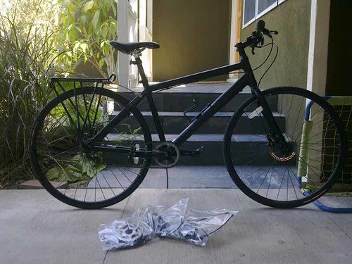
Rhys took most everything off of my bike turning it into a single speed. Pedaling faster, going a little slower, but basically covering the same ground in the same amount of time. These are both almost identical routes, done at about the same ungodly hour in the morning in Venice which is flat as a pancake. I won’t even note elevation change.

Single Speed Bad Boy Made Single Speed By Rhys. Thanks!

27 Speed
Time: 00:36:44
Distance: 9.14 mi

Moving Time: 00:35:54
Elapsed Time: 00:38:50
Avg Speed: 14.9 mph
Avg Moving Speed: 15.3 mph
Max Speed: 18.6 mph

Heart Rate
Avg HR: 159 bpm
Max HR: 170 bpm

Cadence
Avg Bike Cadence: 85 rpm
Max Bike Cadence: 102 rpm

Single Speed
Time: 00:39:20
Distance: 9.62 mi

Moving Time: 00:39:08
Elapsed Time: 00:39:48
Avg Speed: 14.7 mph
Avg Moving Speed: 14.7 mph
Max Speed: 17.3 mph

Heart Rate
Avg HR: 144 bpm
Max HR: 162 bpm

Cadence
Avg Bike Cadence: 90 rpm
Max Bike Cadence: 160 rpm

Continue reading Weekending 07232010

Weekending 07112010

Destroy The Future

Good lord. What happened just then?

Well — I missed a weeknote last week, but I’m not going to do penance. It happens.

I’ve been working — mostly in my head, with a swirl of notes — on two casual commissions for writing, both on the topic of Design Fiction. One is for a forthcoming volume for this journal called, like…Volume. It looks quite curious — reminds me of a cerebral Cabinet Magazine. I think that’ll be a trimmed-of-excess version of the already existing essay, but perhaps without out the Meringue. Along those lines, I continue to catalog these *genre conventions. I’m not entirely sure why, except that they are like the stylings and contours of what makes — in my mind — good Design Fiction, leastways as represented in visual stories.

The second commission is from the Swiss Design Network for their annual proceedings. I’ll be going to their conference in the Fall.

So..those things need to be tied up in short order.

I’ve also spent idle moments pondering a response to the Six Questions posed by the fine friends at Kicker Studios for their forthcoming Device Design Day next month. I think I’ll share some thoughts on the industrial design of Star Trek as a way to talk about the explication/explicitation actions of objects. How objects “speak” or incite/compel/describe actions and social-actions. And as to the Six Questions — I mean..I’m not sure how deliberate I should be in answering them, or thinking of them as some kind historic remarks or anything like that. But they are good ones and they get me thinking — Jack’s are my favorite, still. Criminy his a thoughtfully-funny guy.

Crimminy — and unless the activity of true southern california skateboarding suddenly vanishes without a trace, the going-will-be-slow on the Man Lodge in the back, which is meant to be the Laboratory’s studio. ((The ladder and table saw have spent more time staring at each other and less time being climbed on and/or rip-sawing timbers.))

Sunday July 11 16:16

Daniel Cuervo, Frontside Japan Air. Me? Underneath paying close attention to where he might land.

Why do I blog this? A few notes to remind myself of what I have done but, this week — more to remind myself of what I should perhaps be doing more, or things I should be doing just a little bit less.

Continue reading Weekending 07112010

Creative Corporate Cultures

Pixel Spout

An intriguing short article in the Economist from weeks ago, that I just read in what will surely be a failed attempt to *catch-up on back issues. In this one the article looks briefly at some of the things that Pixar does to maintain its 11-0 record of producing top-notch creative entertainment. A few points are worth repeating from the article.

* Creative reviews, even for stuff you’re not working on. Oftentimes a company gets to a size in which no one knows everything that is going on elsewhere, which results in overlap, duplication, inefficiencies and just plain bad organizational structures. Even at 1,200 people, evidently Pixar overcomes this by having people from everywhere come together and share what they are working on. ((“Employees show unfinished work to one another in daily meetings, so get used to giving and receiving constructive criticism.”))

* People before ideas. Creative individuals trump project ideas. Bring in creative talent and allow the ideas to come from that. ((“Most Hollywood studios start by hunting down promising ideas and then hire creative teams to turn them into films. The projects dictate whom they hire. Pixar starts by bringing in creative people and then encourages them to generate ideas.”))
This is a tricky one, but I think many technology heavy companies — if I can awkwardly translate a film production company from a gadget/software/network-services/internet production company — start with a doorknob and then try to find the family with a house and convince them to put this doorknob on the front door without understanding the life/practices/rituals of the people in the house. Perhaps curious, novel, patentable ideas without a clue as to how it might make sense to normal humans.

* Constructive post-mortems on projects. I think this is crucial. The time to consider what was done and what went right and wrong is a requirement if a team/company/studio is to learn from what it spent so much time and energy to create. ((“Pixar also obliges its teams to conduct formal post mortems once their films are complete…Pixar demands that each review identify at least five things that did not go well in the film, as well as five that did.”))

The article concludes with a warning and a reminder that there are no formulas for creative success — just a few ingredients, some luck and the benefits of leadership that is mindful that creativity is not something you can plan for.

“Managing creativity involves a series of difficult balancing acts: giving people the freedom to come up with new ideas but making sure that they operate within an overall structure, creating a powerful corporate culture but making sure that it is not too stifling. Few organisations can get this balancing act right in the long term—particularly as the formula can change over time.”

Continue reading Creative Corporate Cultures