Power all around

ipad mini

Weighing in at over a ton, and filling a whole room at Bletchley Park, Colossus was the world’s first programmable computer, used to decrypt the Lorenz Cipher. Since it’s creation over 65 years ago a significant improvement in performance and reduction in size has occurred in computing, Moore’s Law extending well beyond what most considered possible. Take a look at the iPad mini above. The immense computing power of the iPad now exists within that little L-shaped board running along two sides of the diminutive tablet. What’s hard to miss, however is the proportionally huge battery, which occupies around 60% of the entire volume of the product.

There have been huge strides made in the field of power storage (tripling in energy density in the last 15 years, mostly due to Li-ion), but this hasn’t been able to match the pressures exerted by hardware. As a result, cell phones now expire significantly quicker than those of ten years ago. The ongoing power struggle is now a key focus in many mobile tech industries, and there are some very interesting developments afoot.

Whilst batteries will continue to improve in some respects, much time is now being focussed on micro-harvesting, aiming to top up the battery at every opportunity. I once read a ‘statistic’ which claimed that if the impact of every footfall on every sidewalk in New York could be captured, the city would generate enough energy to power itself. Whilst this is perhaps apocryphal, it’s true that the vibrations created by human movement generate significant energy. We’re are perhaps familiar with large scale movement harvesting technologies, kinetic bicycle lights for example, but engineers have recently been able to create micro-harvesters. These work in the same way as any generator, moving a magnet through a coil, but at tiny scales. An array of these tiny top-up engines could easily be fitted into most mobile electronic devices, generating 12µW from a 1cm square device.

harvester

But it’s not just movement vibrations from the user jogging, or the rocking of a car, these devices can charge due to external vibrations such as noise. We can attach them to the back of screens or run speakers ‘in reverse’ to vibrate in a noisy bar or restaurant and trickle charge the batteries. Clever stuff.

thermoelectric

So how else can we harvest little bits of energy? Well there’s obviously solar, and lots of work is underway here, but what about the heat from the sun, as opposed to the photons? Where there is a difference in temperature between two materials, we can grab power due to the Seebeck effect. If you’ve ever left your phone on a sunny table you know just how much heat is available in your devices, so this is a potentially exciting area, energy-wise. Not only that, but one side of the thermopile (see above) could be placed next to your skin (your cheek whilst talking, or in your headphones) in colder or darker environments.

faraday chair

Dunne and Raby made the Faraday Chair shown above in order for people to escape ‘leaking’ radio waves from digital products in their excellent book Hertzian Tales. Whilst this may conjure up images of paranoid, tinfoil wearing hippies, the truth is closer than you might think. Whilst the numbers are small, ambient RF (radio frequencies) are a viable energy source. Energy leaking from GSM or WLAN communication services can be captured and converted into little bits of power. The main issue here is distance and power, you’ll know this from your RFID enabled travel card or cordless toothbrush, that said it’s still considered viable.

Power is all around us, and if we want our devices to do more and last longer we’ll need to find ways to grab it and keep it. Whilst none of these technologies generates enough energy to power a screen based device alone, they will add precious seconds to the life of the battery. That said, outside of the pixel based realm, sensors and micro-devices are also trending toward increased efficiency and smaller volumes. Here may be a case for self sustaining electronics which could be permanently deployed into environments, houses, bodies, anywhere there’s light, vibration, temperature or RF. That’s interesting.


Prototyping session with post-its and cardboard at EPFL

It’s the second year I am teaching the HUM-401 class at EPFL with Daniel Sciboz. The course is about creative processes and tricks employed by designers in their work. Our aim is to show engineers from various areas (IT, biology, chemistry, material sciences, architecture) a different approach than the one they have through various means: short lectures, basic assignments and crits. The first semester is devoted to techniques and methods, and the second semester corresponds to a personal project. This course is extremely refreshing for me as it allows to understand the various frictions between “designerly” of doing. I blogged about this last year here and this new class will have will certainly lead me to new findings.

One of the most interesting moment of the first semester is the prototyping phase (which follows the observation and the ideation series of sessions). More specifically, there is course devoted to “quick and dirty prototyping” that we always try to renew, finding original ways to make students understand the relevance of iterating their ideas via basic techniques. The class starts off with a short intro about the underlying rationale to prototyping:

  • We discuss what we found in the field study conducted at the beginning of the semester, and highlight the categories of findings: problems (pain points, lack of something, bad functionality), expressed or observed needs, constraints (physical, social, cultural), general interaction principles, existing solutions, weird ideas. These findings are presented as starting points for “creating something”.
  • Then we discuss the importance of using tangible material to “test” ideas. The funny part of the discussion here, with engineers, is to make them understand that there is no “silver bullet” and the importance of iterating. I introduce here the notion of “thinging” (Pelle Ehn), the practice of using rough things to decide collectively where to go. Mock-ups or props can be seen as “experience prototypes”, to “understand, explore or communicate what it might be like to engage with the product, space or system we are designing” (J.F. Suri).

The idea that mock-ups to test things not only in talk but also through richer bodily, social and contextualized interactions, is easily grasped by the students but not necessary easy to put in place. This is why we then apply these ideas with two exercises.

Exercise 1: the post-it phone

This design exercise is a common assignment in design schools and I found some inspiration at at CIID about how to apply it:

Students worked in teams of three to imagine new mobile interaction scenarios around a theme/context. Each partner applied a stack of twenty or so post-it notes to the screen of their personal hand-held and draw interface states on each. As the interaction scenario was acted out, the notes were peeled off as the reciprocal actions unfolded.

Our brief was the following:

Form a team of 2 persons. Each team has to imagine a new mobile service based on the results of your field study (observation/interview): a map/orientation app. Using a stack of 15 post-its, you have to prototype the 3 core functionalities of this mobile app. Each post-its represents a screenshot of the graphical user interface (drawn by hand), create a treemap of the User Interface flow and then stick your post-its on top of each others. At least ONE of the feature must be audio!. You have 45 minutes, you will have to present this in front of the class in 5 minutes

That brief is straight-forward the the exercise went well. It’s always hard to have the students role-playing the presentation. Most have the tendency to do a demo (it may be more natural with such an audience) and not to show a real-interaction.

Exercice 2: stickers on boxes

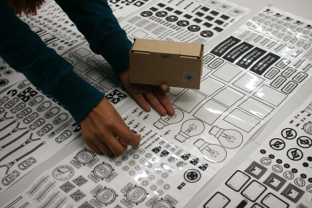
The second exercise uses the marvelous sticker on boxes prototyping toolkit created by Anvil. The materiality of these elements enables to accelerate and improve the sharing and development of ideas in collaborative contexts. It’s a set of cardboard, boxes and stickers (with tons of different shapes, interfaces, logo) for for generating objects that communicate ideas quickly and simply:

The tool currently consists of cardboard boxes in 3 ‘handheld’ sizes, and a sticker catalogue of over 300 different symbols, shapes and icons. From current and past technologies to body parts, we have attempted to make these descriptors cover as broad and comprehensive a range of things as possible. By selecting, arranging and attaching the stickers you can begin to build up a sketch of an object, its potential features and uses.


For this part, the brief was the following:

Same team of participants. Now design a physical mock-up of your project using cardboard shapes and stickers. Create a way to present the use of this prototype in front of the class (role-play). You have 45 minutes, you will have to present this in front of the class in 5 minutes.

See the 5 projects designed by the different groups

Project 1: FYND (Find Your Next Destination)
Context of use: find new places to visit and spatially organize your day.
What it does: the app guides you to the destination you choose (from A to B)

Project 2: Find It Easily
Context of use: during leisure time
What it does: foldable 3D screen on both side of the device, it shows maps and objects’s location

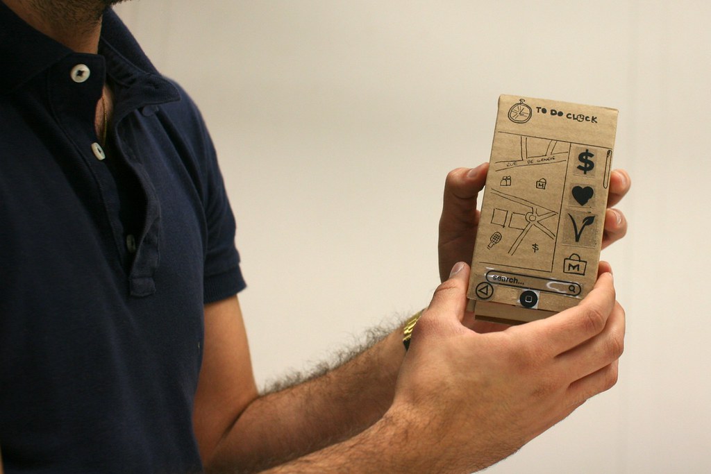
Project 3: To Do Clock
Context of use: daily life/urban environment
What it does: the app allows to create “to do lists” by dragging icons of tasks to a map of the city you are at. The user gets points if he/she gets on time to every places where a todo item is located.

Project 4: GeoCrisis
Context of use: urban street
What it does: a location-based game with a map of where the user is. 3 game modes: survival, capture the flag, and run.

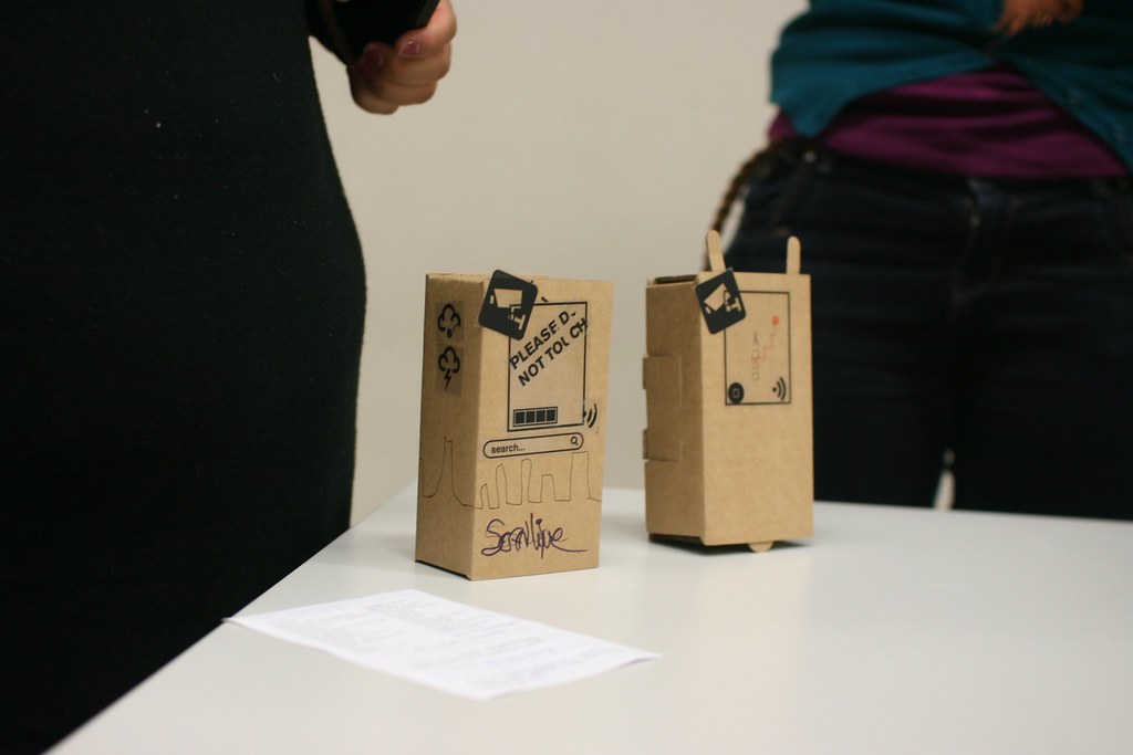
Project 5: Scanline
Context of use: find something (POI, restaurant…) in an urban context
What it does: the service allows to locate you on a map (as well as POIs) by scanning the skyline of the city in which you are located.

Some comments about the activity:

  1. The fact that we had both exercises was a good thing, it allowed to have a final discussion about the relative merits of the two, and the importance of using different types of material to iterate and test ideas in different directions.
  2. The tools themselves lead to intriguing ideas, sometimes in a divergent way (new features enabled by tons of stickers!), or by narrowing down the possibilities (the form factor of the cardboard boxes in the second exercise leads to lots of smartphone app ideas).
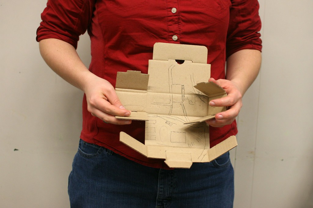
  3. Only two students (out of 16) realized they could use the cardboard box as a sort of foldable device!
  4. As usual with such kind of assignments with non-designers, there is a tendency to treat it as fun and almost absurd. This leads to participants using weird post-its or thinking about odd features for the sake of it. This is of course problematic but I think it’s a starting point for a discussion about the difference between having fun creating something (targeted to a certain user) and not making weird choices because it’s simply funny.

Why do I blog this? Debriefing the use of new tools is interesting for upcoming workshops.

Seen on “A damn shame art”: Armando M. Diaz first…


Seen on “A damn shame art”:

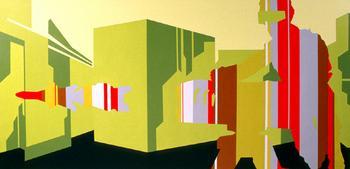
Armando M. Diaz first one-man show at the Paragraph Gallery takes the lens of this brave new visual world order as a starting point in presenting the six canvases in this series. The Acrylic on canvas paintings range from 3’ by 3’ squares to a massive 10’ by 5’ piece. The imagery, motif, and color remain consistent in every canvas: highly stylized architectural landscapes with disorientating abstract lines creating the silhouette of a helmeted soldier, a post-Bladerunner scene created in a frenzy of Day-Glo style colors that have resurged in so many culture mags and Flash websites.

Search terms, by B42 ed.: What are we to make of all these…


Search terms, by B42 ed.:

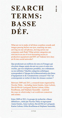
What are we to make of all these countless sounds and images passing before our eyes, reaching our ears, arriving on our cell phones, moving across our computers and iPads? What artistic categories are relevant in an era of ever-increasing access to production equipment and DIY art? Indeed, how does art fit into social networks. […] This book is a contribution to the field of Digital Humanities. It takes the form of a query guide cognizant of the redistribution and dissemination of knowledge via search engines and collective encyclopedias. It facilitates research by providing primary sources based on keywords supplied by artists and scholars of various generations, made meaningful by the contributors’ own experience

Junkware, by Thierry Bardini: Examining cybernetic structures…


Junkware, by Thierry Bardini:

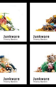
Examining cybernetic structures from genetic codes to communication networks, Thierry Bardini explores the idea that most of culture and nature, including humans, is composed of useless, but always potentially recyclable, material otherwise known as ‘junk.’ Junkware examines the cultural history that led to the encoding and decoding of life itself and the contemporary turning of these codes into a commodity.