Convenience

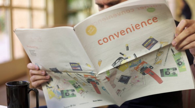
We made a newspaper through our friends at RIG‘s lovely Newspaper Club service. We — myself, Nick Foster, Nicolas Nova and Rhys Newman — collaborated on this. (Rhys did the lovely drawings, by the way.)

We printed a hundred or so. They’re real physical things of course. But you can also download a PDF of Convenience.

The newspaper is called Convenience and it’s based on the hypothesis that all great innovations and inventions find their way into the Corner Convenience store. Take for example, the nine we selected to feature in the newspaper, amongst a couple dozen:


AA Battery (Power)
BiC Cristal Pen (Writing)
Eveready LED Flashlight (Light..and laser light!)
Durex Condom (Prophylactic)
Reading Spectacles
Map (Cartography/way-finding)
BiC Lighter (Fire)
Disposable Camera (Memory)
Wristwatch (Time)

It’s a hypothesis designed to provoke consideration as to the trajectory of ideas from mind-bogglingly fascinating and world-changing when they first appear to numbingly routine and even dull by the time they commodify, optimize and efficient-ize By then, they become so mundane, quotidian and routine that the only way to enliven them is to offer sales discounts (3 for 99¢), packaging copy eye candy (New! Comes with batteries!), color variants, add a few new bells and whistles (Copper Top! Sensually Lubricated!, all done in remarkably infinite variety and a good dose of insight on human impulse and psychology by our friends downstairs in brand marketing.

In the paper, each of our nine items gets a bit of a mini dossier. Where, when, how, how long, by whom? And we have an op-ed section. The over-arching implications here are to consider that great things need not be whiz-bang, flash-bang Military robots+monkeys sorts of things. Or even sleek screen-y things. Innovation can happen in the decidedly less celebrated, less red carpeted approach of just making little things much better and settling for small, deeply impactful implications.

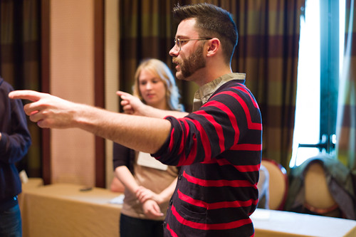
In the paper we also have a center piece that reminds us of the role the Corner Convenience has played in the modern cultural barometer of popular cinema. We did that center section because much of out thinking centered around the quotidian character of the Corner Convenience as represented in film. But also — @fosta and I now here at Emerge 2012 at the Arizona State University in Tempe Arizona (following along at #emerge2012asu) to conduct a Design Fiction workshop.

Our locus of interest? The Corner Convenience of the near future, of course! We are asking ourselves through filmmaking — what will be in the Corner Convenience in a four or five years time? We want to make our own little films to exhibit those things using the styles and genre conventions of Design Fiction.

Corner Convenience

This is where we are, at the counter of your local convenience store — the corner bodega, kiosk, liquor store, small grocer. We could be at the independent certainly. Increasingly we’d find ourselves at any of a number of global chain stores — 7-Eleven, Express Mart, AMPM, A-Z Mart, Get Go, Get n Go, Stop’n’Go, QuickCheck, QuikStop, Kwik Shop, One Stop, Store 24, 7/24, Ministop, R-kioski, Circle K, Kroger, Wawa, Relay, Żabka, Lawson, All Days, In & Out, Convenio, Everyday, Spar.

Just call it Corner Convenience.

Let’s ask ourselves — what makes these stores convenient? It didn’t take long to get here so we’d have to say that location for most of us would be synonymous with convenience.

Next might be the hours the Corner Convenience keeps. This measure of convenience often appears as a kind of subtitle to the store name. “Open 24 hours”, “Open Day & Night”, “Day and Night Liquors”, “We Never Close”.

They are off of every exit on any highway. Around every corner of most neighborhoods. They say they never close. It’s 1:14am. You need gasoline. Turn right.

Summon the image of a weary, pimply-faced 20 year-old Guatamalean immigrant seen safely time-locked into his protected cash register cage in a small beach town in Southern California. We’re free to wander the store — a few aisles of chips, meat jerky, king size candy bars, breath fresheners, throat lozenges, bubble gum, rotissing hotdogs, magazines. Behind two epic walls of built-in refrigerators — bottles of bottled water with excruciatingly meaningless packaging variations, whole milk, low-fat milk, half-and-half, Florida orange juice, orange drink, things to drink, junky pep drinks, Coca-Cola, Pepsi, Monster, fancy Woodchuck Cider nestled by a small scrum of chilly, perspiring white wines, and then a formidable flank of a regional workmen’s after work favorites including 24oz Budweiser Clamato and its variations. Locked safe in the after hours attendant’s cage — ciggies, flavored cigarellos, Zig-Zag papers, condoms, herbal supplement packets for endurance and fortitude, lighters, batteries, laser pointers, analgesics three varieties of aspirin, and some flavorful cough suppressants.

The attendant-cashier idly scrolls through text messages — or electronic mail, or news from home, or considers a death-blow of a move in the Words with Friends game he’s playing with a cousin in Arizona, or updates his Facebook profile photo, or Tweets that he’s bored to 740 followers..it’s hard to tell from behind the 3/4 inch bullet proof. And I don’t really care if he’s amazingly sending digitally encoded radio transmissions to outer space and back because I’ve just bought $53 of Saudi gold. It came over the Atlantic and through the Panama canal in an oil tanker just for me.

The Corner Convenience is a vault containing the treasures of great, world-changing innovations throughout all histories. Truly. We should see our Corner Convenience as a living Neighborhood Museum of Innovation. Someone should enshrine these and teach the lesson to every secondary school student. Think of the product tie-ins. There could be an international holiday commemorating the deep-seated history of innovation in your local 7-Eleven. Where are the brand marketing people? They’ve dropped the ball on this one.

We have at our finger tips the things no one would have taken for granted 50, 100, 200, 500, 10000, 500,000 years ago. There it all is. Fire, for chrissake — and disposable? In any color one would like, or with your favorite sports team printed on it? Are you kidding me? Flick and fire. Flick and fire.

Have an achy head? No leaches at hand? Don’t feel like chewing on the bark of a Slippery Elm? Well — have some acetylsalicylic suspended in a dissolving capsule that you swallow. Nothing to swallow it with? Have some fresh, filtered water, brought to you by truck and ship and conveniently packaged in a dubious plastic bottle. Feeling randy, but not ready to start a family? Pick your variety, shape, size, texture, degree-of-package-salaciousness condom. Concerned about performance? Have a grab-bag of herbal fortitude. Need to make a phone call to *anywhere? Get a disposable cell phone, talk for 120 minutes then throw it out.

It’s all right there. Selection, variety, color — sure, we expect that. But do we stop to marvel at the epic travels in space, time, refinement, iteration, industrialization these mundane, ordinary conveniences have made?

Convenience is the name of the awards ceremony at which capitalism admires itself. Convenience is the final measure of mass production’s success. It is the asymptotic long-tail of industrialization, a tail whose zero is 99¢, 3 for 1, buy-one-get-one-free. Industrialization is found in the rash-dash coupon books that litter our recycling bins. It is the baroque, oddly seductive sales circulars encouraging us to tramp down to our local shop and get a dozen eggs, a flank of beefsteak or a case of birdshot. We find industrialization tucked into the ad supplements of old-fashioned newspapers — the paper newspapers — reminding us that we might need a ream of sustainably farm-harvested non-toxic bleached white paper for our $99 laser light powered printing press.

How do we applaud convenience? Does it represent success insofar as much of the world — though certainly not all — soaks in it? Is Henry Ford, godfather of industrialization, doing an exuberant, boastful Running Man in his mausoleum? “I done done it! I done done it! I done toldya! I done toldya! You know you waaaant it! You know you waaaant it!”

If it is success, it is a conflicted one. No proper post-disciplinary, post-modern Industrial Designer truly *wants their work to end up in the Corner Convenience. That is unless they have fully embraced this sparkly, polished Muzak-filled museum of over-produced, barely distinguished things. They must make peace with the fine folks in brand marketing, the high priests of endless variation and spell-casters of seduction. (We shouldn’t dismiss the Industrial Designer’s dream for another sort of Corner Convenience, albeit of a different register. The convenience store that embraces the mass industrialized infamy of the considered and crafted — Design Within Reach.)

What we have produced for your consideration is a kind of program guide to the counter of your Corner Convenience. A simple, small reminder of the travels that all great things make in this era of mass-convenience and massive, world-scale industrialization. It is with irony that we have made this by re-purposing the newspaper printing press. We are now able to quite conveniently make such a thing — a newspaper, for chrissake — through the foresight and disciplined hard work of the people, presses and algorithms of Newspaper Club. These algorithms marshal unused resources and put them to work in a way that lets the four of us make and print 100 newspapers cheap as chips.

Do not confuse convenience with that which is owed you. Do not act entitled to convenience. Revel in it. Designers, refine it and have the humility to acknowledge what it is, truly. For now, picture the 40-something, father to a few and set to task to create with his colleagues a newspaper on the topic of Convenience. Thus he goes to his Corner Convenience, armed with a 4×6 index card’s list of 10 things of convenience to buy as props so as to consider these conveniences in their physical form. He’s a familiar and regular, yet anonymous patron to his local Corner Convenience. This time though, rather than a quart of late-night milk he runs through a list on an index card: “I’ll take those eye glasses, the 3-pack of colorful BiC lighters, a map, um..condom — no, that one there, in the purple packet..no just one’ll be fine — flashlight, BiC cristal pen..and a watch.” One would rightly think he has slipped his moorings to become the neighborhood apocolyptic, prepping for the trending #2012 topic that foresees The End to it all. And of what would that end be? What would we have no more? For some it would be life — for surely there will be the floods and famines and fires. Mostly though, it’d be an end to Convenience.
Short Note — The Product Design Venn Diagram: Updates

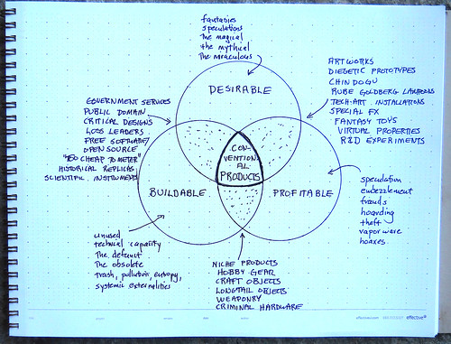
This is maybe even less than a short note to point to a little more conversation that @bruces and others are having regarding the Hubberly Venn Diagram I mentioned a few blog posts ago. @AnneGalloway took some fast-furious notes of Bruce discussing it an event: http://www.designculturelab.org/2011/12/09/critically-making-the-internet-of-things-session-i/. Here’s what she says:

* pretty much impossible to take notes but…

“All the gloss of wonder gets scraped off” when the dreams of science fiction become real and commercialised. But also, why is the design in science fiction so bad?

Theory Object for anticonventional products

Theory Object for Anticonventional Products

Design fiction instead. See Postscapes’ Best Design Fiction 2011. (Ed. See Note Below)

But what about real products? What science fiction can’t do.

RFID + Superglue + Object ≠ IoT

“It’s easy to be bewitched by the apparent beauty and logic of this. But the map is not the territory.”

Design fiction is a form of design, not fiction.

I’m glad that Bruce mentions this idea that “design fiction is a form of design, not fiction.” As I see it and what hope I have for it as an approach to doing and making is that it isn’t fictional or meant to be disputed because it is “less real” than “real design”. That would be terrible — but that’s entirely up to designers who deploy it as a way of working. If it materializes things that others see as imminently real, tangible — things that cause action, then the question as to its “real-ness” and its factual/actual-ness won’t be disputed. So — make things.

There it is. Glad to see more discussions happening around this. We’ll back-fill it with meaning and utility and make it actionable through making-of-things. I think the Ear Freshener may be the Laboratory’s first test.

Note about Postscapes Best Design Fiction 2011 — Our opinion is that it is fab to have a bit of an awards category for things. It draws attention to the activity and all that. We’re not terribly into awards here — in fact, we cleared out the 7th Floor where we had our Division of Awards and Wall of Gallantry to make space for another solder reflow machine.

But, in any case — there was our Trust Clock listed as an entrant — you can vote for it if you like. It belongs in a different category though because that clock was *made and *works. It still sits in the studio, ticking away the time, ready for someone to get up the gumption and nerve to actually live with. I think there are some great and well-tested bits of design in the form of video prototypes, and they’re fun to look at and ponder.

And then — I think the building-of-the-thing is important and shouldn’t be underemphasized, but not to get puffy about. If there are going to be awards, then perhaps it makes sense to divvy things up a bit and indicate the idiom of design fiction that the design works within? Just a thought. But, that’s to say that the building of that clock forced considerations and questions that I don’t think would’ve occurred had one not had to write firmware and solder and all that. We could’ve stopped at that video, but we had more questions that came directly from writing software and discovering interaction rituals based on making activities — where buttons go, how the alarm fob is given and to whom..real material things that wouldn’t come out in a video. Those questions led to other considerations that really made for actionable design — that can *then be delivered in a tangible way to teams who make products that are closer to the center point of the Hubberly Venn Diagram. You see what I mean? There are things that happen when you make design fiction objects that turn on, can break, have byte code uploaded to them. These are things that make the design thorough — which obtains because of the pain of making the thing *work in a different way from animating it working.

Why do I blog this? To capture more discussions and thinking about the goals of design in a broader sense.

Continue reading Short Note — The Product Design Venn Diagram: Updates

Pneu. Ma. Tique.

Thus uttered Antoine Doinel in Truffaut’s film “Stolen Kisses” as a farewell letter to Madame Tabard is shussh-ered off through the Parisian pneumatic tube postal system..

Just enjoyed a coffee and reading Molly Steenson‘s article called Interfacing with the Subterranean on pneumatic tubes infrastructures in Issue 41 of the lovely, always diversely curious Cabinet Magazine. A nice little read on a system we’d now look on as antique, baroque and not just a little bit steampunk-y. That’s her up top sharing with me some of the very intriguing primary research she’s unearthed as she drops-gear and toe-and-heels the turn into the final lap of her dissertation Grand Prix race.

Aside from being still perplexed at how this proto-type internetwork of connected *tubes actually was able to route things hither-and-yon over cities and all such — I find it fascinating that versions of the hardware stack continue to exist in various ways. There are intranets within buildings still. The intriguing aspect of this is the material form that is rhymed (not perhaps on purpose or by design) by the networks electronic of today. Those guys standing around in the rooms receiving and continuing the little chariots of messages are little routers and TCP/IP compliant protocol handlers, one could think.

Why do I blog this? To capture a small historical scrapnote on the always constantly prototyping mechanics of communication that humans perform. This was likely perceived as wondrous, high-technology in its day. I’m surrounded this week by the hubris of high-technology prototyping, creation and thinking. Not all of it wondrous. Some of it down-right silly. Words like “engine” and context and gobble-dee-gook engineerig-y semantics make a hash of what the utterer may think of as perfectly reasonable sentence structure and syntax. I can’t tell verbs from nouns when I hear about context engines deciding that I’m in a meeting and little “agents” squirreled away on the chipset in my hand decide to book lunch but not before my chipmunk agent grabs an auctioneers gavel and let my local restaurants bid for he pleasure of my ordering a sandwich. I don’t believe this is an interesting future. There are others. More whimsical. More fun. More pneumatic.
Continue reading Pneu. Ma. Tique.

Design Advances

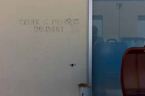
General Designs Delivery. Remnant of some sort found on the wall beyond the model shop.

I’m going to paraphrase something I read in a recent issue of The New Yorker that immediately made me think of things we bunch of folk in the studio are thinking long and hard about — doing advanced design, but even before the “doing”, understanding what it is to be an advanced design studio and what the heck is “advanced design.”

The article was about Quantum Physics called Dream Machine by Rivka Galchen on David Deutsch and efforts to create a Quantum Computer. It’s a fascinating article and I recommend it. Good science fact-fiction stuff. These guys in laboratories with elaborate support apparati to make a four bit computer. Awesome. I can easily imagine the wisps of dry ice-like condensation puffing out of copper-clad plumbing and fittings.

Okay, back to the article. Now — this is just a word substitution not meant to equate what brainiac quantum physicists do with what a bunch of (pepper this with humility) clever creatives do in a little design studio. Just word substitution. In the article, as Galchen is trying to frame the sensibilities of Quantum Physicists and describes it thus:

Physics advances by accepting absurdities. Its history is one of unbelievable ideas proving to be true..

That simple statement stopped me in my reading tracks. There was something deceptively simple in that — an expectation that, or almost rule in a way that in order to move the field along, in order to advance physics, or do advanced physics, or to determine whether or not one was advancing physics — well, one had to be prepared or make sure that you were accepting absurdities.

The word substitution will be obvious to you by now: doing advanced design requires a bit of accepting things that, on the face of it, are absurd — at least at first.

Accepting absurdities, or designing things that are absurd, or realizing that what you’re doing seems a bit absurd are various measures of advancing the state of a practice idiom, like design.

Design advances ..by accepting absurdities

There’s a bit of facing adversity built into that sort of discipline. It means that people are going to look at what you do as absurd — as disconnected from the state of the world right now; as idle experimentation; as just a bunch of weird stuff.

I think the challenge is around the degree of “advance.” Sometimes rather than making “big disruption” sorts of advances, small, simple, low-hanging-fruit sorts of things are more tractable and, potentially — more disruptive for their simplicity. This is where the phrase “wheels on luggage” comes from. Just doing something that, in hindsight seems so obvious, yet is exceptionally, blindly simple to accomplish (again, in hindsight.) Often these “little things done much better” sorts of disruptions effect human behavior in an unexpectedly profound way. Sadly, the hubris of the main players in constructing the future — engineers and technologists — consider a disruption to be wholesale system change of some sort rather than making little things better than they already are. It’s also a battle between complex programs or teams, versus relatively simple ideas with small teams executing a clearly stated vision.

Why do I blog this? There was something about that quote that has stuck with me. I’m not sure I’ve teased it all out — but its resonant and I need to figure out how best to describe what it is that “advanced design” is so I know it when I see it; and what activities “advancing design” consists of so I can tell myself what to do. Accepting absurdities and finding the way to get others who perhaps are less inclined to is a small, fitful start towards this goal.

Continue reading Design Advances

Kitchen of the Future

Knobs

I wonder about the various settings and contexts used to re-imagine what the world might be like in the future. Often times those contexts, objects, environments are associated with what wealthy people would like for themselves in order to drive sales of new stuff. This is understandable in a mostly capitalist world, of course.

Often times one finds rather naive, un-encumbers, un-troubled extrapolations of desires or behaviors for and within these spaces of human endeavor (the car, the bathroom, the workspace/place, the kitchen) based on somewhat awkward and thin assumptions about what the world will be like, and what people want from these spaces. The kitchen is such a place where sometimes wacky ideas about the evolution of behaviors in these spaces tips into the absurd — like 3D printed food in a world where people seem to be enjoying the visceral world of preparation and chopping and stewing and all that. The kitchen is a place where just making simple things just a little bit better seems the best path toward the near future — such as no microwave nagging beeps; refrigerators that are smart enough to either be told (with a *button, not a context sensor) that, yes..the door is open..its open because I’m loading the goddamn groceries..no need to beep at me). Big change — those things should be consistent with the real, global, epic-scale challenges to living in the near future world — which have nothing to do with a refrigerator that lets you know you need more damn milk. I mean..really? Why does that get to be the enginerds scenario for a better kitchen?

*Sigh.

I recently found this Ikea’s Kitchen of the Future and it made me think of a number of topics related to imagining the future. Firstly, it is worth considering why the typical western kitchen becomes the subject for future fictioning.

Why imagine the future of the kitchen, practically thinking? Is this going to save the world from itself? Well — perhaps it could and that actually would be a fantastic design project — reconsider the kitchen in light of (and then list your parameters having to do with ecological collapse/civil liberty infractions/pro-democracy uprising/emergency water rationing/$12 a gallon heating fuel/&c.)

But, as for the kitchen that Ikea imagines, I suppose there are a number of reasons why the kitchen is a seductive setting for setting the components of the future. These probably have to do with perhaps the fact that the kitchen in the West is quite modular and therefore subject to study of the various individual components — refrigerator, cabinets, dishwasher, sink, stove, oven, etc. The kitchen also has a history of reconsideration in this regard if you consider things such as the Frankfurt Kitchen. Such was a purposeful, design-principle led modernization in the height of, you know — modernism. It was designed to be as efficient as possible in a small space using very modern “workflow study” techniques. This meant that it was designed for specific flows of activity, like a factory in a way.

This idea of every-increasing efficiency would be consistent with the Jetson’s kitchen from the old fantastic cartoon. Maximum efficiency — just select what you would like using a physical paper punch-card and it gets issued from the machine (complete with consistently type-faced names for the items.)

In my anecdotal experience and without any exhaustive survey or study — it seems to me that, despite predictions there is quite a move back towards more “artisinal” (*shudder) kitchen activities. Rather than anything indicating that machines will 3D print our food, the craft of cooking appears to be alive and well as indicated by such things as celebrity chef restaurants, a never ending stream of cooking shows on television, various food movements/philosophies that desire a deeper, conscientious connection to the food chain (where has the veggie/beast come from? how was it fertilized/fed?), &c.

I think this example of the Ikea kitchen also embodies the challenges of future-fying anything well. Too much fetish of the object and very specific, naive and — old fashioned — ideas about what people want in the future. ((Isn’t that ironic.))

Why do I blog this? I’m trying to tap into the various parameters by which the future is really crappily represented in models and speculations and scenarios. I think one component of this has to do with an over-emphasis on the artifcats themselves — making faster things, or smaller things, or more silver-y or white things, or 3D food printers because, like..3D and printing are a Wired Magazine meme, or other poorly considered reasons. ((Meanwhile, I would be satisfied with making whoever invented the microwave beep-beep-beep-beep to indicate the timer has expired to have to listen to beeping forever..in perpetuity..until their earballs explode.)) I understand that the Ikea thing is more marketing puff than proper, considered design and it drives me nuts that entities with the ability to bring about real, substantive change in the world bother to spend their money with this crap that’ll just be torn down after the annual investors meeting or the stupid trade show is over. While the kitchen may not be terribly exciting to me specifically (perhaps because of these speculations that ruin the excitement of really making a better more habitable future) everyone has to eat, and those eat’ns need to be prepared — and finding new ways to do that preparation in the near future should be taken seriously without pandering to the whims of deliriously rich people who can afford to redo their kitchen every other year. There should be a kind of agency or consultancy that looks at this sort of thing seriously and re-imagines the near future of the kitchen using principle-led design and maybe even design fiction techniques.
Continue reading Kitchen of the Future

IxD 2011 Designing Advanced Design Workshop

Saturday February 12 10:36

Wednesday February 09 16:16

The problem that occurs when a clever, *advanced idea is inserted into a machine that is already optimized for itself — for efficiency. Just because it’s bright and clever and has colors doesn’t mean that it can find a place to fit in a process that is either (a) already humming along or, (b) unwilling or unable to change and adapt its workflow to allow something to drop into place. From my perspective, this means that it requires either a crisis which *forces the machine to stop and change itself — which is painful — or the machine needs to be changed from the outset to accommodate advanced design that does not come from left field but is accepted as something that is routine and part of the machine itself.

Some notes from Mike Kruzeniski‘s workshop at IxD11 on the topic of Designing Advanced Design. This is a fascinating topic to The Laboratory and equally fascinating to hear it from and participate with Mike, who is a good friend and former colleague at Nokia, of all things. Mike’s now at Microsoft so, like..now it might be like we’re colleagues again! At least partners in doing fascinating and unexpected things in the realm of design and technology.

Anyway. There were a number of highlights that I think are relevant. I’ll start with the general structure of the workshop, which was a workshop. ((Parenthetically, I’m a bit confused by workshops that are more someone presenting than people getting their hands a bit dirty, or going out in the world, or ignoring their iPad/iPhone update status checkers. I would even say that I don’t get the real-time twammering in a workshop. Either be there, or don’t be there. Bring a notebook. Sharpen your pen. Listen, do, speak. Okay, rant over.))

Wednesday February 09 15:06

Wednesday February 09 15:00

Wednesday February 09 14:45

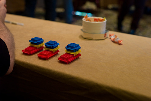
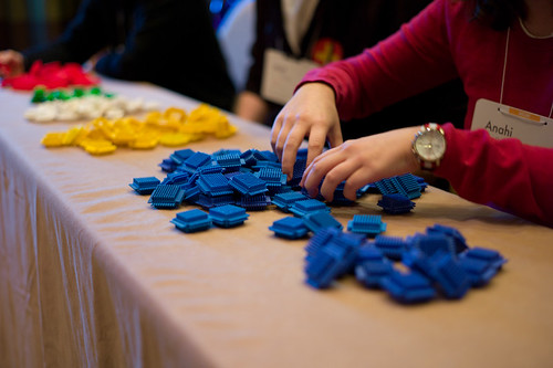
After introductions by Mike and a bit of a discussion about what advanced design might be ((I mentioned I was also quite interested in *advancing design in the sense of moving it closer to the locus of decision making, alongside of the business-y types)) Mike presented the workshop exercise. We were to build boats. Little boats. Made of plastic bits sort of like Legos but, as we would find out later — subject to subtle variations in how they can be assembled, even much more than the typical Lego brick. ((* Update: via @rhysys — they are called Stickle Bricks! *)) The group was broken up into several roles — customers, customer liaison, builders, suppliers, plant managers, quality assurance. Each group played the roles you would expect in the construction of to-spec boats. Customers would place orders which would be relayed to the operation. I was a builder so I basically tried to assemble boats as quickly as possible, making horrible but not-obvious mistakes which resulted in boats being delivered…and then rejected. Each round was broken up into 10 order cycles that ran for a short, fixed amount of time. In that period we’d try to assemble the requested amount of boats, which the customers could reject for flaws. Flaws were sent back to be disassembled so we could try again, but things moved quickly. At the end of the round ((which consisted of a number of order cycles)) a tally was made to determine the per-unit cost based on factors such as — number of workers, number of delivered boats, quantity of raw materials left over, etc. All the things you might understand to influence the cost of a boat. At the end of each round, there was a short amount of time to reconfigure the whole “plant” — increase builders, rearrange how materials moved from source to assembly, break apart assembly into multiple steps, fire people, etc. This was all in order to decreate the cost per boat. We actually did really horribly the first time — target cost: $15. our cost, like..$2500. miserable. We got better over two more rounds, but still only got down to about $30+ or something.

Some insights from this exercise, which is derived from a familiar MBA exercise. First, designers don’t seem to want to fire anyone. Second, MBA people are more than willing to fire workers (based on Mike’s description of when he participated in the exercise at a sort of MBA program). Third, companies that make things — even a few of them and not in the millions of them — are optimized for themselves to be efficient. Change breaks that kind of optimization, resulting in less efficiency, higher costs, etc.

((That third point is one reason I guess we here at the Laboratory prefer small refinements that make big impacts. Making something just a bit better, or refining it with such tenacity — simple, small, thoughtful refinements — that the consequences can become significant without significantly challenging the need for efficiency.))

In the lead-up to this exercise, Mike introduced a few simple yet important tenets surrounding advanced design. There are two basic ways for a company to compete: (1) It can be cheap; (2) It can be different (be something else.) And he introduced one of these curious “Laws” that we here at the Laboratory had never heard of: Parkinson’s Law which basically states that work expands so as to fill the time available for its completion. Or, stated another way: The demand upon a resource tends to expand to match the supply of the resource. ((And yet another way that the Laboratory’s Bureau on Time Management uses as an operating principle: If you wait until the last minute, it only takes a minute to do.))

So then we can think of advanced design as those resources set aside for other activities, which sort of means that it can get a bit out of control if we apply Parkinson’s Law. So — how does one do advanced design? What are some models and approaches?

For the workshop, Mike looked at three case studies of advanced design studios: Nokia, Microsoft and Nike. Each has somewhat different approaches to advanced design, which he laid out. ((I may get the details of the case studies slightly off, but the substance is what I recall and what I think is the significant points.))

3 Approaches to Advanced Design

1. The Outlier
This is the advanced design studio that thinks about “what if?” scenarios, and explores to the side, looking at perhaps total departures from the conventional wisdom. Real out-there stuff that challenges and provokes. He offered three examples of The Outlier: BMW’s Gina Concept car from 2008; Nokia’s Homegrown project; Xbox Kinect

2. The Pantry
A bit like squirreling things away in the pantry for when the weather goes all awry and you’re trapped and can’t get out and don’t want to starve. You do things even if they’re not assigned to go to market. The case study Mike offered was Nike who’s design studio maintains an active bit of work exploring, researching new materials and the like. In the case study, Nike was outdone by Under Armour sports kit who created an intense following amongst various gladiator sports like Football and the like. They broadsided Nike whose marketing people went to design and said, like..help. Design did not start a specific program from scratch to address this, but went to their “pantry” and put together a package from the existing “advanced design” material to create a bit of sports kit that made Football’rs look super scary..like robotic gladiators. Plus, presumably — it worked as equipment. One intriguing thing Mike mentioned was that some folks had been doing some studies on motion and the like with sports folks and found out that feet and hands move the most, so they highlighted feets and hands by bringing out these intense dayglo colorations to the materials used in gloves and sneakers so the players *look fast. I found this fascinating.

3. The Northstar
This is where design works towards an advanced goal, but it’s more an aspirational target that is steered towards, perhaps indirectly. This might best be described as evolving a vision, refining from what’s out there. This I think captures to a certain extent what *vision work does, although sometimes vision work is basically just a nice thing to look at without the tectonics that could activate design work. The challenge is to avoid just creating something that’s cool to look at but doesn’t give enough to make it start becoming material.

audi-avus-quattro

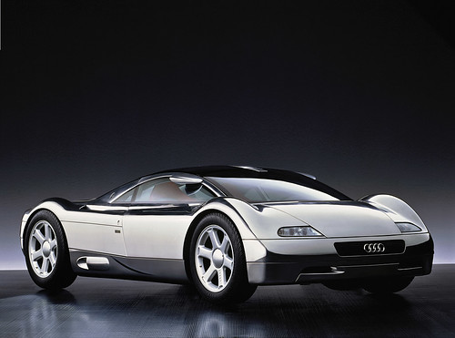
1991 Audi Avus Quattro Concept Car

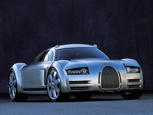
The example Mike offered in this case was Audi Avus concept car that (I know nothing about cars except how to drive them, sorta) that provided some radical new lines in 1991. It became a sort of objective point in a way — guiding the evolution of their surfacing and configurations so that over time Audi cars begin to take on the features of this Avus concept over time. The Avus provides the “Northstar” for the design team. Now — whether its stated expressly as in a lead designer saying..in 20 years lets get *here, or if it is less formal perhaps does not matter so much. Its more that this vision becomes quite tangible over time, an evolution of the car DNA.

Audi-Rosemeyer

Audi Rosemeyer
audi-r8

Audi R8

What I find most intriguing about this sort of vision-y Northstar case of Audi in particular is that they are able to stay on course. Twenty years is a long time — even, it seems to me, in the world of automobile design where things change exceptionally slowly because of the momentum and levels of commitment necessary for manufacturing and tooling and all the rest. Yet somehow they are able to keep their eyes on this objective that must’ve seemed quite radical at the time, especially if you consider what Audi looked like in 1991.

Audi-200-turbo-1

The 1991 Audi 200 Turbo

Some random insights that came up during the workshop.
* The Apple model isn’t reproducible perhaps because it is quite driven by the owners themselves and their personalities and abilities to drive change.
* Advanced design is about change. The instinct of a company is optimization; reduce risk and costs; it will reject change.
* Our role as advanced design is to help companies *prepare for change rather than execute it. In other words, be there when things go badly and people around you start losing their head and blame you while you keep yours, and you continue to trust yourself when all those around you doubt you — in other words, when panic and confusion sets in, advanced design can lead at those moments of epic, systemic change.

What is advanced design?
Let’s take this from the perspective of “advancing” design. The “advanced” moniker seems quite old fashioned. Advancing design, or advanced designing seem like useful semantic word play. The semantics help me think about design as something that can move forward (advancing design), rather than designing something in advance of something else (as advanced design would imply), or designing in a way that is different from what is designed today (or what is thought of as design today). In that way, advancing and poking and provoking means more than differentiation. It means more than using advanced techniques.

Some notes/thoughts about what advanced/advancing design or advanced designing might be:

* working through ideas differently
* designing the way of designing always, for each and ever
* iteration, refinement — put it up, strip it back, put it back up again
* communicating tangibly, materially
* storytelling — film, prose, language
* design fiction – actively suspending disbelief. making props and probes and prototypes.
* proto-typing – making stuff, in the shop, at the bench, learning by making and doing
* photography – way better than clip-art and it forces a different kind of conversation and moves things away from *only working at the screen in Illustrator

Why do I blog this? Because I went to the workshop; it made me think of a few useful things; I’ve been sitting on this in draft state for almost two months.

Continue reading IxD 2011 Designing Advanced Design Workshop

Opportunism

RadiationDetection

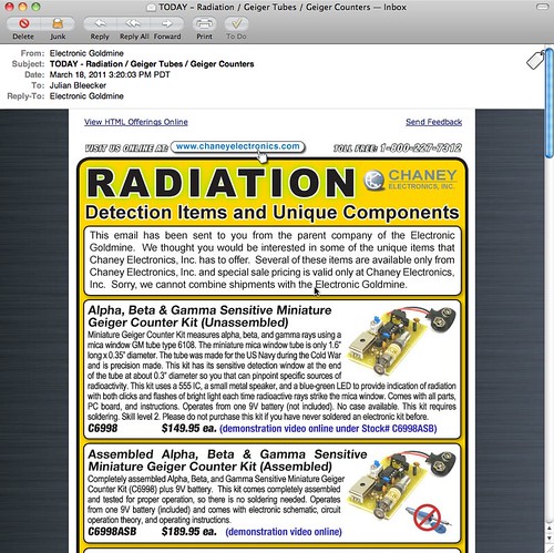
Completely understandable how the recent tragic events in Japan would translate into email from an electronics source containing *only parts and supplies and modules to make Geiger Counters. At the same time as it’s understandable, it’s one of those things that feels like it’s taking advantage of the general panic, confusion, sadness and apocalyptic angst.

Not deflecting the urgency and anxiety of recent events in Japan, it’s curious to me to think about how and when change is able to happen. By that I mean that things happen, swerve off-course or are able to swerve off of into unexpected, new directions. For example, the events after 9/11 where an *opportunity space opened up in which dramatic, unprecedented changes were able to be made in the legal systems of some countries. Things that would not have been so easy to implement had their been no epic tragedy. Similarly, in a way — now we learn quite a bit about nuclear physics, science, speculation about the malfeasance (if you can call it that) of this nuclear quasi-agency in Japan (via @xenijardin WSJ: TEPCO initially resisted using seawater to cool reactors; harm to “valuable power assets” feared ). We find ourselves preparing — again — for an earthquake, nuclear catastrophe, flood, Tsunami, etc. Entirely enormous nations are scaling back and turning off nuclear power plants (I find this most intriguing) and rethinking their energy policies. I mean — that’s epic. Whatever side you may be on the issue of nuclear power, these events, at the cost of untold lives, future lives, physical infrastructure, and so on — everything has been changed.

The imagined course into which the future was going to be made, has swerved.

We often like to think of change coming about from good, thoughtful, happy actions and activities. Like good design work, for example. I think, from my experience, it is often never like this. It is hard. Change is hard. Making things better is hard. Generally, and anecdotally from the experience of myself and others up and down the hall here on the 7th floor of the Laboratory — people are reluctant to change their ways, the course of their lives. Moving out of “comfort zones” and all that is, well — uncomfortable. Adapting and adopting new ways of living, behaving, thinking would make for a more resilient world, I think. One that was not afraid of difference, of giving things up for the hope and possibility of a better things.

Of course — it can all go wrong. But at least we’d try.

*Anyway..

Parenthetically, Studio 360 has an intriguing related radio story on this topic. It is called Japan: The Imagination of Disaster.

Why do I blog this? As always, we here are quite intrigued by how the future comes to be — what are the mechanics, semantics and motivations that move people to obtain and create possible futures. In this case, “taking advangage” of opportunites when one can do that bit of swerving, rudder-pushing, tiller cranking because the currents become favorable to try a new tack.
At that moment when the normal course of events seems to swirl out of control

Continue reading Opportunism

What Innovation

Up and to the Right


Just a super short set of notes from Steven Johnson’s book, Where Good Ideas Come From: The Natural History of Innovation. I don’t have anything too much in-depth mostly because it’s a fast read, when I found time to read it, and it made me squirm uncomfortably. There was not much that made me stop and smile although I did quite a bit of exasperated sighing along the way.

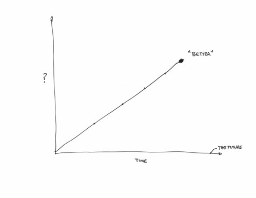
I think this is because Johnson chose to muddle the study and insights of biology and evolution with the activities of humans following their curiosity, their inspiration to make things, their will to create enterprises, their greed to overwhelm their competitors and make fortunes by whatever means necessary, their hubris, their social-political ambitions, their desire to leave a statue of themselves behind — whatever it is that drives individuals to build and create. Using the study of organisms, biology, the ocean reefs, species evolutions, ecosystems — all of these things as metaphors for creativity, innovation, good ideas in the making — well, that’s just problematic in my mind. You exhaust the really interesting work right out the tailpipe of your story and you’re left only with this pre-existing framework of biology and ocean science and these things to explain how Marconi’s innovations with radio. At some point the analogy becomes the story itself — it’s not like the innovation work *is like* ocean reefs accreting new material. The innovation work is a reef, with new ideas building upon old ones like so. At some points in Johnson’s story human endeavor to make new things and come up with new ideas lose out to the simplicity of the science analogy. Human ingenuity becomes the same thing as the study of species, reefs and other “up and to the right” style evolutionary stories. This makes for a good children’s allegory or grammar school analogy — or a good cocktail party explanation of the irreducibly complex activity of “innovating.” But, it makes a book-length treatment of the complexity of creativity fairly gaunt at best.

Somewhere muddled up in there is an argument that Cities breed innovation because people are so packed in together (like an ocean reef?) and ideas propagate more efficiently in density, which may be the case — but it feels like a vague generalization. It’s easy to get into an argument about whether NYC is more creative than Los Angeles, for example — and things quickly spiral out of control.

Perhaps the best part of the book is the last sentence which might be the argument and even the framework for how the book works — forget all the biology analogies. Just this tweetable little nugget.

Go for a walk; cultivate hunches; write everything down, but keep your folders messy; embrace serendipity; make generative mistakes; take on multiple hobbies; frequent coffeehouses and other liquid networks; follow the links; let others build on your ideas; borrow, recycle, reinvent. Build a tangled bank.

Had Johnson followed the walks of those innovators he was curious about, followed them along their mistakes and noted the ways they borrowed, recycled, reinvented he could have done away with the silly biology analogies. It’s all right there in the hands-on work that’s going on — there’s no need for a big, grand, one-size-fits-all theory about how ideas come to be and how they circulate, or don’t circulate and how they inflect and influence and change the way we understand and act and behave in the world. That’s the “innovation” story — or the way that *change-in-the-way-we-understand-the-world* comes about story.

What I think Johnson is trying to do is in fact deliver some material for that cocktail party conversation — to instill in readers’ minds the idea that good ideas don’t just happen in isolation. They happen because of this idea of the “adjacent possible” — Stuart Kauffman’s idiom describing the multiple possibilities for what can happen because things (science-objects in Kauffman’s notion, like molecules or elements that lead to new science-objects; idea-objects in Steven Johnson’s notion, like steam engines and wine presses that lead to new idea objects like locomotives and printing presses) are proximate. Here’s how Johnson introduces it to us — and he’s not really reminding us that he’s taking a scientific thesis by a guy and using it to describe how innovation works.

“The scientist Stuart Kauffman has a suggestive name for the set of all those first-order combinations [molecules becoming DNA, e.g.]: “the adjacent possible.” The phrase captures both the limits and the creative potential of change and innovation. In the case of prebiotic chemistry, the adjacent possible defines all those molecular reactions that were directly achievable in the primordial soup. Sunflowers and mosquitoes and brains exist outside that circle of possibility. The adjacent possible is a kind of shadow future, hovering on the edges of the present state of things, a map of all the ways in which the present can reinvent itself. Yet it is not an infinite space, or a totally open playing field. The number of potential first-order reactions is vast, but it is a finite number and it excludes most of the formst that now populate the biosphere. What the adjacent possible tells us is that at any moment the world is capable of extraordinary change, but only certain changes can happen.”

What could come to be in the world of combinations of molecules and atoms and so forth that happen to be swirling in the same goo — is the basis for Johnson’s thesis about what could be in the world of accreting and “exaption” of ideas. The adjacent possible is meant to describe the what could come to be based on the coexistence and proximity of materials. Things bump into other things and come to form new things under certain conditions. There’s not one possible outcome, but multiple possibilities.

What Johnson does is confuse this for the way that ideas — which are not molecules or atoms swirling in a primordial goo — evolve into possible “shadow futures.” Will and cunning and gile and ambition and money and access to money — these and many other non-biological factors shape how good ideas come to be. ((As well as horrible, wretched, resource-wasting ideas.)) I mean — this is a troubling way to make an argument from the get-go. I don’t think you can just willy-nilly take a thesis from biology (or hypothesis, or lens, or view of how things work) and then use it to describe something that is never as pure as what we understand “nature” to be or “natural history” — he is not creating a story that describes what happens in the world of ideas, spun and spurned by people with bodies, situated in time, space, culture and society and struggling for credibility and authority. And that’s just a problem. The coordinates and biases and ways-of-knowing are all wrong at some level. The units are way off. It’s an allegory at best that misses 99% of the mishegoss of creating knowledge and meaning; an analogy that basically filters out all the work of humans interacting in a different way than the way that molecules and atoms interact. It’s another one of those kinda annoying uses of science to explain society which starts you down the path of immediately assuming that science isn’t society by other means, or that science isn’t already a social enterprise or — worse — that science has it all figured out.

Anyway — I got suckered in because the book has the word “innovation” in it. These sorts of books with titles that are didactic are suckers bait. Its got this funny title about being a “natural history” of innovation and that seemed polite and humble, rather than prescriptive like a lot of business books tend to be. (“10 Steps to Improving Your Organizations Innovation Prospects!” — or things like that.) But then it’s less humble when you realize that this is The natural history of innovation that’s been written. N’ah — I know he’s probably being provocative with this title. But, still — I found it a bit bold. Because inside is not a natural history at all, but rather an argument made through a number of examples. The argument is to dispel the notion that good ideas — ideas that make incremental changes in the graph, making things move up and to the right to a greater or lesser degree — come from a guy sitting around by himself in a lab or basement. Rather, good ideas come about because of their proximity to other, perhaps disparate activities — other intriguing things happening nearby. Johnson’s prop is the ocean reef — and perhaps this is the joke in the title because the reef is understood to be something natural (as if) and therein lies the natural character of innovation.

Couple of notes, so long as they were jotted down while I was reading this:

He has a curiously muddled appendix of good ideas at the end, with the electric battery (1800) — every good idea has a date — sitting alongside of sunspots (1610), as if sunspots were a good idea as opposed to an observation that becomes relevant and topical. I can only imagine that these are intractably complex things that are as dense a knot of activities both purposeful, willful and incidental as one can imagine. Yet here they are rather cavalierly given a sentence or two and a date stamp as if they appeared as a good idea suddenly.

He diverts detractors to his approach of going broad and shallow by saying that there is value in surveying and drawing conclusions from many short case studies and drawing four quadrant graphs that even further simplify the points. The alternative is to be deep and thick, or to go into the laboratory — talking to people to suss out the meaning and history and all that of technology. The broad and shallow perspective is not as thorough. It’s a gloss, but even worse — it’s not substantive and opinion at best. This is fine, but the reader never really knows what they’re losing in the trade.

The argument is an engaging story — a good story. It’s an argument insisting on a POV and a thesis about an intractably complicated social/cultural/political/economic entanglement that cannot possibly be distilled to a core, to an essential character and way-of-being except in the most simple ways which never can possibly be much more than a fairy tale useful only for the most basic of explanations you might use to tell a child why the sky is blue, or as an allegory — it’s certainly not a history, natural or otherwise.

If you want to hear a really irksome panel discussion with Kevin Kelly and Johnson, check out this Radiolab podcast: What Does Technology Want?. It’s curious to me that Johnson and Kelly seem to jump on Robert Krulwich to the point of basically saying — “what’s wrong with you? don’t you believe in technology’s autonomy?”
Continue reading What Innovation

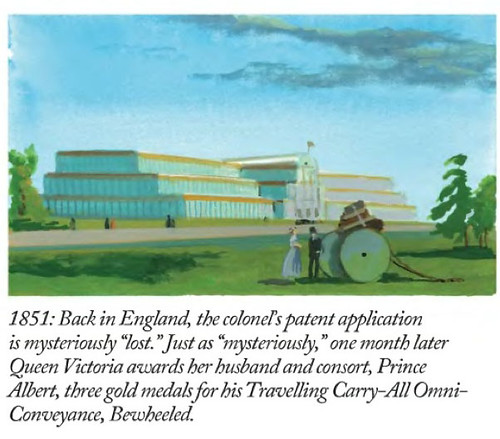
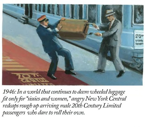
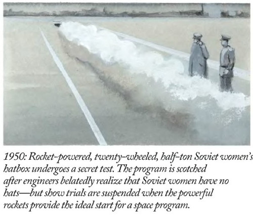
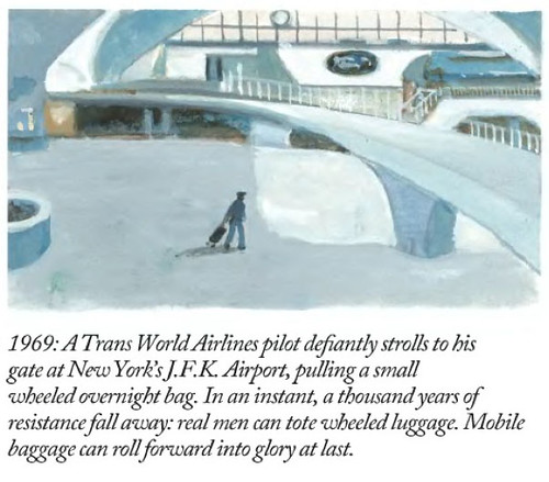
A Wry Look At Wheels On Luggage

Title

Panel-1
Panel-2
Panel-3
Panel-4
Panel-5
Panel-6

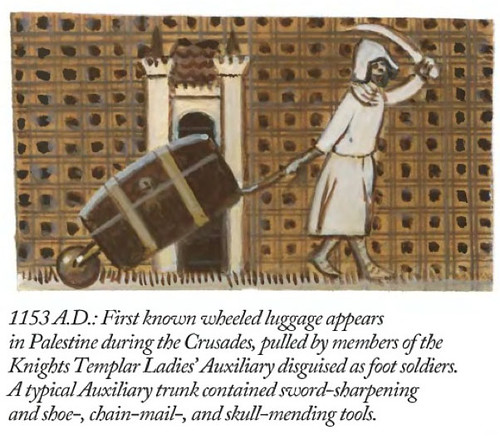
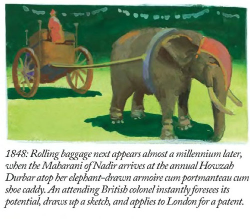
Why do I blog this? The idiom “wheels on luggage” has been one we’ve been exploring here, not so much to get the precise history of it (although that is interesting), but because of what it stands for. Change from one set of circumstances to another from which you look back and wonder — how could things have ever been otherwise? Or, because the change is not due to technological innovation (which is what so much is assumed to pivot) but from an innovation that is simple, direct and requires no billion dollar budgets, scores of PowerPoints, workshops galore and team off-sites. I love this kind of change — much more than the technical variety because they remind me that big change can come from small, simple alterations that just make things better. Some people like big technical imbroglios. While I don’t not like technical things — the power of one person to just sort of *shrug* and screw a couple of wheels onto the bottom of something is quite provocative. Small things done exceptionally well. ((A line of scholarly inquiry as to the social, cultural, political and technological concerns that broadly fit within the study of Science Technology and Society, or Science and Technology Studies. Fair Use, I’d say.))
Continue reading A Wry Look At Wheels On Luggage

Weekending 12122010: Clarity via Complexity

Thursday December 09 17:50

A week spent last in the Nordic EU discovering the knots and twists and snarls and kinks of the imbroglio that goes along with executing on damn good design. On the one hand there was the work of workshops meant to work *upon the work; on the other hand, there are the traces that appear as — if illuminated by forensic investigators UV light — the trails of interconnected relationships, goals, aspirations, roadblocks, paths of hope, begrudging words, encouraging words, optimistic personalities and personality disorders, cues and clues as to how things work, or how they do not; who talks to who, and who does not; where things can get done, and where they will not, despite everything. Very intriguing. Certainly not unusual activities; just the analysis and awareness that comes with trying to understand, and that from the perspective of a science-technology-studies kind of person. It’s like being inside a Latourian analysis of the making of things. I should draw a map.
Continue reading Weekending 12122010: Clarity via Complexity