Slow Media Manifesto

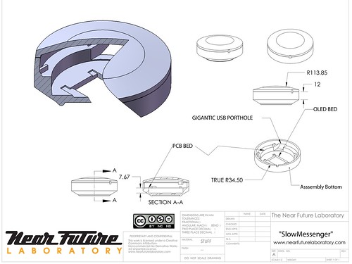
SlowMessenger Capsule

“One might almost say that truth itself depends on the tempo, the patience and perseverance of lingering with the particular.”

Via nettime and @bruces, we come across The Slow Media Manifesto, a 14 point statement capturing what slow media is and where its benefits ((and challenges to conventional understanding of what media is and how it travels)) lie. Makes good, slow reading.

My favorites:

2. Slow media promote Monotasking.

8. Slow Media respect their users

9. Slow Media are distributed via recommendations not advertising:

13. Slow Media focus on quality both in production and in reception of media content: Craftsmanship in cultural studies such as source criticism, classification and evaluation of sources of information are gaining importance with the increasing availability of information.

The Slow Media Manifesto also comes with a blog.

Why do I blog this? Well, the slow sensibilties are something I’m quite intrigued by. There were a couple of projects that the Laboratory has done in the past years that were attempts to understand and design with slow principles. There was the Slow Messenger and the Slow Mail efforts, along with some ideas within the the WiFi Art Cache project that played with ideas of location, speed and activity as presence-based — that is, not everything happens as fast as you want and interactions change based on proximity and so on.
Continue reading Slow Media Manifesto

Slow Down

Friday January 15, 21.24.48

Friday January 15, 21.25.45

Friday January 15, 21.27.17

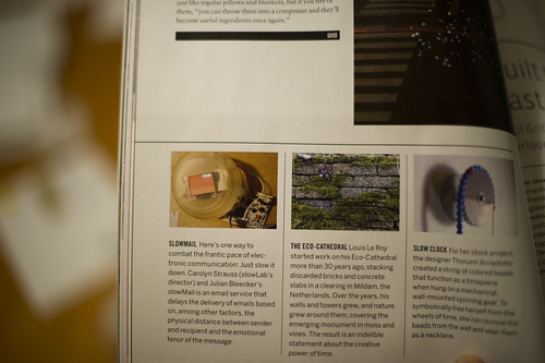
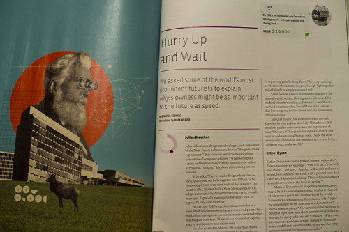
It’s not often we’re found in print, but this happened when the magazine Good did its “Slow Issue”. Jennifer Leonard chatted with us one morning about our perspectives on the slow movement because of our work on the Slow Messenger device and on-going collaborations with slowLab and Carolyn Strauss. There’s mention of the device and a brief interview with folks like Bruce Sterling, Esther Dyson and Jamais Cascio in the magazine and online.
Continue reading Slow Down

The Week Ending 080110

Sunday September 20, 12.53.26

Markings for repair or warnings to mitigate accidents? Seen in Seoul, South Korea.

Whilst technically still on holiday, there were some things done as usual and *holiday* is never entirely just not doing nuthin’.

There was a quick visit to the studio to begin to finish the second of two commissioned Trust devices, which is looking simultaneously quite insightful and lovely. I hope some day that this becomes a lever to torque the rudder if even ever so slightly.

Jennifer Leonard’s interviews in Good Magazine’s Slow Issue (*Perspectives on a smarter, better, and slower future*) with Esther Dyson, Jamais Cascio, Bruce Sterling, John Maeda, Alexander Rose and myself appeared online. The topic of the short discussions? “We asked some of the world’s most prominent futurists to explain why slowness might be as important to the future as speed.”

And, prompted by Rhys’ clever insights into a richer, smarter less ROI-driven vector into thinking about this whole, you know..augmented reality mishegoss, I’ve been reading a fascinating history of linear perspective that has been helping guide more meaningful thinking. (I have yet to see anything that leaps much further beyond flags showing where something is by holding up a device in front of my face, which just seems momentarily cool and ultimately not particularly consonant with all the hoopleheaded hoopla.

I’ve started The Renaissance Rediscovery of Linear Perspective, which has a number of curious insights right off the bat, particularly ones that remind us that linear perspective is only a possibility and not necessarily something to be thought of as “realistic” from a variety of perspectives. In fact, it merely makes renderings that remove experience and abstract points-of-view, something that I recently learned from Latour’s Visualisation and Cognition (which, not unsurprisingly, led me to this Edgerton book via a reference and footnote.)

Configuration A - Binocular Form Factor

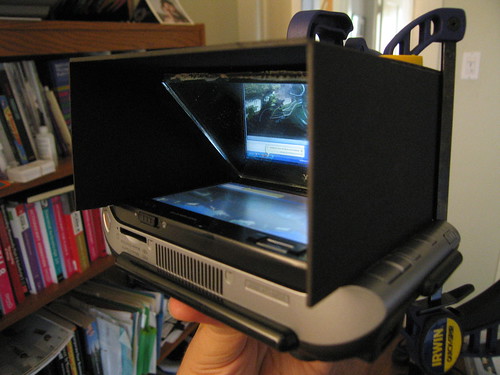
A Laboratory experiment from 2006 — *Viewmaster of the Future* — using a binocular-style form factor. ((The lenses are removed in this photo.))

And, the follow-on, which I haven’t started yet is the enticingly titled The Mirror, the Window, and the Telescope: How Renaissance Linear Perspective Changed Our Vision of the Universe, which immediately caught my eye as I am drawn more to the history, imagery, rituals and *user experience* dimensions of telescopes and binoculars as affordances for, bleech..*augmented reality* than this stupid hold-a-screen-up-to-my-face crap. ((cf. this stuff below — the screen-up-to-my-face configuration — never felt as good as the second iteration of this *Viewmaster of the Future* experiments we did a few years ago.))

Continue reading The Week Ending 080110

Display Driver

20080526_18-52-40

20080526_18-31-04

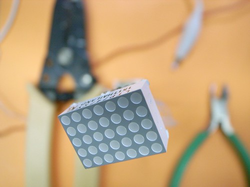
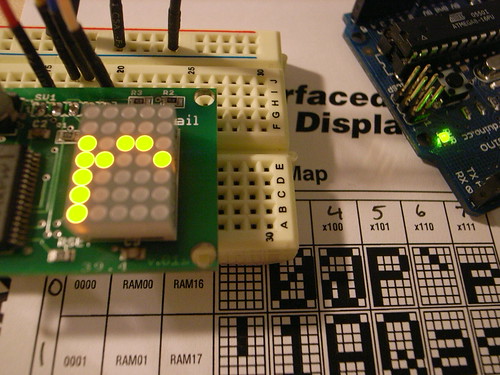
The project here is to find ways to create a simple interface display element, as an experiment in subtractive features — removing things to create less bloat, less confusion. A return to fundamentals rather than feature creep. Not that a 4×5 matrix LED display would necessarily be an end-goal. Rather, what are the limit cases for subtractive design of interface displays? What are the benefits in terms of usability and simplicity and power consumption?

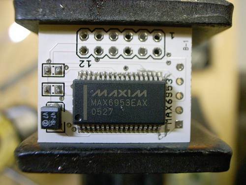
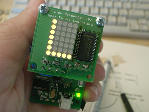
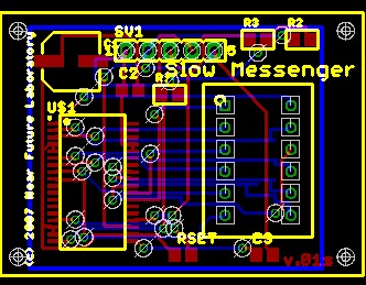
I made another version of the 4×5 matrix display driver using the MAX6953, ostensibly for Slow Messenger, but also possibly for other curious things in the “post-gui” category of explorations. It’s smaller and designed to hold the LED module off of the board so that it’d be possible to have a small setting for the messenger device. I like the idea of a device that’s stalk-like, sort of like these Copic markers I’ve been fond of as of late.

The previous version was like this image, below. You can see that the LED module fits on the board itself, so that mounting the module to fit through some kind of housing would have to take into account the footprint of the entire PCB. That became a bit tricky. I would’ve rather have the LED module at the top of a form like below, but perhaps quite a bit smaller in diameter.

R0013308

20080313_054916

20080526_19-03-20

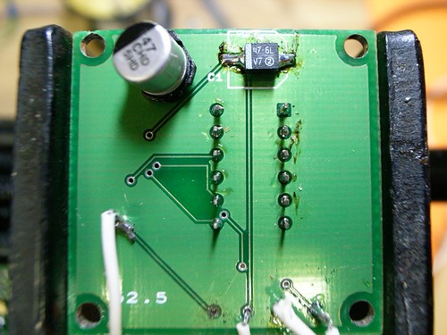
That larger board also had this unfortunate layout issue — entirely my doing. The fatty 47uF capacitor was on the bottom, and the part I used is this ginormous tin can that quite often would get knocked off, or partially knocked off. In the new instance, I managed to find a EIA 3528-21 sized capacitor that’s got a low rectangular profile and put it on top, with most of the other components. I replaced the big thing for the smaller one on this board, above.

SlowMessenger

Slow Messenger 2nd Design

Product Prototype: SlowMessenger

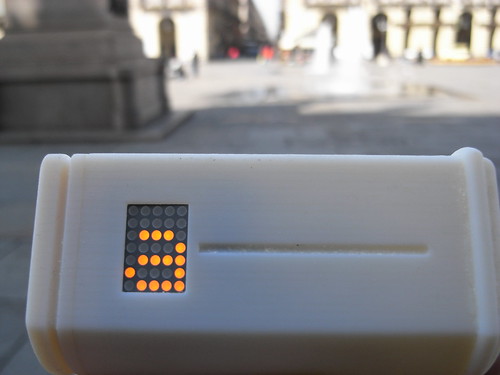
Slow Messenger is an instant messaging device that delivers messages exceptionally slowly. Built into the device is a messaging technology that unfolds its content based on an interface that borrows from the traditions of long-form letter writing, hand-carried mail sent through the post. The instant messaging device connects digital information channels — such as the Internets — to physical information channels — such as streets, hands and the friction of human contact.

SlowMessenger works by simply receiving the message from the message sender. Once the message is received, it is gradually displayed, one letter at a time based on two factors. The first is the relative amount of time that the device is held; the second is the amount of time the device is carried while walking. These factors — holding-by-hand and walking-with — are interaction rituals key to the conveyance of intimate messages. In “another era” that is not the “digitally networked era”, “taking the air” and “perambulating” were crucial interaction rituals for maintaining and knitting together “social network” relations. Friends and intimate couples would “walk hand-in-hand” and discuss matters on their minds. In this “other era”, in times when friends were not in proximity, perhaps because one or the other was off to war or at sea, long-form “letters” were composed to substitute for physical proximity and communication. Postal mail was used to maintain communications and “stay in touch” even if “physical touch” was not, in a literal sense, a possibility.

In this “digitally networked era” communications mechanics are designed to take advantage of the efficiencies of electronic networks. In this way, contact is perpetual and ubiquitous, often resulting in nearly meaningless communiques and dispatches. By “slowing down” the instantaneous message, the device saves time by allowing one to avoid inane drivel and focus on a meaningful connection to one special person.

Slow Messenger Flickr Set

R0013308

SlowMessenger Capsule

20080313_054916

Making Things

SlowMessenger Capsule

Slow Messenger Rapid Prototype

Slow Messenger Capsule

Well, this was fun. Right now, I’d rather be making little ironic, provocative things to think about nearly-real near future worlds than just about anything else. This is very satisfying. Way more satisfying than just writing about such things, and much more satisfying than making the same old stuff for some big gigantic military-academic-corporate-industrial light and gadgets megaplexoid.

It just seemed quicker to go ahead and design some enclosures on my own. Plus, it’s on my ’08 list to learn how to do some design of this sort — just getting an early start here.

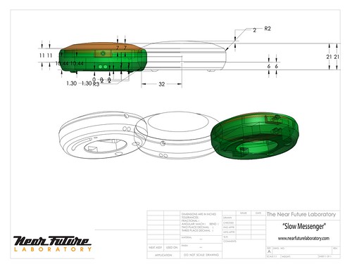
I spent the last few weeks learning Solidworks, enough to create a few simple designs which I could share with some real experts and get little crits and suggestions and tips and so forth. Turns out most of the design process is shaped by the means by which the design will be produced. I’ve been thinking of both rapid prototyping and machining — machining so I can play with different materials other than plastic.

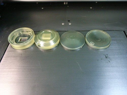
This was printed on an Objet Eden 350, which is a pretty slick bit of kit.

What happened here? Well, I flipped back through the design sketches I had been for the enclosures for Slow Messenger and Flavonoid. The consensus has been something that is definitely not particularly close to the mobile phone box — something curious and round. But, it was important that it not evoke too many preconceived design notions of that device — just wanted it not to get too tangled up in the assumptions and history of the mobile. It defines mobile design/mobile media/etc with too many constrictions. So, something that could fit in a pocket, something without any keys or buttons — just a simple display to show the message.

This design gets close — I’m eager to get something that I can give to people and get notes on for the book. But, I also think this has been a great way to learn how to close the gap between ideas and things that help express those ideas. There’s something about designing away from existing forms to make new contexts for experience. Sure, I could pursue this “Slow Messenger” project using stuff like a cell phone and some server software and SMS or email channels — but it’s more intriguing to me to start from some first principles, and also to create this different physical form that defies conventional expectations and assumptions. The form of the object has as much to say about the context of experience as the “theory” behind the experience. I was starting to feel a bit stuck in the context of mobile experiences, particularly when you have to arm-wrestle with cell phone carriers, the cost of network access and a general lack of interest in creating anything much more exciting than weird advertising schemes.

This Slow Messenger thing may not make much sense in the context of corporate telephony mobile experiences, but the place for making things for new mobile interaction rituals will never come from there.

Slow Messenger Prototype (II)

Slow Messenger

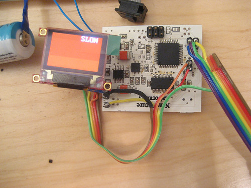
This is the second prototype hardware for the Slow Messenger project we’ve been working on. It’s slow going, naturally enough, probably the result of too many design projects for peculiar mobile devices going at once.

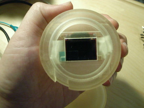
This prototype is using a small 96 x 64 pixel OLED display by 4D Systems and the idea is that you’d have your “instant” messages displayed over relatively long periods of time, and the more you carried the messaging device with you — the more you held it — the more of the message you would see. If you left the device by itself — thereby not really showing much commitment or affinity to the message — the longer it would take for the message to reveal itself.

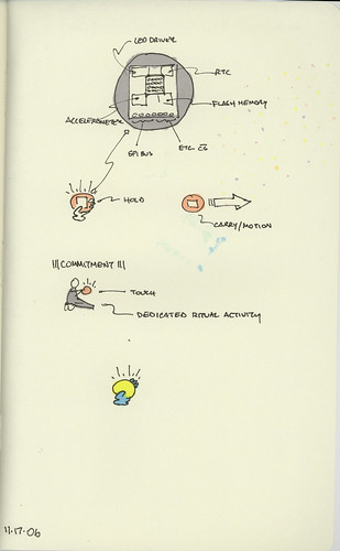
The conceit of the project is to create a kind of “durable affinity” amongst the messaging participants. By coupling the message’s slow unfolding to a tangible object that the recipient must hold and carry around, the communication has a kind of interaction ritual that might be more intimate than punching little plastic squares while staring at a screen. Turning time, touch into a condition of affinity and commitment is the interaction ritual we are exploring.

The project is a “theory object” — not necessarily a product in the sense of something that could have a deep impact on the quarterly results of a large public company. It is meant to be a way to critique an aspect of digital networked interaction through a provocative designed object. Going beyond speculation to specification, design, fabrication, prototype experiences, iteration is significant. It creates something that helps me think about the questions that were initially raised in a day dream much, much more than only spinning the thoughts in my head and as writing on paper could ever possibly do. Constructing the device – taking the idea and making it artifact and then giving them to people to experience and provide their thoughts – is a crucial way to think about the questions and the larger problem of having sensible things to say about the near future of these sorts of interaction rituals.

Efficient, quick communication is a product of power-politics. In order to exert one’s influence geographically, it’s necessary to communicate one’s will over distances and do so in as little time and with as much efficiency as possible. Slow messaging just doesn’t make sense in that context. And that simple necessity has soaked through most of our forms of communicating, even when we are not particularly powerful. It just becomes an assumption that communication happens quickly – not because it cannot be any other way, but because it has become part of the unquestioned “DNA” of communication as a social practice.

But, as in most of our projects, we want to work from unconventional assumptions in order to see what the experiences of communication in a different “anti-” universe might be like. What can we learn about our existing social practices of communication – instant messaging, SMS, always-available styles of presence online – if we do an experiment where the assumption is the opposite. In this case, if we make communication much slower, what do we learn about new ways of relating and sharing with our friends and loved ones? We’re not necessarily assuming that this is the best way to communicate, for example. We’re not making a new product or something of this sort. It is very much an experiment in design as a way to answer some perplexing questions about the relationships we maintain through all these peculiar and compelling messaging systems.

Left To Our Own Devices (Hardware Sketching..What This Means)

Sketching07.001.jpg

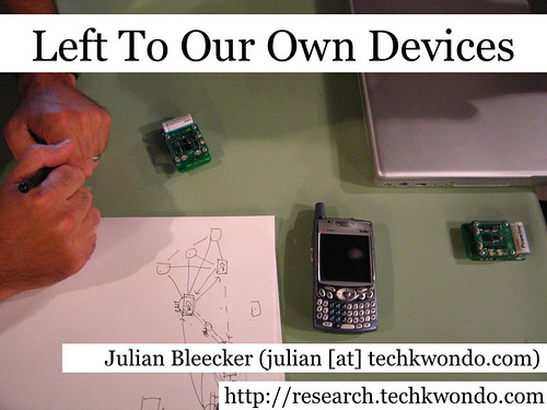
Making our own stuff — what does it mean, how do you do it? There is a sense that the ability to make our own electronic/digital/computational “stuff” is not just fun, but has some larger purpose that’s related to impulses of DIY sensibilities. Making your own devices has a implicit cultural and political message. That is, we can be “productive consumers” as Ruth described yesterday. We can produce the things we need or enjoy or desire based on our own principles, ethics, senses of fun and so forth. This I think is very good, and very important.

Left To Our Own Devices (on SlideShare)
Sketching07.002.jpg

What does this phrase mean, “left to one’s own devices”?
Sketching07.003.jpg

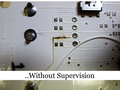
The opportunity to make mistakes and learn from them is crucial to making your own stuff, and developing the skills to think for oneself. This is a mistake I made recently that burned out part of a board. While it was a setback, it was only temporary and in the process, on my own, I learned.

Making mistakes or probing the boundaries of what works and what doesn’t is a powerful way to learn, and, mostly, gain confidence and mastery. So “left to our own devices” also has this sense of learning, or understanding about things that were previously a kind of black art.
Sketching07.004.jpg

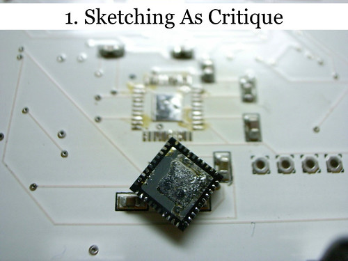
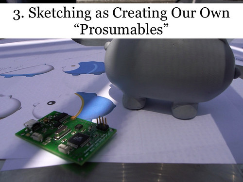
And so what does this mean for “sketching in hardware”? I want to suggest three things, or observations that I think describe what “sketching in hardware” is about. Starting at the highest level is “sketching as critique.” I think there’s a kind of creative or cultural criticism that goes on when sketching hardware.
Sketching07.005.jpg

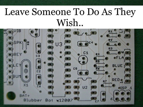
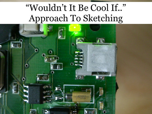
The “Wouldn’t It Be Cool If..” approach to making things. This is design that is driven by the imagination. I notice many projects that suggest this motivation — for instance, it would be cool to have a mobile phone that has no features except to make telephone calls. In fact, it might not even have a display, like an old analog phone. Why do we do this? Part of it is to demonstrate hardware sketching acumen and skills. But I think there’s also an implicit criticism about the way things are that suggests a response. Making things different than they are.

Sketching07.006.jpg

The “What Would The World Be Like If..?” approach to sketching is kind of like writing science fiction by making things that ask what would the world be like if.. These are things that are not necessarily “rational” in the way we often think about rationality. But they are meant to provoke questions about certain aspects of life in the same way that the best of science fiction does. It forces us to consider ourselves and our ways of living by helping us find a partial perspective that is outside of our routine, quotidian lives.

This is the World’s Slowest Instant Messenger, or “Slow Messenger” for short. You can send an instant message to it over, for instance AOL IM, and the message from your buddy will reveal itself over many hours or even days, one character at a time.

Why do this? To imagine what such a world might be like if we communicated slower than we do today. The reason for doing this is more as a thought experiment imagining a different kind of world — either a science fiction world where things are a little different, for instance a world in which slowly unfolding messages are considered a polite, perhaps regal form of exchange, rather than the terse, abrupt, disruptive “fast” mode of communication. It’s also evocative of letter writing traditions, where much time was spent carefully composing a letter that communicated much more than the short message styles of digital exchange. It’s a sci-fi device. But, it needs more than just a story about it — you need to create the device and live with it and share it with people and friends to learn more about the concept.
Sketching07.007.jpg

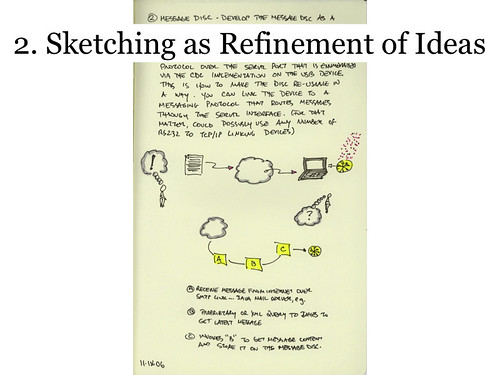
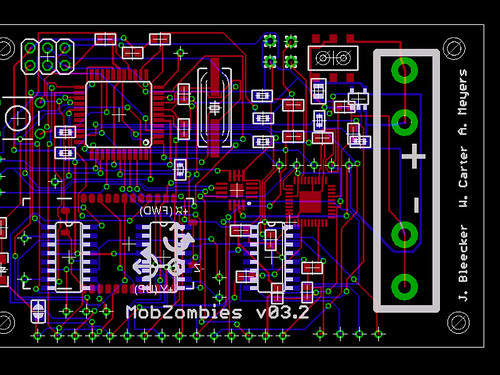
“Sketching” implies of course making meaning through inscriptions — drawing or writing ideas, as in sketching the outlines of a thought that might be developed further, beyond the inscription. For instance, it might become something slightly more durable and enduring — into something that you can create and share with others. Refinement.
Sketching07.008.jpg

Sketching07.009.jpg

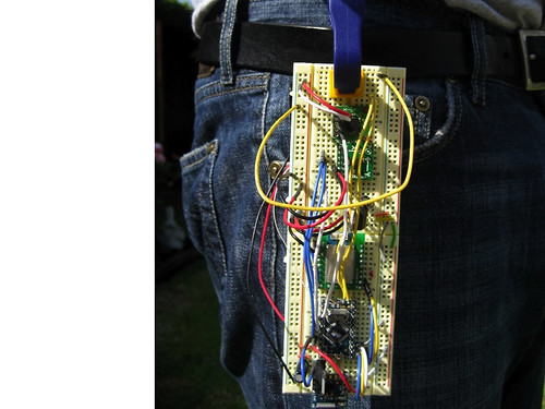
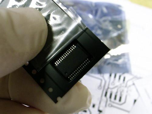
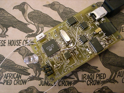
You can easily go from a prototype that’s a bit messy and experimental..Refine that through a more formalized design that starts to close the gap between prototype and an “end product” whatever that might be.
Sketching07.010.jpg

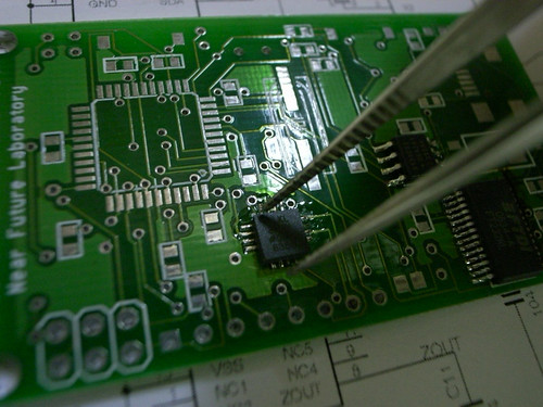
And doing the construction oneself is important — part of the trade craft is a familiarity with the process.
Sketching07.011.jpg

Sketching07.012.jpg

Being done, and refining is a rewarding part of the process of making your own devices.
Sketching07.013.jpg

Creating our own culture of devices is one way of finally ending the myth that there are things called “end products” — it indicates that everything that consumers may consume are always in flux in many terms. I don’t know much about product design, but I do know that designs evolve continuously particularly in the hands of those who are in the cycle of evolving them.

Sketching07.014.jpg

What about toolkits?

1. Need to be crafted carefully so that you don’t have a glut of things that all look a like — the China Syndrome of knock-offs and copied ideas. This is a bad thing except insofar as it teaches fundamentals. When tool-kits become ways to make the same thing over and over again, creativity wanes.

Sketching07.015.jpg

2. Toolkits are not software APIs only. Sparkfun is a toolkit because it provides the resources to learn, not just an interface for connecting to some sort of sensor.Tom Igoe’s a toolkit. Arduino.cc is a toolkit. I believe that “Sketching” as we’re talking about it here is a craft, and crafts take time and discipline to master and it can be hard. But that mastery is important to moving toward a position of creative abilities. Tools should not substitute for community engagement. Rather than just using “turnkey” tools at some point you want to participate with the ultimate toolkit — the community.
Sketching07.016.jpg

Thanks.

The World's Slowest Instant Messenger, Part II

Finally, something to show for this “Slow Messenger” project, a playful interface for instant messaging. I’ve gotten all the hardware bits cobbled together and most of the firmware. Now I’m working on learning how to tie in AOL Instant Messenger so that messages can be delivered to the device. Fortunately (I think) AOL has opened their API somewhat. You get some sort of key and then can create your own IM applications based on their protocol and network. I don’t know how well this works, but I suspect if it works well-enough, a preposterous projects like this should be able to make good use of it.

I found one little unexpected design glitch — the LED driver (MAX6953) and the EEPROM I’m using (AT24C1024) have the exact same ‘default’ I2C address (0x50). I stumbled across this while trying to debug why the EEPROM didn’t seem to work, even after an electrical test and crap. You can typically hard-wire the chip to take on one of another possible addresses. On the AT241024 you just wire the A1 pin to either GND or VCC and set the A1 bit of the device address either low or high. The MAX6953 has a similar deal, only a larger matrix of possible different addresses, probably because the chip will typically be found in systems with lots of MAX6953s ganged together to drive large LED displays. In my case, it’ll be easier to make some small hardware changes to the Slow Messenger display board than it’ll be to change the AT241024, which is on a generic Flavonoid board that I want to keep as identical as possible to the other one’s to make managing the firmware easier.

Strange, but I thought that I got closer to having the real-deal I’d understand more about why I’ve committed so much time to doing it. But, I’m no where near understanding why I’m doing it or what it means. This may be beyond the near future and somewhere from another planet.

I heard someone confuse the Near Future Laboratory with corporate R&D. Like, essentially assuming that what I was doing was stuff just around the bend that someone at some corporate lab or product design operation is probably better suited to develop. Whatev. The Near Future Laboratory is the other near future — the one no one in a corporate lab would really think about because the demands of commerce minimize risk, don’t even scratch their heads if the perceived market is too small, and only think about what can be realized to help make next year’s earnings look good. Just to clarify.

Slow Messenger Part III

Technorati Tags: ,

World's Slowest Instant Messenger

I’ve been fixated on a story my wandering mind told me many months ago about a little theory object that forced me to think about how the connected things in the era of IP networks always do their thing as fast as possible, approaching speeds that are imperceptible to normal humans. Almost without question, this is seen as a good thing. But I wondered what it would take to disrupt that assumption. How hard would the apparatus of connected things fight back? Would it be hard to write slow networked communications software? What is “slow” in the era of connected things? Can their be a slow instant messenger device?

I decided the best way to figure these questions all out was to sketch out what a super slow communications device might be, how it would operate, what it would create in terms of affect for those participating in the messaging, and what it could be “good” for.

Naturally enough, I ran up against all kinds of brick walls. Most people thought I had definitely gone completely misheggeneur. Why in the world would I want something that communicated really, really slow? Everything is supposed to be faster, quicker, more instant that last year’s instant. I mean, processor speeds keep flying through the roof. Broadband gets thicker and quicker. Rates go up when it comes to speed, not down. And I had no clear way to explain why I was drawn to this idea, other than trying to do the opposite of the dominant trend for the sake of seeing what other possibilities for connected digital networking there might be.

moleskine_4_111706_6

This may not be as weird an experiment as it sounds, particularly in an age where the Internet is splitting up into all kinds of tiers of service, with for-pay super high speed networks and bottom-tier, low-rent slow networks. Is it really safe to assume that we’ll always have fast networks available to us? Suppose you had to make a choice for economic reasons – you can send this E-FedEx for $43 and it’ll get there in 1200 milliseconds, or send it E-Postal for $3.19 and it’ll arrive sometime early next week, probably. I mean, it wouldn’t surprise me if this were a likely near-future world. It really wouldn’t.

So, how can slow be good? In my wandering mind I imagined a little device that slowly, very slowly, spilled a message out one letter at a time. Like a slow-scan signal from an interplanetary probe, feeding back a nice galactic photo over the course of 32 hours. Some of those messages might have a certain enjoyable anticipation to them — that’s a good thing..affect in messages where we’ve perhaps re-oriented our sense of affect for communication because we’ve been learning how to expect our communications faster or we expect less from our communication because most of the electronic kind gets all gummed up with crap and spam?

I’m also sort of speculating that this experiment might teach me more about how the “weight” of pre-digital interaction rituals can be re-invested with their pre-digital semantic heft even in the age of electronic mail. That is, can the momentum and weight (of time, of material things moving so as to make connections between people, of haptic/touch/proximity connections based on material coming in contact with things) imbue digital communications with something other than the transfer of information?

Boy, that’s out there. What I’m wondering is — what happens when I have to invest some material energy to get a message between (or from) someone and myself? That’s all this is — it takes three things to get the message going and finally delivered in its entirety.

1. Time, lots of it.

2. Commitment — the thing only works if I keep it close. If it’s off on its own, it slows down its delivery to glacial proportions.

3. Movement — I basically need to carry it with me wherever I go. And if I don’t go anywhere..if I sit at my computer all day, kind of like I did this entire afternoon and evening? That message just isn’t going to move anywhere.

At the end, perhaps a week or so, the message will start revealing itself, one character at a time.

Obviously, this is for the dedicated communicator, who enjoys the anticipation of a message from someone extra special.

Part II Is Here

Technorati Tags: , ,