A Few Things The Laboratory Did In 2012

As the year ends, tradition calls for a review of the several initiatives we engaged in during 2012. The exercise entails looking back in time with the support social network activities and more personal logs to keep track of gratifying rencontres and significant milestones at the Near Future Laboratory.

BARCELONA

In Barcelona we spent the year “sketching with data”, an approach to innovate with data we presented in various conferences and institutions from the high-tech cabarets such as Strata in San Francisco; or Red Innova in Madrid to the more cozy settings of the IAAC architecture school in Barcelona. These speaking engagements were part of a polishing phase that reports on the our evolving practice fed by the accumulated experiences in producing services with data. For instance, we discussed our investigation on the roles of a retail bank in the ‘smart’ city of the near future. Our client had fairly good ideas of the potentials of a real-time information platform. This is the kind of service a bank is extremely familiar with. However, they had limited knowledge on the specific information that could feed and emerge from this kind of platform. As part of our consulting work, we regularly sketched advanced dashboard for participants of the project to explore and interrogate their data with fresh perspectives. The use of the prototypes helped the the different stakeholders in the project craft and tune indicators that qualify commercial activities. This experience still feeds the development of the client’s future services and products based on data.

Another gratifying outcome of the work around “sketching with data” was the release in June and November of the alpha and beta versions of Quadirgram (see Unveiling Quadrigram). The product resulted from a collaboration with our friends at Bestiario and responds to the increasing demand of clients to think (e.g. sketch) freely with data. The tool is meant to diffuse the power of information visualization within organizations and eventually reach the hands of people with knowledge and ideas of what data mean. We had the opportunity to influence many aspects of the product development and release process (engineering, user-experience, go to market strategy, client/investor/provider meetings) and now Fabien proudly sits in the advisory board of the company.

7513631392_f4fa8d162f_bOther fruitful collaborations took place along the year, each of them bringing their unique set of experiences. I am particularly grateful to have joined forces with Urbanscale, Claro Partners, Interactive Things, Lift, Data Side and Pop-up Urbain. While a good share of the work stayed within confidential settings, we reserved efforts for self-started initiatives such as:

  • Ville Vivante: an ‘urban demo’ that took the form of a visual animation and eight posters deployed at the Geneva central station (project led by Lift Conference, in collaboration with Interactive Things).
  • Footoscope: a deciphering tool for football amateurs developed in collaboration with Philippe Gargov of Pop-up Urbain. Its interface provides a perspective on the morphology and tactics of a football team according to raw data on its passing game transformed into indicators and visualizations.

Finally, we kept some quiet moments to contribute to academia with reviews for Sensors, CHI, CSCW and Just-In-Time Sociology, teach a postgraduate course on the design of ‘data services’ and published of the paper New tools for studying visitor behaviors in museums: a case study at the Louvre co-authored with Yuji Yoshimura, UPF and MIT on a follow-up investigation of our hyper-congestion study at the Louvre.

GENEVA

At the Swiss bureau, things were geographically a bit more complicated since part of this year has been spent in Los Angeles, CA for a visiting researchers’ stay at Art Center College of Design in Pasadena.

Overall, 2012 was split between four types of activities:

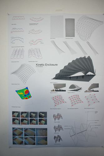
  1. Design fiction projects that aimed at proposing various near future worlds along with a reflection on technological usage. More specifically, we worked on three projects: Corner Convenience (the near future of corner convenience stores as an exploration of technological trajectories), Curious Rituals (about gesture carried out with digital technologies), To Be Designed (a design workshop that aimed at producing a catalogue of near future objects). What we learned in these projects is basically how futures research can take different shapes, how design can be an original language to rebuild a sense of the future and how certain objects can be brought to the table as “conversation-enablers”.
  2. Client projects: three (big) field studies in the US, Switzerland and France, a series of co-creation workshops, and contributing to the production of three conference proved to be very fruitful and satisfying.
  3. Teaching in different institutions: HEAD-Geneva (where I also obtained a research grant for a project about design and ethnography), ENSCI-Les Ateliers (for a workshop with Raphael Grignani), Les Gobelins Annecy, SUPSI Lugano, University of Montpellier.
  4. Book writing: the game controller book will be released in French in the coming days and Laurent Bolli and myself are working on the English edition.

2012 was also spent on the road with talks and lectures spent here and there, some highlights:

LOS ANGELES

* TBD/DTW
The bulk of the year from a Los Angeles perspective was spent conceiving, organizing and producing the To Be Designed / Detroit event. This was sort of a big deal for us. It counts as the start of a series of workshops that the Laboratory facilitates to both discover the material, designed, fictional props that are conversation starters for thinking about different kinds of futures.

While we are still working on the post-event production of a catalog from the future, the overall structure and concept was a significant goal of the event. What we wanted to do was create an environment where a group could “do” design fiction.

The theme of TBD/DTW was on the role of everyday, quotidian things that surround us. Without being normative about it — just the crap that sits in and amongst the significant infrastructure of life. Batteries, pens, knives, pool floats, outerwear, etc. These are the things that, for TBD/DTW, we focused on. In the near future we’ll cohere the workshop’s results in a catalog of these things. We’re still sorting out the precise production and publication.

DF-WK-tumblr_manyb3K5OT1r3ntzxo12_r1_1280

To go along with this goal of creating a workshop environment to do design fiction, we created a work kit composed of a some more everyday objects — a deck of custom designed playing cards, dice, note cards, a resource book, etc. The kit was meant to prompt the creation of unexpected future things through the combination and objects, attributes and design actions. Much like “Mad Libs”, but for objects. This was a theme generally last year — the creation of tools for the imagination. Resources that help prompt discussions and ideation. In the coming year, we’ll work on refining the work kit and testing it in other contexts.

Informing the workshop was the “Corner Convenience” newspaper and Corner Convenience film that we made for Emerge 2012. Rhys was the prime mover for the concept — to reflect upon the exceptional innovation that lives around us, even in the corner Quick-E-Mart or neighborhood bodega. We take for granted the things that are now 0.99¢ or 3 for $1. But many of those things embody incredible technical, scientific, logistical and manufacturing innovations that would drop the jaws of someone who travled forward from even half a century ago. For the film at Emerge, Nick and I looked forward to imagine what the convenience store of the near future would hold.

There were a couple of workshops and conferences. There was the Gaming the Game event at UC Davis in Davis California. And a fun workshop at the Walker Art Center on design fiction. Actually — that’s where I first tried this strategy of thinking through the ordinary evolution of things like garden hoses and digital cameras.

Also, did a workshop at the Anderson Ranch with Casey Reas on digital photography and Processing. That was fun. A good re-entry into the world of programming, which I’m continuing cause if everything goes to heck, it’s good to still be able to dig ditches.

Speaking of which, we’re continuing to develop the “Humans” app in the evenings. This is a way of getting back into programming but also with something I’d like, which is a way to get more of a Windows 8 style view onto my friends by aggregating their service “updates” and “status” and “photos” in one place, rather than having to go to services (which aren’t Human) first.

Weekending 03062012

Um. Well, here in Los Angeles it’s been lots of fun/frustrating days getting back into programming the computer. I’ve been getting a bit overwhelmed by the growing list of “ideas” that I thought would be good ways to get back into it. They’re mostly exercises that I thought would be better than following on in the usual lot of slightly mundane book exercises. The one I’m most curious about is a sort of social browser that, like Windows Phone 7’s live tiles, lets me flip through my friends social service “updates” and the like — but do so without having to go to the services, search for my friend, and then see what they’ve done. So — people first, rather than service first. Nothing brilliant there in that, but more a personal preference. Plus, also being able to see stuff from ancient history (many months or even a year ago) along with the latest stuff.

Some folks have mentioned that Path does this in some fashion. I’m still trying to see how. Right now? Path seems as noisy as Twitter. I’m looking for something a bit more — calmer. And the fact that Path is a kind of mobile Facebook status update yammery thing makes me want to enforce a simple rule that limits the number of slots for people. Or puts individuals in a special “Joker’s” slot based on which of your chums are being more yammer-y. Something like this. But, a couple week’s usage of Path leaves me thinking that there’s something that I want that is missing yet still. It’s still everyone. And sometimes you don’t want to share with or hear from everyone.

I also spent a bit of time preparing for a workshop at the Walker Art Center, where the staff is doing some work on the possibilities of speculation and interdisciplinarity for their own internal work. Looking forward to that a bit — especially to try some of the techniques we use in the studio on a group of people who I basically know nothing about.

Oh, that photo? That’s me programming a networking app while flying in an aeroplane. I know it’s not a big deal, but it sorta is for me in a nostalgic sorta way. I think the last time I did that I was heading to the Walker Art Center in, like..2003. Programming in an airplane, that is. Certainly there was no networking going on at the time — but still. It’s sorta nostalgic and fun to get back to that sort of work.

On my side (Nicolas), the beginning of june is packed with different talks in Europe, the organization of a 3-days conference about video-games, preparing the Summer in Los Angeles and the writing of the game controller book… hence the quiet participation to the weeknotes here.

Interaction Awards 2012: Drift Deck for People's Choice

Drift Deck is up for the IxDA Interaction Awards in the “People’s Choice” category. Which isn’t the “Jury’s Choice” but — whatev. It’s the People, so we’re hustling to make you, the People, aware of this chance for you to choose what is the Choice of the People. For Interaction Design Awards.

Please give it a vote.

What makes Drift Deck chooseable? Well — it does something different and provocative in the world of interaction design for the things we do when we’re going/finding. The canon of interaction design for what were once fondly called “maps” is pretty stuck in the mud. Nothing extraordinary going on there that you wouldn’t expect from the next generation of mapping things.

What we did with Drift Deck was look at the world a little sideways and imagine a world in which the map was a bit dynamic and the act of going/finding was a bit less, you know — purposeful in a tedious, dogmatic sort of way.

It’s an otherworldly map app, if you will. Drift Deck is meant partly to be pragmatic for those times I find myself somewhere and have no idea what to do if I have an hour to wander about. (Sometimes we all need a bit of a start, or a script to follow.) And of course, it’s playful in it’s nod to the Situationists and their experiments with re-imagining urban space.

The principles led directly from the Drift Deck: Analog Edition that you can find here and more here.

These are the kinds of projects we do here. They’re not “Conceptual.” That cheapens the hard work that goes into them. We write code. We do illustrations of things that get properly printed on big Heidelberg presses. We put together electrical components and have printed circuit boards made and populated with parts to create new sorts of interaction rituals, new sorts of devices — new things that are different from the old things. These are ways of evolving the ordinary to make possibily otherworldly, extraordinary things. They come from ideas that we then evolve into material form so that the ideas can be held and dropped and switched up, on and off to be understood properly.

So, just to be clear — Drift Deck isn’t a conceptual bit of wankery. It’s a thing that got made. Ideas turned into lines of code turned into compiled bytecode. Oh, look! It’s running on my iPhone! Doesn’t feel very concept-y to me.
Continue reading Interaction Awards 2012: Drift Deck for People's Choice

Weeksendings 07302010 and 08062010

Friday July 23 12:01

Sketching in Hardware 2010

I can sum the last two weeks up briefly and, again — for my own record keeping. Nothing useful here, likely at all.

The week that ended on 08062010 had a couple of days off during which time I stayed here in LA and the super fun opportunity to photograph the X Games, ESPN’s blitz of extremely nutso sports.

The weekend before was the ThingM produced “Sketching in Hardware” event for 2010. It was held appropriately at the retro-future “Encounter” restaurant smack-dab in the middle of LAX. I presented a brief and generalized thoughts on the Design Fiction business. In the midst of it, I realized that this was an appropriate continuation of the previous three presentations at Sketching I had done. There was this theme of how making things is a way of answering questions, but pushing those questions beyond the pragmatic sort of prototyping — asking “wouldn’t it be cool if..?” and then answering that question by making something. I think this is a different approach from the more engineering-style prototyping which asks “I wonder if this put together with these other things will work?” The difference I was thinking about is that the former is closer to story, whereas the latter is more instrumental and less speculative. Or something.

I spent the weekend *trying to finish the 5000 words I was asked to put together for a keynote at this Swiss Design Network conference this fall. I think it sounds repetitive. I’m trying to find a way to write about design fiction genre conventions or, as Tim Dufree put it during the opening ceremonies for the Art Center’s “Made Up” summer studios “the lanugage of design fiction.”

Enterprise from Foam

Found during the studio pack-up! I think Andrew made this to test the new CNC tool-pathing procedures that were made infinitely easier with the Nikolaj’s hard work.

We packed up the studio so all our *stuff that had been hiding and unnecessarily accumulating so it could be moved aside for new furniture which was generally grumbled about before it even was installed for a variety of reasons, mostly having to do with the inertia that settles around what you think is best for you because it’s already there and works fine. I straddled the line and, if I’m honest with myself, used the opportunity to grumble only because I felt grumbly. Now that the new stuff has been in for a week, it’s an awesomely refreshing change. No over head storage (grumble..sour looks..) means more light (aaaaAAAAH..unicorn-y twinkle noises..) and I can actually see across the entire studio (hip-hip-hooray! my other studio mates!).

Last week was mostly a week of trying to design UIs back and forth from UI principles. It’s hard work, as in bailing hay hard work and by that I mean I feel this delicate balance between knowing what’s right and hearing in my head the voices of people who might be, like..that? It’s all wrong. Where’s the Augmented Reality Door Knob we’re meant to have attached to the side?

*shrug*

I looked over the original Drift Deck notes and spreadsheets — I need, need, need to write up another 20 or so cards to bring the deck for the digital edition up to 52. No big deal — it just needs to get done.

I got some new Laboratory work gear to make for some of our associates for putting in work on the Laboratory’s projects.

The Choreographed City - Mona Breede

Wonderful book of photography by Mona Breede, also found (never lost, just made apparent from beneath the overwhelming piles of stuff and shelves of books.)

Why do I blog this? I missed the week before, so I’m catching up. And I find it extraordinarily useful to have this running log of what I’ve been doing, when and with whom.
Continue reading Weeksendings 07302010 and 08062010

Features Aren't A Measure Of Innovation

A fix to keep a door from clanging against an adjacent utility pole. Observed in Seoul, South Korea.

It’s too bad that the measure of results often must translate to quantities or business-y things, like numbers of meetings obtained or pages of PowerPoint presentations. Decanting often rich, qualitatively substantial ideas into boxes and “slides” and “decks” sloughs off so much richness that all that was learned often evaporates. The miscommunication is tragic in such instances. When asked for “the presentation”, I’ve taken to doing the electronic email version of a *shrug* — sorry, no “deck”. We can chat. I can send you some object-thing-embodiments-of-principles..if you like. If you want to stare at words, well..

The culture of PowerPoint is best described as a social disease. I don’t mean to gripe too much — it’s not a new thing, and it isn’t only a reaction to conditions as they exist for the Laboratory right now. The culture of the deck has been around us since the days at the advertising agencies and brand marketing agencies during the last cycle — where there were entire departments who did nothing but make presentation decks. Ugh. Can you imagine?

The Measure of Reality has been an obsession since I fully comprehended the made-up nature of reality, I suppose while thinking about the social and cultural parameters of science while over-educating myself. It’s good stuff — I’m not complaining — and it makes it positively frustrating at times to communicate something where you know that everything depends on how you communicate and not only the idea living in your head. No matter how much you believe in it, you have to materialize it in such a way that other people believe in it, too. You need to enroll people in your vision to the degree that they suit up and follow.

In the world of things the Laboratory works on — weird gizmos, gadgets and devices — this becomes particularly difficult when the basis for describing a design-led vision avoids touching on technology-specific features. For some reason lists of features are legible to accountants and engineers who often have the keys to the car and decide what gets done. Here, we wouldn’t offer something up that starts with a bit of technical kit — an augmented reality sensor array or whatever — and then build around that. We would start with a peculiar people-centric platform of experience — say, an otherworldly city guide as we did for the first analog edition of the Drift Deck and as Laboratory Associate Platinum Class Jon Bell is doing for the second digital edition of the Drift Deck. Our conceit has been that experiences for people offer a richer, more meaningful and legible way of creating new stuff. Innovating, only not by stacking lists of features and parts and stuff — but at least by starting with ways of creating opportunities and experiences that lead people in new, unexpected directions. That make space for experiences that go beyond expectation. Basically creating new user experiences. I don’t think you do that just by creating new features and bolting on new technologies.

When I first wrote the draft of this post, it came to mind when the folks at Tenyagroup asked permission to use a photo (that wasn’t even mine, but whatever..) I looked at their short article and found it intriguing. At one point they say:

..great brands change the game by changing the customer, not by changing the product. They become new platforms of opportunity for a new kind of customer, freshly empowered.

Those are weird words not really in the Laboratory lexicon, but somehow it makes sense. The “changing the customer” part might be stated plainly as: offering new sorts of interaction rituals and behaviors. Merely adding a bit of technology does not translate that technology into a necessarily compelling experience. It’s back to the doorknobs joke — if you can’t translate the technology into terms and experiences legible to a normal human, you’ve just stacked yet another unnecessary ornamentation on top of everything else.

This is all swirling around an argument not to design for features lists.


For brand builders, the following definitions of “features” might be useful:

Feature – Evidence of unfinished design.
Feature – The absence of brand vision.
Feature – Fear of freeing the customer–and raising him/her to the next level.
Feature – Footprint of the committee: more is less. As a rule, good design minimizes features and maximizes customers.

(inspiration via http://tenayagroup.com/blog/2009/02/21/customers-drive-brand-growth-not-features/)

Why do I blog this? This has been sitting in the Drafts pile for 18 months and I felt it was time to just post it before it got lost to some kind of data backup failure. But, I am continuing to hunt down ways of putting design-for-people as a guiding principle ahead of just adding meaningless features. Sometimes I see ideas from powerful decision-making people that basically lists the technologies du jour as specifications for what should be made. It’s infuriating — which is entirely my fault. I wish I had the techkwondo to flip that for real, and do so in an elegant way that helps people see the trouble of trying to stick doorknobs on everything they see. Also — trying to cohere some thoughts and scraps for the upcoming Device Design Day later this month.
Continue reading Features Aren't A Measure Of Innovation

Slow Media Manifesto

SlowMessenger Capsule

“One might almost say that truth itself depends on the tempo, the patience and perseverance of lingering with the particular.”

Via nettime and @bruces, we come across The Slow Media Manifesto, a 14 point statement capturing what slow media is and where its benefits ((and challenges to conventional understanding of what media is and how it travels)) lie. Makes good, slow reading.

My favorites:

2. Slow media promote Monotasking.

8. Slow Media respect their users

9. Slow Media are distributed via recommendations not advertising:

13. Slow Media focus on quality both in production and in reception of media content: Craftsmanship in cultural studies such as source criticism, classification and evaluation of sources of information are gaining importance with the increasing availability of information.

The Slow Media Manifesto also comes with a blog.

Why do I blog this? Well, the slow sensibilties are something I’m quite intrigued by. There were a couple of projects that the Laboratory has done in the past years that were attempts to understand and design with slow principles. There was the Slow Messenger and the Slow Mail efforts, along with some ideas within the the WiFi Art Cache project that played with ideas of location, speed and activity as presence-based — that is, not everything happens as fast as you want and interactions change based on proximity and so on.
Continue reading Slow Media Manifesto

Is There Such A Thing As An Invisible Metaphors

mouseless01

This is a curious project from some students at MIT. They’ve used a laser beam and a camera sensitive to the light reflected from that beam to track the motion and articulations of one’s hand as it moves and makes mouse-like gestures. So, effectively they’ve gotten rid of the mouse. Which is why they call their project *mouseless and why they’ve given it a bit of fun by an explanatory video ripped and sewn with some Tom and Jerry cartoon wackiness.

What I find curious here is the way they’ve extended the “mouse” metaphor even when the mouse has become “invisible” — or, rather — those bits of plastic and wire and so forth that constitute the mouse are now no longer necessary. But, we’re still operating with the same movements and gestures as if the mouse were there. Which makes me wonder why go through the hassles of taking it away, losing the physical tangibility of moving something with momentum and weight and texture and feedback and all that. It’s like one of these weird engineering efforts to do *something with the technology and then backfill the rationale. I mean — it’s all tiring in a way how little refinement and design and thinking and iteration goes into things like this. I’m exhausted just looking at the invisible mouse..that I can’t see. I mean — I guess the mouse not being there is as weird as the mouse suddenly appearing attached to a computer back in the day, but it’s easier to think of manipulating something material, no matter how weird and unexpected it might be, than it is to pretend that something’s there, that could just as easily be there if we just ditched the idea of an invisible mouse and kept a visible mouse there to begin with. Or something like that.

*sigh*

JCB_22062010_164013_0784

Well, I guess this is what to expect from the best and brightest. The simple obsession with refining and refining and refining rather than just doing something “’cause” seems to yield much more subtle *wheels-on-luggage designs, just making something a little better, as they say.

Why do I blog this? Thinking about the inevitability of metaphor in design while poking through Raphael Grignani’s remarks on Home Grown’s List UI inspired by Mike Kuniavsky’s draft chapters on metaphor for UI/UX for his forthcoming book, and a recent document that pleads for the end of metaphor and direct manipulation. With regard to *mouseless, I see this as another instance of moving from one extreme to another while missing anything in-between or even off to the side, which might be typical of engineering efforts when it plays in the UI/UX sandbox. ((It also is likely not their point at all, but rather a quick sketch of an idea to refine some thinking, or just a clever computer nerd stunt, but I’ll use their work *unfairly to make a perhaps not all that interesting remark on the blog, and to try to up my blog/writing quotient for practice.)) A bit like coming up with weird doorknobs and then looking for a house to put it on. Carts before horses, or gizmos first, humans last. Maybe somewhere we’re missing the subtleties and low-hanging fruit rather than the grand theatrics (engineers) and broad oratory (chatty design gurus who talk rather than make and refine and get into the material of things.)

Continue reading Is There Such A Thing As An Invisible Metaphors

Slow Down

Friday January 15, 21.24.48

Friday January 15, 21.25.45

Friday January 15, 21.27.17

It’s not often we’re found in print, but this happened when the magazine Good did its “Slow Issue”. Jennifer Leonard chatted with us one morning about our perspectives on the slow movement because of our work on the Slow Messenger device and on-going collaborations with slowLab and Carolyn Strauss. There’s mention of the device and a brief interview with folks like Bruce Sterling, Esther Dyson and Jamais Cascio in the magazine and online.
Continue reading Slow Down

Beyond Public Toilet Maps — Prehistoric Augmented Reality Devices

Saturday November 28 12:35

Saturday November 28 12:55

Saturday November 28 12:52

Saturday November 28 12:55

A small collection of historic augmented reality devices, found during a rake through a flea market in Paris with fellow Urban Scout Nicolas Nova last Saturday. Mostly bashed up, broken things — but evocative devices that, when run up against all the excitement surrounding “Augmented Reality”, suggest more to me than the more typical, canonical — hold-my-flat-screen-mobile-device-up-in-front-of-me mode of operation.

Tactically, the evolution of mobile practices like this might learn from the everyday pre-historic rituals, such as gazing through a telescope which, in its infancy, was probably quite close to a kind of augmented reality. It allowed merchants to gaze to the horizon while sitting at port to see what ships were coming in, with what loads. The more speculating merchants could foresee shifts in the local markets because cotton was coming in and eek out their profits with the foresight brought to them courtesy of their expensive, privileged optical devices. A kind of future-seeing device used to their advantage.

Today’s augmented reality has none of that sparkle and magic. The visions of the AR future as best as I can tell is overturned by the fetish of the technology. This truly is a bad approach to making new kinds of worlds. The instrument comes first — a display, compact electronics, embedded compass and network connectivity — are what guide the vision and the “scenarios” (if you can call them that) entail something that basically is an expensive way to ask someone standing right next to you, who probably speaks a language you speak anyway — where the nearest public toilet is. Or where the metro stop is. Or in what direction the museum is. All of these things are problems that have been well-solved and need no tax imposed upon them like data roaming fees, or the inconvenience of a [[bad network/crap GPS signal/annoyance of dropping your $500 toy//&c]].

Augmented Reality in this mode of “design” is a bit like finding a nice door knob…and then looking for the house that looks good around it. Starting with the door knob — the instrumental technical stuff — is a really bad way to design a house, I think.

Why do I blog this? Poking and prodding at a more satisfying set of metaphors, language, histories for what a looking glass / viewmaster / binocular of the near future might be and what lessons it might learn from its prehistoric kin. I’m curious about the possibility of learning from the evolution and development and cultural valance of these earlier devices — considering them in the mode of a magical, exciting bit of technical kit from their time. But what did they do and how were they used? How much of the device and technical characteristics guided what they became, like today? Was someone walking around with some carefully, expensively constructed optics, not entirely sure what to do with them? Or not sure how to sell them to people? How were they to be assembled, technically speaking? What was the level of knowledge of combined optics — was it similar in its sophistication and arcane incantations like programming embedded devices and mobile phones today? What did it take for someone to use the telescope as something other than a device for starring at the moon or constellations? And other questions like this…what can be learned from shifting contexts, moving to historic moments, fictionalizing alternative possibilities for those histories, or fictionalizing the near future of these weird “augmented reality” speculations.

What might “augmented reality” augment besides directions to a public toilet?
Continue reading Beyond Public Toilet Maps — Prehistoric Augmented Reality Devices