Nonobject Short Notes

Nonobject_01

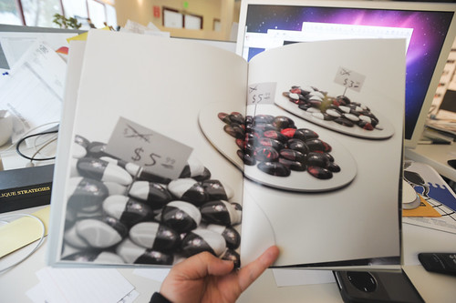
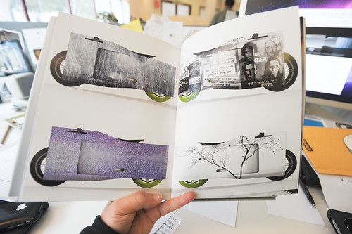
Just some short notes for myself on this book NONOBJECT by Branko Lukic with words by Barry Katz and a foreword by Bill Moggridge. I’ve been eagerly awaiting the arrival of Nonobject, a book that reveals quite a number of speculative objects — that are described as experience-centric design research that push the boundaries of possibility. The objects themselves do innovation through design beyond physical boundaries. As the New York Times describes it — the objects are about freeing form from function.

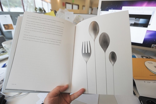
What I appreciate about the objects are the way they take a theme and then stretch it to extremes along a particular experience axis. For example, this set of flatware that has these very long impossibly thin handles to them — made of the impossible, whimsical material “Thinium.”

JCB_15022011_122516_1205

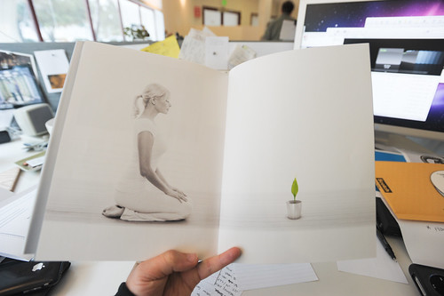
The book is chockfull of luscious renderings, gooey wordy designer-y descriptions of beautiful CAD models. There are beautiful human models serenely poised over expertly rendered CAD objects. The pages are thick and smooth, like pulled sugar-y ribbon candy. You want to lick the pages and their CAD models to see if they will have an impossibly rich, whimsical taste as well.

There are some curious things in here that tip into the realm of design fiction where the design actually brings me to the point of confusion, where I am unwittingly compelled to suspend my disbelief such as when one sees something and wonders if it isn’t actually real, already on Engadget. These are things that are just on the cusp of believability because they are consistent with the ways that ideas and their materialization evolve. Like — you could believe that a couple of future-forward thinking venture capitalists pooled $5 million to finance the design, tooling and short-tun manufacture of some especially curious bit of digital product concept work.

JCB_15022011_122430_1204

JCB_15022011_122737_1206

Most of the things in Nonobject deflect away from design fiction — at least the sort that closes the gap between idea and its possibility. They are truly more like speculative knowledge objects. Things to ponder over and go — hmmmm..curious. Nonobjects don’t make you want to do a google search to find out when the thing is going to be released, or search the leaked items on Gizmodo or something, or place a pre-order. For the Laboratory’s Bureau of Design Provocations, this sort of diegetic prototype is much closer to being there, in the world — than a gooey CAD render could ever be. Evolved visual literacy in this day and age does not CAD renders as much more than what is created by the designer, sitting with their modeling software, satisfying their primal designers’ urges to dream about a world in which everything looks like it should be moving very fast, or have organic, hand-made pebble-like forms, &c.

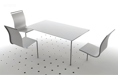
Some of the nonobjects tip into the realm of plausible. The “Behind the Scenes” camera tips into that sort of thing. A camera that captures what’s in front of the lens in a traditionally way — but also what’s behind. This is intriguing design fiction in that it seems quite possible, despite not existing. And it gets one thinking about the experience for people in the world, not just the form and un-functionality of a spectacular dinette set. But — even this makes one stop for a moment. Wouldn’t there be lots of photos of half of the photographer’s head? As soon as you start down that path, you *sigh and slump..just a concept.

Now, I’m not saying that concept-ing and vision-ing and all that does not serve a useful purpose in advancing design. It raises questions and provides material to ponder priorities and principles. It points to unusual things that help those less versed in the possibilities of design to see more broadly as to what the capabilities of this craft might be. It allows free exploration without material constraints. It’s far-fiction, unabashed dreaming and pondering. It distances itself from the material world, the world of tangible needs, constraints and exists almost exclusively in the imagination.
JCB_15022011_122404_1203

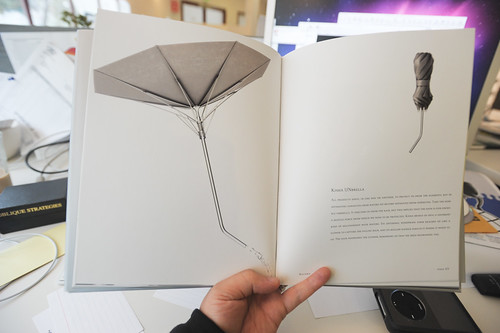
“All products serve, in one way or another, to protect us from the elements, but by separating ourselves from nature we become separated from ourselves. Take the humble umbrella. It shelters us from the rain, but this implies that the rain is our enemy, a hostile force from which we need to be protected. Kisha brings us into a different kind of relationship with nature. Its upturned, windproof form reaches up like a flower to capture the falling rain, and its hollow handle directs it where it needs to go. The rain nourishes the flower, reminding us that we need nourishing too.”

JCB_15022011_122757_1207

At some point this sort of concept-ing and vision-ing tips into the obscure poetry of design that is for designers themselves and really misses the opportunity to translate ideas into the material of the world in which humans live and die. Umbrellas have potential and possibility for being better and different, of course. I have to say though — this particular near future umbrella just confuses the bejezus outta me. This would be curious and even a good design-joke if it said less about watering a lone flower than the rhythms of cheap $5 umbrellas that you get on the corner that end up failing and turning inside out. I mean — a design fiction umbrella that could turn inside out if a torrent of wind decided to do so and *still remained functional as an umbrella..now, that’d be something much more legible and perhaps even tip into the category of “wheels-on-luggage” — like..someday we’d say to ourselves: “what took Totes so long to make the wind-accomodator umbrella?” If Totes cooked the Nonobject “Kisha” I’d get very French and *pffft with a *shrug.

This is sort of where I lost a bit of enthusiasm. While I like the direction and motivation here, this did not feel like the sort of design fiction that I lust after. It seemed very designer-ywith a heavy emphasis on the perfect render. Good design fiction in my mind tends more towards believable, pushing towards the suspension of disbelief as a core tenent — because then you enter into that middle space of confusion tending towards possibility, rather than the dead-giveawy of an expert CAD render in Keyshot or Hypershot or Rhino or whatever.

Now, this is a bias. I’m a design fiction guy, a design fiction-y designer. I believe that a design that tells stories about how the world could be, or what it may come to be is one that serves a purpose in a deep, ideological way to make things better. And, in the two or so years that we here have been exploring and producing design fictions we’ve found that they should be props that live in the corners so that the attention they draw to themselves in only a secondary or tertiary fashion. Fetishize them too much and the magic falls apart. Ancillary things aren’t highly rendered on white backgrounds. So — maybe nonobjects are just something entirely different. They aren’t convincing they way I think a good bit of near future science fiction can become a motivator to create (or avoid) the world it describes. In an important way, design fiction is more than fantasy renderings of impossible worlds and their contents. Design fiction is motivated to bring about change; to make things a bit better. Speculating and fantasizing is fine — an important function. But it leaves one wanting for a set of more tangible objectives, goals, principles or scripts to getting from here to a “there” that’s better than what we have now. It motivated by a loose philosophy that underscores the fact that real, material, hand work *can bring about change. When I see CAD renders, that’s only a small step towards that because our visual culture has adopted and become quite sophisticated — when something is rendered, we can tell. And that erodes the important illusion of possibility, the illusion that closes the gap and makes one wonder if this thing is real, or is this story I’m being told journalism? Or fiction?

These are perfectly captured, fantasy objects. For me, they look too fast, too impossible, too much like the Industrial Designer’s dreams rather than props reflecting the complexity of a fraught, much-less than perfect world. It’s singular — one person in charge of everything, which may indeed be the Industrial Design fantasy par excellence.
Continue reading Nonobject Short Notes
Medical Fiction

A curious book won the Pulitzer Prize, I just heard. It’s called Tinkers What I found most intriguing about the news story is that the book was published by a small specialty publisher — Bellevue Literary Press, which is associated with the Bellevue Hospital in New York City. Probably one of the scrariest hospitals in my imagination. Big, imposing, vaguely Gothic hospitals aren’t cool, as any horror film production designer knows. The floors are inevitably wet and mildewy and the wheels of gurney’s clank from lack of maintenance, which is only the surface of what isn’t maintained.

Anyway, this book is intriguing to me because of the press typically does medical books, which makes sense, but they also publish fiction books that have medical themes — combining fiction with the traditionally very terse, fact-based themes of medical books. Something that sounds kin to design fiction.

Bellevue is a major center for emergency services in New York City, but it is probably best known in the public imagination as a mental hospital. The hospital’s literary press was established five years ago, mainly for the publication of high-end medical books. But Goldman, a veteran of the publishing business, is also committed to releasing works of fiction with a scientific or medical theme.

via NPR
Continue reading Medical Fiction

Plastic Happens

Plastic Slippers

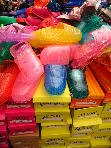
Plastic slippers, found in Seoul, South Korea

To go along with the previous *blog all dog-eared pages* post, an additional description of *what plastic is* — to include alongside of all the others chemical, political, economical, historical, technical, medical, fictional, &c — done in the story-told style, again from a dog-eared page in Richard Powers’ *Gain* — a fictional industrial historical novel of a soap-making company alongside the memoir of those implicated in its adventures to make the world clean, we find this formula:

Plastic happens; that is all we need to know on earth. History heads steadily for a place where things need not be grasped to be used. At a shutter click, a bite-sized battery dispatches a blast through a quartz tube filled with halogens. Excited electrons, falling back down the staircase of available energy states, flash for a second, to dissipate the boost that lifted them briefly into rarefied orbitals. This waste energy bounces off the lines of a grieving face and back down the hole of the aperture, momentarily opened. Inside, reflected light ruffles the waiting film emulsion like a child’s hand impressing a birthday cake. Years from now, metal from the flash battery will leach into runoff and gather in the fat of fish, then the bigger fish that eat them.

Why do I blog this? I like these adjunct descriptive-formulae for things that reframe things in contexts as suited-for and as relevant as what one might typically consider *the* description. Plastic may almost always be framed as in the context of its chemical properties, or chemical architecture. Perhaps also in its marketing terms — how it is sold, or how to frame it as a useful, beneficial part of one’s life. Which of its many varieties can be recycled, which is often never *just* an aspect of its chemical properties, but also a municipal decision or even a legal ordinance that dictates that it *must* be recycled if it is sold in a specific geography. An so on. These multivalent, multiple terms that *are* what make something what it is — their ontological furniture of all sorts, not just the habitual, common-place or “common knowledge”, but those valences of a thing that go alongside of it as well, that are as material and as relevant as the proto-typical and everyday. Perhaps even more relevant, as the Powers’ passage above suggests. More everyday and experienced rather than the rarefied industrial-chemical.

Can these alternatives provide a more legible basis for telling a story about something, and do so in a way that is more meaningful and with deeper, thicker, world-changing impact?
Continue reading Plastic Happens

Innovation and Design

Roberto Verganti’s Design-Driven Innovation, a business book on how “firm’s” can participate in larger networks of design discourse in order to achieve radically innovative stuff. Mostly an argument with a three-step “how-to” addressed chiefly to executives. An intriguing argument with a fistful of examples presented over and over to drive these points home. In the “good” column, I would say that it is not bad to have (another) book addressed to (potentially) skeptical executives who are more motivated by features and bottom line bill-of-materials/profit/margin sorts of things. On the “m’eh” column, I would say that the book, like most business books, simplifies the really curious, intriguing and fun challenges of leading an organization that has fiduciary and legal responsibilities to make as much money as it can; that has cultures that are led chiefly by engineering and accounting; that thinks design is putting lovely curves around rectangular circuit boards; &c; &c; It would be a much more interesting read to hear the knotty, thorny challenges of design-led innovation. Rather than the “pat” case studies, I would like to have more of a deep/thick investigation of what happens really when one leads with design. It’s more than partying with the well-known, hipster designers Verganti highlights.

I’m reading two books at once, a dangerous thing to do because one is always interpreted alongside the other, changing what it may have been and my perspective, necessarily. But, in hindsight I would say that I am doing this on purpose. One of the books is Reassembling the Social: An Introduction to Actor-Network-Theory (Clarendon Lectures in Management Studies) by Bruno Latour, which I am reading for the second time. The other book is Design Driven Innovation: Changing the Rules of Competition by Radically Innovating What Things Mean by Roberto Verganti, which I only bought because of the suggestive, business-y title and because business books are things I can make short work of during a 5 hour airplane flight. You know — they basically tell you everything you discover in the title, and then repeat it for no more than 200 or 250 pages, only with snap-to-grid, spic-and-span examples.

* Skip right on past my rambling to my executives’ summary *

What could be the relationship between a noted sociologist-of-associations and a tailored-suit-with-french-cuffs-wearing business professor / management consultant? Perhaps nothing useful. But, one of the roughly constructed graphics in Verganti’s book resonated with Latour’s notion of the collective — and it was even described as a drawing of “a collective research laboratory” — and being a good Latourian, I had to follow the links in my head. These are just some sticky-notes between these two books and my own interest in the role of design in changing things, as well as the ways that organizations can be led by design sensibilities or design studios, rather than engineering efforts and accounting principles. Both are things that are lurking below the surface of these two books, Verganti more explicitly than Latour.
Continue reading Innovation and Design

Kubrick Anthem

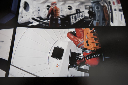
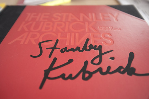
A page from the 2001 section of the amazing new Taschen edition – The Stanley Kubrick Archives. I’m emphasizing 2001: A Space Odyssey here, but this wonderfully designed book covers Kubrick’s film oeuvre.

As I’ve been digging up materials on the design fiction topic, and sending my search beyond the Google into the backyard shed, which includes many cardboard boxes that were sent to myself from New York City to Los Angeles back in 2004, I have had a chance to plunge myself into welcome nostalgia. I found my old
Star Trek: Star Fleet Technical Manual and a copy of The Making Of Kubrick’s 2001.

I remember browsing through this “Making Of” book as a young boy, not reading it so much as looking at the pictures of spaceships and wondering how they were built. I mean – I knew they weren’t real, but I was fascinated by the production aspects, the model making and so forth. The ways and means of creating “special” effects for the film. All of this decanted into some early Super-8mm experiments involving disappearing Cowboys pursuing befuddled Indians, somehow involving my brother and neighborhood chums. Anyway..

This latest Kubrick purchase I can highly recommend for folks with large coffee tables or broad bookshelves. It’s a prodigious collection of stills from all of his films, as well as wonderful backstory insights and production notes and nuggets. For the extent of the material, the richness of the film stills and all this, I’d say this is a strong buy, or one for the wish list, certainly. The book contains stills from the films, meticulously reproduced from original negatives, insights about the production of each film through visual stories, production stills and so on. Also included are some new essays.

(There seems to be some sort of Kubrick revival or renaissance or maybe that’s just my observation. In fact, it must be. I think there’s a Kubrick ghost living amongst me. The night before he died – news that came to me over the morning radio while I was living in Brooklyn – I swear my father and I watched The Killing on a VHS tape. When I came downstairs and told my dad the news, he thought I was pulling his leg, the coincidence being rather bizarre as we were not given to watching Kubrick as a matter of course. I’m not entirely sure what’s going on. I’ve only just now noticed Matthew Modine’s book called Full Metal Jacket Diary of his notes and photographs from his experiences with Kubrick in Full Metal Jacket that I stumbled across just Saturday at Family bookstore on Fairfax. It’s in a curious metal covered design and rich with photographs; certainly a significant contribution to the wider Kubrick mythos. That same day while in the Otis College of Design library, the Spring 2009 issue of Cineaste had an article by Tony Pipolo called “Stanley Kubrick’s History Lessons.” There was one other magazine with a cover story, but I forget what it was.)

Continue reading Kubrick Anthem