Design Fiction at UC Calgary's Environmental Design: A First Go At Design Fiction Genre Conventions

Friday November 19 07:02

From awhile ago, back at the end of last year I went to UC Calgary’s Environmental Design and presented a further iteration of the design fiction business. I realized I hadn’t put down on paper or on this blog some thoughts from the presentation — but mostly thoughts about what design fiction can do.

Just in terms of process, my basic routine is to extend the thinking in steps, using commitments to travel and give a talk or facilitate a workshop as the motivation to move the general thinking a bit further. Where it’s going is oftentimes vague sometimes — but generally it’s just a kind of extending conversation that helps me and I hope others think about the opportunities for collapsing design and science, fact and fiction together into a productive muddle.

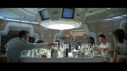
In this talk I set the usual frame — placing science fiction alongside of science fact and leveraging David Kirby’s work on the diegetic prototype — the prototype that does more than an engineering or technical or instrumental prototype. ((That may be my emphasis to say that it does more — or a conceit on my part.)) The exemplary diegetic prototype is revealed through Minority Report — the film — and the role that John Underkoffler played in the technical design and technical production of the film’s gestural interface. Despite the challenges of such a system in practice, Underkoffler was able to work through technical issues pertaining to such an interface mechanism through the context of the film’s story. He had a basis upon which the interface would be employed in the future of P.K. Dick’s world of 2050. Moreover the film’s popularity and just its existence provided a way of circulating the concept of this specific kind of gestural interface. The film and the fictional technology that Underkoffler proposed and demonstrated in the film became a way of leveling-up the idea — giving it some exceptional circulation. In effect, the film became the logical extension of the M.I.T. Media Lab’s mantra of demo, demo, demo — or demo-or-die.

This is the stock presentation I’ve given on design fiction. Early on — I think the first time I explicated all this stuff was in Amsterdam where I gave a talk at the Sandburg Instituut Master Course during Halloween in 2008 — I was trying perhaps not successfully to integrate film clips as a way of describing the importance of the story, rather than just objects or props. That is — during that particular presentation in Amsterdam — I showed unusually long film clips. So — the first 3 minutes of Minority Report, for example. Let’s watch that and allow the cool technology to be part of a story that is more about humans as social beings and this lets the tech become social too — it’s not just a doorknob sitting by itself. It’s also a social-instrument, an artefact that has a role to play in this particular drama. What Spielberg is able to do is introduce the technology to us — it’s just a prop — without making the whole film *just about the gesture technology or even the pre-cogs, or the slick environmental advertising, or the jet packs. They are there, of course — but that’s not what the story is about, any more than the Maltese Falcon was about a statue of a falcon from Malta. The statuette was a prop — a way of spinning the story about a couple of crooked crooks.

The purpose was to give a larger context for the gestural interface rather than just its use in the 30 or 40 seconds we see it in the beginning of the film. I wanted to give the device a role and a purpose — an instrument that’s used routinely. I wanted to shift it from being a spectacle to being just an ordinary albeit sophisticated bit of technical kit. Just in the same way that a microscope in a forensics-heavy police procedural television show is not fetishized as a prop or device in that sort of story, neither should be the gestural interface in Minority Report — even though to our eyes as viewers, at least at the first screening, it is quite extraordinary. The point is that the film makes the device quite ordinary and routine. This is John Anderton just going about his business as a savvy, street-smart, afflicted cop. It just happens to be a future world to us, with all its trappings of things extraordinary.

From this I began thinking about the conventions, stylings, idioms and techniques that make the future seem like today. How do you make the extraordinary appear ordinary and quotidian? This seems to be an important way of depicting the future and making it seem possible. It’s just a way of designing — an understatement of perhaps novel, innovative and crazy ideas from the future. Why do this? Because in a way this is part of the work of design innovation. To make something spectacular routine, domesticated (to borrow from James Auger) and perhaps even boring and everyday. When you can do this, you’ve turned a corner into a new space that provides a setting for a kind of innovation that is chaste and modest and thereby, perhaps — entirely possible. This then communicates your innovative, crazy, off-the-hook idea as legible and something which can already be accomplished.

Thursday November 18 15:20

There’s much in the social, cultural and political history of science and innovation on the topic of modesty as a mode of conveying and communicating an idea. Scientists are especially guilty of this mode of communication — behaving only as unadorned and modest presenters of things-as-facts. Just revealing nature as it is. Simon Schaffer and Steven Shapin’s Leviathan and the Air-Pump: Hobbes, Boyle, and the Experimental Life and especially Schaffer’s A Social History of Truth: Civility and Science in Seventeenth-Century England (Science and Its Conceptual Foundations series) speak much on this topic. I think here I’ve internalized their insights and tried to find ways to leverage the modest proposal of a new, speculative idea — as was the air-pump in its time — as a way to communicate it convincingly. In part design fiction is about communicating a new idea, but of course it is also, perhaps mostly, about actually doing design through the modes and idioms of science fiction.

This way of presenting an idea and enrolling people in it is described quite convincingly by Shapin and Schaffer. It’s really an important read in this regard. It’s a great historical book. I seem to re-read it every few years because it’s almost tactical in its description of how ideas become materialized and circulated. It’s certainly much more thorough and convincing than popular surveys of how ideas evolve and develop — I kept thinking about how loosey-goosey Stephen Johnson’s Where Good Ideas Come From: The Natural History of Innovation end up being for its lack of rigor and its desperate hunt for a simple one-liner — this whole adjacent possible. It reads like a nursery rhyme that forgets that its okay that the world is an intractable complex and entangled place. ((G’aah. I’m all riled up now. I’ll get back to that one later.))

Thursday November 25 09:30
Thursday November 25 09:31

Cinematic Storytelling: The 100 Most Powerful Film Conventions Every Filmmaker Must Know. It sounds very vocational, but I find the idea of a catalog of ways of telling visual stories compelling. It would be nice to create a similar sort of thing for design fiction, I think. This is what is next.

Anyway — so what I’m trying to do now with the whole design fiction business is catalog a series of genre conventions — ways in which one can describe an idea or an object or a bit of thinking. How do we show ideas as they would be in the world? Or as they come to be? I’m thinking about mostly visual stories — little films or proper films, but mostly little films because they can be produced, we have a pre-existing language of visual story telling and now I’m convinced that that language can be used to also do the work of designing. What I and others are talking about is using film/visual explications as a means of prototyping and, perhaps more importantly — designing. It shouldn’t be just a way of showing a concept but also a way to feedback into the design process — or it should be a part of the design process, not just a final demonstration. They should be made in such a way that thinking is going on while they are being made. One should pay attention to lessons being taught by the little filmmaking process because effectively, then — you are also doing design, just with fiction which allows more freedom in the explorations.

Why do I blog this? Well — I’m doing a few design fiction workshops later this summer and fall and it seems like film is a viable way to think through how to set the scene for a near future world, or little moment of that world. It would be quite nice to do a workshop that included film making as the “hands-on” work part of the workshop. It actually takes a lot to think through things if you’re making a little movie, even a super little one. But, things get even more intriguing when the making of the film is actually part of the design process itself — allowing the extra work to be more than communicating the idea, but actually informing it quite directly. Some of the little films we’ve made in the studio were exceptionally useful to shape and challenge notions that work quite well in conversation, or on the screen or on big posters. It’s when things go in the hand and become materialized that you start to discover something about the design that needs more help to make its way into people hands.
Continue reading Design Fiction at UC Calgary's Environmental Design: A First Go At Design Fiction Genre Conventions

Wandering through the future

@chriswoebken spied this one — an art film by Marjolijn Dijkman (NL, if you couldn’t guess) called Wandering Through the Future in which the artist takes 70 science fiction films and uses them to explore how they imagine the future. In an interview, there are some curious and relevant sentiments surrounding the production of the film — particularly this observation that the nearer in the future the film takes place, the more recent the film is. It’s as if we’re trying ever harder to imagine a possible near future, whereas in the earlier days of science fiction film, it was expected to imagine some time far, far in the future.

There’s also a timeline that goes along with it, evidently, of stand-out quotes from the films. I’m guessing this time line is also apparent in a recent book

When I collected all the scenes for this project I couldn’t find a single optimistic future scenario. It started as a timeline of the future along which I placed all the films I could find according to the fictional date when they are set. The distant future is mostly represented through films from the early days of science fiction cinema, and in general the closer you get to visions of the near-present, the more recent the film.

Scenarios change from Barbarella rocking in her space ship in 40,000 AD to almost hyper-realistic and feasible scientific models of the future in which nothing is playful at all.

I think in the 1960s and 70s culture you could still imagine far future scenarios, but nowadays people are already so afraid of the coming 30 years that they cannot think ahead. We live in a science fiction future already; the future of sci-fi has shrunk from the day after tomorrow to today. Yet we should think beyond science fiction and face the future in a different way. The films which comprise Wandering Through the Future often represent a worldwide apocalypse – the entire earth variously becomes frozen, a desert, flooded, contaminated by influenza, a single totalitarian state or taken over by robots. Cinema here does not think of local scenarios or the possibility that different phenomena might happen in different places and at different scales. It’s important to stress that we cannot only paralyse each other with fearful scenarios for entertainment but we should also think of possibilities and create new scenarios to be able to imagine a long term future again.

Continue reading Wandering through the future

Design Fiction Principles: Notes from Design for Screen

Alien Food

A relevant short essay by Piers D. Britton in theThe Routledge Companion to Science Fiction underscores some of the loose principles (loose, because they aren’t quite principles — more a swirl of useful insights) the Laboratory has been gathering around the concepts of Design Fiction. ((Why gather principles? Well, to understand how better to create/construct/author *Design Fiction))

In the essay, Britton starts out by emphasizing the importance of the visual and aural aspects of science fiction on the screen. This is obvious, of course — but worth underscoring because it relates immediately to the appearance of things that may not be real but have to be perceived (“seem”) real. Our common sense has to extend from now to the visual story — the appearance of otherworldlyness should be coextensive with what we understand today.

The point Britton emphasizes at this point is that design in screen-based science fiction works to create the appearance of a coextensive world — extending now to then. And that design for science fiction is oriented toward verisimilitude.

Well..so what, Britton asks. Verisimilitude is of limited value in itself. For him, the important corollary is that screen science fiction appeals to a “viewer’s sense of the tactile properties of unfamiliar phenomena.” I hadn’t really thought about the design elements in a film as textures, so I found this intriguing. Britton makes a broad cut through the history of screen science fiction delineating texture as an element of the design. ((For example, buildings, vehicles, weapons, etc.) He says that, in the 1920’s-60s, textures were modernist, sleek, streamlined, and that after the 70s, it becomes layered, scorched, rough-hewn, layered (cf. Star Wars, Blade Runner, Battlestar Galactica, Alien, etc.)

This I can follow — and its something I can vaguely recall thinking when I first saw Star Wars with my brother, with our much older half-brother carting us along. The banged-upness of the Millennium Falcon is one of these signals of a kind of verisimilitude that is drawn from the present to create a legible future (or past, in the case of Star Wars, but the direction of time matters less than the appearance of something that is *coextensive with today.)

Britton says that this by itself may not help understand the nuances of the screen science fiction genre. He’s curious about how design generate meaning? By looking at specific *texts, we may gather a fuller understanding of the role design plays in the story. But, first Britton takes a moment to point out his conviction that design imagery cannot possibly obscure the story. He says that design is spatial, narrative is teleological; narrative is words; design is not. “..rather than ask how design relates to narrative, as though the two had the potential to harmonize or quarrel, it is more productive to ask how design can operate within the whole imaginative and conceptual experience invoked by screen entertainment.”

((I guess there’s some sort of disagreement within the world of science fiction lit-crit people on this point — or maybe its just a disagreement between a couple of them — to emphasize the role design plays in the story. I think it may go along the lines of design and story being opposed in some fashion. Like — someone may feel that design ruins the story and, well I can imagine someone saying something along the lines of: “the book is so much better..the film just ruins the original story.” Or something like this. If I was still in school and not spending more time in the Laboratory, I might follow this one up. But — it could be an intriguing argument as, presently — I feel that design can tell a story, or pivot a story in a way that a narrative on its own cannot, which isn’t to say that a narrative is hobbled without design, but rather having a physical prop in the hand or on a screen does something that the story telling by itself is less capable of. And, even beyond this point — the making of the physical prop is a nice tangential, additional approach to figuring out the story itself.))

Britton then goes on to ask two questions:

* 1st: how does design uphold the “meta-reality effect” of science fiction?

* 2nd: how does design compel reflection and contemplation about the story’s underlying ideas?

These are two questions worth asking and I’d like to sort out the substance of them, but as far as how satisfying the answers, I’m only sure Britton answers them in a way that would be of use most directly to a lit-crit sort.

He uses two examples to address these questions — Blade Runner and Firefly. I’m not at all familiar with Firefly, but the point Britton makes about Blade Runner is easy enough to state to be worth mentioning.

Britton points out the specific textures of the fashion design in the film which serve to defamiliarize while still being evocative of recognizable forms. In Blade Runner, the costumes are drawn from the 1940s and the 1980s without becoming nostalgic. There is this *defamiliarization driven by texturing and contrasts (Deckard’s trench coats and Tyrrel’s vaguely art-deco octogonal glasses versus the punk-inspired costumes and hair styles of the rebel replicants, for example).

I find this bold contrast curious — this point about the collision of textures (punk versus the 1940s and art-deco) and the possibility that defamiliarization contributes either to this “meta-reality effect” or that it excites reflection on the underlying ideas of the story.

So, if I were to quickly conclude the most useful insight here it would be around this point — a subtle, defamiliarization that might compel the viewer/reader to step out of their routine, or what they might conventionally expect — this can go somewhere to “exciting” contemplation or a deeper engagement with the material than they might if they were seeing something they expected.

((Parenthetically, we’ve used this general principle I think to some modest success both in the design process and the communication of work — rather than showing things people might expect such as PowerPoint decks, bullet points or *slides — we might show a short visual loop and, much more often than not, the substance has nothing to do with what the audience might expect. It forces at least one question — what is this? And then you can answer the question and have a conversation.))

Why do I blog this? Some reading notes as I prepare some material for a talk on design fiction for the fall.