Design Fiction at UC Calgary's Environmental Design: A First Go At Design Fiction Genre Conventions

Friday November 19 07:02

From awhile ago, back at the end of last year I went to UC Calgary’s Environmental Design and presented a further iteration of the design fiction business. I realized I hadn’t put down on paper or on this blog some thoughts from the presentation — but mostly thoughts about what design fiction can do.

Just in terms of process, my basic routine is to extend the thinking in steps, using commitments to travel and give a talk or facilitate a workshop as the motivation to move the general thinking a bit further. Where it’s going is oftentimes vague sometimes — but generally it’s just a kind of extending conversation that helps me and I hope others think about the opportunities for collapsing design and science, fact and fiction together into a productive muddle.

In this talk I set the usual frame — placing science fiction alongside of science fact and leveraging David Kirby’s work on the diegetic prototype — the prototype that does more than an engineering or technical or instrumental prototype. ((That may be my emphasis to say that it does more — or a conceit on my part.)) The exemplary diegetic prototype is revealed through Minority Report — the film — and the role that John Underkoffler played in the technical design and technical production of the film’s gestural interface. Despite the challenges of such a system in practice, Underkoffler was able to work through technical issues pertaining to such an interface mechanism through the context of the film’s story. He had a basis upon which the interface would be employed in the future of P.K. Dick’s world of 2050. Moreover the film’s popularity and just its existence provided a way of circulating the concept of this specific kind of gestural interface. The film and the fictional technology that Underkoffler proposed and demonstrated in the film became a way of leveling-up the idea — giving it some exceptional circulation. In effect, the film became the logical extension of the M.I.T. Media Lab’s mantra of demo, demo, demo — or demo-or-die.

This is the stock presentation I’ve given on design fiction. Early on — I think the first time I explicated all this stuff was in Amsterdam where I gave a talk at the Sandburg Instituut Master Course during Halloween in 2008 — I was trying perhaps not successfully to integrate film clips as a way of describing the importance of the story, rather than just objects or props. That is — during that particular presentation in Amsterdam — I showed unusually long film clips. So — the first 3 minutes of Minority Report, for example. Let’s watch that and allow the cool technology to be part of a story that is more about humans as social beings and this lets the tech become social too — it’s not just a doorknob sitting by itself. It’s also a social-instrument, an artefact that has a role to play in this particular drama. What Spielberg is able to do is introduce the technology to us — it’s just a prop — without making the whole film *just about the gesture technology or even the pre-cogs, or the slick environmental advertising, or the jet packs. They are there, of course — but that’s not what the story is about, any more than the Maltese Falcon was about a statue of a falcon from Malta. The statuette was a prop — a way of spinning the story about a couple of crooked crooks.

The purpose was to give a larger context for the gestural interface rather than just its use in the 30 or 40 seconds we see it in the beginning of the film. I wanted to give the device a role and a purpose — an instrument that’s used routinely. I wanted to shift it from being a spectacle to being just an ordinary albeit sophisticated bit of technical kit. Just in the same way that a microscope in a forensics-heavy police procedural television show is not fetishized as a prop or device in that sort of story, neither should be the gestural interface in Minority Report — even though to our eyes as viewers, at least at the first screening, it is quite extraordinary. The point is that the film makes the device quite ordinary and routine. This is John Anderton just going about his business as a savvy, street-smart, afflicted cop. It just happens to be a future world to us, with all its trappings of things extraordinary.

From this I began thinking about the conventions, stylings, idioms and techniques that make the future seem like today. How do you make the extraordinary appear ordinary and quotidian? This seems to be an important way of depicting the future and making it seem possible. It’s just a way of designing — an understatement of perhaps novel, innovative and crazy ideas from the future. Why do this? Because in a way this is part of the work of design innovation. To make something spectacular routine, domesticated (to borrow from James Auger) and perhaps even boring and everyday. When you can do this, you’ve turned a corner into a new space that provides a setting for a kind of innovation that is chaste and modest and thereby, perhaps — entirely possible. This then communicates your innovative, crazy, off-the-hook idea as legible and something which can already be accomplished.

Thursday November 18 15:20

There’s much in the social, cultural and political history of science and innovation on the topic of modesty as a mode of conveying and communicating an idea. Scientists are especially guilty of this mode of communication — behaving only as unadorned and modest presenters of things-as-facts. Just revealing nature as it is. Simon Schaffer and Steven Shapin’s Leviathan and the Air-Pump: Hobbes, Boyle, and the Experimental Life and especially Schaffer’s A Social History of Truth: Civility and Science in Seventeenth-Century England (Science and Its Conceptual Foundations series) speak much on this topic. I think here I’ve internalized their insights and tried to find ways to leverage the modest proposal of a new, speculative idea — as was the air-pump in its time — as a way to communicate it convincingly. In part design fiction is about communicating a new idea, but of course it is also, perhaps mostly, about actually doing design through the modes and idioms of science fiction.

This way of presenting an idea and enrolling people in it is described quite convincingly by Shapin and Schaffer. It’s really an important read in this regard. It’s a great historical book. I seem to re-read it every few years because it’s almost tactical in its description of how ideas become materialized and circulated. It’s certainly much more thorough and convincing than popular surveys of how ideas evolve and develop — I kept thinking about how loosey-goosey Stephen Johnson’s Where Good Ideas Come From: The Natural History of Innovation end up being for its lack of rigor and its desperate hunt for a simple one-liner — this whole adjacent possible. It reads like a nursery rhyme that forgets that its okay that the world is an intractable complex and entangled place. ((G’aah. I’m all riled up now. I’ll get back to that one later.))
Thursday November 25 09:30
Thursday November 25 09:31

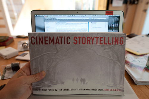
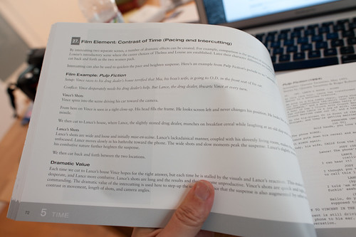
Cinematic Storytelling: The 100 Most Powerful Film Conventions Every Filmmaker Must Know. It sounds very vocational, but I find the idea of a catalog of ways of telling visual stories compelling. It would be nice to create a similar sort of thing for design fiction, I think. This is what is next.

Anyway — so what I’m trying to do now with the whole design fiction business is catalog a series of genre conventions — ways in which one can describe an idea or an object or a bit of thinking. How do we show ideas as they would be in the world? Or as they come to be? I’m thinking about mostly visual stories — little films or proper films, but mostly little films because they can be produced, we have a pre-existing language of visual story telling and now I’m convinced that that language can be used to also do the work of designing. What I and others are talking about is using film/visual explications as a means of prototyping and, perhaps more importantly — designing. It shouldn’t be just a way of showing a concept but also a way to feedback into the design process — or it should be a part of the design process, not just a final demonstration. They should be made in such a way that thinking is going on while they are being made. One should pay attention to lessons being taught by the little filmmaking process because effectively, then — you are also doing design, just with fiction which allows more freedom in the explorations.

Why do I blog this? Well — I’m doing a few design fiction workshops later this summer and fall and it seems like film is a viable way to think through how to set the scene for a near future world, or little moment of that world. It would be quite nice to do a workshop that included film making as the “hands-on” work part of the workshop. It actually takes a lot to think through things if you’re making a little movie, even a super little one. But, things get even more intriguing when the making of the film is actually part of the design process itself — allowing the extra work to be more than communicating the idea, but actually informing it quite directly. Some of the little films we’ve made in the studio were exceptionally useful to shape and challenge notions that work quite well in conversation, or on the screen or on big posters. It’s when things go in the hand and become materialized that you start to discover something about the design that needs more help to make its way into people hands.
Continue reading Design Fiction at UC Calgary's Environmental Design: A First Go At Design Fiction Genre Conventions

Weekending 10032010

hawkinson-draw-001

Well, probably the most intriguing thing that happened last week was the unexpected conversations that started up around the graphs of the future presentation I gave (all of 15 minutes) at the University of Michigan last Saturday the 2nd. It wasn’t unexpected in the sense that it was an award-winning 15 minutes of fame at all — just that it was more legible to people it seems than I had expected. The surprise might be that I had sorted out what I wanted to share in a low-level panic. When I first started thinking about the design fiction stuff and shared it at Design Engaged 2008 in Montreal I had this idea that was super formative about showing representations of the future. And because Design Engaged was a place wher eyou could show things that were still busted up and incomplete, I went for it, and basically showed three kinds of futures from three different thinkers/writers/futurists. But — I didn’t really have good representations so I found some stand-in photos that showed them. Like..for the William Gibson the-future-is-here-its-just-not-evenly-distributed I showed sandwich spread — peanut butter, I think — on a piece of bread to give that sense that the future can be spread about. It didn’t really work. This time, I drew in my wobbly drawing way, the graphs I wanted and I guess it worked because in contrast to the very sophisticated renderings of the surrounding presenters (architects, mostly) it was low-res and low-fidelity which provided a nice contrast, I suppose.

I still want to find a good Latourian graph of the future. Something knotted and gnarled with multiple intersections and conclusions. Inadvertently, Sascha may have given me this when he shared this Tim Hawkins piece “Wall Chart of World History from Earliest Times to the Present” (1997) shown at the top of this post. I wonder if anyone knows how I can obtain detail photography of this?

Aside from that, I have been assembling collections of movie clips for the evolving series on Design Fiction Chronicles. I hope beyond possibility that Volume 1 will be available for the upcoming Design Fiction Swiss Design Network conference at the end of this month.

Also, I owe a call to Nicolas for preparing our workshop on Failures at the same conference.

That’s it.
Continue reading Weekending 10032010

Weekending 08222010

photo.JPG

The disadvantage of having so much fun taking photos of skateboarders is that I have less “design research-y” photos to go along with the dispatches here from the Laboratory. So..I’m reusing some and digging deep into the archives.

Anyway. I’ve missed a week in here somewhere. I can say that the last two weeks have been weeks of wrangling thoughts into diagrams..wrangling and rustling and cow-branding and then, in the evening, playing lonely harmonica melodies and sipping coffee ’round the campfire. And early rising to count the herd, chase back the strays and move them along a little further to the, well..taking the allegory to its logical conclusion would ruin everything so, no good ideas really go to the slaughterhouse, they just get assessed and assayed for bits and pieces.

One continuing realization has been that these are definitely times where doing good projects is enough — and if they do good then that’s enough, too.

There was the usual cross-continental calls to update and share and exchange ideas. Some reviews and research proposals. Very exciting cross-silo puddle jumping going on. I’ve long been intrigued by the possibility that engineering and design cross-pollinate in some fashion and there may be a chance to try in the coming months.

Went to a concert at the Greek — Rodrigo y Gabriela — and normally this wouldn’t make it into a weekending post, except that it formalized the scourge of personal portable video recording devices, mostly the iPhone as there are the inevitable block-heads who just hold the thing up video recording entire songs so that you “enjoy” your time at The Greek — the canonical intimate medium-sized venue — with some jackhole holding a little video screen up in front of your view of what you should just be watching just right over there.

So — in the context of the material of this blog, I wonder how these little mobile devices that allow us to do these fascinating things like record experiences for later playback are changing behaviors. Clearly there is some kind of time shifting and hoarding and collecting and sharing rituals are in play here. Also something is going on with our ability to pay attention and maybe level-up our ability to recollect experiences without these devices — just as moments or translated perhaps into a diary or as a memory. And finally — the selfishness of that guy holding up his iPhone and blocking and impeding the view of the rows of people behind him? What’s up with that sort of willful disregard for fellow tribesman? Or whatever?

Anyway — onward. I think I am going to try to read “The Mirror, the Window, and the Telescope: How Renaissance Linear Perspective Changed Our Vision of the Universe“, the more legible follow-on to Samuel Y. Edgerton’s much more academic “The Renaissance Rediscovery of Linear Perspective“. I guess it’s weird putting a “to-do” in a “weekending”, but I started reading it, so I guess this is a marker in time-space so I can go back and note when I started sometime in the future when I realize I didn’t finish it..again. But, I’m curious for more useful stories in the catalog of useful stories about “how things were different” in the past — sort of a high road around the “wheels on luggage” conversation. I was encouraged to collect more “wheels-on-luggage” stories — moments where you realize that something happened to bring us to where we are today and things have not always been as they are, even if it seems incredibly obvious that anything other than what we have today seems silly — like not having wheels on luggage. In the case of the Edgerton books, he’s looking at how Renaissance linear perspective changed how we see and even understand the world around us, and it’s impossible in a sense to imagine that we could have seen the world differently. That may not be the best “wheels on luggage” example because it’s quite a big thing, different from small bits of design work that just make things a little better and do so in a subtle, understated way, but it’s one other story amongst hopefully many other useful examples. (I’m also curious if something like AR will do what the mirror and the window and the telescope have done to the way we see, understand, describe, discuss the world — will AR have its Brunelleschi moment where all of a sudden our “view” of the world, the way we see, changes?)

And finally — there was the Device Design Day talks brought to the world by Kicker Studio. I gave a presentation — some updates and re-workings of the Design Fiction material based on an essay that is quite well over due for the Swiss Design Network conference in late October. And a renewed committment to myself to do this remake of Kubrick’s 2001, as well as some small threads of the underpinnings of this based on some of the notes on HAL and “strong AI” found in the AIAA’s Special 2001 issue from April 2008, Volume 33 Issue 2. A note to self — I realized I wasn’t able to give any prescriptive thoughts as in — here are the three steps toward better device design. And that was okay — this need not be medicine, although people want a cure. It may be enough to think of Design Thinking as an approach rather than a process. Anyway — Bob Ryskamp has some brief notes on the entire Device Design Day, um..day..

Continue reading Weekending 08222010

Design Fiction @ Design Engaged 2008

03102008_132802

Design Engaged 2008 winds down with a series of quite enjoyable “wrap-up” presentations from some real-world adventures amongst four groups who went out into the field yesterday after the last of the presentations on Saturday. Thanks to everyone and especially Andrew, Boris, Mouna, and Jenn for their hard work and especially for the invitation! Now we wait for Ben’s wrap-up presentation with some discussion.

In the meantime, I’ll quickly post the slides from my really, really early-days presentation called “Design Fiction” where I look at various kinds of prototyping as kinds of prop-making whereby objects are speculations and “conversation pieces” helping to craft and author stories about what the world could be like. This work reaches back to my dissertation, or a chapter of it, where I investigate the role that special-effects play, particularly in sci-fi film, in heping create a convincing story. It goes deeper though — there’s a precedent for film props to be quite slippery in their cultural power, with the props serving as conduits between the “laboratory” and the “set” as locales of meaning-making.

Design is a kind of authoring practice (but different in important ways that have yet to be worked out in my mind from writing words on paper — writing is not the same as what design does when working with material, and the histories and specifics of the practices are quite distinct), crafting material visions of different kinds of possible worlds. Design’s various ways of articulating ideas in material to create social objects and experiences can be seen as a kind of practice close to writing fiction. This is a presentation about the relationship between design, science fiction and the material elements that help tell visual stories about the future — props and special effects. The questions here are this: How does design participate in shaping possible near future worlds? How does the integration of story telling, technology, art and design provide opportunities to re-imagine how the world may be in the future?

What are the ways we imagine and represent the near future? How can we use design and designed artifacts of various sorts to shift our representations of the future to encompass multiple futures? How can design become the prop-making craft for hopefully more habitable, sustainable near-future worlds?

Continue reading Design Fiction @ Design Engaged 2008