Cory Arcangel Show At The Whitney As Evidence That Retro Is As Dead As Disco

So, I’ve admired Cory Arcangel’s work, more or less. Maybe I just really enjoy the seduction of Super Mario Clouds. I had prints once. And I have the little blue artist’s book somewhere. The one with the embossed blue clouds. I didn’t know about the show at The Whitney Museum until I was back home and happened across mention of it in an issue of New York Magazine laying around the house. I was determined to see it before I left, which would be complicated by obligations and promises to myself and other things. But — I’d do it. That and the ICP’s Elliot Erwitt exhibition.

ICP first, then uptown and over east to The Whitney. $18 USD and I was in. I just went straight to the 4th where Arcangel had the entire floor. They allowed photography by special dispensation, so that’s always exciting. I never really understood — in this day and age — the no-photography thing in museums. I guess it’s so people don’t stand around taking photographs of art instead of just looking at it. In any case, you could take photographs at Arcangel’s exhibition.

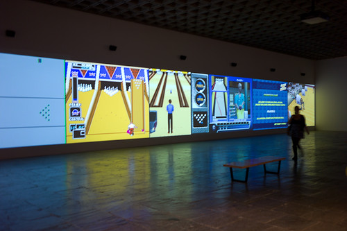
First thing, you’re inundated with the cacocophony of a bunch of retro bowling games projected ginormously against a wall. Okay. Seems Arcangel-y. The 8-bit video game thing. Seen this stuff. I guess most of America has not. I watched and *shrugged and figured I needed to get warmed up. Around the corner so fuck-off big C-Prints of Photoshop gradients and the like. I was told I should appreciate these cause it’s, like..I dunno..something anyone can do? And it’s digital? And now, like..it’s a C-Print that’ll last longer than something-or-another..time? Or, like..who knows? Maybe it’ll be important cause it’s a C-Print of something art-y in an ironic, Williamsburg-y sorta way..like painting a painting on a painting canvas that’s all white? Or maybe black or whatever happened back then.

*Disappointed.

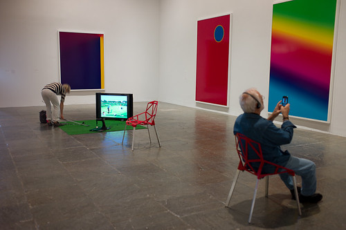
Then there was the pitch of astroturf and a golfing game. And a couple of chairs and a guy listening to something about the show I guess and taking an iPhone photo of one of the C-Prints.

Oh. That’s why they don’t want people taking photos in museums? So, like..you don’t sit there taking photos of things in museums while just sitting there?

*Whatev. Still not feeling it.

Next room. A bunch of unopened boxes of big commodity flat screens with lots of trandemark technology logos like Bluetooth and crap all over them. This is when I started reading the wall text of the pieces of art. That were, like..the art exhibition wall text equivalent of those business books with the long titles that basically explain what you’re supposed to know about by the time you’ve finished reading the book. In this case, the wall text was so didactic and explanatory — that I got the sinking feeling that, had this been a movie? It would’ve been a movie in which the ushers would be waiting to explain to you what you just saw, with the assumption that you’d have no idea otherwise.

*That’s sad.

There was a tape loop of Seinfeld episodes — the one’s in which Kramer invites the coffee table coffee book. More wall text explaining why the hell this is art (besides the fact that an artist made it). It was sad wall text. Like..wall text for the shake weight that explains why you should be buying it to help you “get fit” in case you thought it was an erotic massage toy. What I saw? What I saw was an assembly of Seinfeld out-takes that I might expect to see when Ken Burns does the epic documentary of late 20th century American comedy television. It’s just outtakes. You laugh only because you remember laughing while you were watching it for real on your own sofa (if you laughed) but you certainly forget you’re standing around in The Whitney.

*Feeling anxious about the $18.

Then there was a screening room with a barely tolerable assemblage of YouTube excerpts of guys rocking the guitar with each clip containing a note or passage from a Paganini riff that metal-y guitarist use to exhibit their prowess on the guitar. I get it. It’s a coherent collage of lots of YouTube videos of lots of YouTubers doing the same thing only they’re all different dudes with different guitars in different bedrooms, with..&c.

*Sigh.

And that’s it. I expected something else. The retro thing feels well played out, I have to say. 8-bit is as exciting as those hipsters shooting with film cameras or using typewriters. Video of 90’s sitcoms is just video of 90’s sitcoms. Like being a dude with no cable at home but now you’re sitting in a Hampton’s Inn with jetlag, flipping the channels and you come across the 90’s channel. That’s not fun. And boxes of commodity television sets? I mean..Not sure what to do with that.

I feel like I lost a twenty dollar bill. I’m glad I didn’t rush the ICP. It was well-worth the time dawdling over the lovely photography, even if I had to rush The Whitney.

Why do I blog this? Cause I went there and it made me think about work that I had a thing for but now it seems that 10 years later it’s not the same thing and it’s more tiresome on my brainball. I like the idea of canning stuff from 10, 15, 20 years ago and then pointing to the can and saying what the contents says about “today” or how it’s a little timecapsule of yesteryear and we have a connection to those moments. But it’s more our connection than an artists/artistic translation of those things. And the other thing is? The other thing is that institutional art struggles and will continue to struggle with giving the network’s toys and the industrialists’ toys a place to live in a white-walled space. Youtube in a museum viewing closet all big like that? It’s something else and it’s not quite what is sold on the wall text, which hyperintellectualizes the medium. Same thing with 8-bit bowling games (and just watching 8-bit bowling games). It’s excruciating in a way to not be able to fiddle with it. And to see them on 16 foot walls.

Continue reading Cory Arcangel Show At The Whitney As Evidence That Retro Is As Dead As Disco
How to Live Safely in a Science Fictional Universe

Wednesday November 10 13:07

From the Laboratory’s Blog All Kindle ‘Dog-Earred’ Pages Desk, I bring you a few call-outs, quotes and passages from the brilliant bit of chronodiegetic gooeyness called “How to Live Safely in a Science Fictional Universe” by Charles Yu. Great good barely science-fictional novel here. Really a story about loss and our human nature to regain what has gone and re-do and re-play our lives. Its about travel through time but along the way you get to enjoy some good design fiction swerves and curves. A few good things to think about, ponder over and imagine. I particularly enjoy the way that time-travel is intimate with story-telling in the novel’s world — its a kind of technology and industry (military-industrial-narrative-entertainment complex) that goes along with it: conceptual technology, chronodiegetics and diegetic engineering! I’d say this is a strong-recommend. Pretty much no spoilers below.

On the subway, the guy next to me has his head in a news cloud. Paradox is up 16 percent. If I lean in a couple of inches, I can just make out what it says. Up 16 percent in the fourth quarter on a year-over-year basis...
The guy reaches his stop and gets off, leaving his news cloud behind. I love watching the way these clouds break up, little wisps of information trailing off like a flickering tail, a dragon’s tail of typewriter keys and wind chimes, those little monochrome green cloudlets, a fog of fragments and images and words. On busy news days, the entire city is awash in these cloudlets, like fifty million newspapers brought to breathing, blaring life, and then obliterated into a sea of disintegrating light and noise.

The air above our heads is a smoggy miasma: mostly a vaporous fog of news and lies, mixed in with gaseous-form gossip, meme-puffs, and as always, the mists of undirected prayers. Men on corners whisper about secret shows upstairs.

Chrono-Adventurer Survival Kit
There were no exclamation points or any squiggly lines indicating weirdness or jokiness, or any other graphics to signify, This is for kids, this is a toy, this is just make-believe. It just had those words, and it was dead serious..For five dollars and ninety-five cents, plus a self-addressed stamped nine-by-twelve envelope, sent to a PO box somewhere in a faraway state, the good people at Future Enterprises Inc. would send you a survival kit “of great use and convenience for any traveler who finds himself stranded on an alien world.”
Half of me knew it was stupid. I was old enough to know better, but on the other hand, that font! Those letters in all-caps. It didn’t look attractive and well formatted, the kind of thing a kid’s eye would be drawn to; it looked like it came from a typewriter, unevenly spaced, like there was too much text, too many ideas and words and things that someone had to say, had to let people know about, it looked like it came from the mind of a brilliant, lonely, forty-year-old man, sitting somewhere in a basement in that faraway state, half crazy, sure, but on to something.

Up the street a song cloud floats by, sagging a bit, but still intact. I walk faster and catch up with it just in time to hear the ending, a symphony orchestra, the sound full and resplendent, and it is one of those times, you know those times every so often when you hear the right piece of music at the right time, and it just makes you think, This music didn’t come from here, it was given, it fell from some other universe..

It is well established within the field of diegetic engineering that a science fictional space must have an energy density at least equal to the unit average level of a Dirac box, multiplied by pi.

Then Ed farts and its not good. TAMMY’s still crying but starts to giggle, and I’m gagging a little, and then TAMMY starts laughing so hard she almost crashes herself. Ed saves the day again.

We’re going to meet an important man, the director at the Institute of Conceptual Technology, a gleaming black building, behind gates, that sits on top of University Road, up the hill half a mile above town, where they worked on the hard problems. The big ones, like how to keep paradox from destroying the sci-fi world. They were the people my father aspired to be, this man in particular, they lived the lives he longed for, they drove up to those gates every morning and checked with the security guard and showed their ID badges and the gates opened for them, and they drove behind them, up into the compound, the castle of secrets and ideas that only a hundred people in the world knew about, ideas that only a dozen people understood.
Today is the day, that one glorious day in my father’s life. After waiting half a lifetime, half a career, his moment. Today is the day they come calling for him. They, the world, the outside institutional world of money and technology and science fictional commerce. I remember the call. Sometime after our first wobbly orbit and before he was completely sure he knew what he was doing (or rather, before he realized he would never be completely sure about what he was doing), someone had taken notice. They found him, the military-industrial-narrative-entertainment complex, and they wanted to hear his idea.

In Minor Universe 31, quantum decoherence occurs when a chronodiegetic system interacts with its environment in a thermodynamically irreversible way, preventing different elements in the quantum superposition of the system + environment’s wave function from interfering with one another.

Why do I blog this? To keep track of notes from this book. Some are good ideas for some design fiction experiments. In addition — since I read the Kindle edition (a reasoned alternative to buying the bulky hard cover — which I rarely ever buy — and reading it while on a long trip). I’m confident enough that a Kindle book will not likely be around for as long as a normal book that I feel I must spread my notes around the datasphere.
Continue reading How to Live Safely in a Science Fictional Universe

What Innovation

Up and to the Right


Just a super short set of notes from Steven Johnson’s book, Where Good Ideas Come From: The Natural History of Innovation. I don’t have anything too much in-depth mostly because it’s a fast read, when I found time to read it, and it made me squirm uncomfortably. There was not much that made me stop and smile although I did quite a bit of exasperated sighing along the way.

I think this is because Johnson chose to muddle the study and insights of biology and evolution with the activities of humans following their curiosity, their inspiration to make things, their will to create enterprises, their greed to overwhelm their competitors and make fortunes by whatever means necessary, their hubris, their social-political ambitions, their desire to leave a statue of themselves behind — whatever it is that drives individuals to build and create. Using the study of organisms, biology, the ocean reefs, species evolutions, ecosystems — all of these things as metaphors for creativity, innovation, good ideas in the making — well, that’s just problematic in my mind. You exhaust the really interesting work right out the tailpipe of your story and you’re left only with this pre-existing framework of biology and ocean science and these things to explain how Marconi’s innovations with radio. At some point the analogy becomes the story itself — it’s not like the innovation work *is like* ocean reefs accreting new material. The innovation work is a reef, with new ideas building upon old ones like so. At some points in Johnson’s story human endeavor to make new things and come up with new ideas lose out to the simplicity of the science analogy. Human ingenuity becomes the same thing as the study of species, reefs and other “up and to the right” style evolutionary stories. This makes for a good children’s allegory or grammar school analogy — or a good cocktail party explanation of the irreducibly complex activity of “innovating.” But, it makes a book-length treatment of the complexity of creativity fairly gaunt at best.

Somewhere muddled up in there is an argument that Cities breed innovation because people are so packed in together (like an ocean reef?) and ideas propagate more efficiently in density, which may be the case — but it feels like a vague generalization. It’s easy to get into an argument about whether NYC is more creative than Los Angeles, for example — and things quickly spiral out of control.

Perhaps the best part of the book is the last sentence which might be the argument and even the framework for how the book works — forget all the biology analogies. Just this tweetable little nugget.

Go for a walk; cultivate hunches; write everything down, but keep your folders messy; embrace serendipity; make generative mistakes; take on multiple hobbies; frequent coffeehouses and other liquid networks; follow the links; let others build on your ideas; borrow, recycle, reinvent. Build a tangled bank.

Had Johnson followed the walks of those innovators he was curious about, followed them along their mistakes and noted the ways they borrowed, recycled, reinvented he could have done away with the silly biology analogies. It’s all right there in the hands-on work that’s going on — there’s no need for a big, grand, one-size-fits-all theory about how ideas come to be and how they circulate, or don’t circulate and how they inflect and influence and change the way we understand and act and behave in the world. That’s the “innovation” story — or the way that *change-in-the-way-we-understand-the-world* comes about story.

What I think Johnson is trying to do is in fact deliver some material for that cocktail party conversation — to instill in readers’ minds the idea that good ideas don’t just happen in isolation. They happen because of this idea of the “adjacent possible” — Stuart Kauffman’s idiom describing the multiple possibilities for what can happen because things (science-objects in Kauffman’s notion, like molecules or elements that lead to new science-objects; idea-objects in Steven Johnson’s notion, like steam engines and wine presses that lead to new idea objects like locomotives and printing presses) are proximate. Here’s how Johnson introduces it to us — and he’s not really reminding us that he’s taking a scientific thesis by a guy and using it to describe how innovation works.

“The scientist Stuart Kauffman has a suggestive name for the set of all those first-order combinations [molecules becoming DNA, e.g.]: “the adjacent possible.” The phrase captures both the limits and the creative potential of change and innovation. In the case of prebiotic chemistry, the adjacent possible defines all those molecular reactions that were directly achievable in the primordial soup. Sunflowers and mosquitoes and brains exist outside that circle of possibility. The adjacent possible is a kind of shadow future, hovering on the edges of the present state of things, a map of all the ways in which the present can reinvent itself. Yet it is not an infinite space, or a totally open playing field. The number of potential first-order reactions is vast, but it is a finite number and it excludes most of the formst that now populate the biosphere. What the adjacent possible tells us is that at any moment the world is capable of extraordinary change, but only certain changes can happen.”

What could come to be in the world of combinations of molecules and atoms and so forth that happen to be swirling in the same goo — is the basis for Johnson’s thesis about what could be in the world of accreting and “exaption” of ideas. The adjacent possible is meant to describe the what could come to be based on the coexistence and proximity of materials. Things bump into other things and come to form new things under certain conditions. There’s not one possible outcome, but multiple possibilities.

What Johnson does is confuse this for the way that ideas — which are not molecules or atoms swirling in a primordial goo — evolve into possible “shadow futures.” Will and cunning and gile and ambition and money and access to money — these and many other non-biological factors shape how good ideas come to be. ((As well as horrible, wretched, resource-wasting ideas.)) I mean — this is a troubling way to make an argument from the get-go. I don’t think you can just willy-nilly take a thesis from biology (or hypothesis, or lens, or view of how things work) and then use it to describe something that is never as pure as what we understand “nature” to be or “natural history” — he is not creating a story that describes what happens in the world of ideas, spun and spurned by people with bodies, situated in time, space, culture and society and struggling for credibility and authority. And that’s just a problem. The coordinates and biases and ways-of-knowing are all wrong at some level. The units are way off. It’s an allegory at best that misses 99% of the mishegoss of creating knowledge and meaning; an analogy that basically filters out all the work of humans interacting in a different way than the way that molecules and atoms interact. It’s another one of those kinda annoying uses of science to explain society which starts you down the path of immediately assuming that science isn’t society by other means, or that science isn’t already a social enterprise or — worse — that science has it all figured out.

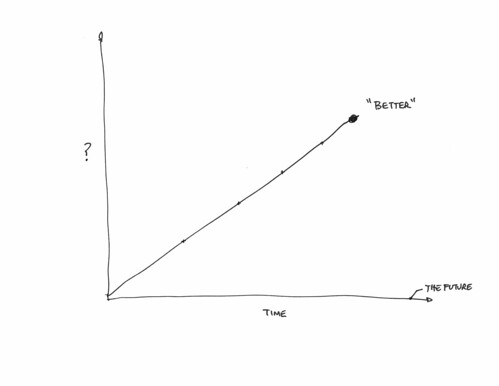
Anyway — I got suckered in because the book has the word “innovation” in it. These sorts of books with titles that are didactic are suckers bait. Its got this funny title about being a “natural history” of innovation and that seemed polite and humble, rather than prescriptive like a lot of business books tend to be. (“10 Steps to Improving Your Organizations Innovation Prospects!” — or things like that.) But then it’s less humble when you realize that this is The natural history of innovation that’s been written. N’ah — I know he’s probably being provocative with this title. But, still — I found it a bit bold. Because inside is not a natural history at all, but rather an argument made through a number of examples. The argument is to dispel the notion that good ideas — ideas that make incremental changes in the graph, making things move up and to the right to a greater or lesser degree — come from a guy sitting around by himself in a lab or basement. Rather, good ideas come about because of their proximity to other, perhaps disparate activities — other intriguing things happening nearby. Johnson’s prop is the ocean reef — and perhaps this is the joke in the title because the reef is understood to be something natural (as if) and therein lies the natural character of innovation.

Couple of notes, so long as they were jotted down while I was reading this:

He has a curiously muddled appendix of good ideas at the end, with the electric battery (1800) — every good idea has a date — sitting alongside of sunspots (1610), as if sunspots were a good idea as opposed to an observation that becomes relevant and topical. I can only imagine that these are intractably complex things that are as dense a knot of activities both purposeful, willful and incidental as one can imagine. Yet here they are rather cavalierly given a sentence or two and a date stamp as if they appeared as a good idea suddenly.

He diverts detractors to his approach of going broad and shallow by saying that there is value in surveying and drawing conclusions from many short case studies and drawing four quadrant graphs that even further simplify the points. The alternative is to be deep and thick, or to go into the laboratory — talking to people to suss out the meaning and history and all that of technology. The broad and shallow perspective is not as thorough. It’s a gloss, but even worse — it’s not substantive and opinion at best. This is fine, but the reader never really knows what they’re losing in the trade.

The argument is an engaging story — a good story. It’s an argument insisting on a POV and a thesis about an intractably complicated social/cultural/political/economic entanglement that cannot possibly be distilled to a core, to an essential character and way-of-being except in the most simple ways which never can possibly be much more than a fairy tale useful only for the most basic of explanations you might use to tell a child why the sky is blue, or as an allegory — it’s certainly not a history, natural or otherwise.

If you want to hear a really irksome panel discussion with Kevin Kelly and Johnson, check out this Radiolab podcast: What Does Technology Want?. It’s curious to me that Johnson and Kelly seem to jump on Robert Krulwich to the point of basically saying — “what’s wrong with you? don’t you believe in technology’s autonomy?”
Continue reading What Innovation

Pogoplug and The Rise of Network Fog

20090820_00

Pogoplug in the wild. Some edition of Linux in there, stripped down to basically require zero configuration. Plug it in to your network via an RJ45, and plug in your USB drive(s) and they appear online.
BTW lying under the tech is a first edition (1973) of the brilliantly quirky and prescientThe Velvet Monkey Wrench by John Muir (yes..related) with hippy-days illustrations by the talented Peter Aschwanden, who also illustrated the repair manual for my very first beater VW Rabbit. It has been recently re-issued. Chapter 8: “In Which Money Becomes Electrified”, complete with “E-Sellers” and “E-Cards.” Great future-past stuff.

Along with Augmented Reality, Cloud Computing seems to be one of the more thorough-going technology memes these days. The concept is consistent with the logic of the network. As bandwidth speeds level-up, and bandwidth costs go down (not free, just less, despite what Chris Anderson hypes) the asymptotic extreme approaches a curious quandary: where should “processing” be placed in relation to “data”?

Imagine if data can move (or appear to move) fast enough between where it is consumed and created such that it doesn’t actually matter where it lives? That might mean that I don’t have to lug around lots of big portable computing power — I can use a svelte device with just a sliver of CPU and enough screen to see what I need to see. No hot, power-hungry hard drive. Etc.

I’m curious about this intersecting graph and so decided to introduce an experiment using this newly available Pogoplug device. Effectively it’s a condensed bit of pre-existing technology wonderfully packaged into simple oneness. Simple oneness — my half-assed way to describe the Pogoplug without referring to it as either “smart”, as an “appliance” or a “smart appliance.” It’s only smart in the degree to which it does not make me feel dumb.

I have to say, it certainly appears clever in a number of ways. First of all, it does something obvious, and I mean that this way: the bits of technical kit required to make ones data appear close to one no matter where one is, within the constraints of reasonable access to networks and so forth — this has been around for quite some time. I can remember — and I’m sure every geek with an itch to not just speculate but live a bit in the future — I can remember cobbling together this and that to get my screen, my data and my command prompt to appear and be accessible from other places. It was all there, all the little packages and so forth — it was just an unpleasant, distasteful peasants stew. Pogoplug adds some robust seasoning. I didn’t have to touch a thing except to plug everything together, copy a unique identifier found in the box into a web form — and the Pogoplug mothership found my unit, prompted me to pick a username and password and then I saw a web interface to all the drives I had plugged into the unit. Nice, simple, surprising.

There’s a bit of software for Windows and OS X to allow the drives to appear like ordinary desktop storage, making drag-and-drop and browsing quite familiar. I can assign files to be shared to specific people — there are no global permissions it appears, which is just fine with me. Although, one interesting aspect of this is a possible shift in the locality of served data. I’m curious about this — rather than data living in the more typical, canonical places like data centers, does it distribute in a fashion, so that your data is accessed at its place of origin, or where you decide to keep it and perhaps you like to keep it close by or even under your mattress or the equivalent in the networked age. And perhaps it is served up and processed more locally, such as at my home, in my car’s computer, directly from my mobile computer or mobile phone or even from my camera.

It’s just a speculation, but a more distributed network of nodes is a peculiar inversion of the typical run and hype of cloud-y things, which implores us to move everything into one or two or many clouds run by cloud service providers. What about an infinity of highly localized service points? What about my front doormat? Should it be a service provider? Can the guys who insist on bringing door hanger adverts for the local Thai restaurant just upload it to my door handle instead? Save the paper? Can I unsubscribe to the inevitable digital version of the crappy real estate newspaper that appears on the lawn in the morning?

I don’t know the specific advantages this might offer when measured against the usual metrics of the technology business — faster, cheaper, more profitable — but I enjoy the concept of keeping my stuff — data, touch points, access ways — close to me, nearby, on me, in my devices, etc. There are times when I feel like I am too trusting when I put it off somewhere I don’t even have physical access to. Perhaps my furniture secures my stuff, hidden in the overstuffed arm rest of my reading chair or something?
Continue reading Pogoplug and The Rise of Network Fog

Exit Strategies. UCLA Design Media Arts 2008 MFA Exhibition

20080515_18-50-47

Took a jaunt through the UCLA Design Media Arts MFA 2nd Year MFA Thesis Show this evening, titled “Exit Strategies.” There were a couple of pieces that stood out to me in the exhibition, which ranged from rather cerebral to playful, all with a good scoop of design sensibilities. There was a good range of work here and this is just some notes to myself and a remark or two in context.

The statement for the show is speaks directly to the multivalent meanings of exiting as cultural and political action. I’m not entirely sure I saw this framing statement in the work and, absent wall text, it was a bit difficult to do much more than “be” with the material and experience what it is on its own. Which is fine, perhaps even preferable for my own personal way of seeing work, which is to not reflect too heavily in the moment of experiencing it.

(The show included no wall text, and the descriptions of the projects on the Exit Strategies page are either quite plain about what project was done by what artist, or are completely vague. A serious shortcoming of the exhibition in my humble opinion.)

Ours is the era of the exit strategy. Whether in military, commercial, or personal engagements, exit strategies inject planned obsolescence into every human action. Exit strategies collapse history into instrumentality: the ends justify not only the means but also the beginnings. They sacrifice openness, complexity, and sustainability to the gods of the closed, the simplistic, and the disposable. They are meager attempts to convince ourselves of the possibility for absolute control and computability in all areas of life.
We see the current cultural obsession with exit strategies as an opportunity. Our work destabilizes the concept of the exit strategy by recasting it as an ethics of escape, subversion, and nomadism. Our exit strategies are material mechanisms for prying open hermetic systems of power and representation. Our practices discover ways out. Our works plot paths for others to follow.

20080515_19-12-21

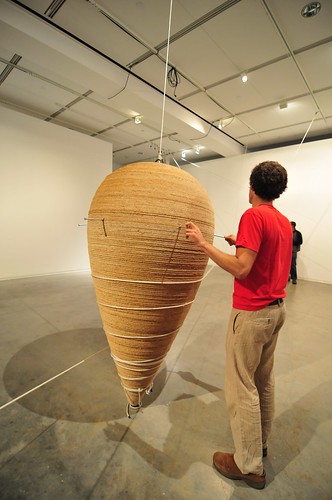
The most fascinating piece in my opinion was this gigantic spinning top by Jacob Tonski
called “Big Top.” Bit as in Gigantic. It exuded mass and angular momentum and the force of that gigantic, hard to move and hard to stop things — war once engaged, promises once given, debts once incurred. The piece was tactile, silent and alluring while also having a quiet danger to it. It was also quite an intriguing apparatus, with a large articulating pulley and weight system to set it on its way. The set up involved holding pins inserted into the huge top and rope wound and wound around the top, while a block of weights rose, partially assisted by a small electric motor connected to a car battery. Once set in motion, the top quietly spun heavy and fast. During the set up, we were cautioned to step back — the holding pins would fly loose under centrifugal force once the weights were released.

Big Top Jacob Tonski from Julian Bleecker on Vimeo.

20080515_19-11-20

20080515_19-05-09

With the top spinning it become impossible not to get as close as possible — even to touch its rather knotted wooden surface (like..ouch.) To me it was a bit like the moment in Kubrick’s 2001 when the black monolith first appears — it was big, silent and entirely compelling.

20080515_18-29-25

Gil Kuno (GII K) Pogophonic was a rather large and apparently physically demanding pogo stick that triggers sound samples. (Another) connection between physical action and digital control of sound and music. (Similar in that regard to probably many other projects, somewhat like Skatesonic.) I enjoyed the playfulness of the project and its physicality quite a bit and it was genuinely fun to watch. It didn’t even matter that there was a somewhat vague association between the stick’s actions and the sound — it need not have been the “mechanics” of the interaction for all I care. Even if GII K said so, and there really wasn’t, that would have been fine in some sense. What I mean is that the artists or performers of pogo’rs merely pogo’d to the sound, or if the sound was live dj’d and the pogo’rs pogo’d to that, I think the effect would’ve been the same for the audience, in fact. In that regard, it could’ve had a somewhat theory-oriented angle in that it made fun of the usual audience response to interactive art, which is to ask, almost before everything — “how does it work?” Which seems to me to be the central departure for “interactive art” or “art-technology” from unwired art. Lately, this point and the question — how does it work? — has become almost annoying and a bit of a distraction from the experience of creative wired work. Where are the wires? How does this connect to my action or activities? The effort is to “figure out” the work at the instrumental level. In some sense, that may be a mark for me (just sayin’..) of what is compelling art-technology versus Make Magazine style hacking.

20080515_18-44-16

What else?

I was initially quite excited by Zach Blas design-product piece called Queer Technologies. The installation was set-up as a provocation at the intersections of consumerism, art and politics. Queer Technologies was the name of the piece, as an “organization” (like a company) that produces products, like theory products, that are tools for “queer agency, interventions and community building.”

Projects [products] include transCoder, a queer programming anti-language; ENgenderingGenderChangers, a “solution” to cable gender adapters’ male/female binary; Gay Bombs, a technical manual manifesto that outlines a “how to” of queer political action through terrorist assemblages of networked activism; and the Disingenuous Bar, a play / attack on apple computer’s genius bar for tech support that offers a heterotopic space for political support for “technical” problems.

This is very intriguing to me — working within the representational tactics and logics of consumer capitalism with boxed software that is a “queer programming anti-language”, the (not terribly original, but still interesting) “Gender Changes” (the name given to devices that switch “male” plugs to “female” plugs as is sometimes necessary when connecting devices together), and a technical manual that is a kind of mainifesto of queer political action.

Okay, interesting — initially very exciting conceptually. Sadly this piece entirely knocked the wind out of the experience I had (I literally was upset, and no longer interested in sticking around) because the artist was selling these items at ridiculous prices. The software was $150 and the manual $100. When I asked — “one hundred what?” I was told that these were “art prices.”

20080515_18-44-48

Boy, there’s a lot to say about this. Besides the fact that the piece ended up being such a downer for this reason, I saw an incredibly obvious disconnect between the objective of a critique of consumer capitalism and the artist’s attempt to insert themselves directly within the hyperbolic market of ridiculously priced mass produced items. I mean..these weren’t even hand-crafted goods. The boxed software contained some sort of optical media with the software (presumably) on it. The books were in meter high stacks. For the sake of my intrigue with the piece, I would’ve spent maybe $30 for the software (and likely just kept it without any expectation of it doing anything — just for the spirit of the pieces anti-product productness) and about the same for the manual. I certainly wasn’t going to fork over $250 for these two things, even if I happened to have that kind of scratch just sitting in my wallet to buy a piece of mass-produced something.

Exit Strategies indeed. I went straight out the door, saluted the Serra and headed home.

20080515_18-33-47

Continue reading Exit Strategies. UCLA Design Media Arts 2008 MFA Exhibition