Maslow's Hierarchy of Magazine Browsing

Sunday March 29, 15.28.43

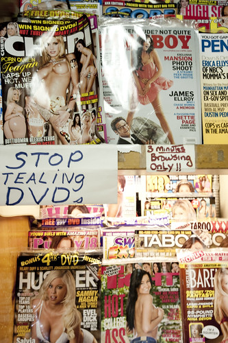
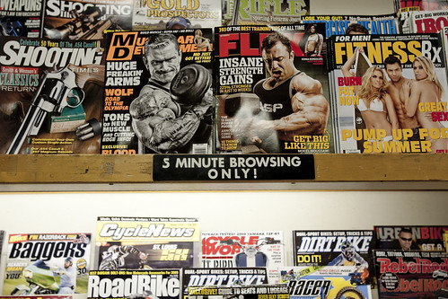
15 Minute browsing limits for the tacky beauty, fashion and narrowcast hobby/sport magazines.

Sunday March 29, 15.28.20

5 minutes for muscles, guns, motorcycles and dirtbikes! Yeah!

Sunday March 29, 15.28.12

3 minutes for the DVD-pinchers prone to the back of the store’s rough-shod top-shelf collection.

Urban Scout Nicolas Nova (whose insights and conclusions on this same curious circumstance are here) and I spied this curious indentation in the cultural fabric of a local Santa Monica magazine stand, which, based on years of experience, is not known for its indulgent overlord. There is this peculiar hierarchy of browsing tolerances embodied in some raggedy, eye-level warning signage. These have a clear correlation to Maslow’s hierarchy of needs expressed in the limits one may have as to time spent perusing the thick, advertising-soaked magazines.

There is less time allowed for the physiological needs as expressed in the three minute limits for the filth, err..sex magazines; five minutes to quickly learn how to bulk-up with steroidal muscle so as to secure the safety of one’s person or find the proper riding technique for shooting from the hip while escaping riotous, foreclosed neighbors on a dirt bike; fifteen minutes for leisured indulgences in bolstering one’s self-regard by learning how to deliver an arrow-straight chip shot or dignify oneself with this season’s hippest trousers.

Why do I blog this? Intriguing rules and enforcement structures that embody social rituals. Even these simple rules about what you can read for specific amounts of time are curious to observe and ponder. The embodiment of the social rituals are erected through constraints on browsing time, the threat of enforcement from the Main Street Newsstand overlord, cautions against ripping him off, etc. Together, the browsing limits ultimately create observable meanings and opportunities for insights as to the specific nature of these corners of our interests, activities, hobbies, dispositions and so on.

Some questions that arise: What are the ways that culture is established and maintained through limits and threats, whether implicit or explicit? How do our needs and aspirations reflect themselves in everyday, quotidian rules, even the ones that are not necessarily stated as explicitly as these ones? How do rules, such as these, and admonishments, such as this one not to steal, which should be obvious, tell larger stories about the conditions of everyday life, as well as the mundane experiences of these simple facilities, like newsstands? How might these sorts of rules and limits be actualized in this context? Would the threat of transgressing the limits be enough, or must an enforcer dispense admonishments directly? How does this scenario play out in the near future of eInk magazines and Kindle 3.0? Would pages fade away after the browsing limit expires? In this case, would the rituals of browsing change directly if the limit is instrumented as a kind of security/enticement mechanism?

Continue reading Maslow's Hierarchy of Magazine Browsing

Kubrick Anthem

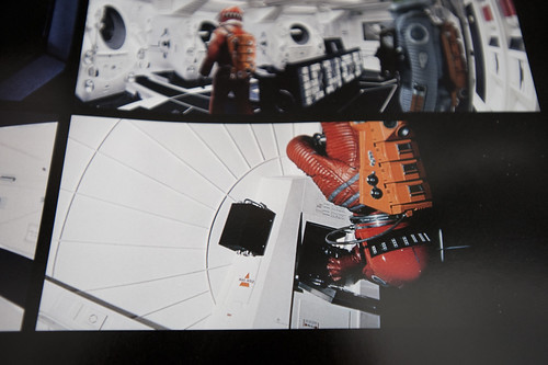
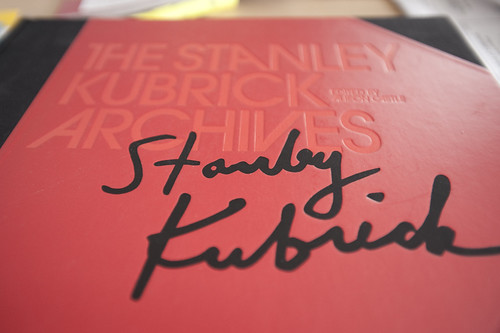
A page from the 2001 section of the amazing new Taschen edition – The Stanley Kubrick Archives. I’m emphasizing 2001: A Space Odyssey here, but this wonderfully designed book covers Kubrick’s film oeuvre.

As I’ve been digging up materials on the design fiction topic, and sending my search beyond the Google into the backyard shed, which includes many cardboard boxes that were sent to myself from New York City to Los Angeles back in 2004, I have had a chance to plunge myself into welcome nostalgia. I found my old
Star Trek: Star Fleet Technical Manual and a copy of The Making Of Kubrick’s 2001.

I remember browsing through this “Making Of” book as a young boy, not reading it so much as looking at the pictures of spaceships and wondering how they were built. I mean – I knew they weren’t real, but I was fascinated by the production aspects, the model making and so forth. The ways and means of creating “special” effects for the film. All of this decanted into some early Super-8mm experiments involving disappearing Cowboys pursuing befuddled Indians, somehow involving my brother and neighborhood chums. Anyway..

This latest Kubrick purchase I can highly recommend for folks with large coffee tables or broad bookshelves. It’s a prodigious collection of stills from all of his films, as well as wonderful backstory insights and production notes and nuggets. For the extent of the material, the richness of the film stills and all this, I’d say this is a strong buy, or one for the wish list, certainly. The book contains stills from the films, meticulously reproduced from original negatives, insights about the production of each film through visual stories, production stills and so on. Also included are some new essays.

(There seems to be some sort of Kubrick revival or renaissance or maybe that’s just my observation. In fact, it must be. I think there’s a Kubrick ghost living amongst me. The night before he died – news that came to me over the morning radio while I was living in Brooklyn – I swear my father and I watched The Killing on a VHS tape. When I came downstairs and told my dad the news, he thought I was pulling his leg, the coincidence being rather bizarre as we were not given to watching Kubrick as a matter of course. I’m not entirely sure what’s going on. I’ve only just now noticed Matthew Modine’s book called Full Metal Jacket Diary of his notes and photographs from his experiences with Kubrick in Full Metal Jacket that I stumbled across just Saturday at Family bookstore on Fairfax. It’s in a curious metal covered design and rich with photographs; certainly a significant contribution to the wider Kubrick mythos. That same day while in the Otis College of Design library, the Spring 2009 issue of Cineaste had an article by Tony Pipolo called “Stanley Kubrick’s History Lessons.” There was one other magazine with a cover story, but I forget what it was.)

Continue reading Kubrick Anthem

Chat With Holly Willis of Blur + Sharpen

Saturday March 28, 11.52.40

Ben Maltz Gallery at Otis College of Design. Closing day for the Future Imaginary exhibition. Where on earth is this? It’s here.

My USC chum Holly Willis did a fun email interview with me for her Blur + Sharpen blog. Below is our fun exchange, which is a discussion of process which is something i am curious about. (More than products of processes for the time being.)

Sometimes I have the best job! This week I’ve been interviewing people about their presentations – the talks they do at conferences and other events – and it’s fascinating hearing how people “write” in the hybrid form that is the visual/verbal presentation. I traded emails yesterday with Julian Bleecker about his presentations, which are stellar. Julian is a designer, technologist and researcher at the Design Strategic Projects Studio at Nokia Design in Los Angeles; he’s also the co-founder with Nicolas Nova of the Near Future Laboratory, their design-to-think studio.
I think of Julian also as a public intellectual in the sense that he actively cultivates a world of shared ideas and experimentation. One of the things about Julian’s presentations is that they’re visually rich – it’s not just that his images are beautiful and provocative, often working at the level of metaphor. And it’s not just that he plays with scale, repetition and pattern. It’s that the visuals and the words and the “performance” of the presentation all meld in very pleasurable ways. Plus, he “works” the material for a while, until the ideas take shape in some new form…

For example, a few days ago, he posted an essay called “Design Fiction: A Short Essay on Design, Science, Fact and Fiction.” It grew out of work he’s been mulling over for a few years, partly in conversation with pervasive computing scholars Paul Dourish and Genevieve Bell. He’s presented the ideas publicly but then produced a printable version for distribution; the design of this version highlights Julian’s skills, but more than that, it suggests the power of design as a mode that productively unites thinking and making. Julian describes the designed essay as “a written kind of design provocation,” adding that for the last few months, he’s been doing more writing than soldering. “The two practices,” he explains, “contribute to the same set of objectives, which is to make and remake the world around us, provide new perspectives and evolve a set of principles that help make the making more imaginative, more aspirational.” I think this is a pretty decent mandate for one’s work. Anyway, here’s our exchange:

Where do you get your visuals? Do you create them or find them or both?

They’re either photographs I’ve taken for one reason or another, or photographs I take for the purpose of illustrating an idea, or other people’s photographs I’ve asked to use, or just straight frame grabs from films or scans from other material. I take lots and lots of photographs that are often visual thoughts or observations about some usually peculiar social practice or something like this. Something that might spark a short idea…

When you start to craft the visual part of a presentation, where are you in terms of the presentation? In other words, do you start with visuals and then think about what you’ll say? Or do you script the whole thing, and then go and find the visual complements?

Depends on the material. For this design fiction thing, I basically wrote it all, much of it in long hand that I then transcribed into text on the computer. There was very little in the way of styling or juxtapositioning of words with images, but there were some images that defined the canonical bits of ideas. That all mostly came together in the three presentations at Design Engaged 08, SHiFT 08, and this Sandberg Instituut Amsterdam presentation for their Moving Movie Industry conference. I pretty much knew what i wanted to say, at least in my head, but i was searching for the right language and structure. The images helped in the stand-up presentations to anchor some of the ideas. Some things got tossed away because they couldn’t make them make sense even if the intuition was there. So, i guess i started with a vague sort of architecture, then stubbed in images to help tell the story whilst standing up in front of people who probably aren’t interested in watching me read something. Then, i started writing something out with a marker in one hand and a cup of coffee in the other, with lots of repetition, trying to get the beats right. Then i transposed that into digital form as a simple text document, working and honing that and then eventually put that text into InDesign and started laying it out alongside of and between images, while also continuing to wordsmith and that sort of thing. The “sidebars” – the sort of parenthetical examples and notes and stuff – were mostly written in InDesign as good examples occurred to me or were suggested.

How would you characterize the relationship between what you say and what you show?

The showing has to be as impactful as the telling wants to be. Maybe this is partly a response to these new kinds of media literacies, or maybe its just my own tendency. Even as I look back at my Masters thesis which I struggled to make visual (PageMaker on an friend’s Mac II), the images were at the heart of things. They told the story as much as the words, and filled in the gaps where the language needed joists and supports or protection from the inevitable (and sometimes productive) misreadings. That sort of thing.

What is the culture of the presentation in your field?

I’m not sure I have a field, but last year and this year and perhaps into the 2010 I cordoned myself mostly into only doing things that have the word “design” somewhere in the description of the activity/workshop or event. In that plot of land, I hope the culture of the presentation is primarily communicative – circulating ideas and provoking. I think this is what this culture is most of the time. You get the odd “sell” presentation here and there, but most of the settings in which this sort of thing gets shared I would say are in between “here are some ideas I have that I want to share” and “this is a section of a book I’ve written/would like to write/will never write, but it helps to think I might.” Sometimes they are school work or in that category that have leeched out into different cultures….
Continue reading Chat With Holly Willis of Blur + Sharpen

Meet The Disabler: Ubicomp Futures Now

03102008_185340

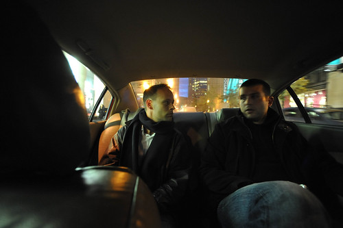
Dashing off into the ubiquitously connected crisis of effects. Montreal, with two chums in the back seat educating me on the consequences of a world of ubiquity — one in which everyone is connected.

03102008_185805

Aaron and Raph poke around the topic — consequences of everyone connected with Aaron attempting to emit laser beam communications networks from his eyeballs.

From the vantage point of the “credit crisis” (really a crisis of trust, but it’ll take the perspective of historical reconsideration in the inevitable Ken Burns documentary 10 years hence to deliver that with some more authority than my just writing it) we meet a couple of near future design fictions. Two excerpts. First, read this one, which is likely familiar to you, if you’re one of my 4 regular readers.

The door refused to open. It said, “Five cents, please.”
He searched his pockets. No more coins; nothing. “I’ll pay you tomorrow,” he told the door. Again he tried the knob. Again it remained locked tight. “What I pay you, ” he informed it, ‘is in the nature of a gratuity; I don’t have to pay you.”
“I think otherwise,” the door said. “Look in the purchase contract you signed when you bought this conapt.”

In his desk drawer he found the contract; since signing it he had found it necessary to refer to the document many times. Sure enough; payment to his door for opening and shutting constituted a mandatory fee. Not a tip.

“You discover I’m right,” the door said. It sounded smug.
From the drawer beside the sink Joe Chip got a stainless steel knife; with it he began systematically to unscrew the bolt assembly of his apt’s money-gulping door.

“I’ll sue you,” the door said as the first screw fell out.
Joe Chip said, “I’ve never been sued by a door. But I guess I can live through it.”

This from Philip K. Dick’s hysterically prescient Ubik It’s like a near future design-gone-absurd style guide for the Ubicomp wonks. Read it, immediately, if you have not already.

Okay. Now, read this one, from a little known writer called Jonathan Welsh.

Jamie De Lisle’s Buick had been warning her for days, first with a flashing yellow light, then a flashing red light. But the 31-year-old mother of two from Collinsville, Ill., was too busy to heed the distress signals. It was only when Mrs. De Lisle began hearing an incessant beeping that she took notice: If she didn’t make her car payment that day, the vehicle wouldn’t start the next day.

The repo man has found a new hiding place — inside your car. Increasingly, used-car dealers are installing remote disabling devices that keep the cars from starting if the buyer gets too far behind on payments.

These so-called disablers, palm-sized devices that are placed under dashboards and wired into ignitions, once were limited to what industry insiders call the “buy here — pay here” segment: the kinds of small used-car lots that line state highways, strung with lights and multicolored pennants. But as the economic downturn deepens, larger, more mainstream dealerships are using the devices as a condition of financing.

That’s from a story by a fellow called Jonathan Welsh titled Meet the Disabler found in a collection of short stories also known as news articles in the fascinating Wall Street Journal.

Why do I blog this? An excellent instance of correlate design fictions — things that have anticipated and sketch out the on-the-ground, everyday, quotidian experiences of possible near futures through science fiction. And, another reason to possibly read some science fiction as design sketches of these possible futures. In the first instance the P.K. Dick design scenario of a ubiquitously networked “smart” door that is able to express itself to the door’s leasee.

This sounds ridiculous, of course. But the backdrop, if we extend the failure scenario, is, say, the Simpson Door Company finding its course of resonance with people’s expectations about what previously “dumb” things become. They decide to explore networking their doors for, say, home security that is embedded within the objects proper (doors, windows, door knobs, etc.) rather than separate devices put in door jambs and window sashes. So, Simpson Door Company makes smart iSecure line of doors and windows with embedded smart computation and voice xml processors so you can talk to your doors — and they can talk back. They’re all hooked up through a nice, comfy-sounding creative commons protected open source API, with REST-ful networking so you don’t have to articulate the door to get it to change its color. There’s a built-in Asterisk telephony server so your phone calls follow you as you move around the house, with the doors and windows acting as large surface sound transducers. Your house, is a speaker-microphone. Then, there’s the rock-bottom edition for more dicey installations, like in shitheel day rental apts because the economy has really tanked and lots of people work day-to-day jobs that come with bunkhouse housing paid for with a bit of government stimulus to keep 1/3 of the population from being officially, certifiably, miserably homeless. Nothing stops the taskmasters from installing pay-to-egress and pay-to-ingress Simpson Door’s. So..they do.

The lines between the science of fiction and fact are like a gradient. Speculation is not forecasting, it’s making weak signals legible as possible near futures.

What is intriguing here is that the “perfect” operational scenarios hardly consider the frankly more likely scenarios that are quite a bit grittier than what gets “pitched” as the beautiful, perfect world. But, there’s a rut that is difficult to get out of, which is that people won’t buy into things that have these gritty potentialities to them, if the gritty potentialities are used as the design baseline. I find the bumpy edition of design scenarios far more compelling, perhaps because of this generally critical, sideways glance I take on these things. I want nothing of Pink Ponies and this sort of kempt future world of perfectly manicured lawns and delicate flower beds behind walled and gated borders. Terribly boring. On the other hand, pointing out the failed scenarios is also useful for talking through larger contexts such as — what experiences and circumstances yield things like The Disabler and the Door That Sues. It’s not the technical artifact that is at the heart of things. Rather the technical artifact — the ubicomp door and car — provide a way to tell stories about larger social systems and the consequences of, in this case, this financial/credit/honesty/trust crisis, which is more significant than the individual instrumentalities like these positively intractable, illegible financial instruments which were instruments of deception more than any sort of legitimate risk mitigation algorithm.
Continue reading Meet The Disabler: Ubicomp Futures Now

Arranged Things

Saturday March 21, 12.17.20

Found items, Saturday noon, arranged thusly.

Saturday March 21, 12.16.37

Further indication of a rather polite evening’s activities. Broken bottle, top half. Not smashed. Or smashed into something. But, placed carefully. Arranged things.

Sunday March 15, 16.27.37

Further arrangements. My friend Tod called this one “Larry, Curly and Moe.” Get it?

Friday March 20, 15.21.43

More purposeful arrangements. Capacitors, large ones to handle the switching effects of 12 volt solenoids, placed in a recently assembled circuit board.

Friday March 20, 15.09.18

Burnishing brushes for a Dremel, arranged in their holding bin.

Why do I blog this? Observations that caught my eye. Things arranged with purpose. Thoughtful acts. Practices and constraints in which things assume their “proper” place. Remnants of reviewing old grad school reading lists, especially Sorting Things Out: Classification and Its Consequences by Geoffrey Bowker and Susan Leigh Starr. It’s a wonderful treatment on the ways in which categories function as embodied social practice. The purpose and utility of boundaries between things, disciplines, people, actions, specifically around organizing, disciplining, classifying, cataloging. All that good taxonomic stuff that we social beings tend to do to order ourselves and our knowledge. If there’s a lesson for me in that book its about unclassification and undisciplining, especially when the boundaries become so accepted that they discipline even in their absence. New things, new futures, innovation mean pushing away from older orders of knowledge and practice.

Anyway.
Continue reading Arranged Things

Upcoming Travels and Talk: Design Connexity

From April 1 until the 3rd I’ll be at the Design Connexity conference as part of Eighth International Conference of the European Academy of Design. On Friday the 3rd I’ll give a talk, probably on Design Fiction or Prototypes and Special Effects, rehashing and rethinking some material from my dissertation.

But, seriously. Check out the conference themes.

Design Boundaries

In a post-modern digital age we can witness attempts to combine art and technology crossing the boundaries in what was originally described by C.P. Snow (1959) as the ‘two cultures’. Snow’s fundamentally convergent position sought to expose the cultural divisions between art/humanities and science/technology. New design courses are being developed that embrace the concept of transdisciplinarity, moving beyond traditional subject boundaries. This theme invites papers that explore the boundaries between disciplines and professional practices, for example between design and architecture, design and craft or design and fine art.

Responsible Design

Designers are often cited as being major contributors to the ever-growing problem of waste as landfill sites fill up with discarded products that were designed without any consideration for recycling or reuse. Responsible designing makes it imperative that new products are designed with ‘cradle to cradle’ vision. This theme invites papers that explore the issue of responsible design, developing new strategies and insights into how this may be achieved.

And the favorite of the Near Future Laboratory Theme Evaluation Division:

Anti-Design


The Ad Busters web site states that: “We are a global network of artists, activists, writers, pranksters, students, educators and entrepreneurs who want to advance the new social activist movement of the information age. Our aim is to topple existing power structures and forge a major shift in the way we will live in the 21st century”. Is this the beginning of anti-design, a reaction against our material culture? This theme invites papers that challenge our notion of the role of design in the 21st century.

Continue reading Upcoming Travels and Talk: Design Connexity

Mixed Food Culture Messages

Friday March 13, 20.10.06

Friday March 13, 22.32.47

Friday March 13, 20.35.23

Clearly. Sushi.

Friday March 13, 20.36.31

..and a placemat with Korean warnings about things in the food, and a lovely little beer glass with Hite, the Pabst Blue Ribbon of Korean beers (and wonderful for that..I’ve had my share there in Seoul). This was taken at Arado Restaurant, Whilshire and Wilton in Los Angeles.

A great Sushi (I guess..) restaurant on Wilshire and Wilton in the prototypical mixed use mini mall in Los Angeles. Four grown adults well-served with entrees, appetizers, plenty of better-than-good American sushi, beers, the works for $109, tax excluded. That’s reasonable to me, considering the next night, two beers and two sausages at the hipster downtown spot set a couple back $32.

But, what I found most intriguing about this place was that it was own and run by a Korean couple. Whilst I did not find out the motivation behind opening a Japanese style restaurant with sushi bar in the borderlands of Los Angeles’ Koreatown, I was curious. I wonder — where and when do these kinds of cultural borders get crossed and where are they allowed to transcend the typically hard-and-fast boundaries they define?

Why do I blog this? Curiosity about where and under what circumstances culture transposes.
Continue reading Mixed Food Culture Messages

Thoughtful Acts, With An Appropriately Snarky Attitude

Sunday March 15, 16.29.56

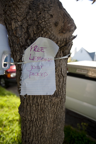
Neighborly offerings. Fruit fresh from the tree is often found out and about in Los Angeles.

Some observations of peculiar social practices found from last Saturday’s head-clearing perambulation. There was this, first as I approached from this tree from the eastward.
People lucky enough to have fruit trees often have more than they and the resident squirrels can consume themselves. Offering some up to passersby is indeed a thoughtful act. Often, the fruit looks like fruit properly should; not the curated spheres you find in the supermarket. The wonderful Fallen Fruit Collective does their urban incursions based on a proliferation of fruit trees that overhang the public/private property borders around various cities. I understand they got their start here in Los Angeles — Silverlake is what I’m told.

Sunday March 15, 16.29.21

Bags for those forgetful dog walkers, and pointed advice in the form of a veiled threat to the more reluctant who engage in the converse Thoughtless Act of not picking up their dog’s poo.

On the verso of the same tree, a thoughtful offering of a different sort — advice and some supplies related to picking up after your dog does its business. My front yard has been bombed. A family remedy: liberal application of powdered red chili pepper in the grass. The challenge is in re-applying after the dew and sprinklers have dissolved the previous applique. It appears to work mostly through learned behavior. Dogs habitually deposit in the same spot, sniffing for the previous target. When they get a stinging whiff the first time, they remember to just avoid that locale and move along.
Continue reading Thoughtful Acts, With An Appropriately Snarky Attitude

Design Fiction: A Short Essay on Design, Science, Fact and Fiction

A couple of years ago, in a small discussion group while I was teaching at USC, Paul Dourish presented an early draft of a paper he and Genevieve Bell were working on. If you read this blog, you probably know the paper. It’s called ” ‘Resistance is Futile’: Reading Science Fiction Alongside Ubiquitous Computing.” It’s a wonderful paper for a number of reasons. What is most wonderful, for the purposes of this dispatch, is the clever way the paper creates a conceptual linkage through science-fiction-ubiquitous-computing. The idea that “science fiction does not merely anticipate but actively shapes technological futures through its effect on the collective imagination” and “Science fiction visions appear as prototypes for future technological environments” — well..this is really juicy stuff.

(Their paper is generally around in draft form, for better or worse, thanks to the Google. It’s forthcoming in the Journal of Personal and Ubiquitous Computing, which is generally only readily available to academics and researchers with access to pricey journals.)

Paul asked myself and a number of people to consider writing something like a response or further considerations kind of thing that could sit alongside the article’s publication. I started in on this last summer. Ultimately, for reasons that became clear as I was writing the essay, I decided that there would be more to be said than would be tolerated in a staid, expensive, peer-reviewed academic journal, never mind that there could possibly be a wider conversation beyond the ubicomp community as my thinking ran into film, design, fan culture and unanticipated other places.

The short bit I wrote ended up as “Design Fiction: A Short Essay on Design, Science, Fact and Fiction.” It’s available as a downloadable PDF, out there in the on The Near Future Laboratory’s modest puff of Internet Cloud. (Its various incarnations as slideshows and talks can be found here on Slideshare.)

ST-TechnicalManual_1

Schematics and parts list for the Star Trek communicator from the original series, of course. Speculation and imagination beyond the surface, imagining a more fully realized near future world. From Franz Joseph. 1975. Star Trek Star Fleet Technical Manual.

What is this all about?

Extending this idea that science fiction is implicated in the production of things like science fact, I wanted to think about how this happens, so that I could figure out the principles and pragmatics of doing design, making things that create different sorts of near future worlds. So, this is a bit of a think-piece, with examples and some insights that provide a few conclusions about why this is important as well as how it gets done. How do you entangle design, science, fact and fiction in order to create this practice called “design fiction” that, hopefully, provides different, undisciplined ways of envisioning new kinds of environments, artifacts and practices.

I don’t mean this to be one of those silly “proprietary practices” things that design agencies are fond of patenting. This is much more aspirational than that sort of nonsense. It’s part an ongoing explanation of why The Near Future Laboratory does such peculiar things, and why we emphasize the near future. The essay is a way of describing why alternative futures that are about people and their practices are way more interesting here than profit and feature sets. It’s a way to invest some attention on what can be done rather immediately to mitigate a complete systems failure; and part an investment in creating playful, peculiar, sideways-looking things that have no truck with the up-and-to-the-right kind of futures. Things can be otherwise; different from the slipshod sorts of futures that economists, accountants and engineers assume always are faster, smaller, cheaper and with two more features bandied about on advertising glossies and spec sheet.

Design Fiction is making things that tell stories. It’s like science-fiction in that the stories bring into focus certain matters-of-concern, such as how life is lived, questioning how technology is used and its implications, speculating bout the course of events; all of the unique abilities of science-fiction to incite imagination-filling conversations about alternative futures. It’s about reading P.K. Dick as a systems administrator, or Bruce Sterling as a software design manual. It’s meant to encourage truly undisciplined approaches to making and circulating culture by ignoring disciplines that have invested so much in erecting boundaries between pragmatics and imagination.

Horizons_Cover

The American Institute of Aeronautics and Astronautics, a professional science fact organization, considers the way Arthur C. Clarke and 2001: A Space Odyssey has contributed to space travel in their April 2008 newsletter. Well worth the read for revealing the entanglements of science, fiction and fact.
AIAA Houston Section newsletter, April 2008.

When you trace the knots that link science, fact and fiction you see the fascinating crosstalk between and amongst ideas and their materialization. In the tracing you see the simultaneous knowledge-making activities, speculating and pondering and realizing that things are made only by force of the imagination. In the midst of the tangle, one begins to see that fact and fiction are productively indistinguishable.

Design is about the future in a way similar to science fiction. It probes imaginatively and materializes ideas, the way science fiction materializes ideas, oftentimes through stories. What are the ways that all of these things — these canonical ways of making and remaking and imagining the world — can come together in a productive way, without hiding the details and without worrying about the nonsense of strict disciplinary boundaries?

Wednesday March 11 2009, 195455

How did William Shatner change the world? If you’re wondering, allow yourself to enjoy the remarkable, campy and entertaining documentary (of sorts) called How William Shatner Changed the World Science fact and science fiction are given a good stir in this show, which explores “the science behind the science-fiction of Star Trek.” Whereas Joseph’s technical fan art translates the science fiction into a speculative science fact, this short, campy docu-film follows William Shatner, playing William Shatner, trotting about the world pointing to the ways that Star Trek influenced real, science fact in the world today. We see interviews with real people — scientists and technologists mostly — who have anecdotal stories about how Star Trek inspired their breakthrough ideas, or provided a backdrop near future imaginary for their aspirational thinking.
Saturday April 23 1994, 000000

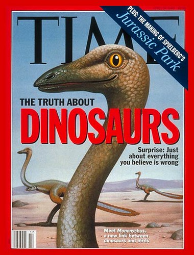
The intermingling of science, fact, fiction, production is exhibited on this ancient cover of Time Magazine, 14 years ago during the last Jurassic Park (the movie) dinosaur craze. (Read this closely: it contains truth, a science, a film, a correction to your grade school knowledge, and special effects made props/prototypes of science.) Curious crosstalk between science fiction and science fact, genetics, science politics and museum exhibition design was energized by this Spielberg/Crichton/Horner collaboration. Horner? Who? He is the swaggering outlaw paleontologist hired on by Spielberg to serve as a technical consultant – who was also the basis for the thinly veiled Sam Neil character called Alan Grant in the film. He held a controversial theory that dinosaurs were more bird-like than previously thought. This was a minority view in the paleontology (the science) community. But, with the film and his participation as a science consultant, it was a view that became bolstered way behind the possibilities of peer-review, patient experimentation, annual science convention discussions and scholarly arguments. If you need more convincing that the science of fact and the science of fiction are all tangled up, and can be productively intertwined, read on.
Thursday July 03, 03:04:17

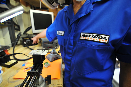
Aspire, imagine, make the future you want.

I’ve written more about this, from some conversations with friends and colleagues last fall. It’s here, in this PDF called “Design Fiction: A short essay on design, science, fact and fiction.” It started at that discussion group with Paul in 2005 or 2006, and evolved into something I presented last fall at the Design Engaged ’08 workshop in Montreal, then the SHiFT 08 conference in Lisbon last October, then at the Moving Movie Industry conference, finally at the O’Reilly ETech 2009 conference.

Subsequently, this topic has been taken up in a variety of forms and venues. Bruce Sterling has a wonderful essay on the topic in the ACM Interactions journal. And I organized a panel at South by Southwest 2010. with Bruce, Sascha Pohflepp, Stuart Candy and Jake Dunagen with Jennifer Leonard doing an excellent job of wrangling and moderating. (The video should be available in a month or so from mid-March 2010.)

By request, here is a Design Fiction Printable Edition that will print on normal, human paper, to scale on 8.5×11.

Why do I blog this? A written kind of design provocation. For the last several months, there’s been a bit more word cobbling than wire soldering. The two practices contribute to the same set of objectives, which is to make and remake the world around us, provide new perspectives and evolve a set of principles that help make the making more imaginative, more aspirational.
I should also add that, when I was writing my master’s thesis on Virtual Reality some time ago (it’d have to be ‘some time ago’ for that topic), I wrote about science fiction meeting science fact, which was some of the earliest inspiration for this work, shared by the laboratory imaginary of the grad student “cyberfreaks” in the University of Washington HITLab and our reading/re-reading of Gibson’s Neuromancer during the early 1990s. Not just Neuromancer but all kinds of science fact/fiction. The simultaneity of the science fiction and the military science fact that was the first Gulf War. I wrote about that, too, because I was being taught by the guy who made that military technology, which was an unpleasant experience, but one from which I learned a great deal about how fact and fiction can swap properties. That same curiosity led to further interest in visual stories and their role in understanding and making sense of the world around us, especially in science fiction film and video games. I wrote a dissertation on this, studying with Donna Haraway, err..when I was a young lad in 1993-95. Therein was a chapter on Jurassic Park as simultaneously science fact and fiction. We had plenty of lively discussions specifically on this film. (Sarah Franklin was visiting at UCSC then and wrote some really amazing stuff about science fiction and genetics out of that, back in the late 90s that appears in “Global Nature, Global Culture.”) There was a seminar paper I did on “Until the End of the World”, looking at the Sony Design concepts Wim Wenders used to create a compelling science fact within the science fiction diegesis. In there was one of the earliest bits of video game commentary (SimCity 2000) from a critical theory perspective, not that I care about ordinality, but some folks seem to. There was a chapter on the SGI Reality Engine, ILM and Special Effects in science fiction (mostly Jurassic Park, which brought me to David Kirby’s early work – he’s the guy who coined this phrase ‘diegetic prototypes’, btw) and science fact showing the techniques and technologies that allow media to cross from fiction to fact. And so on. In many ways, this essay is a continuation of these interests and one I share with a great deal of friends, colleagues and complete strangers, I’m sure. Lots of people are playing around in here, excitedly and eagerly swapping ideas and stories. It’s a conversation that’s usually quite energetic and fun. If the ideas herein intersect and entangle with yours, it means you’re a healthy, creative individual, aspiring for a better near future we all hope to one day to live within. It’s a waste of my time to say things like — yes, I’m working on that. Yes, I have been working on this while you were in grammar school. And to do this every time someone mentions something you are also thinking on? That’s just preposterous. I used to do that with students, or point out to them someone who has also been working on something they think they have thought about for the first time. Inevitably, for the younger students who think they’re the only ones in the world who thought about such-and-so idea — they shrink and pout and get petty and don’t realize that they are in a world of ideas and their uniqueness is in the doing, not the clamoring to be Sir Edmund Hillary climbing that hill for the first time. That’s an ancient, sick model of intellectual and creative cultural production. It’s a world of circulation these days, with knots and rhizomes and linkages between lots of activities.
And that’s all I have to say about that.

Finding The Way – HMC6352 Digital Compass

Friday March 13, 23:53:41

Since I was asked, and asked again, I’ll toss this technotopia solutions nugget to demonstrate that, despite the evidence demonstrated by recent public appearances and weblog postings, we here at the Laboratory are in fact still fully engaged in connecting wires amongst components. Components take a variety of forms, as do the wires. Sometimes bits of silicon strongly encased in hermetically sealed plastic. Other times, cultural components made of different materials. Observations and their conclusions take a variety of paths and sources of inspiration. We enjoy looking at curious people-practices, inspecting them for insights and stories to be told with a variety of resources: objects, images, words.

And so on. More on this point later.

In the meantime, an eager follower has asked for some simple advice that could have been dispatched in an electronic mailing. Instead, The Near Future Laboratory resources room has decided to fold that information into a weblog “posting.”

Wayfinding, of the digital variety has become exceptionally straightforward for those who are okay with writing a dozen or so lines of code for the handy-dandy Arduino and this HMC6352 digital compass which is available as a breakout board off the rack from our friends at Sparkfun.

The compass will give you a perpetual stream of degrees-heading from magnetic north and has interesting adjustments to let you make offset corrections and that sort of thing. It works simply, as all such things should be. It’s a TWI/I2C device, so you get it on the I2C bus, and send commands to its address (42h). Easy-peasy. If you’re doing anything like setting a RAM or EEPROM register, you send the approrpriate command and address. But, for the most part, you’ll just want to tell it to send heading data, right? That’s simple — send the letter ‘A’ (41h) and back comes the heading data. That’s it. Send an ‘A’, get a heading. Send an ‘A’..get a heading. Over and over, or as often as necessary.

Done.

Here’s some Arduino code to get you going!


#include

// http://wiring.org.co/reference/libraries/Wire/index.html
// On the Arduino board, Analog In 4 is SDA, Analog In 5 is SCL
// These correspond to pin 27 (PC4/ADC4/SDA) and pin 28 (PC5/ADC5/SCL) on the Atmega8
//
// These correspond to pin 27 (PC4/SDA/PCINT12/Analog Input 4) and pin 28 (PC5/ADC5/SCL/PCINT13/Analog Input 5) on the Atemga168
// The Wire class handles the TWI transactions, abstracting the nitty-gritty to make
// prototyping easy.

int address = 0x42 >> 1;
 int reading;
void setup()
{
  // this for debugging the data
  Serial.begin(9600);
  // set up
  CLKPR = (1<<clkpce);
  CLKPR = 0;
  // initialize the HMC6352
  Wire.begin(); // join i2c bus (address optional for master)
}

void loop() {

  Wire.beginTransmission(address);
  Wire.send('A');
  Wire.endTransmission();
  //delay(10);
  Wire.requestFrom(address, 2);

   if(2 <= Wire.available())    // if two bytes were received
  {
    reading = Wire.receive();  // receive high byte (overwrites previous reading)
    reading = reading << 8;    // shift high byte to be high 8 bits
    reading += Wire.receive(); // receive low byte as lower 8 bits
    reading /= 10;
    Serial.println(reading);   // print the reading
  }

//  delay(50);
}

Continue reading Finding The Way – HMC6352 Digital Compass