Apparatus at The HABITAR Exhibition

Wednesday June 17, 14.44.17

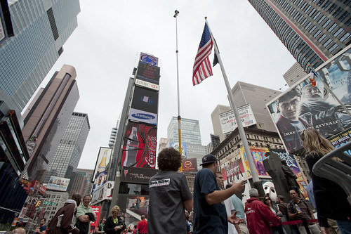
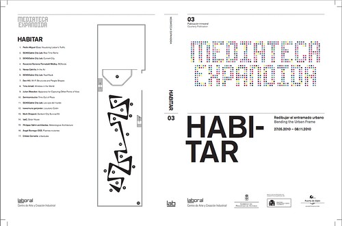
As Fabien has mentioned and due to his participation in curating the event, the laboratory’s Apparatus for Capturing Other Points of View will be exhibited at HABITAR. It’ snice to have this project reconsidered in an art & technology context. The exhibition catalog is available as a PDF here.

Originally this was a thought-collaboration after a Nokia colleague turned me onto this William H. Whyte small book called The Social Life of Small Urban Spaces. Whyte managed to capture the dynamics of urban parks and gathering points with the recording technoogy of the day — eyeballs, notebooks and some 16mm cameras. (You can watch some of it here and other places.)

HABITAR

It was a simple thing to get excited about — how might this sort of observation be redone in the early 21st century and what might be some curious things to look for? My own interest was to build the thing and make it a provocative instrument and then wonder what a video enhancement and post-processing of these images look like? Something algorithmic, I supposed — are there behaviors and movements that can be abstracted from the general hub-bub and rush of urban pedestrians’ lives?

You can find most of the videos here, and there are some new edits at the exhibition should you be in their neighborhood.

Continue reading Apparatus at The HABITAR Exhibition

Weekending 05282010

Thursday May 27 19:13

…well, it was a short week in the studio and more time spent pondering how to build out the new Laboratory / Man Lodge. Plans and actions. There was good conversations around the main project in the Studio — which basically translates to excelling at communicating what are already good ideas. In this particular sort of design activity, I am learning how important it is to translate keywords and metaphors over deep details and pleas. It’s all a team thing, bantering about the strongest sensibilities to enroll our allies and stakeholders increasingly. It’s a conversation ultimately, and less a “case to be made” sort of design exercise. Which keeps it light and fleet-footed.

There were some conversations with some colleagues about *multimodal technology, which I find to be a curious name, but still an intriguing, unexpectedly enjoyable discussion.

With the rather sullen decision that I won’t be able to fully participate in the 01SJ Festival with its Out of the Garage and Built Your Own World themes — these being near and dear to the Laboratory’s sensibilities, I plan on contributing to the catalog, which is probably just as well as any additional deadlines to help me complete a design / science fiction essay due end of July..well, those will help me finish it by the end of July.

Oh — ordered a pair of LinkM‘s..a new ThingM dongle to connect to I2C devices via USB, which makes it just a tad more convenient to control my old PSX project (a way to listen to a PS2-style controller as well as emulate one and thusly control a PS2 or PS3) with a computer rather than only an Arduino or other microcontroller. I have no idea why this might be interesting, but I’m curious to experiment with it.

What else? Only partially related to the Laboratory — some days were spent in the skate park after coming down the coast during these longer near-summer days.
Continue reading Weekending 05282010

More Peculiar Design Fiction Film

A recent post by @bruces sent me into a squirrel hole this morning, smoking out this NANOYOU project and its various techniques for helping people —particularly young people it seems, which is to say..the future — what the heck nanotech is. The one above is described thus:

**
An introduction to the strange new world of Nanoscience, narrated by Stephen Fry.

This film is non-commercial and funded by the EC for the NANOYOU project – nanoyou.eu – an education portal about all things nano.

This film was produced by Tom Mustill for the NANOYOU Project as a resource for young people, teachers and anyone interested to get a quick introduction to Nanoscience. Please feel free to download, embed it and pass it on!

The film was mainly shot at and with the assistance of the Nanoscience Centre at the University of Cambridge and features researchers involved in exploring the world of Nano.

**

This other one via @bruces (http://www.wired.com/beyond_the_beyond/2010/05/nanoyou-project/) depicting a neo-gangster noir pulling genre conventions from, like..*shrug* — All The President’s Men deep-throat-y vibes, CSI lab-geek-as-hero sensibilities, and tweeked out Minority Report gesturing on subway windows. A curious exploration with lots of Hockney-esque collage of little moments from films and what looks like 1980s adverts of the-future-is-the-printed-circuit-board whip-pans of surface mount electronics and reflections in lab goggles. Lovely, too.

***
Tramway Fantome

By Alexandre Simeray and Mehdi Brahamia

This film was made in the context of the NANOYOU project. http://www.nanoyou.eu

Scenario: Story of industrial espionage featuring an enigmatic, mysterious mode of transport that discredits banality.

Technology: Touch screen, augmented reality, creation of antimatter using special effects through a lens, nano-crystals, camera and 3D animation, sensor networks, positioning in existing networks.

Values: The desire to share the essence of our project in a more or less serious way. Our project is highly technical, to render it credibility without losing interest. This video is a prelude to the release of the project as if it would be an advertisement.

Design Fiction Pictures Presents: Earth to Luna

A suggestive and left-to-the-readers scrap of net-archeology found at http://desi-fi.posterous.com/earth-to-luna — a title card for a design fiction film? By Design Fiction Pictures? Lovely.
Continue reading Design Fiction Pictures Presents: Earth to Luna

Week Ending 052110

Stamen Aphorisms

Good to my habits, I’m nearly a week behind weeknotes. No matter — they are more notes-to-self than anything else.

Last week — the one that ended on Friday the 21st — was a week of busy-bodying some knowledge for a small audio electronics prototype, which included remembering how the heck Op-Amps work. Clearly I was in need of some making activities because this one became obsessive. ((I haven’t been in the shop in weeks and I’m becoming symptomatic.))

Matt Biddulph visited the studio, which was awfully nice to be able to share some of our work with a sympathetic earball, and then to hear of what he is doing in and around the Nokia battleship.

Started reading Obliquity in the hopes of finishing it to write up a small review but, well — it’s another one of those business books that was derived from a newspaper essay and probably should’ve stayed at that. There’s not much more that should be said, unless you’re into endless examples shoe-horned into a principle, about taking the *oblique approach to achieving a goal, enjoying the journey, following your curiosity and passion. And this translates, in the business idiom, roughly to examples of those who claim to have gone after what they believed rather than shareholder value and profits, which, in the examples, are shown to just *come when business leaders just do what their heart tells them to do. Actually kinda silly, really. I mean that in the kindest way, but, you know.. ((I was hoping for something closer to The Craftsman. ((Parenthetically, I found this other Obliquity: Speculative Fiction from the Pacific Northwest while poking around for the business-y Obliquity..maybe I should read that instead as a purgative.

Those are the highlights, I would say.

Continue reading Week Ending 052110

Wandering through the future

@chriswoebken spied this one — an art film by Marjolijn Dijkman (NL, if you couldn’t guess) called Wandering Through the Future in which the artist takes 70 science fiction films and uses them to explore how they imagine the future. In an interview, there are some curious and relevant sentiments surrounding the production of the film — particularly this observation that the nearer in the future the film takes place, the more recent the film is. It’s as if we’re trying ever harder to imagine a possible near future, whereas in the earlier days of science fiction film, it was expected to imagine some time far, far in the future.

There’s also a timeline that goes along with it, evidently, of stand-out quotes from the films. I’m guessing this time line is also apparent in a recent book

When I collected all the scenes for this project I couldn’t find a single optimistic future scenario. It started as a timeline of the future along which I placed all the films I could find according to the fictional date when they are set. The distant future is mostly represented through films from the early days of science fiction cinema, and in general the closer you get to visions of the near-present, the more recent the film.

Scenarios change from Barbarella rocking in her space ship in 40,000 AD to almost hyper-realistic and feasible scientific models of the future in which nothing is playful at all.

I think in the 1960s and 70s culture you could still imagine far future scenarios, but nowadays people are already so afraid of the coming 30 years that they cannot think ahead. We live in a science fiction future already; the future of sci-fi has shrunk from the day after tomorrow to today. Yet we should think beyond science fiction and face the future in a different way. The films which comprise Wandering Through the Future often represent a worldwide apocalypse – the entire earth variously becomes frozen, a desert, flooded, contaminated by influenza, a single totalitarian state or taken over by robots. Cinema here does not think of local scenarios or the possibility that different phenomena might happen in different places and at different scales. It’s important to stress that we cannot only paralyse each other with fearful scenarios for entertainment but we should also think of possibilities and create new scenarios to be able to imagine a long term future again.

Continue reading Wandering through the future

Design Fancies

Just came across this one, via @bruces over on <a href="“>Beyond the Beyond — a series of *design fancies created by Matt Brown which appear to be cleverly fictionalized designers to go along with these designers design fictions. Wonderfully inventive and I could see this sort of thing being quite therapeutic for normal, factual designers. You know — either imagine a colleague, or take a piss on the designer jackhole.

The image above is a book done by this designer — with two editions, one particularly rare.

Kurt Manchild was an author and inventor born in Jackson, MO in 1952.

From a fairly young age Manchild found that he had ridiculously vivid dreams of finished inventions. He spent his teenage years thinking that dreams like this were normal. It wasn’t until the ’72 National Sleep Science Association (N.S.S.A.) convention that he found out his dreams were unique. He spent the next few years talking with bartenders, clergymen, and designers about his deep sleep brainstorms and formed a whole new philosophy. Armed with this knowledge he wrote his first and only book, Silent Brainstorm: Ten Dreams That Every Designer Should Have at Least Once a Week. In the book he describes ways to trick your brain into certain dreams. He writes about the “Garage Sale Dream” where you go to a garage sale and see new products and then wake up and draw them. He also writes a lot about “Museum Dreams” where you would go to a design museum and it would be filled with amazing stuff that again, you would draw out upon waking. His book was a best seller in most of Europe and was available in two editions. The black version is semi-rare.

Why do I blog this? A very intriguing way of constituting an imaginary, design fiction concept. The strength of the imaginary thing — the design fiction — is elevated by the story surrounding it — it’s *backstory or moment of production, including the designer with a personality and a home town and so on. It’s a bit of an intriguing special effect of a sort that I should add to my modest catalog of design fiction genre conventions. Nice work.
Continue reading Design Fancies

Design Fiction Principles: Notes from Design for Screen

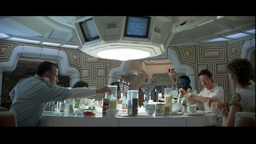
Alien Food

A relevant short essay by Piers D. Britton in theThe Routledge Companion to Science Fiction underscores some of the loose principles (loose, because they aren’t quite principles — more a swirl of useful insights) the Laboratory has been gathering around the concepts of Design Fiction. ((Why gather principles? Well, to understand how better to create/construct/author *Design Fiction))

In the essay, Britton starts out by emphasizing the importance of the visual and aural aspects of science fiction on the screen. This is obvious, of course — but worth underscoring because it relates immediately to the appearance of things that may not be real but have to be perceived (“seem”) real. Our common sense has to extend from now to the visual story — the appearance of otherworldlyness should be coextensive with what we understand today.

The point Britton emphasizes at this point is that design in screen-based science fiction works to create the appearance of a coextensive world — extending now to then. And that design for science fiction is oriented toward verisimilitude.

Well..so what, Britton asks. Verisimilitude is of limited value in itself. For him, the important corollary is that screen science fiction appeals to a “viewer’s sense of the tactile properties of unfamiliar phenomena.” I hadn’t really thought about the design elements in a film as textures, so I found this intriguing. Britton makes a broad cut through the history of screen science fiction delineating texture as an element of the design. ((For example, buildings, vehicles, weapons, etc.) He says that, in the 1920’s-60s, textures were modernist, sleek, streamlined, and that after the 70s, it becomes layered, scorched, rough-hewn, layered (cf. Star Wars, Blade Runner, Battlestar Galactica, Alien, etc.)

This I can follow — and its something I can vaguely recall thinking when I first saw Star Wars with my brother, with our much older half-brother carting us along. The banged-upness of the Millennium Falcon is one of these signals of a kind of verisimilitude that is drawn from the present to create a legible future (or past, in the case of Star Wars, but the direction of time matters less than the appearance of something that is *coextensive with today.)

Britton says that this by itself may not help understand the nuances of the screen science fiction genre. He’s curious about how design generate meaning? By looking at specific *texts, we may gather a fuller understanding of the role design plays in the story. But, first Britton takes a moment to point out his conviction that design imagery cannot possibly obscure the story. He says that design is spatial, narrative is teleological; narrative is words; design is not. “..rather than ask how design relates to narrative, as though the two had the potential to harmonize or quarrel, it is more productive to ask how design can operate within the whole imaginative and conceptual experience invoked by screen entertainment.”

((I guess there’s some sort of disagreement within the world of science fiction lit-crit people on this point — or maybe its just a disagreement between a couple of them — to emphasize the role design plays in the story. I think it may go along the lines of design and story being opposed in some fashion. Like — someone may feel that design ruins the story and, well I can imagine someone saying something along the lines of: “the book is so much better..the film just ruins the original story.” Or something like this. If I was still in school and not spending more time in the Laboratory, I might follow this one up. But — it could be an intriguing argument as, presently — I feel that design can tell a story, or pivot a story in a way that a narrative on its own cannot, which isn’t to say that a narrative is hobbled without design, but rather having a physical prop in the hand or on a screen does something that the story telling by itself is less capable of. And, even beyond this point — the making of the physical prop is a nice tangential, additional approach to figuring out the story itself.))

Britton then goes on to ask two questions:

* 1st: how does design uphold the “meta-reality effect” of science fiction?

* 2nd: how does design compel reflection and contemplation about the story’s underlying ideas?

These are two questions worth asking and I’d like to sort out the substance of them, but as far as how satisfying the answers, I’m only sure Britton answers them in a way that would be of use most directly to a lit-crit sort.

He uses two examples to address these questions — Blade Runner and Firefly. I’m not at all familiar with Firefly, but the point Britton makes about Blade Runner is easy enough to state to be worth mentioning.

Britton points out the specific textures of the fashion design in the film which serve to defamiliarize while still being evocative of recognizable forms. In Blade Runner, the costumes are drawn from the 1940s and the 1980s without becoming nostalgic. There is this *defamiliarization driven by texturing and contrasts (Deckard’s trench coats and Tyrrel’s vaguely art-deco octogonal glasses versus the punk-inspired costumes and hair styles of the rebel replicants, for example).

I find this bold contrast curious — this point about the collision of textures (punk versus the 1940s and art-deco) and the possibility that defamiliarization contributes either to this “meta-reality effect” or that it excites reflection on the underlying ideas of the story.

So, if I were to quickly conclude the most useful insight here it would be around this point — a subtle, defamiliarization that might compel the viewer/reader to step out of their routine, or what they might conventionally expect — this can go somewhere to “exciting” contemplation or a deeper engagement with the material than they might if they were seeing something they expected.

((Parenthetically, we’ve used this general principle I think to some modest success both in the design process and the communication of work — rather than showing things people might expect such as PowerPoint decks, bullet points or *slides — we might show a short visual loop and, much more often than not, the substance has nothing to do with what the audience might expect. It forces at least one question — what is this? And then you can answer the question and have a conversation.))

Why do I blog this? Some reading notes as I prepare some material for a talk on design fiction for the fall.

Week Ending 051410

Not A Drill

Well, the house is proving a persistent but not at all unwelcome distraction from blogging stuff, but that’s okay. Managing to set up even a M*A*S*H*-like *Man Lodge was mitigated by, like..unpacking scores of boxes containing mostly books, old disk drives or bits and bobs from the old Laboratory workbench. But, alas — the embryonic Laboratory / Man Lodge is clear enough to hold a desk, stereo and bicycle with room to pace contemplatively whilst sipping a tincture of Port in a purloined *Oriental Brewery beer glass ((evening) or mug of coffee ((morning)).

Enough.

Last week felt the blitz from weaving my brain back and forth between meeting builders and minding some quite engaging and provocative studio projects. Lots of fun in the studio these days. Maybe the second time in the *two years ((the anniversary for being a proper, full-time Nokian passed on Friday)) that I felt that a big project really was a big project. ((Not to say the others were not — rather that the calibre of engagement, requirements, expectation and leadership might suggest that this is not a drill.))

So — there’s been lots of work getting into the material, defining the shape and contours of it. This is the work of describing to ourselves what it is and what it means — moving from intuition and the vague vernacular of the *top-level, into the material itself. You run across the dips and bumps and questions that can only come from digging deep into the material in a very materialistic way. How do you translate intuition and instinct into something that is communicable beyond a vague — “it’s kinda like”? Clearly it takes time and a willingness to get beyond the unease of not knowing how to talk about something, or even those moments when you think — you know what? This is the stupidest thing in the world — no one will like this. We’ll be ridiculed.

In the midst of doing this it becomes clear that design cannot be done without the designing. You can’t just write or PowerPoint it. If you don’t break a sweat or nick a finger — if *you don’t — you’re not doing the design work. The things you find out from materializing an idea rather than just screenizing it — if you don’t get into the material itself, make the thing and keep making it over and over — you won’t find the depth of it.

And — you can’t just specify requirements, or get all high-falutin about the implications, or assume because you’ve stated your point but haven’t been able to enroll others in your mission that you’ve done the work. Cause, like..you haven’t. So..that’s that.

That current flowed through the week itself.

Then there was this crazy crit session at the USC Architecture School. Wow — Neil had his hands full. The architects he brought in were, like..I don’t even know. Rarely even handed with the students — maybe that was just apparent to me. I don’t really believe in critiquing by pummeling. Anyway — I said all I need to say in an earlier post. But — that was something I did last week.

The Drift Deck work continues apace, although we missed our call last week because of various and sundry commitments to other things.

There was a bit of play getting back into *Max/MSP for some prototyping ((never ceases to amaze me how Baroque that thing is — what a wrestling match)) and *Logic which is exploding heads in the Laboratory.

That’s it.

Continue reading Week Ending 051410

Five Advantages of The Concept of "Design"

((Via Unhappy Hipsters. The photo caption is: It was far more satisfying to relive their romance via iPhoto slideshow.))

The Unhappy Hipster site has the tag line “It’s Lonely In The Modern World” dryly shifting design toward self-mocking irony. Perhaps a kind of denaturing of the sublime intoxication home/interior/architectural design was once able to effect. Seasoning this with Latour, we might wonder if there ever was a modern world and if there were not — have we ever been lonely?))

I read — closely, but not obsessively — this essay by Bruno Latour that was delivered as a keynote at the Networks of Design meeting of the Design History Society in 2008. I pretty much read whatever Latour writes, and listen to whatever he discusses in lectures where available. Mostly because he can be insightful while also being funny, and there aren’t too many philosophers who can make that claim. But also because I find his work mostly relevant, or I make it relevant to this ongoing project of understanding design and comprehend how design is a way to circulate and create knowledge through the materialization of ideas. ((The bedrock of this project is a bit of science-technology studies, which is how I came across Latour some decade or so ago, a hobbled appreciation of actor-network theory, and my infantile understanding of the questions surrounding this “object-oriented ontology” thing.))

So, when Latour has an essay that proposes *a few steps toward a philosophy of design, I figure I should give it a look-see.

Continue reading Five Advantages of The Concept of "Design"