The Future Silicon Valley’s Billionaires Don’t Want You To See

JCB_20082014_195202_7606-Edit

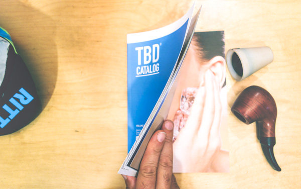
I want to share with you the latest book project from the Near Future Laboratory. It’s called TBD Catalog — the Design Fiction product catalog for the normal ordinary everyday near future.

You can get your own copy of TBD Catalog here in our own shop. We’re also a publisher now, in the modern sense.

TBD Catalog contains 166 products, 62 classifieds and advertisements to tell little stories about the world we are likely to inhabit if the exuberant venture capitalist handlers and computer programming day laborers of Silicon Valley have their way.

It’s a future quite different from the perfect, seamless, integrated, one-touch, Cloud-based advertising fakery used to make your pupils dilate with “wantfulness” — a want for cute connected family robots, software and plastic dongles ‘made with love’ and self-driving cars with impish earnest eager bumper faces and $9 drip coffee made with algorithmic precision and ordered ahead from an App.

The future represented in TBD Catalog starts with Silicon Valley’s breathless visions — and plops it down on the counter of your corner bodega. This is the future that comes in party colors. It’s the 3/$1.00 and buy one get one free future. Got your iPhone stolen? In the TBD future, if you’ve got ‘Find My Phone’ enabled, just use your Call For Backup App — we’ll send some licensed and disciplined toughs fresh back from Spec-Ops to knock on doors, fold their arms and growl imposingly if necessary. It’s the Uber of semi-private personal security.



Design Fiction


Design Fiction


With TBD Catalog our technique for employing Design Fiction was to follow today’s major “tech” trends and see where their hyperbole might likely wind up in some likely normal ordinary everyday near future — 3D Printers; Internet of Things; the Algorithmic Life; The Cloud; Machine Intelligence; New Funding Models; Mass Customization; Etcetera.

The TBD Catalog future is the near future ordinary. The constant low power and exploding battery future. The bad firmware bricked $800 device future. The lousy customer service phone menu UX and busted algorithms that send a hundred emails to the same customer and shift-reload doesn’t clear the error future. The bad monopoly network service conglomerate run like an accounting firm future.

That world. The one when ‘now’ becomes ‘then’ — after all the glitzy wearables/internet-of-things/self-driving car Kickstarter advertising TechCrunch blogger promises dull to their likely normal.

We did TBD Catalog because no one else has done so much to tell a story about the likely future beyond excruciating, mind-numbing white papers, link-bait blog posts and breathless “insights” from strategy agency reports that read as though they’re in league with the pundits who all basically work for the startups anyway. We wanted a perspective that was engaging, entertaining and probable while also insightful, generative and provocative.

Take a look around amongst the strata of futurists, insights reports, strategy assessments, TED Talks and the like. There is little to go on to ruminate about these trends beyond the vague “imagine a world..” fantasy scenarios and dreamy video pitches with earnest mandolin soundtracks. There are scant stories about a world when these trend-things are fully-vested within our lives in a way that doesn’t seem like the boom-cycle perfect world advertisement where we 3D print fresh licensed Opiline knife sets. The stories we get are either perfect utopia futures or the robot-zombie apocalyptic busted future with fascist jetpack cops chasing down malcontents.

TBD Catalog cuts through the middle to tell stories from a world where Nobel Prize winning technology is sitting on the counter of your corner liquor store in 23 different colors, all with a keychain and instructions on how to entertain your cat. This “ordinary” story is the one we’re working towards. These are the stories that are in short supply. Stories about our world when the extraordinary idea makes its inevitable journey to become the ordinary commodity thing that occasionally needs repair or a software patch for a security flaw.

TBD Catalog creates these sorts of stories by hinting at the implications of today’s ‘disruptions’ — by representing the kinds of products and services we might imagine in the near future and implying little corners of that near future world and the social lives around it. In TBD Catalog each product, service, classified advertisement and customer review is a bit of Design Fiction — a mix of trending topic plus designed object plus a small evocative story-description. Each Design Fiction is a little story about life in our likely near future world.

What are some of the stories in TBD Catalog?

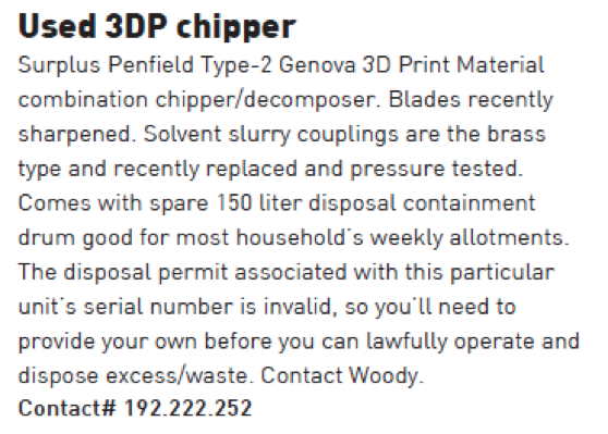
TBD Catalog tells a story about a world in which every household has as many 3D printers as they now have electric toothbrushes, and a lease-licensed 3D printer material waste disposal unit.


Design Fiction


Algoriture Design Fiction


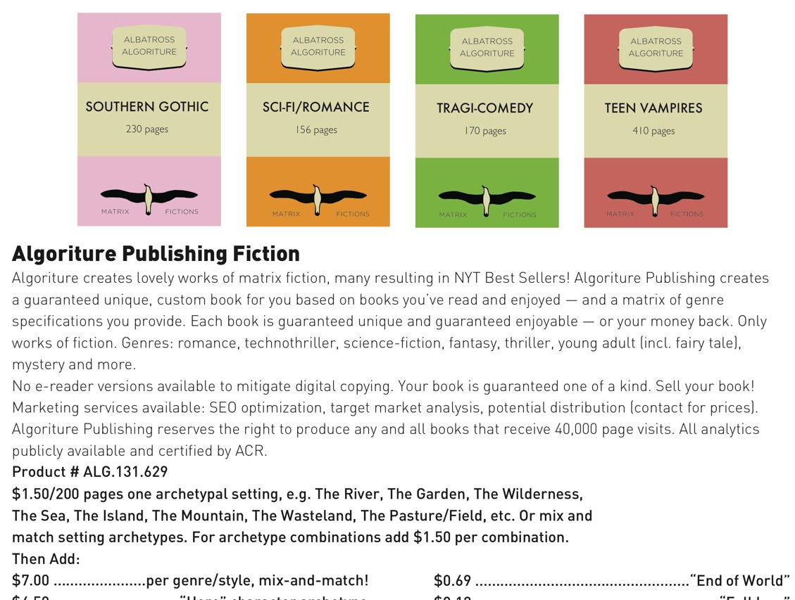
TBD Catalog reveals a world with bland “Algoriture” algorithmic literature optimized for trends, tastes and expectations and written by Amazon’s data analytic-fed intelligent bots rather than normal, human authors.

What about a world in which algorithms are so trusted, we allow them to find a playmate for our children, or the perfect “soul mate” for ourselves when we turn 18.

Internet of Things Design Fiction


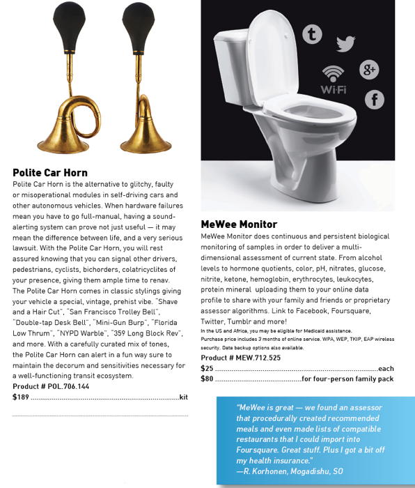
MeWee Monitor hints at what an Internet of Things world might look like if everything — the glass you drink with, the bar stool you sit on, and the bathroom door you lock behind you and the chamber pot you sit upon  — is connected to everything else, and lets the world know what it’s doing.

Why did we do a product catalog from a likely future? The Near Future Laboratory is of the opinion that whatever “comes next” should be prototyped not just in hardware and software (which we do, and enjoy) but through compelling, engaging, tangible moments that play out near future scenarios. Not only the spot-on-perfect advertiser-scripted scenarios, but the more likely and realistic moments as well. This sort of prototyping has imminent value as a means of shaping an idea, reflecting on contingencies, making things better and feel more full-vested in the world.

Design Fiction is a form of prototyping an idea. It’s a way of  reflection that can take an idea, trend or concept and intimate it in a more material form that can generate conversations that then reshape the idea into something better. Design Fictions have a remarkable ability to make that materialized concept come to life in a much more embodied way than specifications, one-pager or items in a PowerPoint bullet list. TBD Catalog’s Design Fictions take the promise of extraordinary and weird Silicon Valley aspirations and turn them into the normal and ordinary props that come to life as part of our everyday lives.

Design Fictions have exceptional value from a pragmatic perspective. They are more than entertainment. Design Fiction can operate as a viable approach to design itself — a form of exercising hunches without committing to full-blown execution. Design Fiction can find the tangential implications and alternative possibilities of your instincts — and then show a path forward towards sketching, testing and materializing your ideas. As a catalog in which your idea might exist in the future. As a fictionalized quick start guide. As an instruction manual or bug report. As a blogger’s review or customer service script.

Design Fiction is a creative instrument. It is truly a form of prototyping. It is an approach to design and strategic foresight that is actually generative. Design Fictions provide the basis for viable ideas, even in the idiom of satire. In their second reads, they become more — each of the 166 products has a “..huh” moment. There are dozens and dozens of Kickstarters in here, surely. And a few things in TBD Catalog we here at the Near Future Laboratory have actually prototyped — for real. Even some we’re pursuing after having our own “..huh..that could work..” revelation.

Let me be clear — we here are not opposed to the “next new thing.”  We are eager to entertain. But also — we focus on creating ‘next new things’ everyday. TBD Catalog is meant to remind us that every cool trend, every ‘wow’ gadget, and even some Nobel Prize-winning technologies become entertainment devices for our house cats or a faster way to stream crappy online ads. We need those kinds of likely near future representations — as alternative as they are to the glowing reports in your favorite trends blog — to focus ourselves on the challenges this world faces in light of rapidly changing behaviors, expectations, desires, rituals and algorithms.

Welcome to your near future normal ordinary everyday.

======
Buy TBD Catalog
Check out the work kit we used to create the products
Read more about Design Fiction
Green Pages

Nick and I came back again to the Emerge 2013 event at Arizona State University to workshop an issue of “Green Pages”, the Laboratory’s ‘Quarterly Design & Technology Fiction Almanac.’

For those of you who haven’t subscribed, or don’t know about it, Green Pages is Design Fiction operationalized. Green Pages makes Design Fiction into something the entertainment industry can use directly.

In Part 1 of each issue we curate a careful selection of imminent and emerging technologies, provide a brief on each. In Part 2 we select a number of these and provide authored narrative and cinematic elements that are one-page diegetic prototypes, elements of fictions, Macguffins, props, prototypes, conceits, etc.

An example of Part 2 would be a one page plot synopsis, or a bit of production design for a prop informed by one of the technologies introduced in the issue.

The stories in Part 2 for this issue are especially good. They do not make the technical element central, but rather use it as stimulus for a proper narrative. We spent a lot of time unearthing good, dramatic, character-driven stuff that wasn’t ham-fisted techno-thriller fodder. I’m excited by these stories — they’re quite compelling, evocative moments of larger dramas that could easily see their way to being produced in some form — film, pilot, novel, etc.

Since this is the first time we’ve mentioned Green Pages here on the blog, I should say that it is a trade publication — it’s not an art project, or flight of design fancy. It’s an edited journal for a specific trade audience — producers, agents, writers, production designers, directors, etc. It’s not a PDF — we print it, authenticate each copy of each issue, and mail them out like normal, human print publications.

There has been interest beyond Hollywood for a publication like this. That’s partially because of the content but also some interest in the approach we take to translating raw technology ideas into compelling narratives — scenarios, they’re called in other domains.

For the workshop here at Emerge 2013, we thought the general approach to creating these Design Fictions and diegetic prototypes would be a worthwhile learning experience for folks at a large research university like ASU. For example, engineers and scientists who perhaps could learn how to translate technical stuff into compelling stories that help them round out the purely technical idea (wireless power distribution, for example) with issues and implications in a broader sense. Working in a room with engineers, policy gurus, creative writers all at once — everyone with their game-face on — was truly exciting and extremely productive. We had some excellent, exciting starters .We managed to get a solid bit of work on them the first day. Then on the second day we had some super exciting creative work — a screenplay excerpt, page one of a novel, a film synopsis, character casting notes and production design for a key prop of eco-thriller.

We’ll be working over the next weeks to clean up the material — in one and a half days it’s difficult to really complete a full issue, printing and binding and all that. But we were able to get the core done and hand out a few to the Emerge participants.

Good stuff.


Arizona, February 2013

From the desk of The Editors

Welcome to Issue 7 of Green Pages.

This is a milestone issue for a number of reasons.

Firstly, our subscriptions have more than doubled since we first launched — and that happened entirely by word of mouth. This kind of growth is unprecedented in the trade journal world.

We’ve also received an unprecedented number of recommendations from you, our subscribers, recommending colleagues for a complimentary issue. Thank you for the suggestions. We are working hard to follow through and vet your nominations.

We’re also excited because this issue was done in collaboration with the Arizona State University’s Center for Science and the Imagination. This is the first time we’ve worked directly with a major research university. We hope this will set a new precedent for the way we create and curate our content.

Inside this issue you’ll find a diverse collection of our front pages containing concepts that range from biotech to counter-surveillance to prosthetic enhancements. There’s Swarm Robotics, Encoded Ballistics, Image-based Diagnostics, Foliage Penetrating Radar, Lab Grown Bone, Afterlife Cells, Surveillance Drone Mitigation, Depression Detection Systems, Lighter Than Air Vehicles, Billion Pixel Camera, Digitigrade Prostheses, Tracheal Scrubbers, Data Magnets, Predictive Vaccines, Nanoturbine Surfaces, Organ Printing, ‘Miracle Salt’, Svalbard Gene & Seed Bank, Vortex Ring Gun, and more. There are some very exciting, provocative research projects that are easily extended into the realm of story telling — and not all as purely techno-thrillers. We’ve developed several of these into one pages conceits and précis both cinematic and traditional narrative-based. We have some evocative production design as well.

Overall, we’re quite happy with this issue. We hope you enjoy it.

Dr. Bleecker and Mr. Foster (Eds.)

3Difficult

Bleecker has been pestering me to write this for a while now, but I’ve been wrestling with my point of view. Matt Webb has written a lovely piece here about the evolving notion of “product”, which has spurred me on, so let’s give it a go.

Matt Ward recently reminded me of an awkward conversation I had with BERG’s Matt Jones (there are a lot of Matt’s in here) about what constitutes a “product”. I steadfastly defended the tangible, but Jones was more fluid with his definition including services, content, the digital and the physical. I’m happy to admit that in retrospect I was wrong – clearly wrong, but why was I so inflexible? Why was I so dogmatically fixated on objects as the be-all and end-all definition of a product? My defensiveness began to bother me until I realized recently that I wasn’t defending an idea, I was defending my trade.

I like things, I make and draw things, things you can touch, hold, sit in or on. Things made of stuff, things hewn from bigger lumps of other stuff or molten stuff squeezed into holes. I’m an industrial designer at heart, and I’m saddened by what’s happened to my craft. We were once the kings of things, but for a variety of reasons I think we’re in danger of being left behind. As Bueller said “life moves pretty fast, if you don’t stop and look around once in a while you could miss it”.

In the early years of the 21st century, the Industrial Design world fell to sleep. Whilst it slept a new breed of digital designers emerged, keen to render their ideas in three dimensions. Tools developed quickly, became cheaper and more ubiquitous, and whilst the industrial designers gazed into their huge screens to interrogate the acceleration of a curve across a surface, other things began to appear. Real things made of plastic and metal, with blinking lights and power cords. But these things weren’t from the hands of industrial designers, they were from the hands of the Bay area startups, the digital design labs, hell even the ad agencies.

Making became the talk of the town, and to some extent it still is. We’re in the first stumbling days of the Internet of Things, and are increasingly seeing the paper thin definition between digital and tangible falling away. It’s all up for grabs, and some are grabbing more than others. The more groovy folks I know from the digital world fully understand the difficulties and realities of shipping products, and appreciate the unique skills of a good industrial designer, but there are many who don’t. They see a world of instantly printed, maker bot-ed, 3D sintered, laser cut products, and see no need for a separate skilled individual.

Let’s take a little step back. Remember Flash when Macromedia had the reins? Remember how excited everyone was? A generation of graphic designers found they were able to simply make things move on screen, in a browser, online. Many of them made a mental and professional leap and began referring to themselves as ‘web designers’. Some made the leap successfully, but for many the romance was short lived. The reality of actually producing content for the web was way more complex than getting text to float across the screen or making an intro animation. It was hard. It required serious programming chops, it was like a whole different profession. For this reason, many of the graphic designers I knew returned to their poster design, font development and annual reports, leaving web development to those more experienced and capable of delivering it.

Today’s emergent manufacturing tools are tantalizing indeed, and have given designers of all ilks access to manufacturing techniques hitherto out of technical or financial reach. It’s now simple for a couple of fairly inexperienced guys to feasibly produce products for sale, which is fantastic, but let’s take a critical look at a few of these products. How many of you have invested in a cool thing on Kickstarter only to receive constant emails about how expensive tooling is, or how hard it is to source PSU’s, or how the team massively under-budgeted the production? There have been many projects which simply ground to a halt because the Matter Battle was just too tough, before we even get into the debating the dubious legal position of these devices (CE mark anyone?)

Rapid prototyping techniques are to real products what the play-doh fun factory is to real manufacturing. Things need to exist with integrity rather than just to exist, there are standards which need to be maintained. A rapid printed thing is cool, but to produce a product for mass consumption requires a whole new level of thinking and experience. A good industrial designer can provide this.

Before we get carried away, this needs to be a two way deal. Industrial designers need to wake up and embrace the ebullient folks in the digital world, and work together to deliver real things well. Industrial designers have tended to shy away from the scary worlds of UI, UX, web development and programming, as if they were some alien entities. I see industrial design moving from an experimental realm and into a delivery function, where surfaces are created to ‘skin’ the doohickey spat out from an engineering or development center. That’s not good enough. As industrial designers we need to understand that what we know how to do is golden. We should join in, get involved, build ideas together with digital designers rather than steadfastly holding our corner. We need to do this soon, because the digital guys are keen, and we’re the dinosaurs.

If industrial design is to survive beyond a word of styling and surfaces it needs to embrace the joie de vivre of our digital design brethren, and if you are an Arduino tinkering, web-centric designer, I’d encourage you to look beyond those white dusty 3D things your friends are all excited about. I fully embrace the emergent era of the post-disciplinary designer, but we have to be honest with ourselves and understand specialisms.

Making things is hard. Really hard. Don’t let anyone tell you anything different.

Ceci n'est pas une caméra

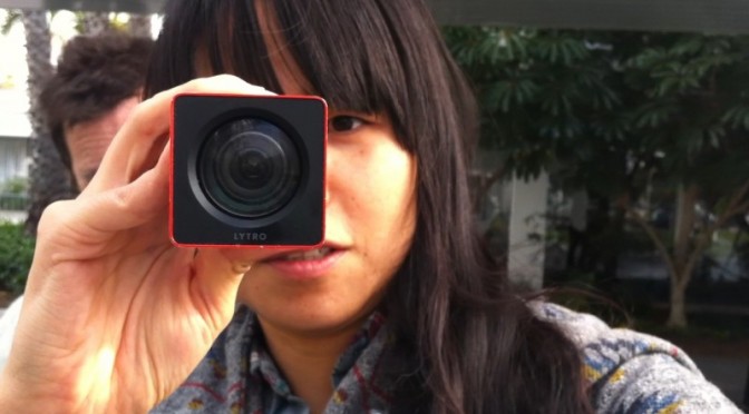
Yesterday while leaving the LA Photo exhibition in Santa Monica — a kind of catch-all retail event of photography through the commercial curatorial world of private galleries — I happened across a small scrum of people with anodized extruded rectangles holding them close to bush leaves, flowers and tiny bits of dirt on the ground. Lytro was in town somehow — or stalking about doing a bit of half-assed DIY guerrilla marketing.

There. I’m a Lytro hater. And maybe I’m getting old and cranky and beginning to catch myself thinkign — “I just don’t understand what kids are up to these days..” That’s a sign of something, I suppose. Oftentimes I can riddle it through and understand, even if I wouldn’t do the “whatever it is” myself.

Nevertheless, I don’t understand what Lytro‘s doing. Let me try and riddle it through.

For those of you, unlike me, who don’t scour the networks for any sign or hint of an evolution in photography and image making generally, you may not know about Lytro’s weirdly optimistic talk about “light field imaging” techniques that is meant to revolutionize photography.

Well, this is it. Effectively, a proper bit of patent gold that allows one to capture a light field (their stoopid way of basically saying “image” or “photograph”) and derive the path of every light ray in such a way that you can focus *after you’ve captured your light field. What that means practically is that you never have to worry about focus ever again, and you can recompose the focus point forever afterwards. So — all that lovely, soft, bokeh (nez depth of field) that has come to mean “professional” photography because you previously could only get nice, lovely, soft depth of field with an expensive, “fast” lens and a big sensor? Well — now you can walk around with an anodized extruded rectangular tube and get it as well. It’ll cost you a bit less than that fast lens would’ve, and you get all the advantages of touching a little postage stamp sized screen to control the camera, and you can run your finger along a side of the rectangle to access zoom controls, and — best of all — you can shove the extruded rectangle at your friends and capture *their light field.


Seriously though — if I were to do a less snarky critique, I’d say that they a few things all turned around here.

First, they missed a serious opportunity to play up on the apparent fascination with analog, or retro-analog, or analog-done-digital. People seem to be in love with cameras that are digital, but harken back clearly to pre-digital photography. I’m talking about the industrial design mostly — but cameras like the Fuji X100 are beautiful, digital and, in their form, signal image-making/image-taking. Things like Instagram filters — whatever you may think about them — signal back to the vagaries and delights of analog film chemistry and the fun of processing in the dark room to achieve specific tonal and visual styles. There’s something about the analog that’s come back. That’s a thing. Perhaps its digital getting more thoughtful or poetic or nostalgic and then we’ll move onto a new, new comfort zone with our gizmos and gadgets and they’ll become less fetish things than lovely little ways to capture and share our lives with pleasing accents and visual stylings. Pixel-perfect will mean something else. Roughness and grit will be an aesthetic.


The extruded rounded rectangle isn’t bad, but it’s not so much camera as it is telescope. And if it’s signaling telescope, I’ll want to hold the thing up flush to my eyebeall, like a pirate or sea captain. And that’s fun as well. More fun, I’d suggest, than holding it out like I was getting ready to chuck a spear at someone.

The fact that I have to hold it several inches so I can pull focus on the display? Well, that’s several inches away from my subject and that little physical alignment schema of photographer —> intrusive-object —> subject is a bad set up. It ruins the intimacy of imaging making. I think that’s well-appreciated if thoroughly ignored aspect of the history of the camera design that the viewfinder makes a difference in the aesthetic and compositional outcome of picture taking. That’s a little bit of lovely, low-hanging fruit in the IxD possibilities for the future of image-making. It’s less a technology-feature, than a behavior feature that can be enabled by some thoughtful collaboration amongst design+technology.

The posture some folks take now of holding their camera out at nearly arms length to compose using the LCD screen on the back of many cameras? That’s bad photography form. You’re taking an image of what your eye sees, not what your camera sees. The intrusion of the visual surround that your peripheral vision naturally takes in when you don’t compose with your eye up to the viewfinder changes the way you compose and how you compose. I’m not saying there are rules, but there are better practices for the rituals of photography that lead to better photography and better photographers. Leastways — that’s what I think. It’s why I prefer an SLR or a rangefinder over a little consumer camera with no viewfinder, or a gesture to the viewfinder that’s barely usable.

You should try taking an image using the viewfinder if your camera has one and then never turn back to the LCD. Use the LCD for image sharing — that’s fine. Or for checking your exposure — that’s awesome and maybe one of the best advantages of the LCD. But to compose using the LCD, you’ve effectively lost the advance that the viewfinder brought to photography, which is to compose the view and do so in a way that makes that composition intimate to the photographers eye. Everything around is removed and blocked out. There are no visual distractions. What you see is basically what you get. (Some viewfinders don’t have 100% coverage, but they are typically quite close.) When the consumer camera manufacturers introduced thin cameras they had to do away with all the optics that allowed the image coming through the lens to do a couple of bends and then go to the photographers eye. And, anyway — all that is extra material, weight, glass, etc. So people started taking photographs by, ironically, moving the camera further away from themselves forever changing photography.

Well, that’s okay. Things change. I like looking through a viewfinder and grouse whenever I see people not using their viewfinder. And, I suppose I don’t use one many times when taking snaps with the happy-snappy or the camera on my phone. Whatever.

The point is that Lytro missed a fab opportunity to redo that compositional gaff that a dozen years of consumer electronics innovation dismissed out of hand.

That’s the Industrial Design gaff. There’s more.

Then there’s the interface. To *zoom you slide your finger left-and-right along an invisible bit of touch-sensitive zone on the gray plastic-rubber-y bit on the near end of the extruded tubular rectangle. Like..what? Okay — I know we’re all into touch, so Lytro can be forgiven for that. But — hold on? Isn’t zoom like..bring it closer; move it further away? Shouldn’t that be sliding towards me or away from me? Or, wait — I get it. The zoom gesture people may be used to is the circular turning of a traditional glass lens. Zoom out by turning clockwise. Zoom in by turning counter-clockwise. Well here I guess you’re sort of turning from the top of the barrel/rectangle — only you’re not turning, you’re finger-sliding left and right. So, I have no idea how this one came about. While a mechanical interface of some sort was probably not considered practical given the production requirements, tooling, integration and all that — I think this begs for either a telescoping zoom feature, or a mechanical rotating zoom feature. At a minimum, a rotating gesture or a pull-in/pull-out gesture if they’re all hopped up on virtual interfaces mimicking their precedents using things like capacitive touch.

Me? I’ve been into manual focus lately. It’s a good, fun, creative challenge. And even manual exposure control. Not to be nostalgic and old-school-y — it’s just fun, especially when you get it right. (Have I game-ified photography? N’ach.) Now with Lytro, the fact that I can focus forever after I’ve taken the image means I’ve now introduced a shit-ton of extra stuff I’ll end up doing after I taken the image, as if I don’t already have a shit-ton of extra stuff I end up doing because the “tools” that were supposed to make things easier (they do, sorta) allow me to do a shit-ton of extra stuff that I inevitably end up doing just cause the tools say I can. And now there’ll be more? Fab.

And further related to the interface is the fact that they introduced a new dilemma — how to view the image. Just as we got quite comfortable with our browsers being able to see images and videos without having to download and install whacky plug-ins, Lytro reverses all that. Because the Lytro light field image is weird, it’s not a JPEG or something so browsers and image viewers have no idea how to show the data unless you tell them how — by installing something/installing/maintaining else, which isn’t cool.

And now I suspect we’ll see a world of images where people are trying to do Lytro-y things like stand in close to squirrels so you can fuck around with the focus and be, like..oooOOooh..cool.

I don’t want to be cranky and crotchity about it, but I take a bit of pride in composing and developing the technical-creative skills to have a good idea as to what my image is going to look like based on aperture and shutter speed and all that. I know Lytro is coming from a good place. They have some cool technology and, like..what do you do if you developed cool technology at Stanford? You spin it off and assume the rest of the world *has to want it, even if it is just a gimmick disguised as a whole camera. Really, this should just be a little twiddle feature of a proper camera, at best — not a camera itself. It’s the classic technologist-engineer-inventor-genius knee-jerk reaction to come up with a fancy new gizmo-y gimmick that looks a bit like a door knob and then put a whole house around it and then say — “hey, check it out! i’ve reinvented the house!”

*shrug.

Why do I blog this? Cause I get frustrated when engineer-oriented folks try to design things without thinking about the history, legacy, existing interaction rituals, behaviors and relevancy to normal humans and basically make things for themselves, which is fine — but then don’t think for a minute about the world outside of the square mile around Palo Alto. It could be so much better if ideas like this were workshopped, evolved, developed to understand in a more complete way what “light field imaging” could be besides something that claims camera-ness in a shitbox form-factor with an objectionable sharing ritual and (probably — all indications suggest as much) a pathetic resolution/mega-pixel count.

A Few Things The Laboratory Did In 2011

LOS ANGELES

Projects
* It was a year of mostly audio creations ahead and around of Project Audio for Nokia. Some very exciting little bits of design, fiction and design, fact. These will continue into 2012 with some more public than others, necessarily. The over-arching theme of creating a renaissance of Audio UX across the board and to say — listen, we’ve been very screen-y over the last, what? 50 years. Our screens a nagging jealous things. What about our ears? Has design fallen short in this regard and actually is design incomplete insofar as it relies so heavily on what we see and what we touch, sit in and so forth without regard to the studied appreciation and elevation of what and how we hear? Effectively, sound is an under-appreciated and, from within the canon of even just UX and Interaction Design — basically ignominiously ignored.
* Made a couple of little electronic hardware things, but not as much as I would’ve liked. An incomplete portable audio mixer; an incomplete portable Ear Freshener. Those’ll go into the 2012 pile.
* We worked on a bit of Radio Design Fiction for Project Audio at Nokia. The conceit was to work with and understand radio as something that possibly everyone did and had — rather than centralized broadcasting, such as big commercial radio stations — everyone had a radio and possibly radio was a viable and successful alternative to personal communication such that point-to-point communication (e.g. cell phones) never took off because a bunch of powerful men met in a high-desert compound in New Mexico and conspired to make Zenith and RCA the largest corporations in the world. Cellular never takes off and AT&T becomes a little lump of spent coal in the global economic smelter.

Presentations & Workshops
* At the beginning of the year was the Microsoft Social Computing Symposium. I went, and mostly listened. I think I got happily wrangled into facilitating something.
* There was the 4S conference where I presented on a panel to discuss the relationship between science, fact and fiction. David Kirby was on the panel, so that was tons of fun. Discovered this book: Science Fiction and Computing: Essays on Interlinked Domains, but then realized I had it already.
* I participated in a fun panel discussion for the V2__ Design Fiction Workshop in Rotterdam
* I went to The Overlap un-conference outside of Santa Cruz
* I went to Interaction 11 to see about the world of interaction design.
* Australian Broadcast Corporation interview on Design Fiction — Transcript and here’s the actual audio and stuff.
* Interview on Vice – Talking to the future humans with Kevin Holmes.
* Interview on Steve Portigal’s The Omni Project
* UX Week 2011 Design Fiction Workshop
* Fabulous Project Audio workshop in London with the fine folks at Really Interesting Group.
* And there was Thrilling Wonder Stories event at the Architectural Association in London in October.

That’s all the stuff that I can remember right now. I’ll add to it for the Laboratory log as things return to my memory.

BARCELONA

Projects
Our main investigation line on network data (byproducts of digital activity) brought us in direct contact with the different actors of the urban environment (e.g. city authorities, service providers, space managers, citizens) jointly exploring the opportunities in exploiting this new type of living material. Our projects strategically split into self-supported initiatives initiatives and client works with a common objective to provide new tools to qualify the built environment and produce new insights for its actors. We experimented complementary approaches with observations and prototyping mutually informing our practice. For instance, along our investigations we like to employ fast-prototyped solutions (see Sketching with Data) to provoke and uncover unexpected trails and share insights with tangible elements such as interactive visualizations and animation. We found it to be an essential mean to engage the often heterogeneous teams that deal with network data around a shared language. Practically, we teamed up with:

* A real-time traffic information provider to produce innovative indicators and interactive visualizations that profile the traffic on key road segments.

* A multinational retail bank to co-create its role in the networked city of the near future with a mix of workshops and tangible results on how bank data are sources of novel services

* A large exhibition and convention center to perform audits based on sensor data to rethink the way they manage and sells their spaces.

* A mobile phone operator and a city council to measure the pulse at different parts of the city from its cellphone network activity and extract value for both city governance and new services for citizens and mobile customers.

* elephant path is a pet project to explore the actual implementation of a social navigation service based on social network data. Would love to develop it more, automate it and port it to mobile. It won the 2nd price at the MiniMax Mapping contest.

Product
The second part of the year was also dedicated to collaborating with our friends at Bestiario to land a product that provides tools for individuals and organizations to explore and communicated with (big) data. Our role consists in supporting Bestiario in matching market demand with product specifications, orchestrating the design of the user experience and steering the technical developments. Quadrigram has integrated now our data science toolbox.

Presentations
* After staying out of the stage for most of the year (expect a lecture at ENSCI in Paris), I entered the polishing phase on the work with data with a talk at the Smart City World Congress.

Publications
* Our friends at Groupe Chronos kindly invited us to participate to an issue of the Revue Urbanism. We contributed with a piece on the ‘domestication’ of the digital city. I also wrote a text for Manual Lima’s recent book Visual Complexity. The text was not published eventually, but I appreciated the opportunity to write about my domain for a new audience.

We have been actively collaborating with academic entities such as:

* Yuji Yoshimura at UPF on a follow-up investigation of our study of hyper-congestion at the Louvre. The first fruit of this collaboration that also involved Carlo Ratti at MIT has been published in the ENTER2012 conference proceedings: New tools for studying visitor behaviours in museums: a case study at the Louvre
* Jennifer Dunnam at MIT for which we collected Flick data used in her Matching Markets project.
* Francisco Pereira at MIT for the article Crowdsensing in the web: analyzing the citizen experience in the urban space published in the book From Social Butterfly to Engaged Citizen.
* Boris Beaude at EPFL who helped us run a the co-creation workshop on open municipal data at Lift11
* Bernd Resch at University of Osnabrueck who spent endless hours developing and run models for our specific needs for spatial data analysis

and studios and individuals:
* Urbanscale for their effective and beautifully crafted maps
* Olivier Plante who designed Elephant Path
* Bestiario, the team behind Quadrigram
* Brava, our german graphic designers

GENEVA

Projects
* Three field studies about the appropriation of various digital technologies: Shadow Cities (a location-based game), 3D interfaces on mobile displays, the use of head-mounted displays in public settings. While the first one has been conducted internally (and will result in a presentation at the pre-ICA conference), the two others have been conducted for a French laboratory in Grenoble. Although field research about this has been conducted in 2011, it’s quite sure that the insights we collected in these 3 projects will be turned into various deliverables (speech, articles, report…).
* Interestingly, the Geneva bureau has more and more request for projects out of the digital sphere. This year we worked with a cooking appliance manufacturer, a coffee machine company and a electricity utility on various things ranging from new product development (the near future of …) to co-creation workshops or training the R&D team to deploy design research approaches (based on ethnography).
* I also took part to the “Streets of BBVA” project with Fabien, contribution to the workshop series about the use of networked data for a spanish bank.
* My second book, about the recurring failure of digital products, has been released in French. It eventually leads to various interviews and speeches (See below).
* For Imaginove, a cluster of new media companies in France, I organized a series of lectures and workshops about digital technologies.
* The game controller project is slowly moving forward (discussion with editors, writing, drawings…). Laurent Bolli and myself not only work on the book but there will be also an exhibit at the Swiss Museum of Science Fiction (planned for March 2012).
* I wrote a research grant with Boris Beaude (Choros, EPFL) about the role of networked data in social sciences. It’s a quite big project (3 years long!) and we’ll have the answer by April 2011.

Various speeches and workshops
* Des usages au design: comprendre les utilisateurs pour améliorer les produits, Talent Days, December 1, Lyon, France.
* Panelist at Swiss Design Network Symposium 2011, November 25, Geneva.
* Mobile and location-based serious games? At Serious Game Expo, November 22, Lyon, France.
* Les flops technologiques, ENSCI, PAris, November 17.
* My interaction with “interactions” in interaction design, ixda Paris, November 16.
* User-Centered Design in Video Games: Investigating Gestural Interfaces Appropriation, World Usability Day, Geneva, November 10, 2011.
* Fail fast. Learn. Move on, Netzzunft, Zürich, October 27.
* Wrong is the new right, NEXT 2011, Aarhus, Denmark, August 31.
* Robot fictions: entertainment cultures and engineering research entanglements, Secret Robot House event, Hatfield,, UK June 16.
* Tracing the past of interfaces to envision their future, Yverdon, June 9.
* Traces and hybridization University of the Arts, London, June 19.
* PostGUI: upcoming territories for interaction design, Festival Siana, Evry, May 12.
* The evolution of social software, April 7, Lyon, France.
* De l’ethnographie au game design, Brownbag Tecfa, April 15, Geneva
* interfaces & interactions for the future” Creative Center, April 8, Montreux.
“The evolution of social software”, April 7, Lyon, France. Gamification Lift@home, March 3, Lyon.
* Smart Cities workshop with Vlad Trifa and Fabien Girardin, Lift11, Geneva, Switzerland
* Culture et numérique : la nécessité du design, L’Atelier Français, January 27, Paris, France.

Teaching
* At HEAD-Geneva, at masters level, I taught a semester-long class about user-centered design (how to apply field research in a design project) for two semesters. This fall, I also taught interaction design and acted as tutor for 9 masters students (which is obviously time-consuming!).
* At ENSCI, I conducted two week-long workshops/courses: one about reading in public places, one about the use of rental bikes with Raphael Grignani (from Method).
* At Zurich school of design, I gave a day-long course and workshop about locative media last June.
* At Gobelins Annecy, I gave a three day course about innovation and foresight, last June.
* At HEG Geneva, I also gave 3 lectures about innovation and foresight last fall.

Weekending 19122011

On the Swiss front of the laboratory (Nicolas), there is progress on the game controller project. Laurent and myself indeed met with scenographers in Lausanne to discuss the upcoming presence of the joypad collection at the Swiss Museum of Science-Fiction (yes, there is such thing as a Swiss Museum of Science-Fiction) in 2012. We chatted about the way the controllers will be presented, a chapter I wrote for the catalogue of the exhibit and also a new visual representation to be displayed as a complement to the devices. It’s the diagram that you can see at the beginning of this blogpost, designed by Laurent Bolli. What started as a book project is now slightly more complex with various artifacts like these. It seems that we’ll also sell the poster with postcards. We have the outline ready and part of the book is already written but the design approach we favored lead to intriguing bifurcations: it seems that every opportunity we get to discuss the joypad history lead to some new viewpoint that we try to express visually. And this representation then enables us to get a different perspective on the topic per se. Hopefully, I’ll write during the Christmas vacation!

Apart from that, the week was also devoted to a day of lectures at the Geneva University of Arts and Design. Monday was about interviewing techniques in field research and the afternoon about user participation in interaction design (from user-generated content to designing “hackability”.) This fostered an interesting discussion about repurposing and hacking. Students argued whether designing something so that people can create new features/functionalities is different than letting extreme users hack a system. What we agreed on at the end of the course was simply that those are different kind of possibilities along a certain spectrum… which allowed me to highlight the work of Michel de Certeau and the importance of observing peculiar ways to repurpose things in the environment (food for thoughts for designs).

And finally, I spend the end of the week conducting a field study in the train between Geneva and Zürich. The point of this project is to explore the use of (light) head-mounted displays used in conjunction with cell-phones. I can’t talk much about this but we’ll make things public at some point, perhaps an academic publication if time allows it.

At the Los Angeles Station (Julian) most of the last week was focused on a workshop at the Nokia Advanced Design Bureau where we had a wonderfully intense two day Project Audio workshop with our friends Tom Taylor and Phil Gyford from RIG. That was great good fun and engaging. Working with friends from outside the bubble of Advanced Design provides a bit of a checksum on the work. That’s to say — facing inward and not nearly as public about what we do and how we do it as we should be (and could be), bringing in trusted, thoughtful, engaged partners helps validate or repudiate the design we may *assume is fab, but may or may not be. With them alongside, we were able to move from some axioms and principles that came out of our first workshop in London a month or so ago to quite tactical plans as to how Project Audio moves forward in the 2012. Some more thinking, lots more making and some things that are very fast moving and involve multiple other participants who should be engaged in the design and making work. In between those two workshops we managed to find a way to work across eight timezones — and realized that the tools for doing so are a bit broken.

In other news, questions still abound in the Executive Floor as to when and why to make things become real produced things and when things are best as props and prompts to help shift and advance what design does.

On the one hand, making a “real” thing can be quite viscerally satisfying. You can say — “Look! I *made that thing hanging there on that rack in that box. I *made something that is real!” I understand that motivation. And oftentimes making that sort of real thing in that sort of real world is necessary because that, ultimately is how you make money to buy bread, if you work at a place where revenue is made through paying consumers. That’s good. And maybe along the way you’ve helped make people think differently about what can be in the world because many people? Well..many people consider least common-denominator crap like Color Changing Digital Alarm Clock Cubes is as good as it gets. And all good advanced designers aspire to advance that assumption and do things like set new high-water marks in the realm of little things that make the world just a little bit better.

On the other hand, making theory objects, props, prototypes and MacGuffin’s have the effect of poking and provoking the practice rather than the consumer — they are effective as ways of changing design in a wider sense because designers are the audience. They are potentially infectious and pedagogical. Of course, it is guaranteed they are incomplete almost by definition — you’ll never get the thoroughness and inevitable compromise that comes with tooling for manufacturing or constructively arguing with “The Business” about what this is and who it is for. The design priorities are sanctioned by the priorities of getting something that goes to the larger marketplace and you end up with a diluted thing that does/teaches nothing. I guess my point is that the prop can teach and the “real” (eech) thing has the potential to be a sad, diluted thing that eats time and money.

Continue reading Weekending 19122011

Short Note — The Product Design Venn Diagram: Updates

This is maybe even less than a short note to point to a little more conversation that @bruces and others are having regarding the Hubberly Venn Diagram I mentioned a few blog posts ago. @AnneGalloway took some fast-furious notes of Bruce discussing it an event: http://www.designculturelab.org/2011/12/09/critically-making-the-internet-of-things-session-i/. Here’s what she says:

* pretty much impossible to take notes but…

“All the gloss of wonder gets scraped off” when the dreams of science fiction become real and commercialised. But also, why is the design in science fiction so bad?

Theory Object for anticonventional products

Theory Object for Anticonventional Products

Design fiction instead. See Postscapes’ Best Design Fiction 2011. (Ed. See Note Below)

But what about real products? What science fiction can’t do.

RFID + Superglue + Object ≠ IoT

“It’s easy to be bewitched by the apparent beauty and logic of this. But the map is not the territory.”

Design fiction is a form of design, not fiction.

I’m glad that Bruce mentions this idea that “design fiction is a form of design, not fiction.” As I see it and what hope I have for it as an approach to doing and making is that it isn’t fictional or meant to be disputed because it is “less real” than “real design”. That would be terrible — but that’s entirely up to designers who deploy it as a way of working. If it materializes things that others see as imminently real, tangible — things that cause action, then the question as to its “real-ness” and its factual/actual-ness won’t be disputed. So — make things.

There it is. Glad to see more discussions happening around this. We’ll back-fill it with meaning and utility and make it actionable through making-of-things. I think the Ear Freshener may be the Laboratory’s first test.

Note about Postscapes Best Design Fiction 2011 — Our opinion is that it is fab to have a bit of an awards category for things. It draws attention to the activity and all that. We’re not terribly into awards here — in fact, we cleared out the 7th Floor where we had our Division of Awards and Wall of Gallantry to make space for another solder reflow machine.

But, in any case — there was our Trust Clock listed as an entrant — you can vote for it if you like. It belongs in a different category though because that clock was *made and *works. It still sits in the studio, ticking away the time, ready for someone to get up the gumption and nerve to actually live with. I think there are some great and well-tested bits of design in the form of video prototypes, and they’re fun to look at and ponder.

And then — I think the building-of-the-thing is important and shouldn’t be underemphasized, but not to get puffy about. If there are going to be awards, then perhaps it makes sense to divvy things up a bit and indicate the idiom of design fiction that the design works within? Just a thought. But, that’s to say that the building of that clock forced considerations and questions that I don’t think would’ve occurred had one not had to write firmware and solder and all that. We could’ve stopped at that video, but we had more questions that came directly from writing software and discovering interaction rituals based on making activities — where buttons go, how the alarm fob is given and to whom..real material things that wouldn’t come out in a video. Those questions led to other considerations that really made for actionable design — that can *then be delivered in a tangible way to teams who make products that are closer to the center point of the Hubberly Venn Diagram. You see what I mean? There are things that happen when you make design fiction objects that turn on, can break, have byte code uploaded to them. These are things that make the design thorough — which obtains because of the pain of making the thing *work in a different way from animating it working.

Why do I blog this? To capture more discussions and thinking about the goals of design in a broader sense.

Continue reading Short Note — The Product Design Venn Diagram: Updates

Weekending 11202011

Ack. Just a few short notes from the week previous.

Well, we got some more clarification on the graph of possible-probable-desireable but I wasn’t able to spend as much time figuring out how to employ it as an approach to design — I mean..not that I’d figure out anything crazy in the midst of a work week. But, then John Marshall sent a note that tipped me back into this idea of Device Art which has notes of things that are like “devices” perhaps in the sense of an instrument designed to achieve in the product sense, but then also art.

..device art is a form of media art that integrates art and technology as well as design, entertainment, and popular culture. Instead of regarding technology as a mere tool serving the art, as it is commonly seen, we propose a model in which technology is at the core of artworks.

So aside from this idea of the tool serving the art, but the tool itself being the art — you’re going to begin to flirt around in some curious territories in the possible-probable-desirable Venn diagram seeing as much art deliberately avoids that center sweet spot and confronts common-sense ideas as to what is, should or could be.

*shrug. It’s a start anyway. Besides, I like the idea of lots of small, little device-y things that do very unexpected, unusual but, maybe at the end of it, desirable and profitable things, but they have to be made by hand by artistans. Or things that are desirable, but not profitable but easily made. What would they be?

There was a curious visit to the Oblong Industries loft-y-studio in downtown LA late last week. You’ll know Oblong as the place where John Underkoffler evolved his diegetic prototype of gesture-based interfaces developed in Minority Report. So — that’s what they do there..and this time around rather than paying lots of attention to what the gestures were doing. I’ve decided they’re weird. It’s just one of those things where — whey you look at the world from a slightly different angle, everything looks different and then you start to wonder. It’s like closing one eye or standing on your head or putting on weirdly lensed glasses and you see something that makes you go, “huh..”

There were a bunch of things that drew my attention — first the scale of the gestures is a bit much. If you do a two-thumbs-up-and-throw-them-over-your-shoulder you perform a kind of screen-reset to put everything back to state zero. That’s useful. The gesture is a good sort of — get-outta-here sort of thing. It’s very articulated. Then there’s this one you see above — the Meatloaf-y “Stop right here!” gesture. There are others.

I’m not faulting the system. The technology works and its fun to try and its fun to watch. It makes good sense in specific contexts where you have big display systems and doing micro-gestures (relative to the scale of screens) with a mouse does not really make good sense. And I can clearly see how this bigger system them have works well in the context of certain work environments, like the guy doing operations stuff for Seal Team 6 while they’re charging into some crazy part of the world. It seems very tactical in a way.

What I was most intrigued by was the scaling-down of their systems to smaller environments and environments without those nasty gloves and big IR tracking configurations. They had a set up with what looked like an Xbox Kinect sensor for doing just broader gestures, without all the finger-twiddling of the bigger set up. This is interesting for simple navigation of things in, perhaps — a retail environment. So now we’re closer to the Minority Report thing of advertising talking to you.

Last thing was some continuingly somewhat frustrating prototyping of some audio objects. Frustrating because once you’re spoiled by the ease of working with kits like the Arduino or, for that matter — iOS — getting to know a new poorly documented chipset is like having your eyeballs dried out. But — at least the tech support guys are prompt with little hints as to what they mean when they describe something that needs a secret decoder ring to comprehend.

Continue reading Weekending 11202011

Weekending 11132011

Hello. It’s time for the weekending post. A few things.

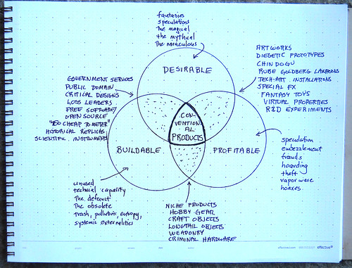
First — I was introduced to this graphic above from @bruces. It shows a Venn diagram showing a kind of perspective of what-could-be. For that reason, I chose to interpret it as another “graph of the future”. How’s that? Well, because it indicates the measure of what can be a product and therefore, what can enter into the world at a particular scale — it’s represents things that can exist at some point in the future. It’s a really simple measure of “product” or “possibility”, but because of its simplicity, its admirable. It says that what can be a product must be desirable, profitable and possible/buildable.

Update: @bruces posted his notebook drawing that I originally saw three, wine-fueled hours into a midnight dinner in London. It comes from Hugh Dubberly.

I pondered this a bit over the week. I shared it for a moment at the recent Society for the Social Studies of Science conference, as a way to think about the future. But, what I want to consider are the unexplored, peculiar areas that are not at the super-sweet spot there in the middle. Are these various terrains that can be explored — perhaps to shift the meaning of what is desirable, profitable and possible? Ultimately, that sweet spot in the middle has to become some sort of least common denominator. What about the impossible? Or the barely possible? Or the unprofitable, but possible and desireable? You see what I mean? How do yo get out of the rut of assuming that everything must be a product — desirable/profitable/possible — and actually innovate? Make new impossible things? Or new, weird things only desirable to 17 people?

Update #2. Here’s Hugh Dubberly’s drawing — at least I think it is. I never saw the one from which Bruce did his notebook sketch.

Yet to be considered.

Well, also this week was a bit of frustrating time figuring-out-new-stuff. Can you believe that we still have to use USBSerial dongles by Keyspan in 2011 in order to talk to modern bits of development hardware? What gives with that?

This is a development board for a VS1000 chip which does audio decoding. I’m hoping to learn more about how to make it do interesting things for some real-time audio hacking and making-of-things. Look for cool stuff soon. Definitely desirable, possible and unprofitable little gizmos and hatchapees.

The last thing is that the video of the Thrilling Wonder Stories thing I did in London last week with Bruce Sterling and Kevin Slavin is available online now at the Architectural Association web site. It’s worth a look. If you fast forward to about 1/2 way through, you’ll get to the start of the presentations from myself @bruces and @slavin_fpo.

Finally, had a lovely coffee time chat with David Kirby who was in town to do some interviews for his upcoming projects.

That’s it for what happened.

In upcoming news, you’ll find more people blogging and doing things through the Laboratory.

The band is getting back together. Yeehaw.

Continue reading Weekending 11132011

Weekending 11062011

Last week was fun and busy. The big thing that stands out was a sort of prodigal son’s return to the academic swampland — I went to the 4S — the Society for the Social Studies of Science conference in Cleveland Ohio. There I participated in a lovely little panel that had the overarching theme of the relationship of science, entertainment, fiction and fact. I shared my insights on the whole “design fiction” enterprise. I was humbled and happy to be there with David Kirby who continues to be a major catalyst for my thinking and lots of other people.

We called the panel The Fiction in the Science (full-colon, of course and then you say what you actually mean by that) : The Intersection of Fiction and STS. (STS is “science, technology and society”).

The basic idea is to discuss and describe and then (what I see as my role) operationalize insights into the prolific relationships amongst ideas and stories and the primary movers of societies today — science & technology. If the STS and 4S sorta people understand or are able to bring an analytic eye to the ways in which, for example, forensic science in television has shaped and informs popular understanding of law, investigation and jurisprudence — then what? So what? How are you able to turn that around and “operate on” those insights? Turn fiction into fact? Turn insight and observation into an actionable, doable creation — how do you do design with fiction, but really?

That operationalization comes from the observations of Kirby and others who have seen the ways that technical consultants of various sorts are able to have their particular perspectives turned into stories that large audiences engage and then accept as the way things are. I’m interested in this reality effect and how it can become part of what design does, to make things hopefully conscientiously better than they are.

We had one of those great dinner discussions the night before that is basically the main reason to go to these things. There was discussion about creating a center to study and produce things; to formalize the relationship between science, technology and science-fiction so that there is no more embarassment when a scientist/technologist draws from science fiction. So that there could be something like the <a href="How to Live Safely in a Science Fictional UniverseInstitute for Conceptual Technology — for real.

Other than the 4S, which was the highlight — there was continuing work on the prototypes for Project Audio. Printed circuit boards came in and got stared at as I’m out of solder paste and should’ve realized that a week or so ago. Hopefully it’ll be in this week. As well, ordered some more little parts for construction of a set of concepts from the workshop in London with RIG two weeks ago. Unrelated, but related — there was the second annual Girls Combi Pool Classic which marks a year of work on the photography book project. And I’m still not entirely done, but I did start a Kickstarter to hopefully get a limited print run of the book done.

Continue reading Weekending 11062011