 Most of what I know about the world I know from movies. From Vietnam to corn syrup, the majority of the factual composition of my brain comes from celluloid, for better or worse. As an Industrial Designer, I’m constantly trying to find simple ways to explain to people exactly what it is that I do, often to blank faces. This got me thinking: how are designers portrayed in the movies? Wider still, how are all creative people portrayed in Hollywood? I think there are a few archetypes, which I’ve outlined below. (I’ve been rooting deep within my cinematic memories for examples, but please get in touch if you know of any more.)
The Writer: Hollywood loves a writer. I would argue there are more movies about writers than any other creative character, perhaps because film is a narrative art. It’s easy for writers to write about writers. Perhaps the best movie about writers is Barton Fink, excellently portrayed by John Turturro, though it also displays many of the tropes of the writer protagonist. The writer is quiet, introverted, often old fashioned – for the longest time, writers used typewriters in movies, long after most had moved to a PC. The writer likes solitude, silence. The writer is tortured: by his publisher, by the deadline, by the characters in his story. The writer is an outsider. The writer is interesting, smart, insightful. There are some excellent movies about writers, from the wild ride of Fear and Loathing in Las Vegas to the structure breaking American Splendor or Adaptation, but most tend to abide by the well understood rules in the portrayal of a creative writer.
The Inventor: from Rick Moranis in Honey I Shrunk the Kids to Doc Brown in Back to the Future, the inventor is almost always portrayed as a wacky, white-coated character with wild hair, spectacles and chaotic living conditions. A character who is wildly secretive and socially awkward, the inventor is a classic Hollywood anti-hero. I suspect there aren’t many such characters in real life. Most lab physicians, chemical or mechanical engineers I’ve met are calm quiet types, but the social awkwardness is a truism, as is the predominantly male makeup of such characters. (A subset of Inventor is the Mad Professor, from Dr. Frankenstein, to countless Superhero movies)
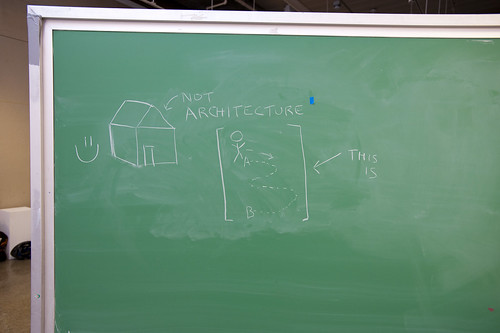
The Architect: this one’s a doozy. Architecture is a go-to employment for any character who is lovable, creative, yet feels trapped in an urban environment, or in a big corporation. The architect has big ideas, but no-one will listen. The architect carries rolls and rolls of blueprints. The architect visits building sites wearing a hard had, he meets with builders and points at things. The architect is a bland job which is non-polarising for any character who needs to appear employed, without his job becoming an important narrative element. Tom Selleck played an architect in Three Men and a Baby. Do you remember? No of course you don’t, it’s not important, but you did remember that he was lovable, educated, smart and maybe a little creative. Woody Harrelson was an architect in Indecent Proposal, but again, just to make him into the nice guy. Liam Neeson in Love Actually, Matthew Broderick in The Cable Guy, Matt Dillon in You, Me and Dupree… you get the picture. There are movies where architecture and architects play a central role, such as the Fountainhead or Towering Inferno, where the role is expanded, but typically ‘The Architect’ remains a proxy for ‘nice guy’.
The Fashion designer: Want a totally wacky character? Want to add some zing, some spice, some drag queen sass? Then your character is a fashion designer. From the characters in Sex and the City and the Devil Wears Prada, to Will Ferrell’s excellent Jacobim Mugatu in Zoolander, fashion designers are perpetually portrayed as vapid, bitchy prima-donnas. I’ve met a fair few fashion designers and there are definitely some who fit that mold (as excellently lampooned by Sacha Baron-Cohen in Brüno, and the documentary The September Issue perhaps illustrates just how real the stereotype can be), but increasingly fashion designers are smart, sensible business people. Perhaps slightly breaking that mold is Audrey Tautou Coco Before Chanel, which is a little more calm about the fashion industry, but it’s a period piece which focusses more on the love story than the design work.
The Painter: See The Writer, but dial up the internal torture and money worries.
The Graphic Designer: This is a little more rare, perhaps because it’s less widely understood as a profession. There are characters who work at magazines, and there are characters who work at Newspapers, but actually designing type and layout? Not so much. Halle Berry played a graphic designer in Catwoman, falling asleep at her drawing board. Jessica Lange played a graphic designer in Scorsese’s Cape Fear, at one point discussing how to draw a logo with Juliette Lewis. Generally speaking, the Graphic Designer is simply another ‘Architect’ character: likable, creative and trapped by a corporate life.
The Advertising Creative: An associated go-to character, although displaying quite different traits to the Graphic Designer. The Advertising Creative is a brash, hard working, hard living urbanite. The Advertising Creative is some parts writer (struggling with copy and straplines), some part architect (struggling to remain creative in a corporate world) but crucially is far more business savvy and less likable than most creative characters. Dudley Moore’s Emory Leeson in Crazy People is a wonderful example, as is Kirk Douglas in The Arrangement, and Rock Hudson in Lover Come Back, but the clearest example of the character is Richard E Grant in How to Get Ahead in Advertising. In TV land, the character has been immortalized by Don Draper et al in Mad Men, firmly sealing the traits of the role.
The Industrial Designer: This is very rare, and often strays into Inventor territory. In a movie, if you need a character to create a new product it typically happens in a boardroom, on a whim (see Tom Hanks ‘I don’t get it’ scene in Big). In Elizabethtown, Orlando Bloom plays an Industrial designer who gets fired from Mercury Worldwide Shoes, and Ewan McGregor played a vehicle designer in The Island, but the roles are fairly inert, a typical ‘Architect’ persona, designed to make the character employed without any polarising characteristics.
The UX designer: see ‘Inventor’ but lots more computers (Tron, The Lawnmower Man and Brainstorm are good examples)
So what have we learned? Across the board, characters who have ‘creative’ jobs are considered interesting, from the flamboyance of the fashion world to the intellectual introspection of the writer, Hollywood loves creative characters. Creative characters are well educated, and with the exception of the Mad Professor or the Advertising Creative, they are likable.
What is interesting is which part of the creative process is used for each of the character stereotypes. Writers and Painters are tortured by the pre-creation ideas phase, Inventors tend to focus on the experimenting phase, Architects and Designers are often portrayed tackling the implementation phase, and Fashion tends to focus on the presentation or post creation phase. I’ve called this the Hollywood Design Index. Perhaps that goes some way to explaining public perceptions of each segment of the design industry, and without getting too overblown, it could have a longer term effect on how each industry is understood. Typically the portrayal of designers in Hollywood is a very pale reflection of reality, but then again, the portrayal of soldiers, politicians, lawyers or doctors is no doubt just as clichéd.
